Focus keyword: geometry in web design
Meta description: Geometric figures, lines, and spaces can be used to improve a website’s flow and usability. Here are 7 ways you can imaginatively put geometry to use in your web designs.
When you think about it, there are a lot of things you learned in school that you’ve never had the occasion to put to practical use.
Take geometry for instance. You learned how to build on what you learned earlier to solve new problems, which is something of value that you took away with you whether you realized it or not. You also learned some basic formulas, e.g., the area of a circle or the volume of a container, which you may have used many times.
The subject matter here deals with aesthetic uses of geometry in web design. We’ve put together a selection of BeTheme pre-built sites and live websites to illustrate the value of applying geometric elements to web design and how to go about doing so.
1. Slice your sections on a diagonal so visitors will naturally want to move down the page
When building a website, we often do so by sections; connecting them like we would connect building blocks, i.e., by taking a modular approach. When one section is placed above another, the horizontal line creates a disconnect, as it is intended to do, but it also creates a stop-start situation which interrupts a site’s natural flow.
Diagonals on the other hand entice visitors to continue moving down the page.
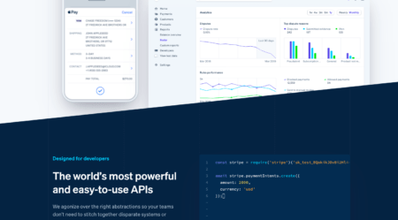
Stripe uses a diagonal divider, which is not only effective, but makes space to insert a “peekaboo” hint as to what lies ahead.
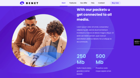
BeData a BeTheme’s pre-built site, uses the same approach, but with 2 diagonal lines.
2 diagonal lines are used to great effect on several pre-built website pages. Note that if the angle formed by the 45-degree dividing lines was inverted, a visitor would be tempted to stop, or at least pause before moving on.
2. Use geometric shapes to make decision-making easier
When designing a website, you want visitors to take actions without them having to think too much about how to get to the next step in the decision-making process. Give them too many options or comparisons to think about and they are more apt to take a wrong path, or simply become frustrated and leave.
Geometric shapes can be used as filters or recommendations by pointing visitors to –
- Plans that are best suited to satisfy a particular need or situation
- Best-sellers or other popular products
- Options that have unique properties
Sephora uses circles with embedded text to draw attention to popular or highly-recommended products.
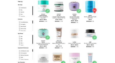
A green circle, for example, could indicate eco-friendliness, while a red one might suggest an item is a best buy.
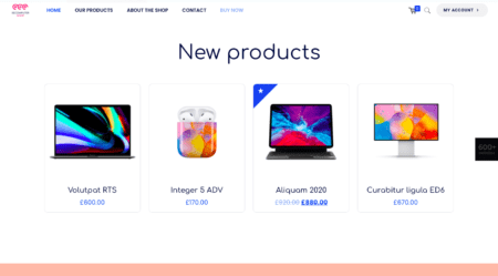
BeComputerShop uses stars rather than text to denote best-selling products.
While the shapes you use could depend on your intent or on the nature of a particular product line, consistency is what counts.
3. Use shapes that portray your brand in the best possible light
We typically provide the transparency consumers seek by using text and images. Images can be particularly effective as they can serve as windows into a brand’s world. Geometric shapes can be used to carve out those windows and can be used to add a personal touch as well.
Web3 carves out a window into its world this way:

In this example, the shape of a polygon carves out a window in the homepage, inside of which is an introductory video.
BeInternet uses a far different shape to accomplish much the same thing.
The circular hole and a static image replace the polygon and the video. Note how the clarity of the image also communicates transparency.
4. Use images that contain geometric figures to show visitors the way
You can insert a line or shape in an image or select an image that has its own geometric figure. Either way, the geometry doesn’t have to be bold and brash, it can direct a visitor’s direction subliminally. This example from the Hyatt Place Hotel in Delaware website is a case in point.
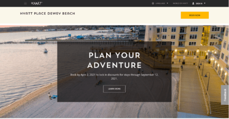
A visitor’s eyes are naturally drawn to the upper left corner of the screen at first but are attracted to the center by the rectangular box with its text. Moving again to the right, the walkway leads the viewer downward.
BeFarm uses its hero image to provide a downward-pointing pathway.
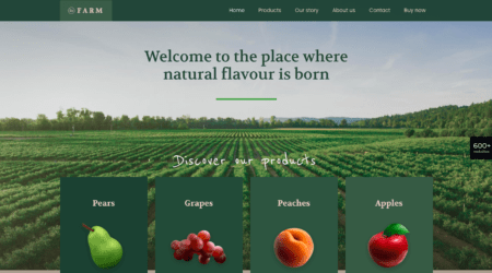
If the rows ran left to right, the viewer would still quickly focus on the products, but the image itself would only be background.
5. Use different planes to spice up your content
A flat design doesn’t always work well when promoting an activity or an event. While the images can often get the job done, placing key objects on different geometric planes can create a motivating 3-D effect.
Don’t try using this approach repetitively throughout your site. More isn’t always better.
This is what Ryan’s Island Cafe did:
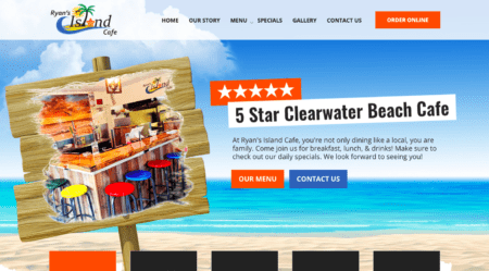
While the beach scene, complete with wooden signpost, creates the right atmosphere, note how the image juxtaposed on the signpost creates a 3-dimensional feel.
BeFunFair uses geometric lines and shapes to create a 3-D effect.
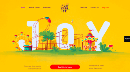
“Joy” is on one plane, the rides looping through are on others.
6. Use lines and arrows created from shapes to provide direction
The following two examples use lines and arrowheads formed from geometric shapes to keep visitors moving across or down a page.
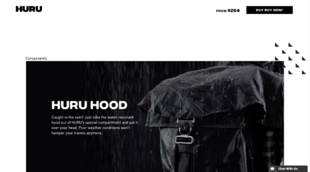
HURU’s uses triangles to form arrowheads on its product pages.
BePhotography on the other hand, uses plus signs and circles to create pathways for visitors.
These directional cues take visitors from one place on the page to another.
7. Use the psychology of shapes to entice visitors to take actions
Some shapes can have psychological meanings and can thus be used to stir visitors to take actions.
- A Square for example suggests orthodoxy and balance
- A Circle can be used to denote harmony, protection, and also infinity
- A Triangle suggests stability
- A Rhombus can imply something is modern, fashionable, or up-to-date
- A Hexagon is symbolic of strength and unity
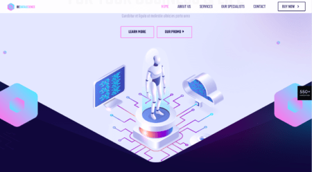
Built by Buffalo uses hexagons to symbolize organization and strength when introducing people to its website.
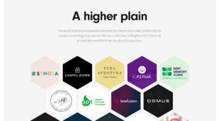
Note how the interlocking of hexagons can also symbolize unity and reliability through cooperation.
BePrint sends a message of harmony with a Venn-like arrangement of circles.
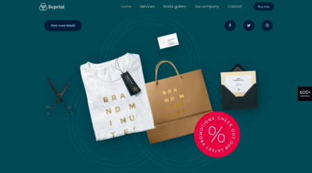
The geometric design may be subtle, but it is nevertheless effective. It becomes one with the logo, and in doing so it supports the brand.
How will you creatively apply geometry in your web designs?
Using geometry in web design does not need to be limited to cleverly placing colorful geometric shapes in a sea of white space, when you could easily use figures, lines, and planes to lead visitors through a page or site. You could also use geometric elements to psychologically engage visitors and inspire them to take actions.
Many of BeTheme’s pre-built sites already have creative geometric elements embedded into their designs. If you would like to follow this trend, BeTheme makes it just that much easier to do so.
About the Author

Kate Dagli
Kate is a passionate web designer who loved WordPress from the minute she laid her eyes on its code. Writing about WordPress themes, plugins, and web design trends is her dream come true.