People tend to underestimate the power of design, whether it’s about the design of a door handle or a soap dispenser. This is even more true when it comes to web design, as the habits and intuition of visitors are even more important and time-sensitive.
So, how do you bring website improvement in order to make it perform better? In this post, we explore five tips that will ensure that your visitors will not leave your website angry about some website design issue, a thing that wouldn’t happen if you worked with a web design company in San Francisco.
1. Readability matters more than anything else
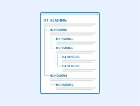
It may sound very obvious, but looking at some websites, it’s better to repeat it over and over: your website must be readable or it’s basically useless. A visitor coming to your website will need to be able to read it, or he will leave the website quickly.
On the Internet, good readability means that your content must be written with short paragraphs, headings, and sub-headings that can be quickly scanned to find the desired information in seconds. On top of that, you need to use fonts properly sized so that legibility is perfect right away. This means that reading has to be made comfortable by using a good font size as well as the optimal line length (about 50 to 60 characters per line).
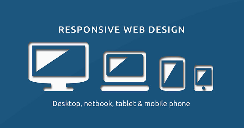
2. Make sure that your website is responsive
More than one-third of global website visits are made from mobile devices. If your website is not designed to be displayed properly on mobile devices, it will have bad consequences for you.
First, Google and other search engines will not rank you well for mobile searches, they might even not rank you at all. Second, your website visitors that will find your website from a mobile device despite the bad ranking will leave it right away if they can’t read it due to bad mobile design.
Responsive design, like you can see on Grizzly Marketing’s website, has become much easier in the past years, make sure that your website is responsive so you don’t lose one-third of potential traffic to it.
3. Use images and illustrative content to your advantage
Buiding an attractive template and design for the general look and feel of your website is only half of the job, you also need to design the content that you include on each page. Following the same logic of scannability and conveying information quickly, you should try to design the content in order to bring each piece of information in the best possible format. Use bullet points, self-explanatory images, videos, and tables when appropriate, so that your website is easier to understand.
4. Be thoughtful with your website header
On your website, the header serves a double purpose: it gives it an identity and it is used to navigate. A commonly used technique is to make the website header sticky, so it stays there to make the website more usable in terms of navigation. It allows you to add calls-to-action after scrolls, so it’s a much-appreciated tip for website optimization.
5. Make proper use of white space
A common mistake made by beginner designers is to overload web pages with too much information and to try to stack all the information above the fold. This will give a bloated look and feel to your website, and it will also make the information harder to find. Using white space is a great way to make information stand out better and to optimize the data available on the website.
About the Author

Peter Makeshoff
Peter Makeshoff is the founder and main author of Designer Daily.