Every time the new year rolls around, we find ourselves eager to improve the way we live and work. We do it by leaving our comfort zones long enough to try new things – like the latest design fads.
Good intentions – problematic results.
Chasing after design fads is short-term thinking. It can be easy and exciting, but the results tend to be short lived.
Think long term instead.
We’re talking about design trends with staying power, a quality you want in your websites as well.
What’s behind staying power? Simply put, it’s a matter of fashioning your work around strong, tried-and-true design principles. There’s nothing wrong with “tried-and-true”.
It’s also about engaging users while not taking them out of their comfort zones.
Remember – every visitor to your website asks the same question: “What’s in it for me?”
It’s not about you.
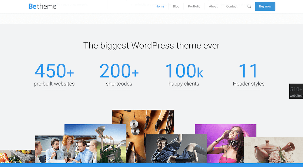
Browse the BeTheme library of 500+ pre-built websites and you’ll see what we’re talking about. These professionally crafted design aids all have something in common – staying power.
Ready to put that staying power to work for you? Take advantage of these tried and tested web design trends.
Trend #1: Skip the tendency to overkill and stick to a super minimal navigation approach
A wonderful thing happened as we found ourselves moving toward achieving a mobile-first experience. Websites, when viewed on desktops, gradually became less complicated and easier to navigate.
When you need to shrink a design element to make it fit, something has to give. With menus, its available space and the allowable number of links. Designers have addressed that on mobile sites by limiting the number of key pages in the primary menu. Secondary links are relegated to footers or sidebars and call-to-action buttons are likewise distributed. The result is much cleaner design.
BeRepair is an attractive example of this. This pre-built website has tucked its navigation menu neatly under the hamburger menu icon.
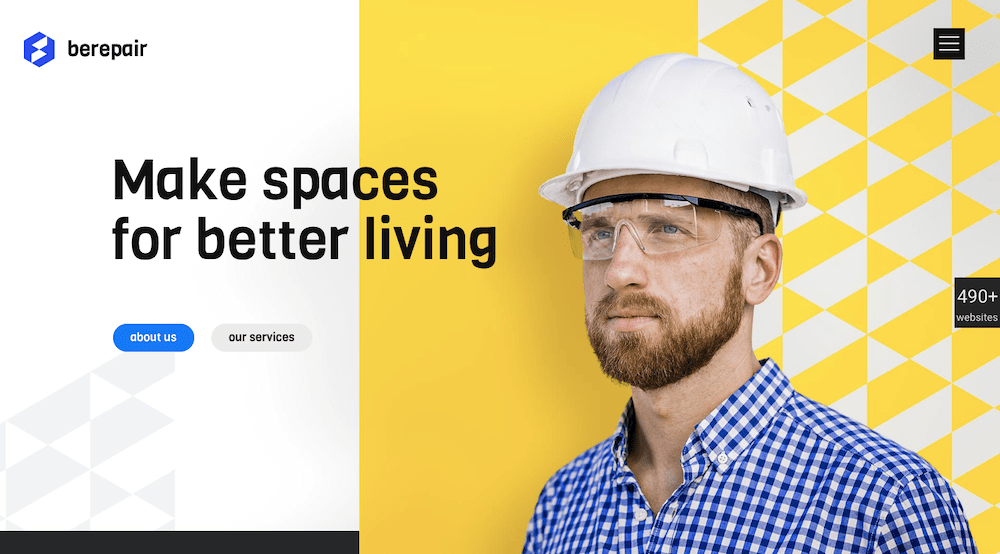
Upon opening the pop-out menu you’ll notice it follows the less-is-more design trend – short, easy-to-navigate links in a sea of white space.
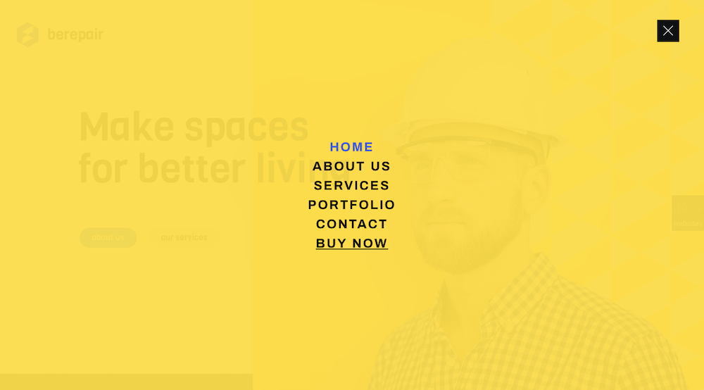
BeGarden, with its non-traditional navigation benefits from a minimalist approach. It is demonstrated in its left-aligned menu.
Trend #2: Add greater emphasis to your message with white space
It’s all about doing more with less. This design trend can be lots of fun to work with.
Users like it too. A crisp, concise, to-the-point message in a wide open space can help your conversion rate – a lot.
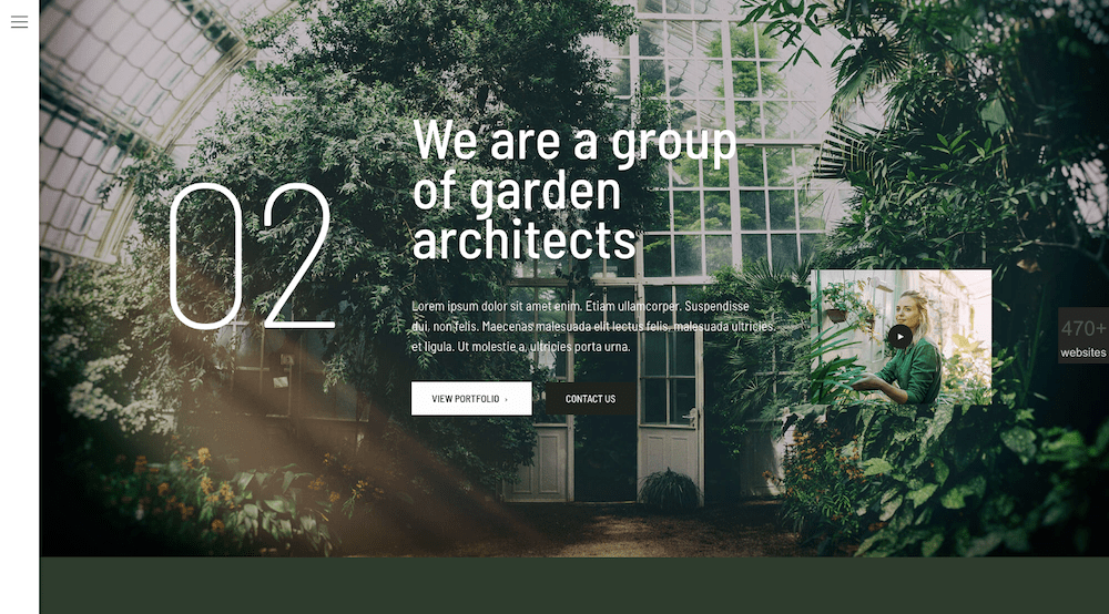
This applies to videos as well. Brevity rules – as illustrated at the bottom of BeWine.
The BeWeddingPlanner site shows how powerful simple imagery can be in telling your brand’s story.
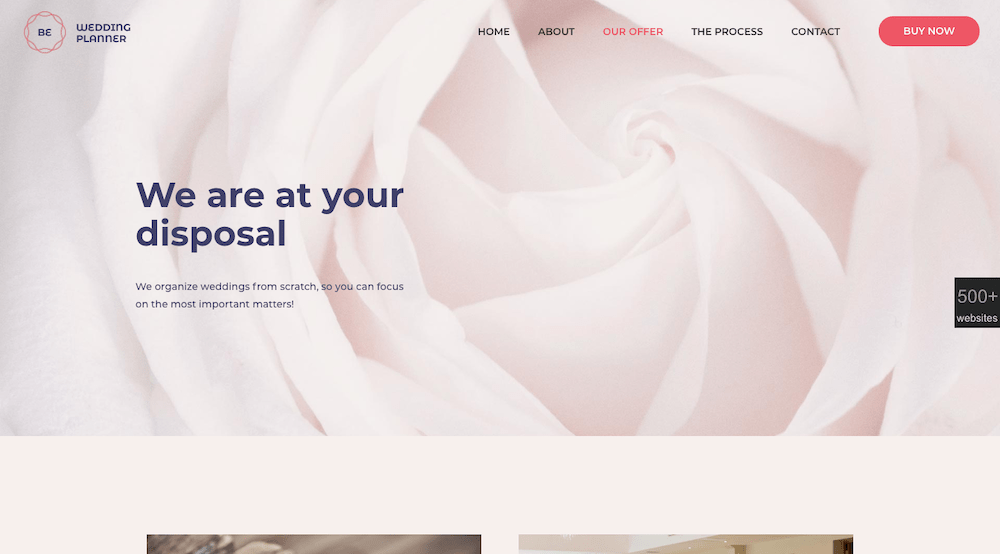
Some text is usually necessary, but in this case not very much.
Trend #3: Give visitors a human face to connect to
It’s not about you. That’s worth repeating. Blog readers, business customers, and online shoppers have something in common. They seek out brands they feel they can be loyal to.
The way you present your website to them can strongly influence how they will initially evaluate your brand. And the best way to do that is to “talk” to them. Make them feel like there are real people behind what they are seeing on the screen; people that have their best interests at heart.
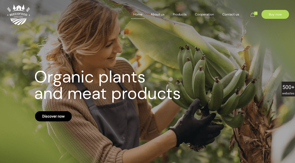
Adding warmth to your site can be extremely effective. BeEcoFood does this with a lively header.
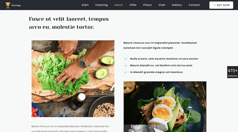
BeCatering does so by adding a human touch. It’s like the food is being prepared just for you.
Trend #4: Create a harmonious experience with universally-accepted typography
The importance of typography to good web design should be obvious, but you need to do your font homework. Not all font styles are 100% browser and device friendly, so you need to do a little research. Sans-serif fonts like Arial, Roboto, and Tahoma are safe choices; as is Times New Roman for a serif font.
There are many more of course. Just take the time to verify they work across all devices and browsers.
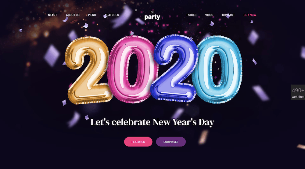
Pick a font you know to be web safe so you can devote your creative energies to other tasks. BeParty’s animation is an example.
Or, an eye catching design like this BeTheme’s website page, with its minimal text, plenty of white space, and engaging and informative imagery.
Trend #5: Dark mode is here to stay – Embrace it
Dark mode is a popular, relatively new design trend. Look at all the ways its being used and you can see it definitely has staying power.
Users love Dark mode because it’s friendly on the eyes. That’s important since those on mobile show no signs of spending less time looking at their screens. Quite the opposite in fact.
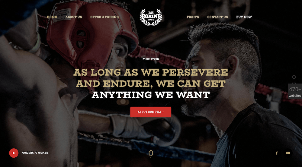
Although websites may tend to grow darker, good design dictates they do so in the proper contexts – as is the case with BeBoxing’s powerful hero image.
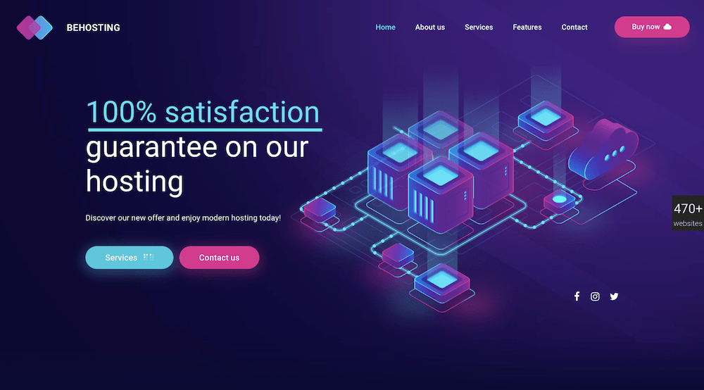
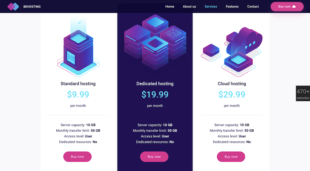
BeHosting uses the dark mode trend to make its key messages stand out in a dramatic, delightfully pleasing way.
Which web design trends will you adopt this year?
You don’t what to invest your time and energy in a web design trend that might be a passing fad. But if you can find a good application for it, feel free to use it. You still need to think long term and make choices that will ensure your websites’ longevity.
Any time a design trend you’ve implemented stops working for you, it’s time to swap it out for something else.
For the most part, you should be focusing on those design trends that aren’t going away any time soon. That will always be the case when you choose to select any of BeTheme’s 500+ pre-built websites as the foundation for your web design.
About the Author

Kate Dagli
Kate is a passionate web designer who loved WordPress from the minute she laid her eyes on its code. Writing about WordPress themes, plugins, and web design trends is her dream come true.