We are always looking for ways to upgrade our skills, what we create, and the services we offer to our clients. Unlike making New Year’s resolutions – and you know long those last – we tend to do a periodic check consciously, or let our subconscious manage that task, which it often does quite well.
So, its not a matter of what trends you resolved to follow in 2020, Rather, it’s what your thoughts are for the rest of the year – and beyond.
Ask yourself this. How is the website you design today going to perform 6 months from now? 1 year from now? 2 years from now? If the trend or trends you’ve subscribed to become obsolete your website may become obsolete as well. Nothing short of a complete overhaul or redesign can save it.
What you need to be doing is to subscribe to web design trends that hold a promise of having an abundance of staying power.
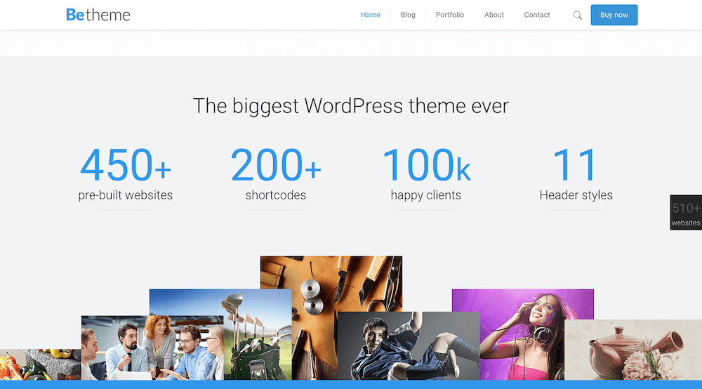
Browse BeTheme’s collection of 500+ pre-built websites and you’ll get a good idea of what we’re talking about. These professionally-crafted design aids have the staying power you’re looking for and need.
Trend #1: Skip the urge to overkill. It’s better to take a minimalist navigation approach
Trying to pack too many clever features into a navigation system can backfire because good mobile design practices require a more minimalistic approach, an approach that has resulted in websites viewed on desktops have become much easier to navigate with the passage of time.
Think of it as taking a 30-word sentence and reducing it to 12. It may not be easy, but the end result is often more well-defined and easier to understand. In designing a menu think of links as words. The more links you can eliminate or place elsewhere, the better.
BeRepair is a great example of this. Its nav menu is neatly ticked away beneath the hamburger menu icon.
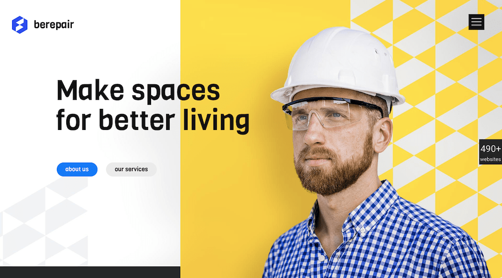
When you open the pop-out menu, you’ll see an example of the increasingly popular less-is-more design trend in action. The links clearly stand out in a sea of white space and are easy to navigate.
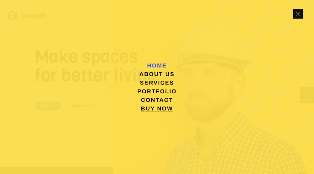
BeGarden’s non-traditional navigation uses the minimalist approach to good advantage in its lower left menu.
Trend #2: Use white space to showcase your message
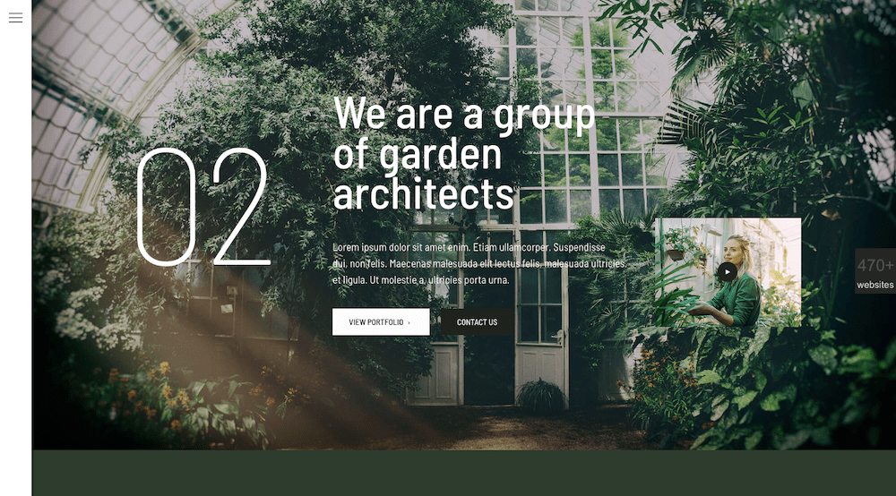
Brevity is the name of the game here. It’s all about learning how to do more with less, and it can even apply to videos; as aptly illustrated in this BeWine pre-built website.
The BeWeddingPlanner site is a beautiful example of how simple imagery can tell your brand’s story powerfully and effectively.
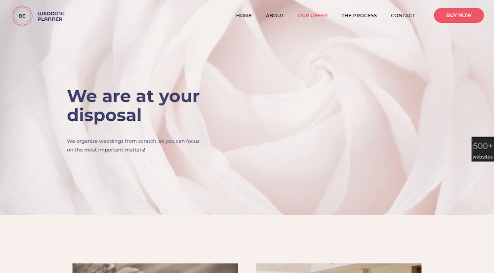
It also clearly demonstrates how effective minimal text can be in getting your message across.
Trend #3: Give visitors a human face to connect to
“Reader board” website designs are rapidly becoming passé. Give your site a personality. You’ll profit from it.
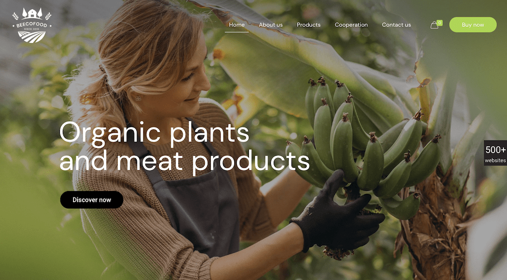
Adding a touch of warmth to your site is nearly always effective. BeEcoFood’s lively header sends a warm, personal message that viewers will find hard to resist.
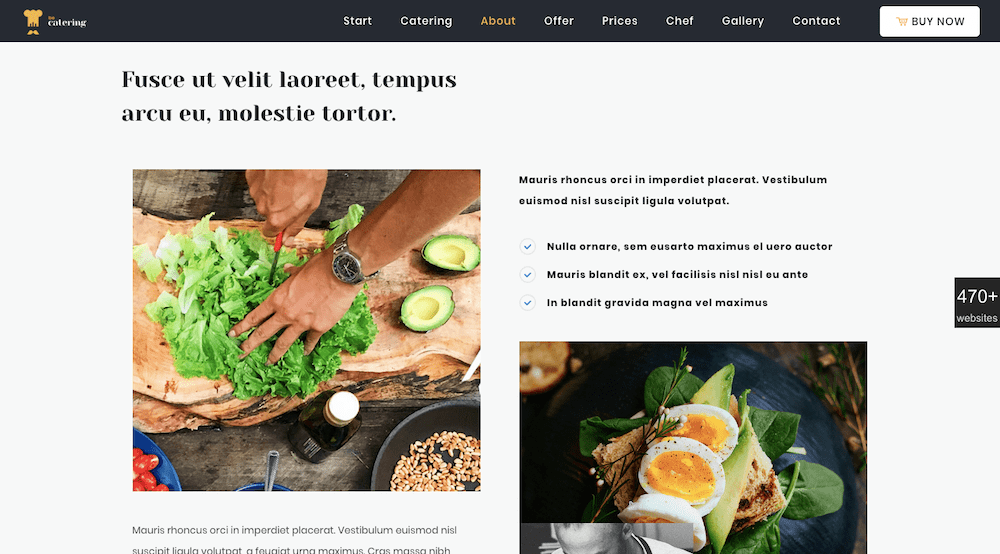
BeCatering adds a human “from our table to yours” touch to its home page by making it appear as if the food is being prepared especially for you.
Trend #4: Use common-sense, universally- accepted typography to create a harmonious viewer experience
First, a poor choice of font can sometimes send the wrong message. Second, not every font is 100% browser or device friendly. Either stick to tried-and-true fonts like Arial, Tahoma, or Times New Roman, or make sure the font you want to use is web safe.
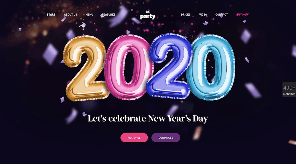
Once you have picked a web-safe font, or fonts, you can apply your design talents to other tasks; like the serif fonts in BeParty’s animated design for example.
Or, like BeTheme’s website page attention-getting design with its minimal text, sans serif fonts, generous use of white space, and attractive and instructive imagery.
Trend #5: Dark mode isn’t going anywhere. Don’t just grudgingly accept it; Embrace it
The dark mode trend is relatively new and it’s popular. It’s also highly practical and definitely has staying power.
Dark mode is easy on the eyes; a good thing since we live in a society where more and more people are spending more and more time viewing their mobile devices.
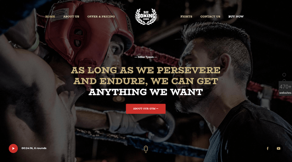
As popular as darker websites have become, good design dictates it is used in the right contexts; as is the case with the BeBoxiing pre-built website’s hero image.
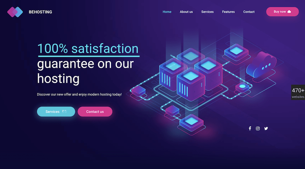
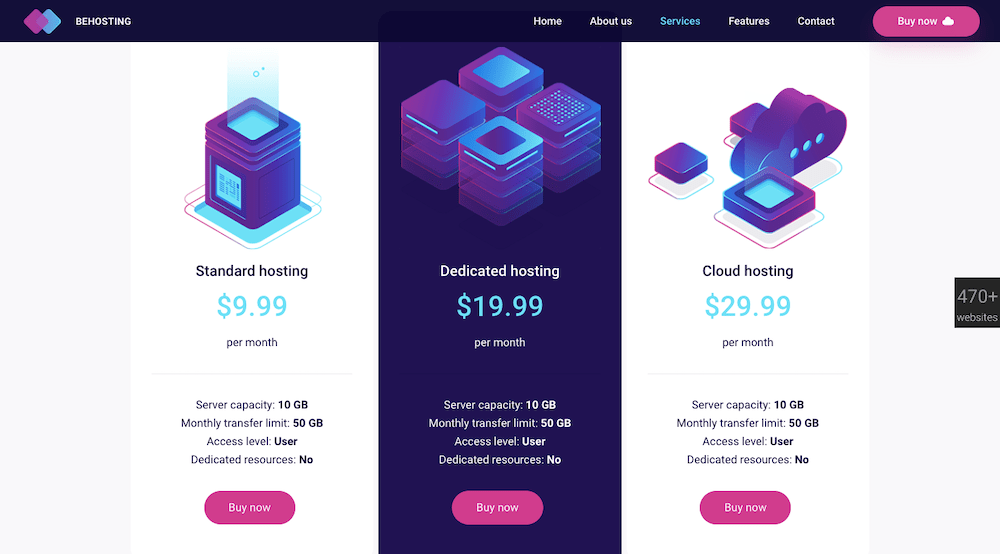
This BeHosting example illustrates how using the dark mode trend can dramatically highlight a site’s key messages in crisp, delightfully pleasing ways.
Which web design trends do you think will stick to us for the rest of the year?
If you were a gambler, you’d likely put your money on all 5 of the above trends, and it would be a safe bet. It would in fact be a rather hard sell to try and convince someone that any one of them might be a passing fad.
As you proceed through the rest of this year and into the next and your website traffic and/or conversions start to drop off it could be that a design trend you’ve implemented is either slowly becoming obsolete or was simply a passing fad.
That scenario is unlikely if you stay focused on following design trends that have staying power; like the 5 discussed here.
Or, you can simply select one of BeTheme’s 500+ pre-built websites for the foundation for your web design and not have to worry at all about keeping up to date.
About the Author

Kate Dagli
Kate is a passionate web designer who loved WordPress from the minute she laid her eyes on its code. Writing about WordPress themes, plugins, and web design trends is her dream come true.