Web design trends don’t just happen. They arise in response to peoples’ thinking in terms of their needs to do better.
We tend to welcome positive change, as long as it doesn’t suddenly jerk us roughly out of our comfort zones when making a transition from an existing condition to a new one.
The digital world has provided numerous good examples of changing website design trends and practices, with the new web design trends of 2022 being the latest.
We will take a close-up look at 5 new trends. We’ll include BeTheme pre-built sites to illustrate the use and effectiveness of these new trends and how you can use these pre-built websites for inspiration or use them directly to create or redesign sites for your clients in 2022.
5 Web Design Trends to Use in 2022
Applying these new design trends as you design or redesign websites for your clients should help them to engage their customers more effectively as they search for information, products, or services.
The 5 new design trends –
1. Immersive image design can inspire consumers to take more actions
According to Statista, people spend more than two-and-one-half hours on their smartphones on any given day, and another half hour at their desktop.
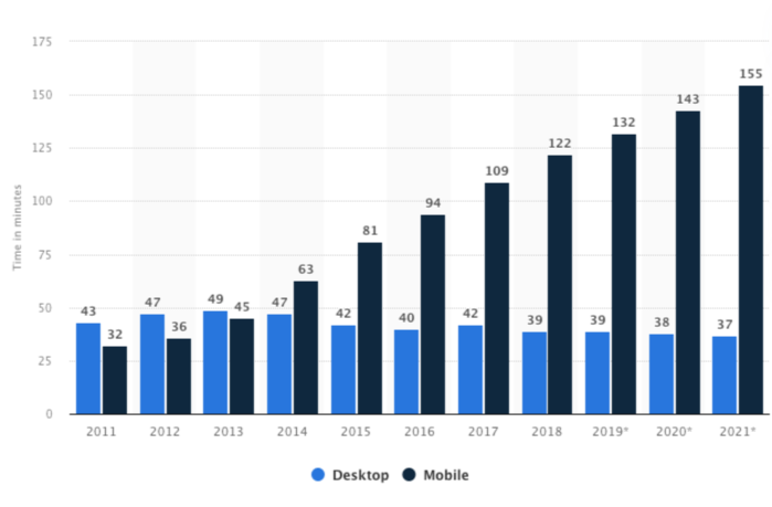
This is happening all around the globe, and while some of this time is devoted to entertainment, a hefty percentage is dedicated to searching for information on activities that go beyond simply looking at their screens – such as looking for a restaurant, making a reservation, or shopping.
This keenness for online searching is worth mulling over. When all is said and done, the best way to sell a product, a service, or some information is to give the prospective customer a “feeling” for it.
That makes sense, but how do you go about it?
With a product, it’s relatively easy. You can zoom in on it, display options or comparisons, or show it from different angles.
Experiences can be more difficult, but the problem can often be resolved using an immersive image design approach in which a digital environment is created that feels real to the viewer.
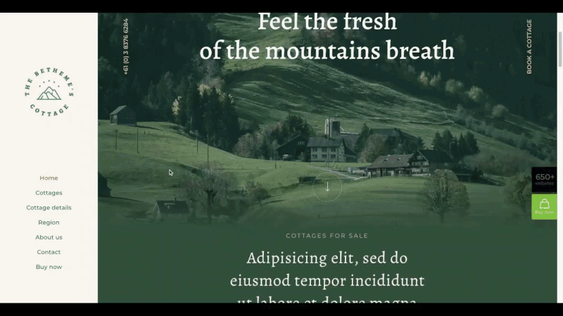
Many of BeTheme’s pre-built websites have been crafted using an immersive image approach. BeCottage2 is a good example of this. It combines image filtering with a blurring effect to blend the landscape images into the digital content.
Surfing2 is another example. Notice how the lighter part of the ocean image blends nicely into the page’s background.
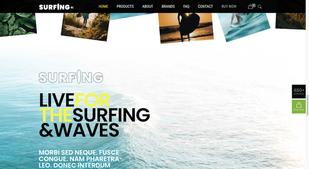
What the designer has accomplished here is to provide the site’s visitors with a smooth flow from the digital content into a natural setting, thereby creating a calming sensation.
2. Changing typography puts a spotlight on content
In the past, designers have often relied on changes is color, style, or font size to attract the attention of visitors. In 2022 we will be taking a different eye-catching approach; we will be applying movement to text.
We will go about it in a way that does not create unnecessary distractions or make a website less user friendly. The objective is to make the website stand out among its competition using well-timed and strategically placed pieces of moving type, without going overboard in the process.
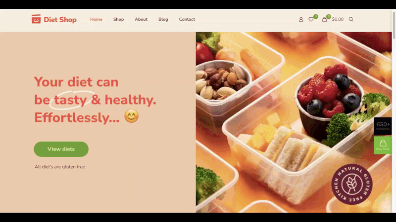
Special effects tend to be most effective when used sparingly, and the same is true when motion is applied to key pieces of content as is done in this BeDietShop page:
BeEvent7 uses the motion of the ticking of a clock. This use of motion invariably captures a visitor’s attention for a few moments, which is often enough.
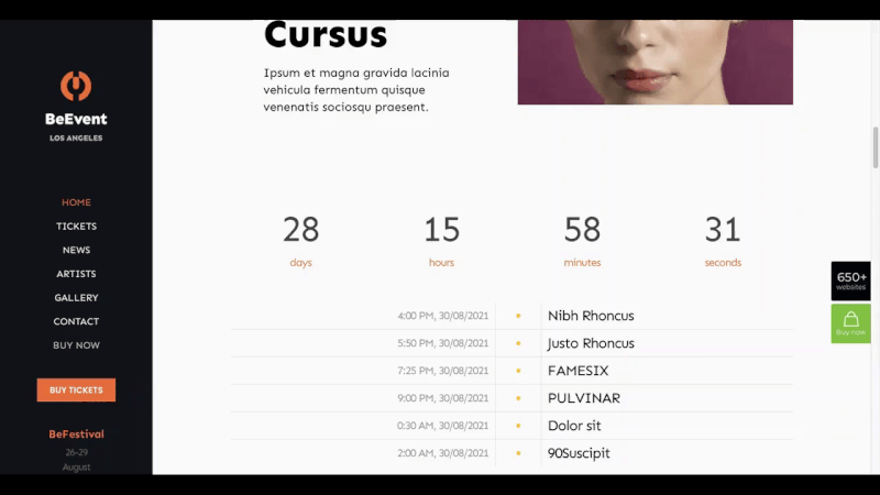
Businesses track sales and charities track donations using this technique. The effect is especially attention-getting when a goal or objective is on the verge of being satisfied.
3. Line art backgrounds can be useful guides
Every few years there seems to be a “latest” trend in the way website backgrounds are used to attract attention. Most recently, the focus has been on using dramatic gradients, with the use of dark color schemes and background video sliders prior to that.
In 2022, we will be going with something that, while less dramatic, will be just as engaging. That “something” is the use of line art which when cleverly used doesn’t only attract but can guide or direct as well.
We don’t have to rely of the use of arrowheads or pointing fingers either. Line art that is much more abstract will get the job done, but in a more subtle and pleasant way.
The BeCoworking pre-built site offers a simple example:
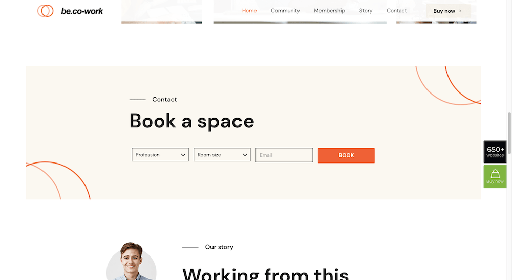
Note how the circles in the two corners attract attention, and by curving inward they draw that attention toward the booking form.
BeAgency6 also uses line art backgrounds effectively:
Although it first appears to be purely decorative, the unformulated artwork is quite effective in guiding a visitor’s eyes through the content.
When you consider how many ways there are for people’s eyes to scan across a page, using subtle lines like these to help keep them focused on the right parts can do impressive things when it comes to website engagement.
4. Interactive graphics provide more context for users
Design trends may come and go, but the basic goals of website design remain the same, and that is to attract as many visitors as possible, engage them, and get them to take a desired action.
Engaging them is often the hard part.
One web design approach is to make use of interactive design elements. Take a button for example and make it “look clickable” instead of simply looking like another 2-D object; or take a key image or icon and transform or animate it in some way when a visitor hovers over it.
Setting something in motion is one thing. There are times however when you may want motion to cease. You’re trying to attract and engage visitors and get them moving from one place to the next, without sending them on a joyride.
Interactive design is also a great way to pique a visitor’s interest in learning more about something.
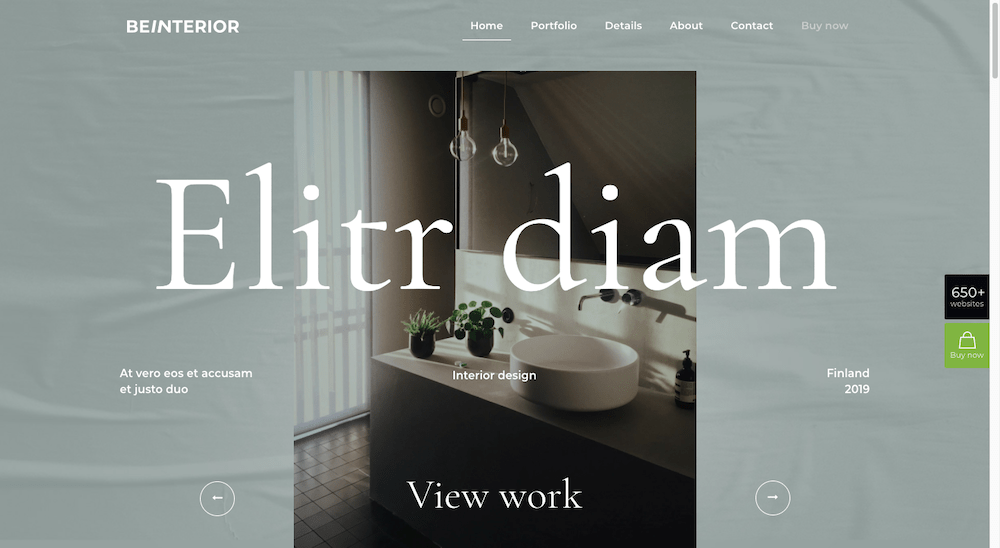
One example of interactive graphics would be to convert scrollable content into a slideshow experience. BeInterior6 does precisely that at the top of its home page:
Scrolling has become so standardized that controls are sometimes called for to get visitors to stop long enough to engage with important content. An auto-rotate setting would be one solution. Or you might consider creating a unique feature like this Before/After image on BeDentist4’s pre-built website:
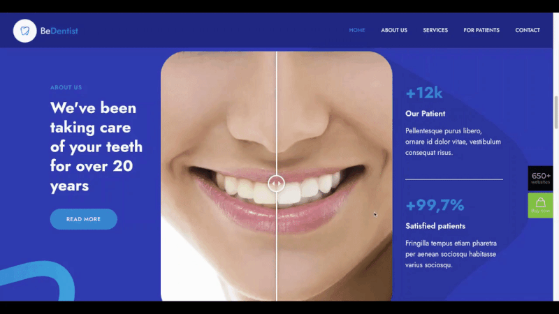
The designer could have elected to place before and after images side by side, but this method gets the visitor interested in what turns out to be a more entertaining way to demonstrate the results.
5. Use positive color palettes to send the right vibes to visitors
It used to be that designers often became preoccupied with finding just the right color or colors to elicit a certain emotion, including finding colors that would encourage a visitor to take a desired action.
We are quite aware that colors can influence our emotions, but why or how they do more often than not remains a mystery.
Is there a color, or something about it, that can be used to elicit a positive response?
Color theory tells us that various factors could be in play in such a case, such as the shade, the context in which the color appears, the culture of the observer, or how one color contrasts with others.
As one example, we sometime tend to equate a splash of yellow with sunshine or happiness but placing splashes of yellow throughout a website won’t necessarily make a visitor happier. Too much of it could have an opposite effect.
You need to take into account the circumstances surrounding the site you’re creating together with the nature of its intended audience. Do you want to scare people into taking action or make them feel safer and more confident in their deliberations?
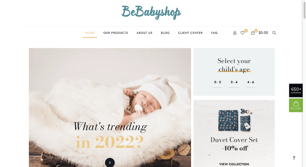
The BeBabyShop pre-build website focuses on a variety of soft tone backgrounds surrounding the products to create a gentler experience:
The BePizza5 site uses a slightly neutral color palette that transitions from a dusty green to a dusty pink in conjunction with a selection of beige tones to convey a cozy and relaxed atmosphere.
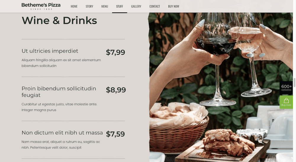
This is not an example of what most restaurants use in their website designs. All too often the focus is entirely on the food, and the color palette tends to be rather bold or excitable, and little or no attention is given to the ambience.
Keep up with the times with a little help from BeTheme
Taking designers out of their comfort zones can create a stressful if not a traumatic situation. We cling to our favorites or those practices that are most familiar to us.
Getting used to something new isn’t always easy.
BeTheme’s pre-built websites make the transition into a new world of design trends easy as they are always crafted with the latest and greatest trends in mind. Since older pre-built sites are readily customizable, they can easily be repurposed to take advantage of 2022’s web design trends.
BeTheme offers a complete WordPress web design solution with its 3 different builders and 650+ professional-grade pre-built sites. You can use this cost effective solution to build a completely customized site for every client or need— and quickly.
About the Author

Kate Dagli
Kate is a passionate web designer who loved WordPress from the minute she laid her eyes on its code. Writing about WordPress themes, plugins, and web design trends is her dream come true.