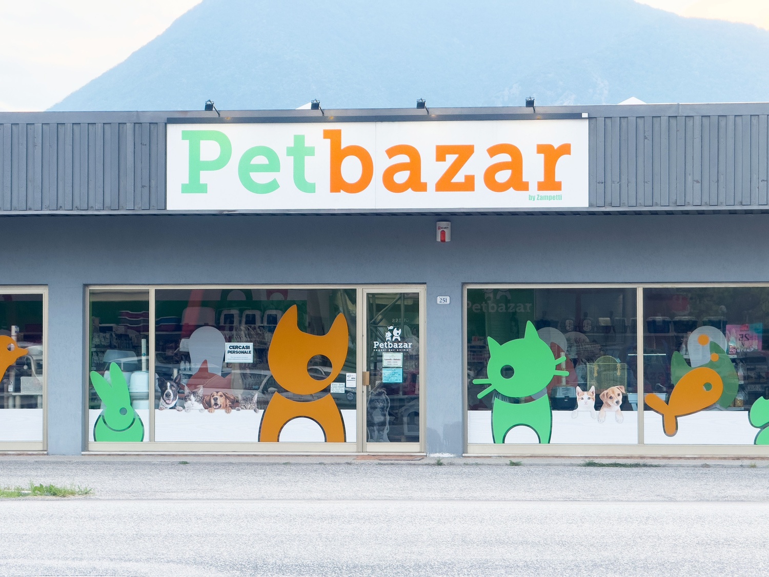
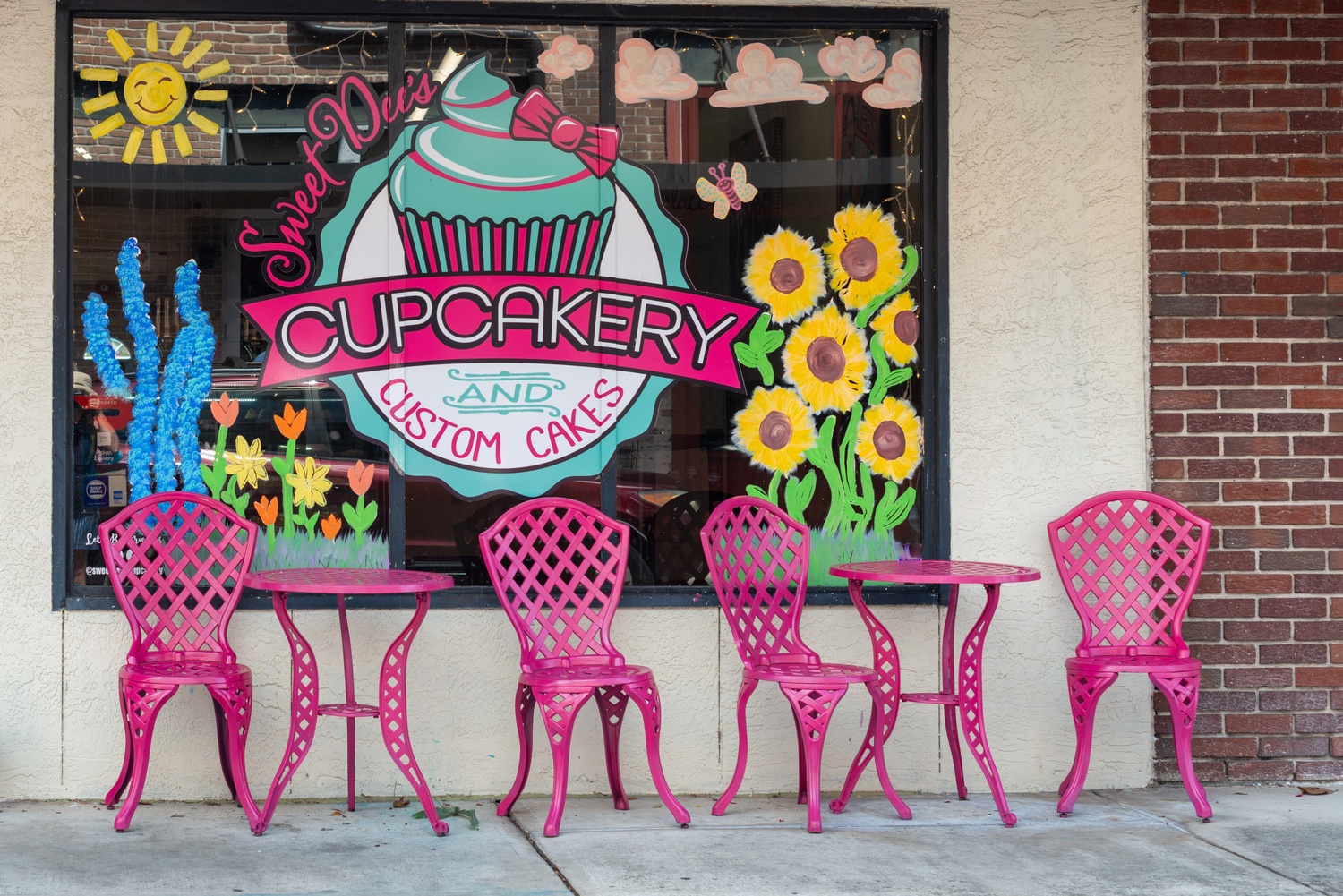
Window graphics work like a silent message on the front of a business. People walking past decide in a few seconds if they care enough to look in, so the design on the glass has a lot of work to do in very little time. Poor layout, messy visuals, or hard-to-read text can make even a strong offer fade into the background.
Storefronts, offices, and service locations use glass for more than light. That surface can support branding, privacy, and clear information. Anyone involved in building a brand in a retail space, office, or studio can benefit from a simple set of practical habits.
1. Start With Purpose And Priority
Every window project works better when there is one main goal. Some want to drive foot traffic for a promotion. Others focus on privacy for staff. Some only need basic information such as hours of operation and what type of services sit inside.
Clear priorities guide layout decisions. If the main goal is to attract new customers from the sidewalk, the primary message should sit at eye level with strong typography. When the priority is wayfinding, place more attention on directional arrows, door labels, and practical details such as contact information.
Think about viewing distance as well. Drivers passing at speed do not have time to decode long phrases. Short messages, large fonts, and simple shapes work better for them. People on foot can handle smaller details such as product categories, service lists, or short taglines.
2. Keep Layout Clean So Messages Read Fast
Busy windows tire the eye. A crowded design can hide important details, even if the artwork looks impressive in a mockup. Printed window graphics perform best when there is enough empty space around main elements, so the viewer can separate one idea from another.
Start with a basic hierarchy. One main message at the top level, supporting text underneath, then secondary elements such as icons or smaller descriptive lines. Large shapes or images anchor the composition and guide the eye. Avoid stacking many different fonts or colors; two typefaces and a modest color palette usually feel calmer and more focused.
Design options often tempt teams to keep adding more. Careful editing helps more than any other effect or layer. Favor strong alignment, clear margins, and consistent spacing. High-resolution artwork matters here because fuzzy edges or pixelated images draw attention away from the message. Supplying print ready files to your printer, with the correct scale and bleed, prevents last-minute resizing that ruins proportions.
3. Match Materials To Function And Visibility
Glass is not a single type of surface in practice. Some locations sit in direct sunlight all day. Others face interior hallways under artificial light. Material choice affects how the graphic reads in each case.
Window films give you a wide range of privacy and light control options. Frosted finishes soften harsh light and hide clutter behind the glass. Clear or transparent films keep sightlines open while still carrying subtle patterns, logos, or text. Perforated films use tiny holes to allow people inside to see out while presenting a more solid image from the outside.
4. Plan For Durability And Daily Use
Window graphics live in real conditions, not just design software. Doors open and close hundreds of times a day. People lean against glass or brush bags along the surface. Sun, rain, and temperature changes all add their own pressure.
Scratch resistance matters in busy environments, especially near door handles or push bars. High traffic areas near entrances benefit from stronger laminates or thicker materials. Exterior wraps on large glass areas need films and inks rated for UV exposure and weather, while interior panels can use lighter specifications.
Permanent adhesives suit long-term brand elements that will stay in place for years, such as core logos or regulatory markings. Short-term campaigns or seasonal messages work better with removable adhesives that leave less residue when removed. Exterior signs near the same entrance should share a similar visual language, so people do not need to decode two different design systems at once.
5. Size, Spacing, And Legibility
Legibility makes or breaks a window project. The most creative concept falls flat if people cannot read it quickly. Letter height, line spacing, and viewing distance all connect.
Size adjustment can solve many problems before they appear. Large type for key phrases, shorter text blocks for details, and plenty of line spacing keep letters from merging into each other at a distance. Clean sans-serif fonts often read better through glass than ornate scripts, especially in busy street environments.
Vinyl window lettering works well for concise, high-impact messages such as store names, taglines, or directional notes. Place these elements at consistent heights across multiple windows whenever possible, so the whole frontage feels organized instead of scattered.
6. Think About Impact Over Time
Clean glass makes a major difference. Dust, fingerprints, and residue can dull colors and reduce contrast, especially on lighter designs. Maintenance schedules help staff know when to wipe down panels or call in a cleaning service.
Many teams treat window graphics as long-lasting advertising tools that support promotions, brand awareness, and clarity for newcomers. Stunning displays do not always require complex art. Exterior campaigns can also sync with interior materials, such as point of sale signs or digital screens, so visitors see a consistent story from street to checkout.
Conclusion
Window graphics mix design, materials, and practical information on a surface that many people see every day. Clear goals, thoughtful layout, good material choices, and solid production habits keep the final result readable and durable.
Businesses that treat glass as part of their communication system, alongside exterior wraps, interior decor, and other print pieces, usually get more value from every square foot. Smart use of printed glass can support building a brand presence, guide visitors, and keep information like hours, services, and contact details in plain view where they are actually needed.
About the Author

Mirko Humbert
Mirko Humbert is the editor-in-chief and main author of Designer Daily and Typography Daily. He is also a graphic designer and the founder of WP Expert.