Your website is a valuable marketing asset. It allows you to raise brand awareness and capture more leads.
But is your website doing enough to convert visitors into customers? And is it giving you a competitive advantage? Because if it isn’t, you’re losing sales to your competitors.
Persuasive design is the key to making a great first impression on your visitors and getting them to take action. Here we’ll take an in-depth look at persuasive design techniques that you can implement to push your marketing strategy forward.
Why Design is Important
You’ve likely heard the adage “Don’t judge a book by its cover” before — the idea that you shouldn’t judge something based on how it looks. Even though a book may have an atrocious cover, it could very well tell a compelling story that tugs at your heartstrings.
This adage sounds great on paper, but it just doesn’t apply to websites. Users form an opinion about a website in just 50 milliseconds.
That means you only have a fraction of a second to make a positive first impression on your visitors. Otherwise, users will bounce if you don’t pass this harsh test.
Just to illustrate, have a look at the following example:
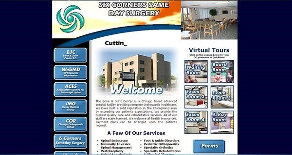
What’s your first reaction? There’s a good chance you’ll likely click the back button. The reason is simply because the design doesn’t convey trustworthiness. It also looks like it was designed in Microsoft Paint.
A well-designed site isn’t just important to making a positive first impression. It also has a direct impact on conversion rates. If your site is poorly designed (like the one above), it leaves a negative impression of your business. That in turn can lead to fewer sales for your business.
More people are going online to inform their purchasing decisions than ever. 49% of shoppers use Google to discover new brands or products.
That means your website is often the first point of contact that a prospect has with your business. Fail to make a positive impression and you’ll likely lose that person forever.
A persuasive design can go a long way towards building trust with your visitors and increasing conversion rates.
Now let’s look at persuasive design techniques you can implement.
1. Create a Visual Hierarchy
When visitors visit your site, they have a clear purpose in mind whether it’s to shop for a new product or browse the latest headlines.
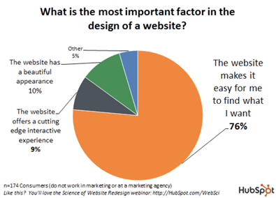
76% of users say the most important factor in the design of a site is it makes it easy for them to find what they want.
In other words, when a visitor comes to your site, they want answers and they want to find them right away. If a visitor can’t find what they’re looking for, they’ll likely bounce and click through to another competing site instead.
Visual hierarchy is one of the most important aspects of web design. It involves arranging elements on a page in a clear and logical manner. This makes it easy for your visitors to navigate your site and take a designed action (e.g., Subscribe to your list).
If users have a hard time figuring out how to navigate a page, it lacks a clear visual hierarchy. In contrast, organized layouts provide a more seamless browsing experience.
Avoid clutter and use plenty of white space to draw attention to key elements. Pay attention to sizing as users tend to notice larger elements like headlines more easily.
This page for a Linkedin email finder tool offers a good example of a clear visual hierarchy:
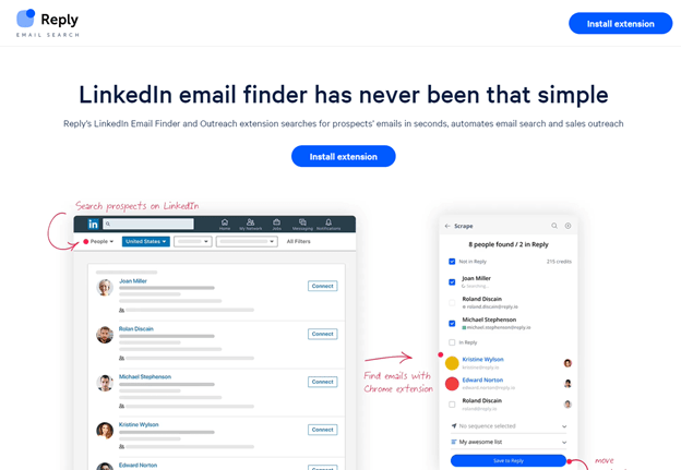
There’s plenty of white space here and the desired action is clearly highlighted through the CTA button. The headline is also placed at the top and in a larger size, making it the first thing that visitors see.
Besides landing pages, you also have to consider design for other pages like your blog posts. Take this example from HustlerEthos:
Notice how they used H2s and H3s to guide your way through the article. Furthermore, they also included clickable buttons and images in each section to catch your attention and successfully turn it into a desired action. In this case, it would be clicking those links.
Understand what your users are trying to accomplish and structure your website pages accordingly to create a more seamless experience.
2. Leverage Social Proof
Social proof is an incredibly persuasive design element. It’s a psychological phenomenon where people change their behavior based on what others are doing.
For example, let’s say that you’re deciding between two businesses. If one has more positive reviews than the other, you’ll likely choose the one others have rated more positively.
Likewise, a business that has received mostly negative reviews will likely make you reconsider your decision.
Incorporate social proof in your web design by featuring testimonials or reviews from your customers. This boosts your business’ credibility, which can drive more conversions.
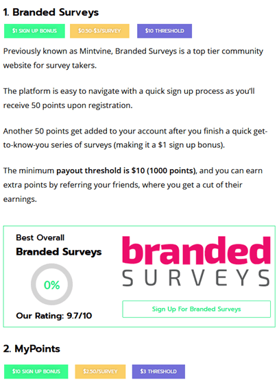
For example, on every product page, Runners Athletics, an online store that sells running sunglasses, adds customer reviews with pictures incorporated.
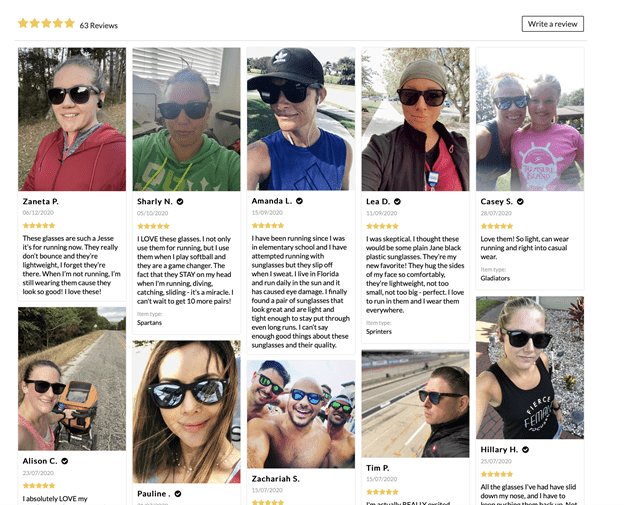
Isn’t it a good way to encourage others to buy their sunglasses? The fact that these reviews come from actual customers makes them far more credible and compelling.
Take a similar approach with your own site. Encourage your customers to leave reviews for your products or services. Be sure to prominently feature those reviews on your product pages to persuade visitors to make a purchase.
Furthermore, you can have an entire page of your website dedicated to customer reviews and case studies. This section by Frevvo highlights how various institutions found their workflow automation software useful with links to in-depth case studies.
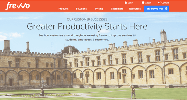
This allows potential customers to see how companies similar to theirs have used the software to automate their workflows.
3. Add a Clear Call to Action
A call to action or CTA is a prompt on your page that directs visitors to take certain actions. Examples include filling out a lead form, signing up for a free trial, or making a purchase.
Your CTA should be distinct from other elements on your page and should be placed above the fold for better visibility. You should also optimize your CTA copy based on what action you want visitors to take.
Here’s an example of a CTA that Guardian Home, a Toronto home care services company, places on its home page:
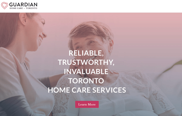
The CTA here is simple, clear, and precise. The button also draws visitors’ attention because of its distinct color.
Add clear CTAs to your landing and product pages. A well-designed CTA can persuade more visitors to act and increase your conversion rates. But be sure to test your CTAs as changing the color, copy, position, and even size can affect conversion rates.
4. Create a Sense of Urgency
Have you ever purchased a product to take advantage of a limited time offer? That’s an example of urgency that many businesses incorporate in their marketing to nudge visitors to make a purchase.
Creating a sense of urgency on your own pages can convert more of your visitors. There are a number of ways you urge visitors to take action.
Here are some examples:
- “Only a few hours left to claim your spot”
- “Don’t miss out on this limited time offer”
- “Buy now and save 25% on your next order”
For example, Orizaba, a clothing brand that sells Baja hoodies and Mexican blankets, is currently offering a discount to new subscribers, but only for a limited time.
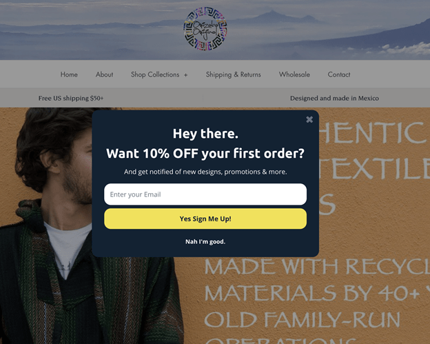
See the familiarity in the wording? In the example above, new customers can get 10% off their first order and Orizaba can build their customer base.
By creating a sense of urgency on your product pages, you can not only increase conversions, but also connect with more of your audience. If you have a time-sensitive offer, make sure to actually stick to it.
5. Touch on Emotional Points
It may seem that consumers are rational about their purchases. They think them through and carefully consider their options before proceeding. But extensive research shows that most purchasing decisions are largely based on emotions.
Just listing off different features likely won’t get you the results you want. If you want to connect with your audience, then you need to touch on emotional points. That means turning features into tangible benefits that visitors can visualize.
Start by identifying pain points. What is your audience currently struggling with? What problems are they trying to solve? Highlight those pain points in your design and really press on them to get the point across.
Here, EarlyBird plays on the love families have for children and their desire to secure their financial future:
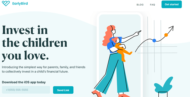
With its headline, EarlyBird emotionally connects to people who want to invest in their child’s future — something that new parents deeply care about.
6. Leverage the Use of Photos
Blocks of text on a webpage can be overwhelming for online users.
One way to improve readability and increase engagement is to use relevant images. You can take it even further and make your design more persuasive by using photos of people.
In one case of an online art shop, using human photos on the website increased conversions by 17.2%. More people purchased from artists who used actual photos of themselves because they could see who was behind them.
The urge to emotionally connect with others is strong. Adding pictures of people makes those connections much easier.
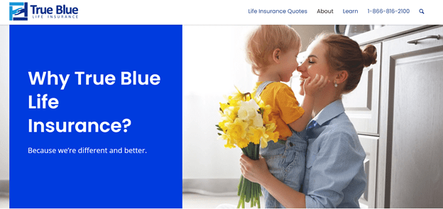
The example below from True Blue Life Insurance shows a photo of a mother holding her child, evoking an emotional reaction from visitors.
Note that you don’t always need to include photos of people on your website. But you should at least include photos that are relevant to your offer or the topic at hand.
For example, this page on the best nursing programs includes images for each school:
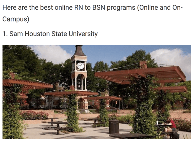
Visitors to the page can get a sense of what each school looks like and get information each, which will make them make an informed decision. Sourcing images for your content takes more effort, but it’s well worth it.
In general, you want to avoid using stock images. Eye tracking studies have shown that people tend to ignore these types of photos.
The reason is because stock images tend to be for decorative purposes — they don’t provide any real value. As a result, most people don’t pay much attention to them and are likely to become annoyed.
7. Limit the Number of Choices
Research from Google has found that users prefer simple designs. An overly cluttered design presents too many choices and is more likely to overwhelm users.
Just take a look at this homepage below:
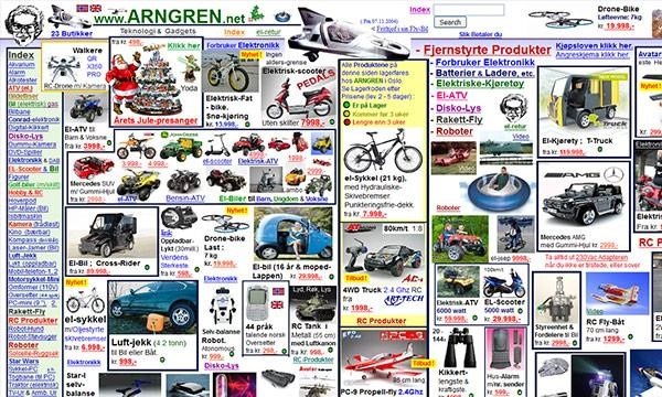
The design is incredibly overwhelming.
There’s so much going on here that it’s difficult for users to know what to focus their attention on. Instead of navigating through the page, most users will simply bounce out and click through to another result.
To make your designs more effective, always focus on one clear action that you want visitors to take. Here’s an example of this in action from Excel Builders’ homepage:
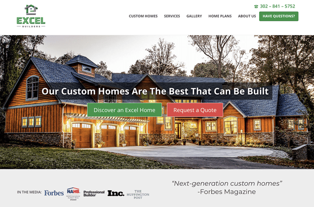
Visitors on this page can learn more about having a custom home built or directly request a quote for information by clicking one of the CTA buttons.
By limiting the number of choices on a page, you simplify the decision making process and make it easier for your visitors to find exactly what they’re looking for.
Conclusion
The design of your website has a strong impact on whether visitors will stay long enough to learn about your offer. A poorly designed website will only leave your visitors with a negative impression of your business.
If your conversion rates are abysmal, implement the persuasive design techniques as described here. These include using social proof to boost your credibility, adding clear calls to action to get your visitors to take action, and touching on emotional points to connect with your audience.
Other strategies include using images that are relevant to your products or services and limiting the number of choices on a page. By making these changes, you’ll be able to form a lasting impression with your audience and drive even more conversions.
Be sure to keep a close eye on your analytics data. That way you can measure the impact of any changes you make to your website.
About the Author

Joanne Camarce
Joanne Camarce is a digital marketing expert specializing in SEO, eCommerce, and social media. She loves meeting new people and embraces unique challenges. When she's not wearing her marketing hat, you'll find Joanne fine-tuning her art and music skills.