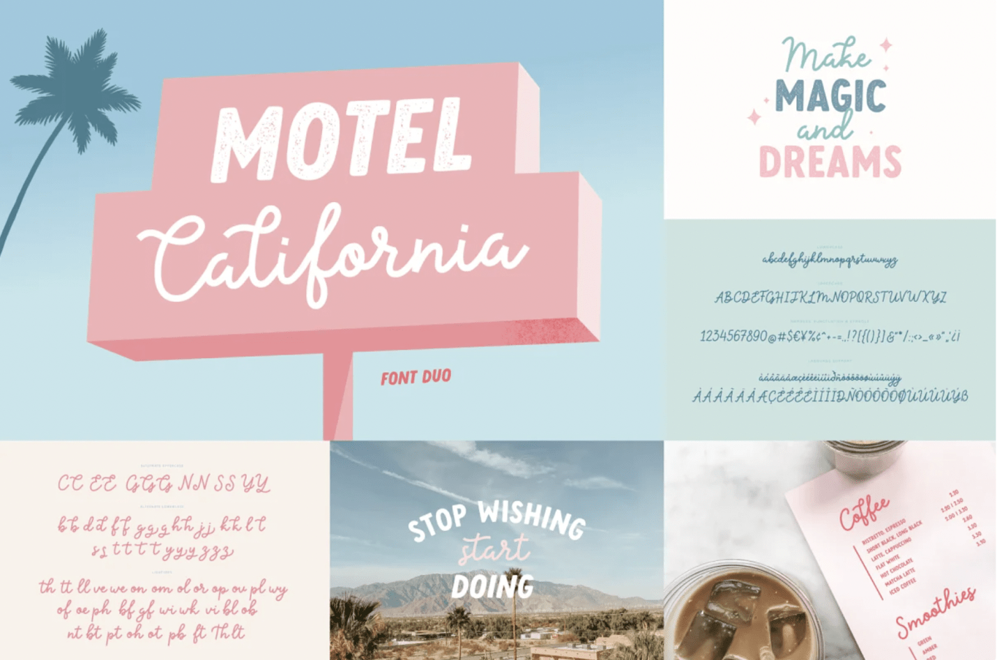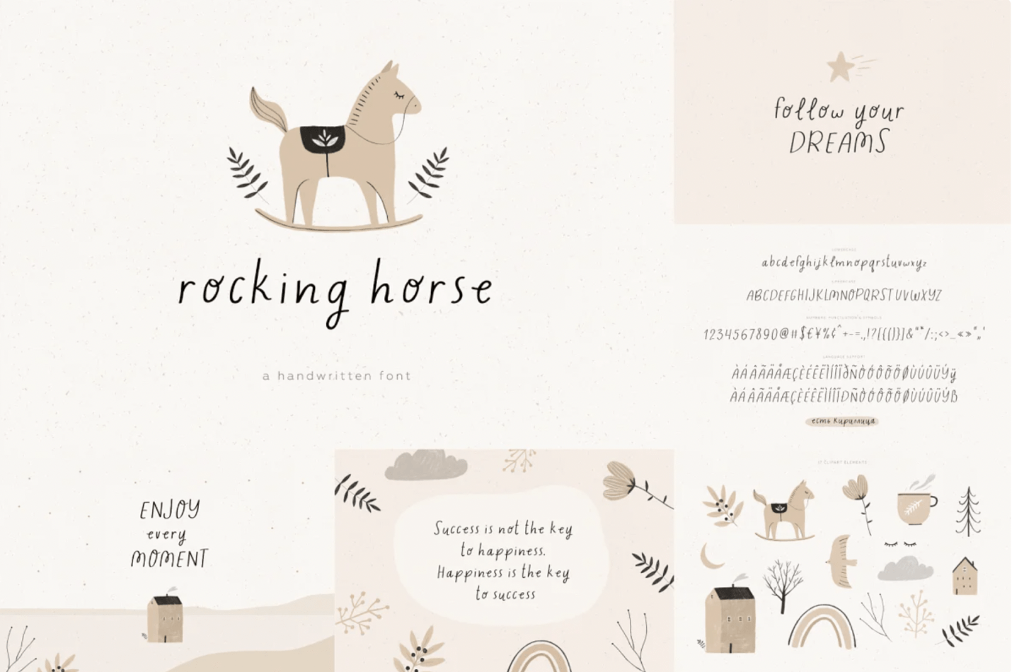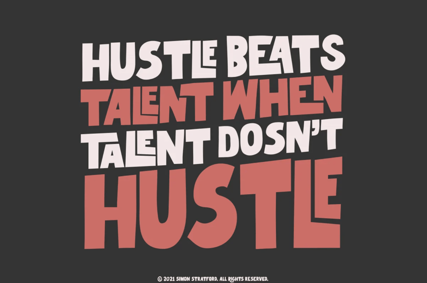
Typeface, font, call it what you want — it’s a small thing in the grand scheme of a campaign, but if it’s done wrong, your ads might not get their message across. They could end up being laughable or downright confusing. To help you out when choosing fonts for your next print piece or web ad, here are eight simple ways to avoid making this mistake:
1. Know the Difference Between Serif and Sans Serif Fonts
Serifs are tiny projections on some letters; think of them as feet that make each letter stand apart from the other (see “A” below). Serif fonts often indicate stability and tradition, whereas sans serif fonts give a modern, urban look.
2. Match Fonts Aesthetic to Your Message
You don’t want your font to overpower your message — you just want it to enhance it! Make sure that if you’re using serif fonts, they’re easy on the eyes (like Times New Roman). However, if you use too many different font style or if they’re hard on the eyes (maybe one’s light and another’s dark), then all bets are off; people will be too busy trying to figure out what they’re reading to take in your content.
3. Keep Your Font Style Consistent Throughout the Piece

If readers laugh because they think it looks funny but can’t put their finger on what’s wrong, then you’ve lost them… and maybe even some prospective clients! This is especially true if you’re doing a print piece and you have lots of copy. Three’s not too many when it comes to typography, so choose two that work well together (Arial + Times New Roman) instead of one at each end of the spectrum (Tahoma + Comic Sans). Also, make sure your headlines are larger than your body copy, so they pop off the page.
4. Don’t Mix Up Different Languages in One Document
If you’re creating a document with different languages, such as English and Chinese, be careful about using both horizontally and vertically set types. While you can certainly add some flair by doing so (see the logo below), it’s unprofessional to do so when mixing up languages — especially if your piece is for commercial purposes.
5. Don’t Mix Up Different Typography Styles Within One Language
This mistake is similar to #4: Mixing up font aesthetics within one language can be just as unappealing and confusing for readers because each typeface has its own personality and mood. Look at “BuzzFeed,” which uses an easy-to-read font (Helvetica) throughout; even though they run lots of articles, their website still looks clean and professional.
6. Don’t Use Fonts That Are Hard to Read
I know we’ve probably said it about a thousand times at this point, but the key is to keep your readers in mind when choosing typefaces: If they can’t make out the fancy font on the page or if they think it looks unprofessional, you won’t get your message across. For instance, Comic Sans isn’t appropriate for much other than cartoons; even though it’s beloved by many of our clients, it has its place. A good font choice would be one of our favorites: Helvetica! It’s simple, easy-to-read, and clear… plus there are tons of weights, so your message will stand out no matter how many words you need.
7. Don’t Forget About the Effects You Can Add

Take pictures of your free fonts or handwritten fonts and use them as a brush script, or for a more modern look, try Aline type (similar to Futura). If you’re feeling adventurous, combine two of your favorite typefaces, such as Arial and Abadi MT Condensed (see below), and place one on top of another: They’ll work together to make an even larger image. And if all else fails, there’s always Google Fonts — they have over 800 free typefaces that are super easy to use! Just make sure you follow these simple rules when choosing your next font to avoid mishaps.
8. Don’t Use Typefaces That Are Too Small
If people can’t read it, they won’t. Be sure to use a minimum of 14 pt and opt for an even larger type if you’re creating a blog, website, or social media page — people tend to scroll quickly through digital pages, so you want your message to stand out!
Bottomline
A font can make or break your ad. The wrong font will make your readers stop reading, and the right fonts will keep them hooked on every word. With so many different fonts out there, it can be hard to know which one is best for you. That’s why Creative Market is here to help! They understand the importance of choosing fonts that are not only visually appealing but also easy to read. So next time you’re creating your ad, choose wisely and with our advice in mind.

