Branding goes beyond the logo. It also transcends the product or service and creates an emotional resonance with the public. Typography assists with creating a brand.
As we move into a digital world, new products or brands are being given the opportunity to shine.
If you’re looking at building a brand which stands out amongst the competition, focus on the role typography plays in creating a deep emotional resonance with your audience.
Designers today work with digital and web technology. This includes video, illustration and social media. However, text-based website content plays an important role in building a relationship with an audience.
Once a video has been played, the audience will interact with the text of a website. In fact, there is probably more text on a website than anything else. As a designer, you can ensure this makes an impact.
Typeface helps to identify a brand
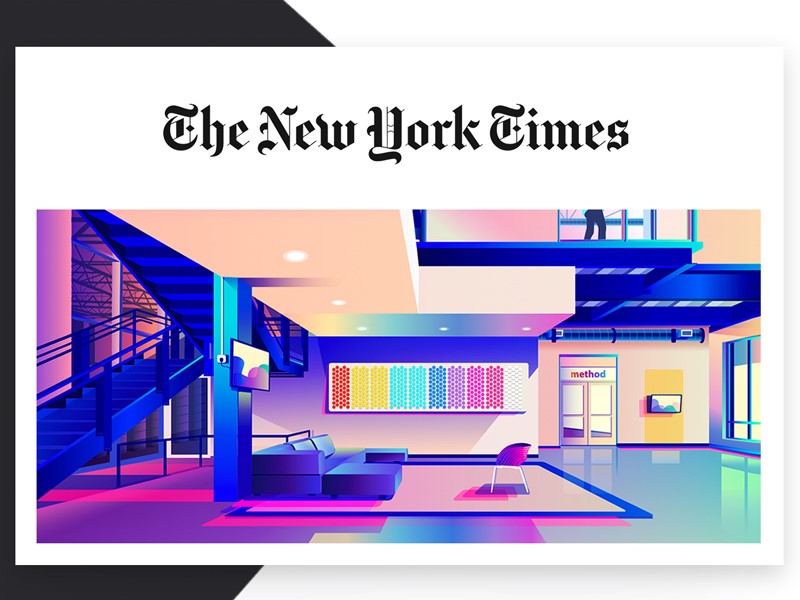
There are many free fonts available online, but if you’re looking at identifying your brand, paid fonts or unique font designs have their place. Companies such as The New York Times and Coca-Cola are immediately recognizable by the fonts they use.
Using a single identifiable font gives your page a clean feel. As a page is not simply made up of headers or titles, you can use other fonts as well. Limiting your number while creating a neat feel to your page helps to create an identifiable brand which is familiar to readers.
Classic brands have used digital imagery to create an online presence. This means that their brands remain easy to identify both online and off. The quality of the design creates a positive experience for online viewers.
What do fonts add to a brand?
Fonts are expressive and give words a visual representation or language. They are also durable because they help to create an identity for a brand that will remain in the minds of the public.
Brands such as Coca-Cola, American Eagle, Apple, Vogue, Disney and Calvin Klein all use distinctive fonts that help to identify their products and communicate their message. It is no wonder companies pay such large quantities of money to have a logo designed.
Through using typography, brands communicate a message. Think of Disney’s typeface logo, which communicates fun, imagination, vibrancy and nostalgia. However, branding goes beyond the typeface used for a logo.
Aligning you’re the typeface on a website with a company’s message helps to add another layer to the brand.
Which typeface should you use?
There are a great number of different typeface fonts in the world. Some are wonderful, some terrible, and opinion is sometimes personal. However, there are some basic design principles to take into account when choosing a font.
Body fonts
When selecting your body font choose lettering which is simple and easy to read. Some fonts come with serifs or finishing strokes (serifs) between letters, such as Times New Roman. Others are without these strokes and are sans serifs.
In the printing industry, serifs are often used for text. Online, however, the copy is often sans serif, and fonts like Helvetica are popular choices.
Fonts for headings
When selecting headings, fonts can be dramatic or full of flourish. It should also be bold enough to command attention. Display fonts break up your page, add contrast and direct the user’s attention. You can use fonts which are eccentric, elegant, beautiful or full of flourish.
The font does have to be easy to read, however. This is because headings often give a site user quick insight into the contents of a page. If the font is difficult to read, it will lose its design purpose.
When working with a font, it is often helpful to limit your choice to two options, but vary the weight and height in order to create emphasis or hierarchy within the text. This will help to create a sense of consistency as well as keep your page uncluttered.
When selecting a typeface, take the following into consideration:
Legibility: Does your typeface feel familiar to your readers? Are the letters easily distinguished? Look at the spacing between the typeface. Does it flow, so that readers can follow easily?
Readability: Is it easy to make sense of the text? Each letter should disappear into the background as the reader recognizes the overall shape of the words. This makes the text enjoyable for the reader.
Suitability: Look for a font which is suitable for the product or brand. Apple, for example, uses a slick, clean-lined and modern typeface as a part of its brand. Remember to pick a typeface which fits the purpose of your design as well.
Free versus paid for typeface
Many people use the term typeface and font interchangeably. However, from a technical perspective, typeface refers to the name of the lettering (such as Helvetica or Arial) whereas font refers to the variation within the lettering, such as Bold or Light.
A typeface which is freely available online often comes in only one font. This means it doesn’t come with a variety of weights and styles. This might limit your options as a designer.
Many free fonts are also untested, which means that they do not always look the same across web browsers. This can limit your ability to design your page according to the message you would like to portray.
Quality fonts which have been tested and which are helpful to the design industry are not normally free. There is a range of typefaces which are fairly inexpensive (between $35 and $75) which will give you a range of options and weights in order to create a cohesive and well-designed site.
There are, however, some designers who charge a great deal for their lettering. Determine your client’s budget in order to establish how much you have to spend on a typeface.
Services such as Adobe Typekit are helpful to access fonts across the web. Typekit obtains fonts from different artists, testing them across different browsers to ensure uniformity and quality. Users can obtain typeface from Typekit.
Creative Cloud is a desktop application which enables you to sync fonts available from Typekit onto your computer.
If you’d like to build up a library of font purchases on your own computer, you can use sites such as fonts.com or myfonts.com.
These fonts can be purchased by you for a set fee. If you do choose to purchase your fonts, ensure that everybody who will need access to them will have a license to do so if you’re working in a team. Otherwise, this might exclude certain members of your team from working on a project.
Digitalization adds new options to design
In the past, printing relied on letter setting. When a book or pamphlet was about to go to press, blocks of letters were arranged in a printing press. Lettering options were limited. It was also harder to make changes because this would mean rearranging all of the letters in the typeset.
These days, it is much easier to make changes to a page as you go along. This means making copy easier to read. You can add or subtract headlines and break up the text. You can also try out a number of different lettering styles until you are happy with your design.
How does your font speak to your audience?
Each typeface has its own personality. Some fonts are clean-lined, sleek and modern. Others speak of elegance and heritage. They bring a sense of trustworthiness and reliability.
The personality of your typeface should combine with the message behind a brand in order to send out the correct message. This is particularly true with a logo.
Your design should send out a message or first impression to a potential client or customer. This message will be clear before the client purchases a product.
What meaning will the audience take from it?
A typeface will have to mean to your reader. If a font is familiar, it will often feel as trustworthy as an old friend. This doesn’t mean you have to limit your choices. Instead, consider carefully what your brand is portraying.
Fonts are often related to products we’ve seen in the past and will remind viewers of a range of products, from pickles to candy. Some fonts are associated with ceremony while others with technology or creativity.
When it comes to font, consider the size, weight and height of your typeface as well. This will enable your font to whisper, shout or make a simple, bold statement.
As a designer, you have the ability to use type to create a statement. And to ensure you are putting across the right message.
Understand how your message is received
The choice you make in selecting your font will determine how your readers determine a brand or product. Are you contemporary, innovative, trustworthy or old fashioned?
![]()
How you present a brand will determine audience response.
Although some responses are subjective, it is often helpful to determine how an audience sees a design or product before making a final commitment.
Selecting the best choice for a brand often means determining how the audience interprets your design.
Researching or understanding public perceptions of a typeface will help you to establish the meanings you create for a product and the way that your brand speaks to the audience.
Your design should be invisible
If your design is doing its job, your audience shouldn’t notice your typeface. This is because the whole is more than the sum of its parts.
You want your audience to gain an overall impression of a brand which transcends both your design and the product.
This might be one of creativity, honesty, reliability, innovation or even intelligence. This is because it’s the emotional resonance with a brand which motivates a client to make a purchase.
An effective design assists clients to understand a product, organize information, easily digest what is being said and it attracts attention.
This enables the audience to build a story. In effect, a good design is like the backstage work in a theatre which ensures the audience is able to resonate with the production.
Summary
The story we absorb, or the end product we perceive (form) follows a process of careful and practical planning or creation. As designers, we want our work to be attractive.
However, it is the thought and creativity we put into it which will result in the emotional resonance with a brand or product. It is therefore crucial that this is well thought through. Without it, we simply create an attractive image.
Typography, when used with care, can turn a product into a brand which has a deep emotional resonance with its audience.
About the Author

Mirko Humbert
Mirko Humbert is the editor-in-chief and main author of Designer Daily and Typography Daily. He is also a graphic designer and the founder of WP Expert.