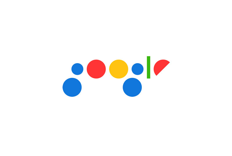
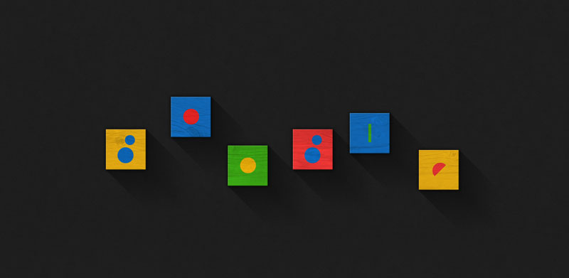
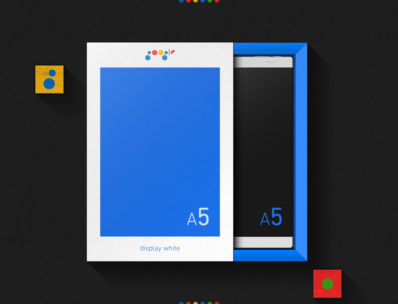
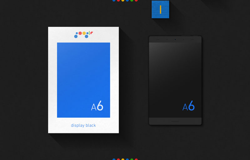
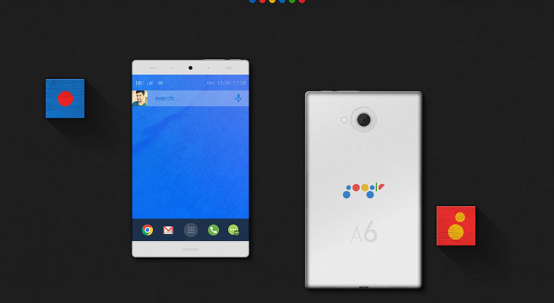
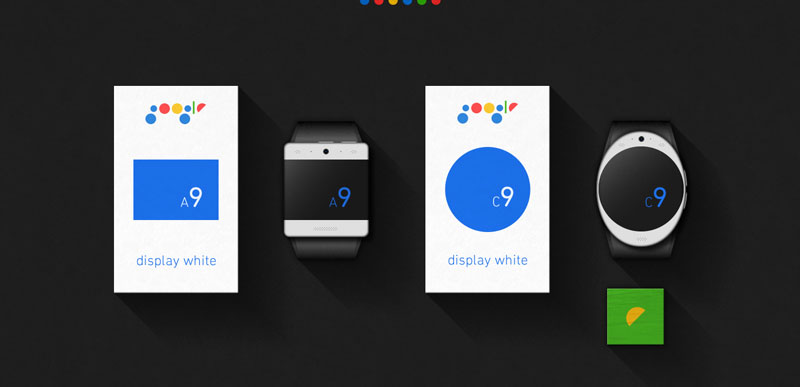
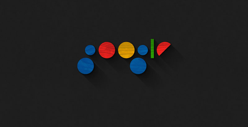
Graphic design Bruno Bua, from Portugal, had a lot of fun with the Google logo. He tried to imagine a minimalist re-branding using only geometric shapes and the Google colors.
This logo is not truly outstanding or practical, but it shows some interesting thinking on the shapes that form the identity, and some thoughts on the multi-platforms adaptations that are necessary for a modern logo design.
About the Author

Peter Makeshoff
Peter Makeshoff is the founder and main author of Designer Daily.