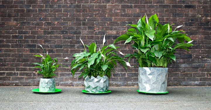
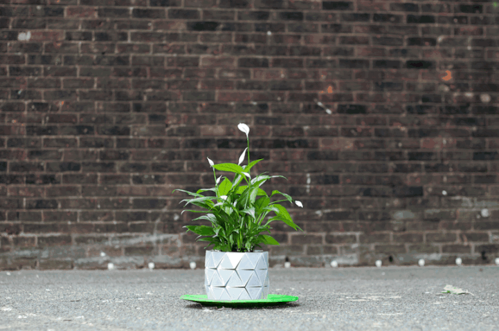
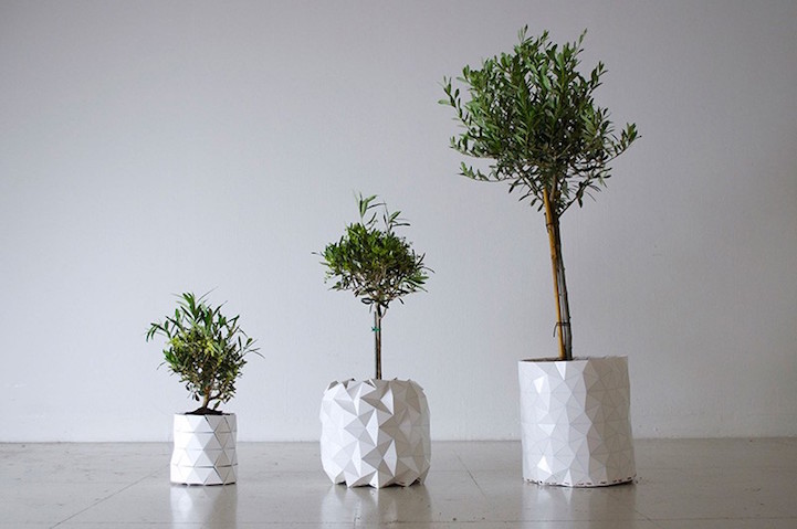
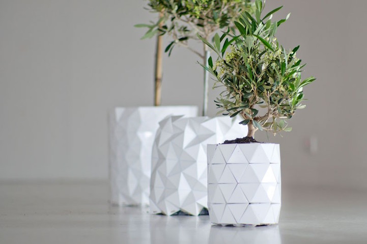
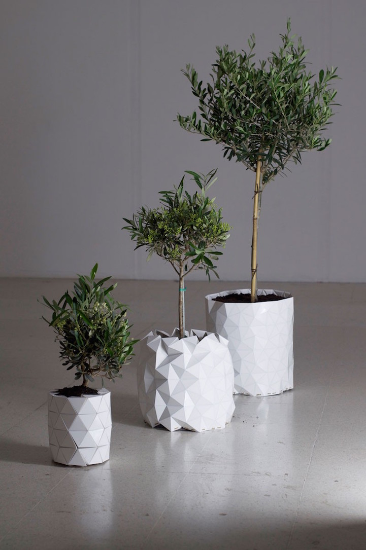
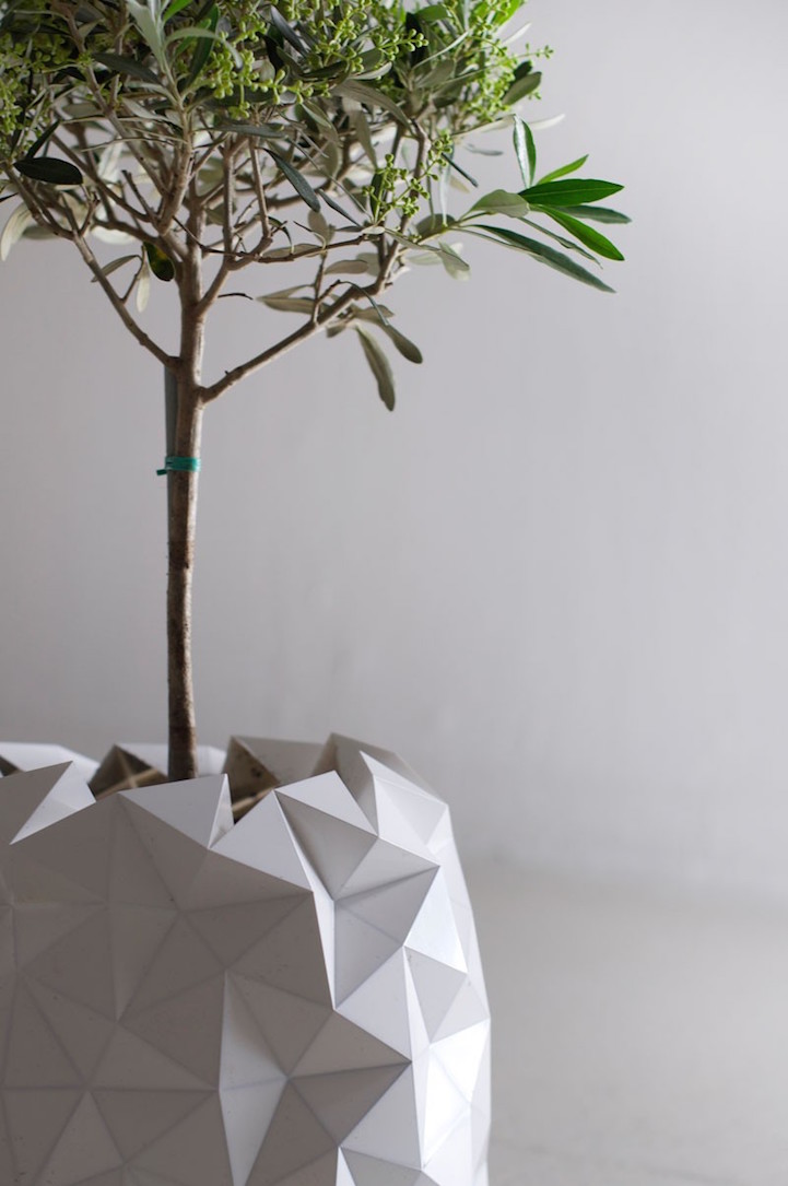
Responsive design is a term usually used for web design, to mention websites that are crafted in a way that makes the content adapt to the device or screen size. This planter imagined by Studio Ayaskan is more about the device adapting its size to the content, given that plants grow over time (if everything goes well). I’d argue that this could be called responsive design as well.
Studio Ayaskan’s pot, that goes by the suggestive name GROWTH, has a clever design based on origami patterns. Unlike most manufactured furniture and household items, it is designed to evolve with the plants it contains. The origami pattern was calculated to mimic natural growth and organically transform.
About the Author

Peter Makeshoff
Peter Makeshoff is the founder and main author of Designer Daily.