As web designers, we live at the intersection of aesthetics and function. We obsess over color palettes, perfect our typographic hierarchies, and engineer seamless user journeys. But in our pursuit of beautiful and engaging digital experiences, are we building doors that are locked to a significant portion of the population?
The answer, often, is yes. For too long, web accessibility has been treated as an afterthought, a “nice-to-have” feature, or a technical checklist for large corporations. The reality is that creating accessible, ADA-compliant websites has shifted from a ethical consideration to a fundamental pillar of professional web design. It’s not just about avoiding lawsuits; it’s about embracing our role as architects of an inclusive digital world.
The Rising Tide: More Than Just Legal Compliance
The Americans with Disabilities Act (ADA), a landmark civil rights law from 1990, has been successfully interpreted by courts to include digital spaces. While there isn’t a single federal “ADA website standard,” Web Content Accessibility Guidelines (WCAG) 2.1, Level AA have become the de facto benchmark for compliance.
The legal landscape is intensifying. Lawsuits over inaccessible websites are soaring year over year, targeting businesses of all sizes, from major retailers to local pizza shops. But beyond the legal risk, the business case is undeniable. Consider this:
- Market Size: Over one billion people globally live with some form of disability. That’s a massive audience with significant purchasing power.
- Improved SEO: Many accessibility best practices, like semantic HTML, proper heading structures, and descriptive alt text, are also prime SEO ranking factors. An accessible site is often a more discoverable site.
- Enhanced Usability for All: Accessibility features, such as clear navigation, captioned videos, and high color contrast, benefit everyone, including users on mobile devices, older adults, and people with temporary impairments like a broken arm.
An accessibility audit is the tool that bridges the gap between intention and implementation. It’s a systematic review of your website against a set of standards (like WCAG) to identify barriers that prevent people with disabilities from using your site effectively.
Deconstructing the Audit: Key Compliance Points Every Designer Must Master
An accessibility audit can seem daunting, but it breaks down into manageable principles. Here are the key areas where your design and development choices have the most significant impact.
1. Perceivable Information and User Interface
This principle ensures that users can perceive your content with at least one of their senses. It’s the cornerstone of accessibility.
- Text Alternatives (Alt Text): Every non-text element needs a text alternative. For images, this means descriptive, concise alt text. For designers, this means moving beyond
image01.jpgor generic descriptions. Ask: “What purpose does this image serve? What information does it convey?” A decorative image should have an empty alt attribute (alt=""), but an infographic needs a detailed description. - Time-Based Media: Provide captions for live and pre-recorded videos and audio descriptions for visual content in videos. Transcripts are also essential for audio-only content, like podcasts.
- Adaptable Content: Create content that can be presented in different ways without losing information. This is achieved through:
- Semantic HTML: Use HTML elements for their intended purpose.
<nav>for navigation,<button>for buttons,<h1>through<h6>for headings. This creates a logical structure that screen readers rely on. - Responsive Design: Ensure your site is usable and readable on any device or zoom level. Avoid horizontal scrolling.
- Semantic HTML: Use HTML elements for their intended purpose.
- Distinguishable Content: Make it easier for users to see and hear content.
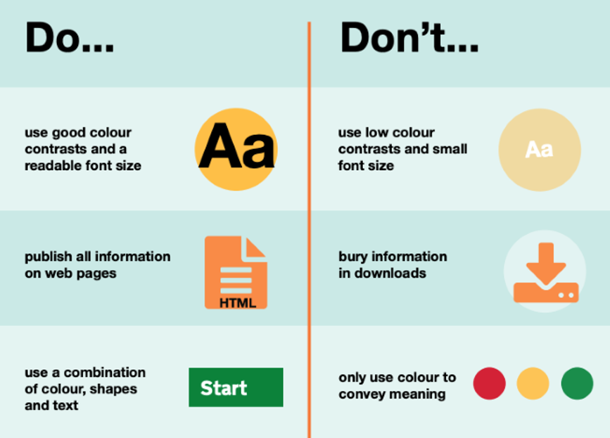
- Color Contrast: This is a big one for designers. Text and images of text must have a contrast ratio of at least 4.5:1 against their background. Large text requires at least 3:1. Use tools like WebAIM’s Contrast Checker to validate your color palettes during the design phase.
- Color is Not the Only Visual Means: Never use color alone to convey information. For example, a form error shouldn’t just be a red outline; it should also include an icon and text, like “This field is required.”
- Text Resizing: Ensure users can resize text up to 200% without breaking the layout or losing content.
2. Operable User Interface and Navigation
Users must be able to operate the interface. This means the components and navigation cannot require interactions that a user cannot perform.
- Keyboard Accessibility: Every interactive element—links, buttons, form fields, custom widgets—must be fully operable using only a keyboard (typically the Tab key). This is non-negotiable for users with motor disabilities or who rely on screen readers. As you design, visualize the tab order. Is it logical? Is there a visible focus indicator?
- Enough Time: Provide users with enough time to read and use content. If you have a session timeout (like on a banking site), give users a warning and the ability to extend it. Avoid moving, blinking, or auto-updating content unless the user can pause, stop, or hide it.
- Navigable: Provide ways to help users navigate, find content, and determine where they are.
- Skip Links: A hidden link at the top of the page that becomes visible on keyboard focus, allowing users to skip over repetitive navigation links.
- Page Titles: Each page should have a unique, descriptive
<title>that clearly states the page’s purpose. - Headings and Labels: Use descriptive headings and labels to describe topic or purpose. A proper heading structure (
<h1>-><h2>-><h3>, etc.) acts as a table of contents for screen reader users.
3. Understandable Information and User Interface
Your site and its operation must be understandable to all users.
- Readable: Make text content readable and understandable. While primarily a content concern, designers influence this through typography—ensuring legible fonts and adequate line height and spacing.
- Predictable: Make web pages appear and operate in predictable ways. Navigation should be consistent across the site. Components that repeat on multiple pages (like a search bar) should behave the same way each time.
- Input Assistance: Help users avoid and correct mistakes, especially in forms.
- Clearly label all form fields.
- Provide clear, specific error messages (e.g., “Email address is invalid” instead of “Error”).
- Suggest corrections when possible.
4. Robust Content and Reliable Interpretation
Your content must be robust enough to be interpreted reliably by a wide variety of user agents, including assistive technologies.
- Compatible with Assistive Tech: This is where clean, valid HTML pays off. Maximize compatibility with current and future user tools by adhering to standards and ensuring proper parsing. Avoid “div soup” and use ARIA (Accessible Rich Internet Applications) landmarks and roles wisely to enhance semantics when native HTML isn’t enough.
From Audit to Action: Integrating Accessibility into Your Workflow
An audit isn’t a one-time fix; it’s a snapshot. The goal is to bake accessibility into your design process from the very beginning.
- Shift Left: Integrate accessibility in the discovery and wireframing stages. Consider keyboard navigation and semantic structure before a single line of code is written.
- Use the Right Tools: Leverage automated checkers (like WAVE or axe DevTools) to catch low-hanging fruit, but remember they only catch about 30-40% of issues. Manual testing with a keyboard and a screen reader (like NVDA or VoiceOver) is irreplaceable.
- Educate and Advocate: As a designer, you are an advocate for the user. Champion accessibility within your team and with your clients. Frame it not as a constraint, but as a catalyst for better, more resilient design.
Conclusion: The Future is Inclusive
Designing for accessibility is an act of empathy. It’s a commitment to recognizing the diverse ways people interact with the digital world we create. An accessibility audit is not a punitive measure; it’s a quality assurance process that ensures your work can be experienced by everyone.
In an increasingly digital-centric world, an inaccessible website is akin to a physical store with a staircase but no ramp. It turns away customers, damages your brand, and excludes people from essential services and information. By embracing ADA compliance and the power of the accessibility audit, we aren’t just checking boxes. We are fulfilling our core responsibility as designers: to create meaningful, usable, and beautiful experiences for all.
About the Author

Peter Makeshoff
Peter Makeshoff is the founder and main author of Designer Daily.