
An online presence is a lifeline for modern businesses. Whether you own a young startup or an established brand, you require a website to survive and thrive in a competitive space. But you need more than a random interface, some content, and a few features to attract traffic and maximize visitors. An exceptional design is a worthy investment when it comes to achieving online visibility and sales.
According to surveys, a 2-5% conversion rate indicates a successful online run for a website. Reaching the figure is not about a fancy interface. The latest design trends can do the trick because most online shoppers prioritize sites that follow them. Minimalism is taking the web design space by storm with its clean aesthetics, strong useability, and affordable design costs.
Statistics show that 84.6% of web designers believe that crowded and cluttered designs are the worst mistakes. Conversely, minimalism rules because it facilitates easy navigation and excellent user experience. Although it sounds simple, minimalism is often tricky to get right. You may end up missing out on essentials or going over the top. So how can you adopt the minimalist design trend?
We have some actionable tips to maximize the potential of a minimalist web design.
Be Selective With the Content Elements

While minimalism is about limiting distractions and unnecessary elements, you cannot overlook the necessary content and features. Being selective is the best way to achieve a design that sells without overwhelming the visitors. You can start by conducting a content and feature analysis, as it can help you select the essentials.
According to website design agency Operation Technology, design should replicate a brand’s story, no matter how minimalistic you want your website to be. The story is an element that establishes a connection with the audience, making it a compelling aspect of their buying journey.
Here are a few tips to choose wisely:
- Minimize the cognitive load with fewer choices as they ease the decision-making process
- Get rid of generic content that doesn’t serve answers to questions of your target buyers
- Place relevant content at the top of the design because it gets attention and holds the visitors
Blend Images Seamlessly
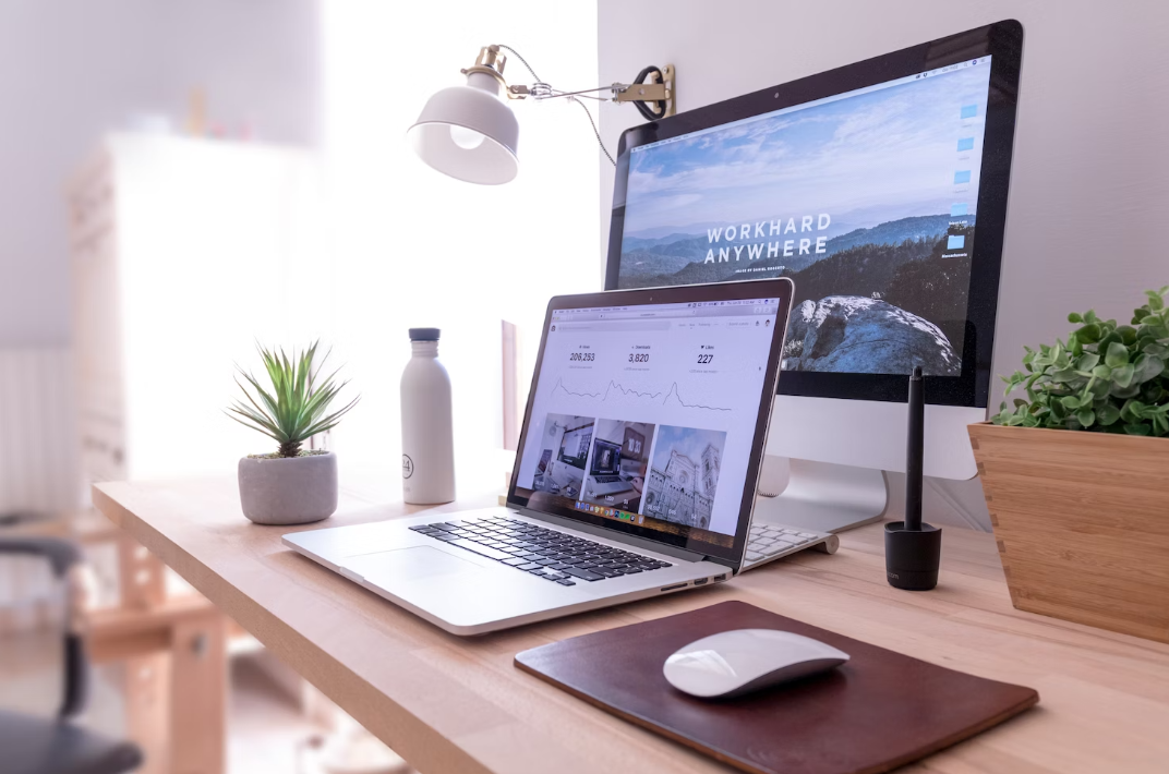
Although minimalism is about cutting the design clutter, you cannot hook the visitors without engaging imagery. Did you know that 50% of online shoppers make buying decisions based on images? Even if you don’t run an e-commerce store, you must use them to build connections and credibility for your brand. A minimalist design approach requires blending imagery seamlessly into the flow.
Once again, be selective about the images you choose because too many of them can create visual clutter and slow down the loading speed. Image quality is a critical aspect you cannot overlook. Less is more when you choose high-resolution, aesthetic, and relevant images that align with your brand’s narrative.
Win With Typography
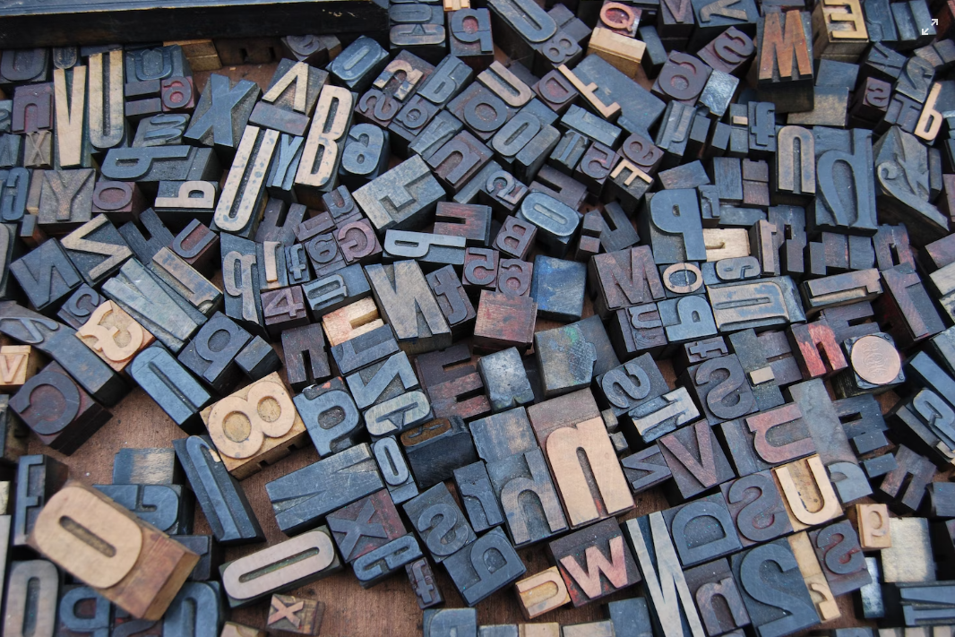
Typography seems an insignificant thing when it comes to web design, but it can be a game-changer. Font selection is the mainstay of minimalist designs because the right one makes the content clean and readable. Like imagery, it can grab the attention of the visitors and drive them down the conversion funnel.
Here are a few typography tips you can rely on:
- In minimalist design, you must stick with just one or two fonts families because too many of them can compete for attention and overwhelm users
- Legibility should be your priority while selecting fonts for your website
- Dividing text into blocks can improve readability and minimize the design load
Play with Colors and Contrast

A recent survey shows that 40% of visitors appreciate colors the most when it comes to visual design elements of a website. Even as you choose a minimalist design, remember to use color judiciously. To start with, ensure that the color palette of your website is a perfect match for your brand identity. Additionally, work with the right combinations and contrasts to get an eye-pleasing effect.
Be ready to experiment with hues because monochromatic color palettes are not the essence of minimalism. Using a limited number of colors makes sense, but you shouldn’t build a black-and-white website. Use colors at the right places, play with contrasts, and get the white space right. The placement of elements and colors is the cornerstone of a minimalist yet attractive design.
Wrapping Up
The minimalist design trend is here to stay because modern online buyers are overwhelmed by the sheer number of sites and volumes of content online. Simplicity can get you some brownie points, but you must embrace the trend wisely. Remember to maintain brand consistency and showcase the essentials to get the message across. At the same time, stay true to your commitment to achieving more with less. Following these tips can help you get the best of both worlds.
About the Author

Peter Makeshoff
Peter Makeshoff is the founder and main author of Designer Daily.