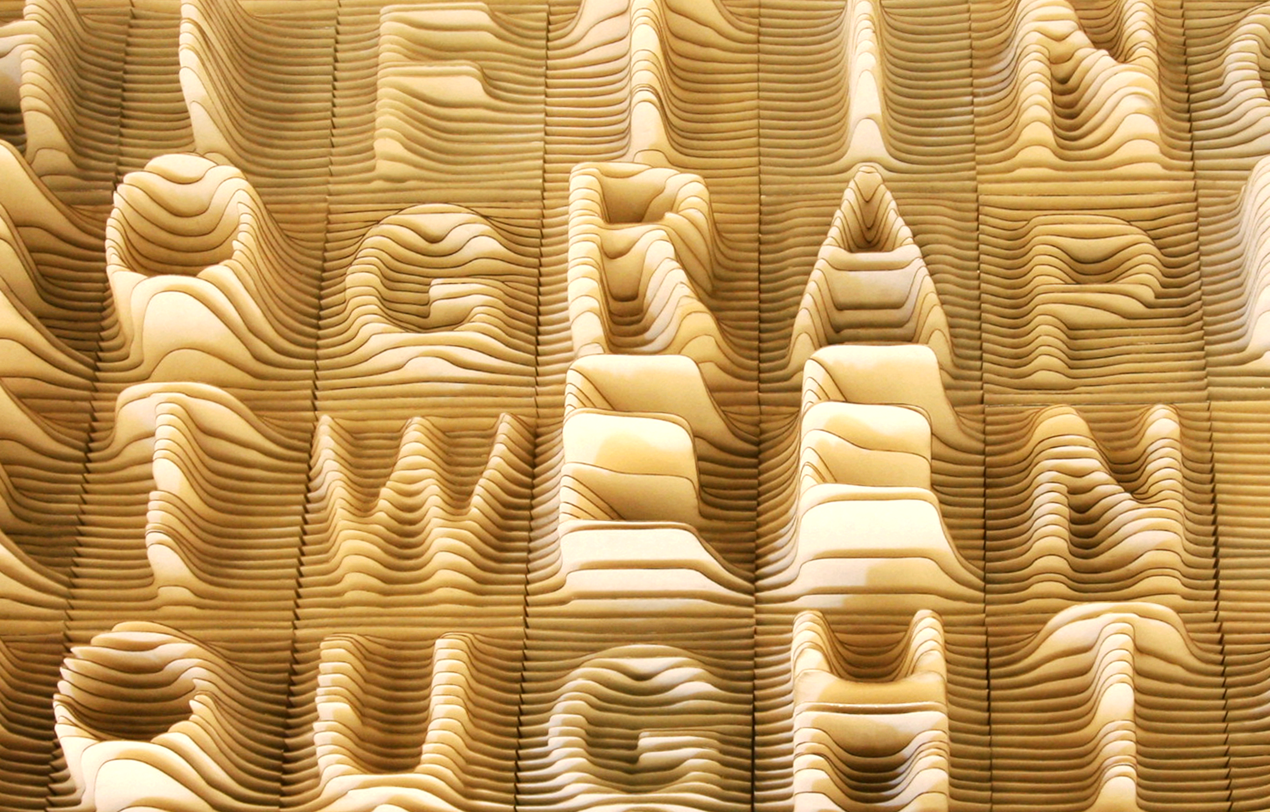
Synoptic Office has released a creative font that was built using topographic-like lines to make each letter come out. It’s already pretty cool in terms of craft and visual results, but the project is more than just an artsy stunt.
For each letter, the elevation of the topographic lines varies according to the number of time the letter is statistically used in the English language. This gives you a typographic and topographic landscape of the English alphabet, an interesting and artistic example of data visualization done right.


