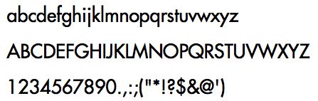
Gotham
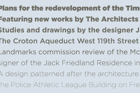
Ah, Gotham, the vernacular, everyman sans serif. It’s likely to be the Helvetica of 2007–08, or better yet, “The New Helvetica.” It’s forms are sturdy, and its character distinct (and I daresay “American,” much like how Gill Sans is “English” or a Fraktur is “German.”) These alternatives, though, are available when you want something different.
Alternatives
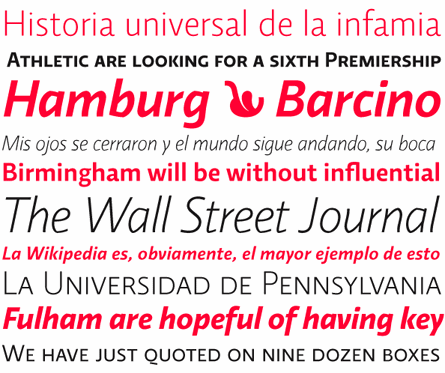
Proxima Nova
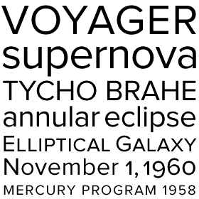
Proxima Nova, designed by Mark Simonson, is named for its close proximity to grotesque (ie. News Gothic,) geometric sans (ie. Futura) and neo-grotesque (ie. Helvetica.) It shares the construction, details and stroke constrast of these categories, respectively. Proxima also takes inspiration from the Federal Highway fonts, and the fact that it was designed (and redesigned, hence the Nova addition) over the course of 27 years gives Proxima Nova an American vernacular quality that is reminiscent of Gotham, only more refined.
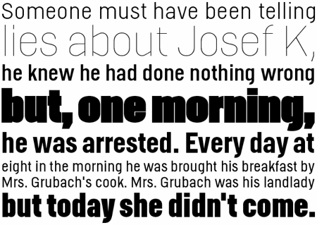
Bryant
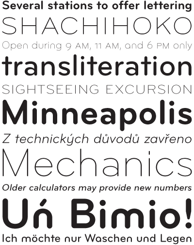
Bryant, by Process Type Foundry. Bryant is based off the Wrico Lettering Set, a set of pens, rulers and plastic templates that one can trace for use in drafting. Think of Bryant as a more serious version of Gotham Rounded. Looking for something more economical? The Bryant Condensed family has the width of a grotesque, and would make a fine contemporary substitute for fonts like Benton Sans.
Stag Sans
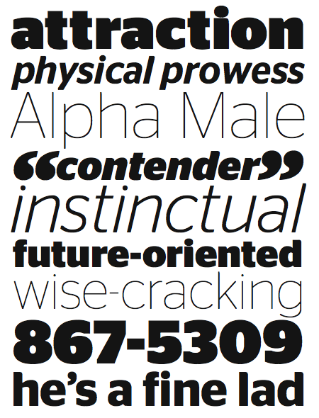
Stag Sans, by Christian Schwartz. Stag Sans is Gotham’s humanist cousin, with higher x-height and softer, more blunt edges. The capitals are humanist and has higher contrasts, but its lowercase are more akin to Gotham, and thus can be used as an alternative.
Scala Sans
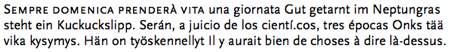
Scala Sans came into wide use in the 90’s, partly because it has a construction reminiscent of a roman typeface, and calligraphic influence (ie. two-story ‘a’ and ‘g,’ having true italics instead of sloped roman.) Besides being one of the first fonts in the second “wave” of Humanist sans designs (the first wave is typified by Gill Sans, the second by Syntax and Frutiger, and the third by Scala Sans and Myriad.) The fourth wave is a bigger one that lasts until today. With such wealth of offerings, I’ll present fonts from new designers that you may not have heard of before.
Alternatives
Xtra Sans
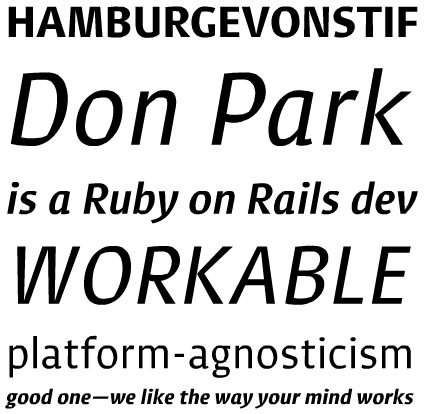
Xtra sans, by Jarno Lukkarila. This font combines the sturdiness and compactness of a grotesk (the same category that I mentioned before) with strong broad-nib pen strokes. Use Xtra sans if you want to convey a classical yet contemporary quality to your design. At smaller sizes, the generous counterspace makes this font readable. At bigger sizes, its calligraphic details gives it enough character to stand on its own.
Fresco sans
Fresco sans, by Fred Smeijers. This family, like Scala sans, was designed to be used alongside their serif counterparts (Fresco and Scala, respectively,) and can be more versatile than sans fonts that are designed by itself. Using the sans and serif font side by side guarantees headline and body type that aligns well with each other, and can greatly reduce your font matching headache.
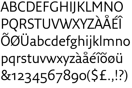
Fedra Sans
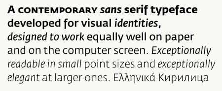
Fedra sans, by Typotheque. Fedra sans is one part of a superfamily of fonts that include not only a serif family with lower and higher contrast (for low-resolution and high-resolution printing, respectively), but also a sans display and serif display version (for use in larger sizes,) Arabic, monospace and phonetic. Use Fedra sans when your design requires a varying application of font, from the biggest navigational signage to that footnote in the annual report.
Futura
Futura can look good, but is also tricky to use well (tip: I like it set bold and loosely kerned.) These alternatives may not necessarily have a lot of characters, but are probably more adaptable to use in more situations.
Alternatives
Avenir
Avenir, designed by Adrian Frutiger, who proclaimed that “Avenir is the better Futura” (!) This, in my opinion, is true because it maintains Futura’s geometric construction, normalizes its quirks and expands its width offering. For instance, the pointed ‘A’ and single-story ‘a’ that is the hallmark of Futura are gone, but its single story ‘g’ and higher ascender/descender are retained. Use Avenir when your job calls for a more versatile, toned-down geometric sans.
Neutraface
Neutraface, by House Industries. Neutraface, which comes in display and text flavors, was inspired by signage with linear, geometric construction found on commercial buildings designed by Richard Neutra. This face, along with Avenir, gain prominence as a Futura alternative from the early 2000’s. Hint: If Neutra is too quirky for you (the low cross-bar on “A,” for example, is not to everyone’s taste,) use Neutra 2, its “normalized” cousin.
Richmond
Richmond, by Jim Parkinson. I see this face as Parkinson’s British and American answer to European Futura. It shares the same distinctiveness that Futura has, only with with a “warmer” geometry construction (like the London Underground type.) Use Richmond when you want more character in your design.
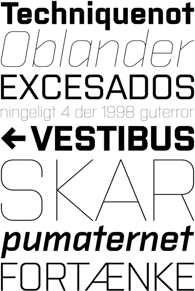
Square Sans
Much like its humanist or geometric sans counterparts, square sans serifs took root in the mid 20th century with Eurostile. But today, fonts like Klavika and Neo Sans came into prominence with the rise of Web 2.0 companies, not surprisingly, because it screams sleek, clean and high tech, thanks to its narrow width, relatively high x-height and squarish letterforms. Here are alternatives that you could use: some more humanist, some more grotesque, and others geometric—but all distinct.
Alternatives
Relato Sans
Relato sans, by Ricardo Santos Eduardo Manso. I originally meant to categorize this font as an alternative to Scala sans above. But Relato’s italic, though having much calligraphy influence, is still somewhat rigid—not unlike Xtra sans but with more exaggerations—thus making Relato sans an appropriate substitute for both a humanist face like Scala, or a “techie” sans like Klavika—something that very few fonts could do.
Helsinki
Helsinki, by Ludwig Übele, is an alternative that’s sleek and crisp, but retains the width and quality of a grotesque. The design is based off Finnish highway typeface.
Purista
Purista, by Suitcase Type Foundry, is yet another approach to this category. It takes the literal definition of a proper square sans (like Eurostile) and gives this model even more geometric quality, as well as weight levels, to make it versatile.
Notable Square Sans Alternatives
Caput, by Fontfarm
Sophie, by Fontsmith – more feminine
Stalemate, designed by Stefan Hattenbach
Reykjavik, by PSY/OPS
Up next: Regional Characteristics of Typefaces, From French, English to Catalan (And Everything Inbetween)
But for now, I hope that you learn a thing or two about fonts, font classifications and foundries that designed them.
What typeface would you like to see the alternative of? I’ll do my best to answer.
—
Bram Pitoyo is a brand strategist, hacker and typophile who aims to unite the creative and technology communities in Portland, Oregon, and around the world. On most days, you can find him planning, organizing and reporting events of this nature. On some other, you’ll find him talking to local personalities.
About the Author

Mirko Humbert
Mirko Humbert is the editor-in-chief and main author of Designer Daily and Typography Daily. He is also a graphic designer and the founder of WP Expert.