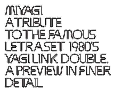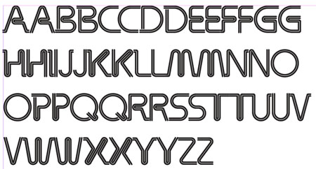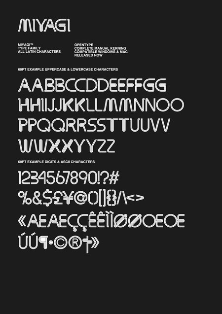
Miyagi is a redesign of “Yagi Link Double”, a letraset font. It’s a creative and beautiful work by designer Alex Haigh. I thought that Designer Daily’s readers would be interested in an interview with him. Don’t forget to visit the online foundry he’s launching: Hypefortype. There will probably be more great fonts coming from there, so make sure you subscribe.
Can you introduce yourself to our readers?
My names Alex Haigh, I’m a freelance designer from Nottingham, currently working under the guise of Thinkdust.
What made you chose to digitalize the “Yagi Link Double” Letraset font?
Typography has always featured within my work, and over the last couple of years I have started to take a vast interest in type. Following this, I started to collect old typographic catalogues for inspiration. Having flicked through pages upon pages of beautiful typeface I noticed Yagi Link Double. I wanted to use this for a project at the time, and after looking through the internet for hours I could not seem to find the typeface anywhere, only to finally stumble upon the fact that this typeface had never been digitised. I thought this was quite interesting and a shame to say the least. So following that I decided to reproduce the typeface and make a few amendments to make sure it was unique, yet held the same character.
What would be the most appropriate uses for Miyagi in your opinion?
Definately print, digital work will do it no justice at all. The beautiful thing about Miyagi, is in the fact it is so seemless and detailed. As a headline printed digital or litho you will be suprised how well this looks.

After working more than 200 hours on recreating a font, what would be your advice for the young typographers wanna-be out there?
I think you have to be patient, through creating my own typefaces I have learnt that if you give up on a letter just because you’re finding it difficult to suit the overall composition, it can end up destroying the entire typeface. Some of my early creations were affected by this, and having looked through I know I could have done a better job. So be patient, take your time and try to make everything feel like a family in the same way you would design a brand identity or website.
Your new foundry, Hype for Type, will be started in 2009. Can you tell us a few word about this project?
This is a very exciting project, and very challenging. I’m currently working on the website design, looking after the IA, and also the CMS. HypeForType is a new digital online foundry with a difference. I will be locating some of the most unique typefaces throughout the internet and helping our partners turn them into digital products. One of the most exciting features is our designer section. Every 3 months we will work closely with some of the industries most prolific designers, illustrators, and artists to create a unique limited edition typeface exclusively available through HypeForType. For Volume one which we already have confirmed you can expect some beautiful creations from; Si Scott, Alex Trochut, Jon Burgerman, Luke Lukas, HelloHikimori, and Suprb. It’s going to be a very exciting project, and be sure to drop by the website and fill in your email for our official launch date: www.hypefortype.com.


