Cryptocurrencies have not been popular for too long in the digital world, but ever since the 2017 craze, they can be seen pretty much everywhere. Nearly everybody has heard of what they are and what they do, but very few know what they look like.
And they don’t really look like anything, because they’re just a few lines of code, but multiple crypto websites have taken it upon themselves to showcase the visual sides of cryptocurrencies and may have introduced a new trend of web design in the process.
A couple of years ago, there were just a handful of sites where people could get information about cryptos, therefore they didn’t have to struggle too much about standing out. But now, every second site is talking about cryptos, and they need at least something to peek out of the crowd.
Let’s take a look at some of the most popular crypto hubs and find out how they distinguish themselves from the competition through website structure and design.
Cointelegraph
Cointelegraph is considered to be the Bloomberg of the cryptocurrency world. Everything related to crypto news will always be posted there first, therefore it has a lot of traction.
Due to the fact that the website is purely news focused, it needs to make those news reading sessions for investors as effortless and comfortable as possible.
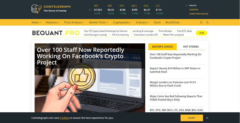
If we take a look at any of their news pieces, we notice that there is very little sidebar action. Most of the page for the article is dedicated to the text itself and is trying to be as precise as possible.
The only real estate occupied by ads is the right-hand side of the webpage which is a perfect position. Due to the fact that we read from left to right, having a clear left-hand section is essential to make the reading process fluid.
Furthermore, when we look at the website, we immediately notice the unique design patterns of their images, which are used to describe the contents of an article from a single glance. Only a few websites commit to having a unique design like Cointelegraph.
Coinmarketcap
Observe any cryptocurrency trader on his or her typical day and you will see them access Coinmarketcap at least ten times. The reason is that the website provides price charts on every cryptocurrency available, and tries to make it the start of the webpage.
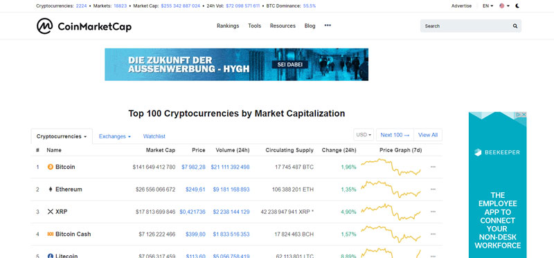
When we take a look at the website, there are only three ad spaces, which are quite far apart actually. Many designers would say that this is a terrible use of webpage real estate, but it at least works as an amazing UX design.
Furthermore, we see that those ads can simply be closed and are not permanent, which adds the extra value for the visitor.
The design is extremely simple, which does justice to the website’s main product, the chart. If anything takes away the spotlight from those charts, then the website’s whole point is lost.
InsideBitcoins
InsideBitcoins is not as popular as the websites listed above, which is understandable, because those two sites are basically if Bloomberg and Bloomberg Terminal reincarnated into crypto sites.
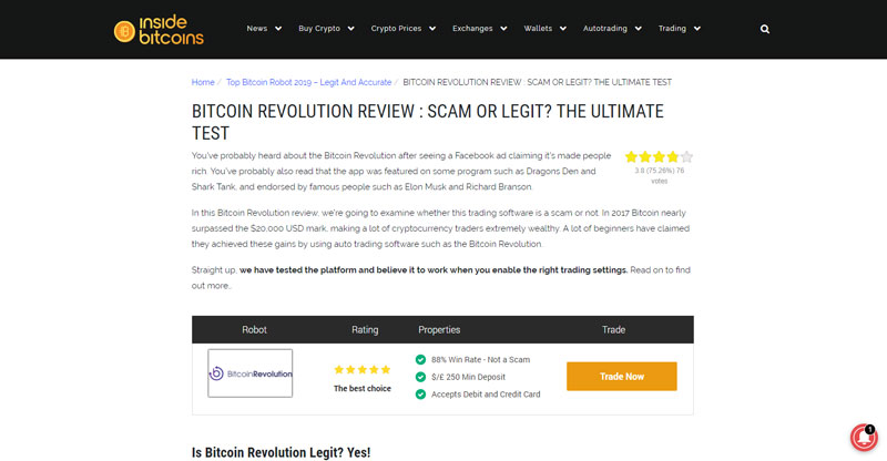
InsideBitcoins mostly focuses on product reviews and comments by the community, therefore they have a design which is absolutely focused on the content and nothing else.
There is no fancy design to be found on the website. All there is is a navigation bar and a footer, that’s the extent of the design and it works!
Simply taking a look at one of the product reviews, such as the Bitcoin Revolution review we see no ads, no sidebar action, no nothing. The webpage purely focuses on simplicity and the contents of the review.
This way, the website is communicating to the viewer that “we are not trying to sell you anything”, which is designed to keep that person returning.
Coinnounce
Coinnounce cannot even come close to the popularity of Cointelegraph in terms of a crypto news website, but they sure are very similar when it comes to the design. But we can’t say that they execute it as well as their more popular counterpart.
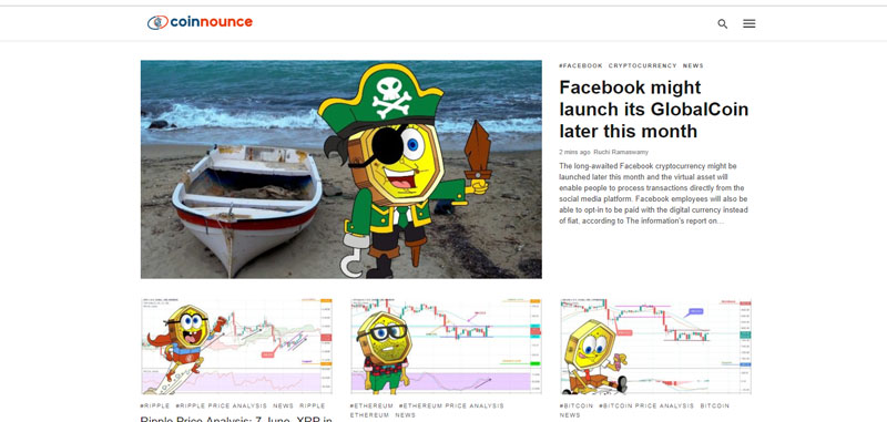
You see, Coinnounce took Cointelegraph’s personalized pictures and cranked it up to 11. In terms of the design, there’s not much to it and the colours don’t match the mascot as well.
Despite this, the design trends in the crypto sphere are so scarce and generic, that even adding that Spongebob figure was enough to help Coinnounce stand out from the crowd.
So what’s the best practice?
It may be hard to tell the best practice out of the examples provided above, but one thing should be clear.
The simpler it is, the better it is for the viewer. Although these websites are not using their webpage real estate nearly enough as traditional popular websites are, it’s at least allowing the content itself to shine.
The less there is to distract the visitor, the more likely they are to remain on the website for longer and return in the future.
About the Author

Peter Makeshoff
Peter Makeshoff is the founder and main author of Designer Daily.