A logo can be redesigned. A color palette can be refreshed. But changing a brand’s primary typeface years after launch is painful, expensive, and often avoided until the brand feels hopelessly dated. The best brand typography does not need to be replaced every few years. It ages gracefully, carrying the brand forward without screaming its birth decade.
Here is how to choose fonts that will still look right ten or twenty years from now.
The Difference Between Trendy and Timeless
Trendy typefaces are easy to spot. They appear everywhere for eighteen months, then vanish. The condensed sans-serifs of the 2010s. The extreme geometrics of the early 2020s. The retro revivals that cycle every few years. These fonts work for campaigns, not for brand foundations.
Timeless typefaces share common traits. They have been in continuous use for decades. They work across contexts and scales. They are legible in both print and digital environments. They do not rely on a single distinctive gimmick—an unusual ‘g’, an exaggerated x-height, a novelty curve—that will look tired when the gimmick falls out of fashion.
This does not mean brands must use default system fonts. It means the distinctive elements should come from how the typeface is used, not from the typeface itself.
Proven Candidates That Endure
Some typefaces have proven their longevity through decades of use. They are not exciting. That is precisely why they endure.
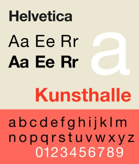
- Helvetica (1957) is the most imitated typeface in history. Its neutrality is its strength. Brands that use Helvetica are not making a typographic statement. They are removing typography as a variable, letting other brand elements speak.
- Garamond (16th century) has been in continuous use for nearly 500 years. Its elegance is understated. It works for luxury brands and universities alike because it signals tradition without shouting.
- Futura (1927) carries the energy of the Bauhaus but has softened into a versatile geometric. It works for modern brands that need energy without trendiness.
- Times New Roman (1932) is ubiquitous but unfairly dismissed. Its legibility at small sizes is exceptional. For brands with dense text—newspapers, academic publishers, legal services—it remains a strong choice.
- Akzidenz-Grotesk (1898) predates Helvetica and influenced it. It has a slightly more human character while maintaining neutrality.
These are not the only options. But any brand considering a different typeface should ask why these proven options were rejected. The answer should be strategic, not aesthetic.
What to Avoid
Certain typeface characteristics reliably date a brand.
- Extreme contrast (very thick thicks and very thin thins) was popular in 2010s fashion branding. It is difficult to read at small sizes and looks distinctly of its era.
- Overly distinctive glyphs become caricatures. A ‘g’ with an unusual ear or a ‘Q’ with an exaggerated tail may feel distinctive at launch. After five years of seeing it everywhere, it feels tiresome.
- Aggressive condensing signals a specific design moment. Condensed typefaces work for headlines but fail as a primary brand font. They limit applications and age poorly.
- Fad revivals of 1970s or 1980s display faces come and go. Using a Pac-Man-era arcade font for a brand is a decision that will require another decision in three years.
The common thread is novelty. Novelty ages. Familiarity endures.
The Versatility Test
A brand typeface must work across a staggering range of applications: a favicon, a billboard, an embroidered hat, a laser-engraved pen, a mobile notification, a newspaper ad, a trade show banner. Each application imposes different constraints.
Test every candidate at 9 pixels on a low-resolution screen. Test it at 200 points on a large monitor. Test it on a fabric tag. Test it reversed out of a dark color. Test it in all caps. Test it in sentence case. Test it with diacritics (é, ñ, ü) if your brand operates internationally.
A typeface that fails any of these tests is not versatile enough to be a primary brand font. Keep it for headlines or special applications. Choose something more robust for the core identity.
The Role of Customization
Fully custom typefaces are expensive. But small customizations to existing typefaces can add distinctiveness without sacrificing longevity.
Modifying the ‘a’ or ‘g’ to have a unique character. Adjusting the weight distribution across the alphabet. Creating a proprietary ligature for the brand initials. These changes are subtle enough that they do not date the font but distinctive enough that they make the font recognizably yours.
The risk is over-customization. A font that is too unusual becomes a liability. The goal is to make the brand’s typography slightly more specific, not to invent a new alphabet.
Testing Against Competitors
Brand typography does not exist in a vacuum. It exists on the same screens, shelves, and billboards as competitors. A typeface that looks distinctive in isolation may look indistinguishable next to similar brands.
Collect competitor materials. Set the same headline in your candidate typeface and theirs. Compare. Are they distinct? Does your choice communicate a different position, or does it blend in?
The goal is not to be different for the sake of difference. The goal is to be appropriately distinct. A bank should not use the same typeface as a streetwear brand. A children’s toy company should not use the same typeface as a law firm.
The Bottom Line
Brand typography is a long-term investment. Choosing a font because it looks cool today guarantees that it will look dated tomorrow. Choosing a font because it is functional, versatile, and proven will serve the brand for years.
Test every candidate against real-world constraints. Avoid novelty. Seek familiarity with subtle distinction. And remember: the best brand typography is the typography users do not notice. They just feel that the brand is trustworthy, professional, and right. That feeling is the goal. The font is just the tool.
About the Author

Peter Makeshoff
Peter Makeshoff is the founder and main author of Designer Daily.