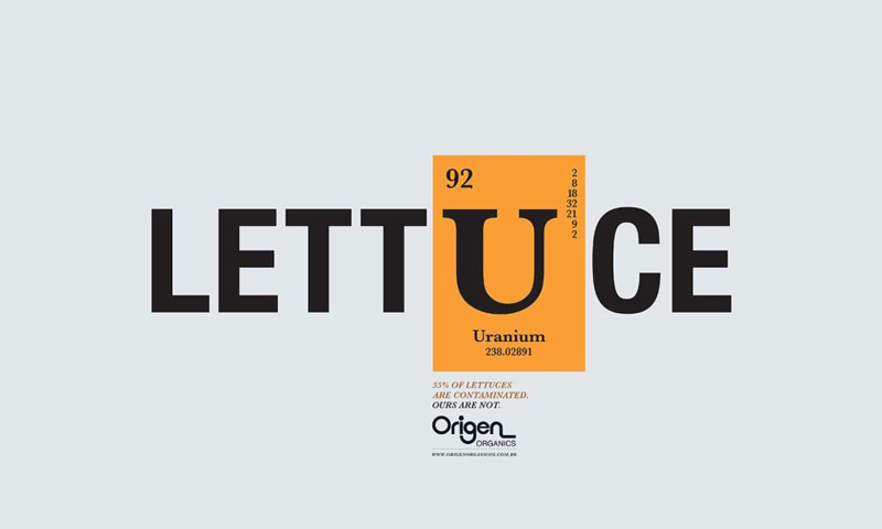
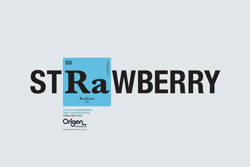
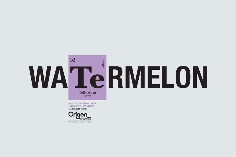
For advertising, you need to catch people’s attention immediately and to have a message that’s quickly understandable. With typography, it’s quite easy to make your message understood if it’s not too complex, but it’s rather hard to catch people’s attention.
For this campaign for Origen Organics to promote organic fruits and vegetables, Y&R Brasil did both. A bright color box immediatly gets you to look at it, then a subtle typographic change inside that box gets the message across easily. Chemical elements abbreviations are used inside the word to hint that most fruits and vegetables nowadays are contaminated. This is maybe the only downside, the message about their own production not being contaminated should be a bit more obvious.
About the Author

Peter Makeshoff
Peter Makeshoff is the founder and main author of Designer Daily.