When we talk about startup landing pages, we’re talking about that initial web page your visitors land on.
Think of it as the digital doorway to your startup. It’s not just any ordinary webpage. It’s tailored to serve one main goal – like introducing a new product, capturing email addresses, or driving sign-ups.
Importance of Landing Pages for Startups
Now, why the fuss about these startup landing pages? Well, it’s like hosting a party and setting the first impression. You want your guests (in this case, your potential customers) to feel welcome and curious about what’s next. It’s your shot at making that great first impression.
And we all know how much those count in the startup world. Your landing page can significantly influence whether your audience stays to explore more or bounces off somewhere else.
Core Principles of Effective Landing Pages
Clarity and Simplicity
Clear Headlines
Imagine meeting someone new, and within the first few seconds, they just blabber a storm without making any sense.
You’d probably want to walk away, right? Same goes for your landing page. Your headline should be the punchy introduction that grabs attention. Make it clear, make it catchy. No beating around the bush.
Concise and Persuasive Copy
Once you’ve caught their attention, now’s your chance to charm them.
Your website copy should be like a good storyteller. Engaging, yet straight to the point. Remember, the modern web surfer has the attention span of a goldfish. Don’t waste words. Use them wisely.
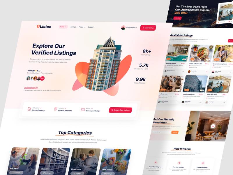
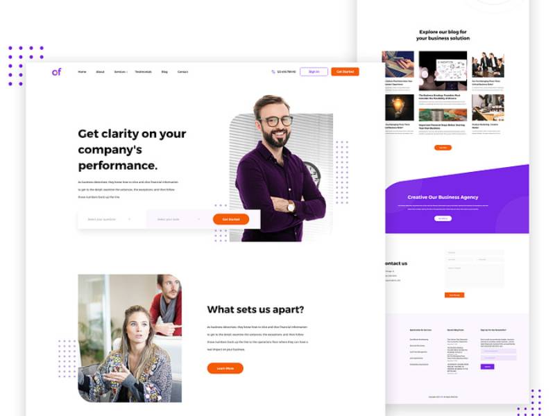
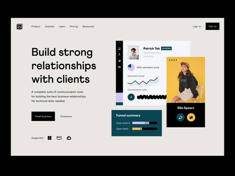
Visual Appeal
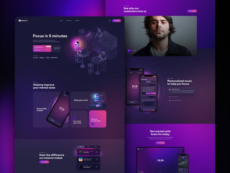
Use of High-Quality Images
You ever scroll through a site and see pixelated, low-quality images? Instant turn off, isn’t it? Images, including those in a captivating parallax slider, communicate so much more than words.
So if you’re gonna use them, make sure they’re top-notch.
Engaging Animations and Scroll Effects
A tad bit of flair never hurt anyone! Animations and scroll effects can make your startup landing pages feel dynamic.
It’s like adding that extra spice in a dish. But like with cooking, overdoing can spoil the broth. Make it subtle, make it relevant.
Conversion Focus
Call-to-Action (CTA) Placement
Alright, so here’s the thing about CTAs. They’re like that friend at the party who nudges you to dance. They encourage action. Whether it’s “Sign up now”, “Learn more”, or “Grab the deal”, CTAs are crucial.
Place them where they’re visible. And yeah, make them pop. Nobody notices a wallflower.
Minimal Distractions
Ever been in a conversation where someone keeps checking their phone? Annoying, isn’t it?
On your startup landing pages, distractions are those unnecessary elements that draw attention away from your main goal. Keep the extras to a minimum. Keep the focus sharp.
Best Practices for Startup Landing Pages
Understanding the Audience
Okay, so picture this: You’re throwing a mega party. Do you start by choosing the music or knowing who’s coming?
Obviously, you need to know your audience first, right? It’s the same with startup landing pages. Before even starting with the design, ask yourself:
- Who’s coming to my site?
- What are they looking for?
- What vibe will keep them grooving (or, in this case, browsing)?
It’s like having a cheat sheet. Once you know your audience, half your job’s done. Everything you do next? It’s all about them.
Comparing with Competitors
Drawing Inspiration
We all have that friend with the killer wardrobe we sometimes get “inspired” by. It’s cool, as long as you’re not just copying their style. When building a landing page, sneak a peek at what the competition’s doing, whether it’s in the realm of IT company websites. Not to copy, but to get those creative juices flowing.
When building a landing page, sneak a peek at what the competition’s doing. Not to copy, but to get those creative juices flowing.
Differentiating from Rivals
While it’s awesome to draw inspiration, don’t forget your unique flavor. If your competitor is the “classic rock” of landing pages, find your “hip-hop” groove. It’s not just about being different. It’s about being you.
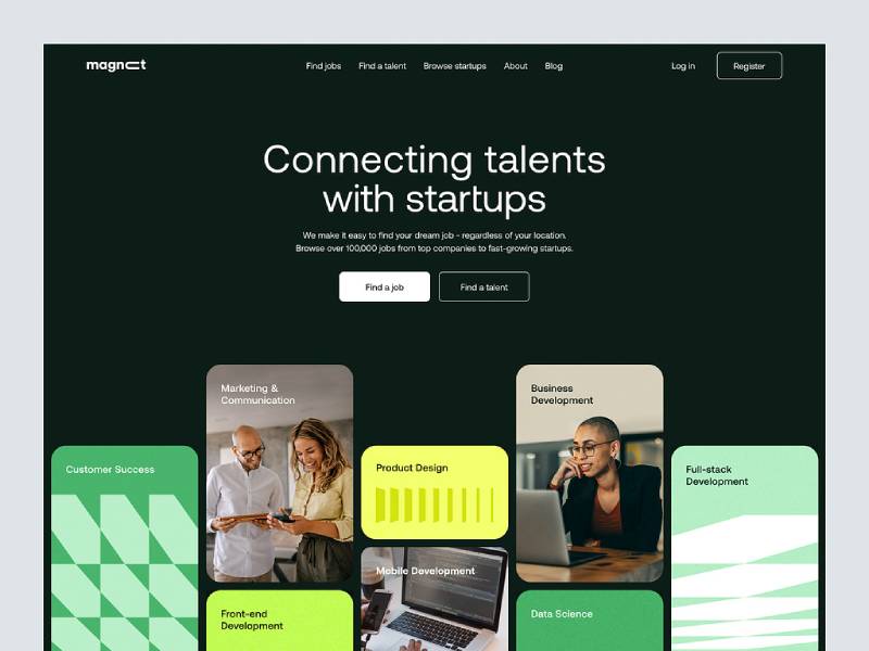
Engaging with Visual Content
Role of Traditional Visuals
Think of traditional visuals as the jeans in your wardrobe. They’re timeless. Charts, graphs, basic images – they’re trusty, and they work.
They bring a sense of familiarity to your startup landing pages. So, while chasing the new, don’t forget the old.
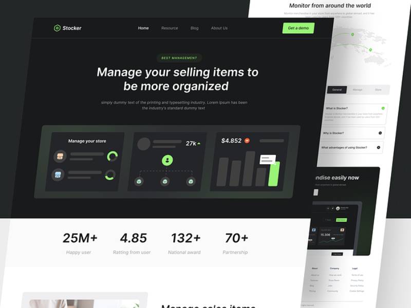
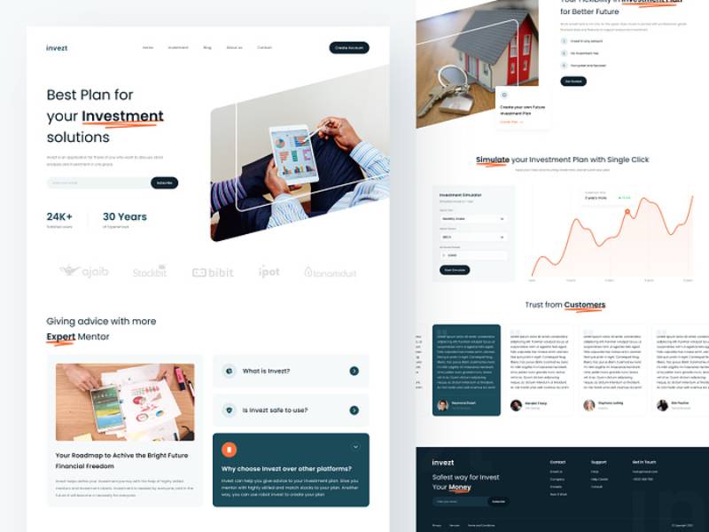
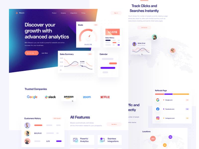
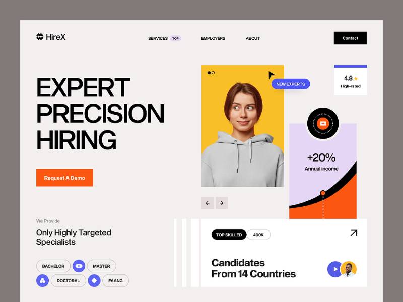
Importance of Hero Images
Hero images are like that killer leather jacket – the centerpiece of your outfit.
A hero image is that large, featured image at the top of your site. It’s the first thing your visitors see. Make sure it’s bold, relevant, and just downright cool.
Generating Interest Before Sales
Goal Setting
You’ve got to know what you want. Before diving headfirst into your startup landing pages, set your goals. Want people to sign up? Download something? Buy a product? Know your endgame.
Lead Collection Strategies
You ever been to a party and connected so well with someone, you just had to exchange numbers? Your landing page should do the same. Use strategies like cool pop-ups or irresistible offers to get those email addresses.
Leveraging Social Proof
Testimonials and Reviews
If your best friend recommends a burger joint, you’re more likely to try it, right? Testimonials are like those recommendations for your business. They’re little golden nuggets of trust. Show ’em off.
Displaying Client Logos
Flaunt the big names you’ve worked with. It’s like name-dropping at a party. But here, it’s cool. It builds credibility and makes folks think, “If they’re working with them, they’ve got to be legit.”
Types of Startup Landing Pages
Lead Capture Pages
These are the chatty ones. Their main job? To get information from visitors.
Think of them as those friendly folks at parties, always looking to get to know everyone. Use forms, offers, or downloads to get those precious details.
Click-through Landing Pages
Here’s where things get real. These pages are your smooth talkers, guiding visitors towards making a move, like purchasing a product or signing up. They’re all about that action.
Benefits of Startup Landing Pages
Validating Business Models
Imagine launching a brand-new sneaker, but instead of going all out, you just send a prototype to a few close pals to get their thoughts. That’s the vibe with startup landing pages.
Before you splash out on a full website, these pages let you test the waters. They help you see if your idea rocks or needs some tweaks. So, it’s like a sneak peek into what your audience digs.
Testing and Iteration
Now, don’t get me wrong. We all want our first landing page to be a success. But reality check – sometimes we miss the mark. And that’s okay. Startup landing pages are like your practice court. Put something out, see how it flies, then tweak, change, and toss it up again. It’s a game of figuring out what sticks.
Building Demand and Interest
Ever seen those long queues outside a cool new club? And even if you weren’t planning on it, you kinda wanted to see what the fuss was about?
That’s the magic of startup landing pages. They generate buzz. They get people talking, clicking, and craving more. It’s your digital hype squad.
Building a Startup Landing Page
Choosing the Right Tools
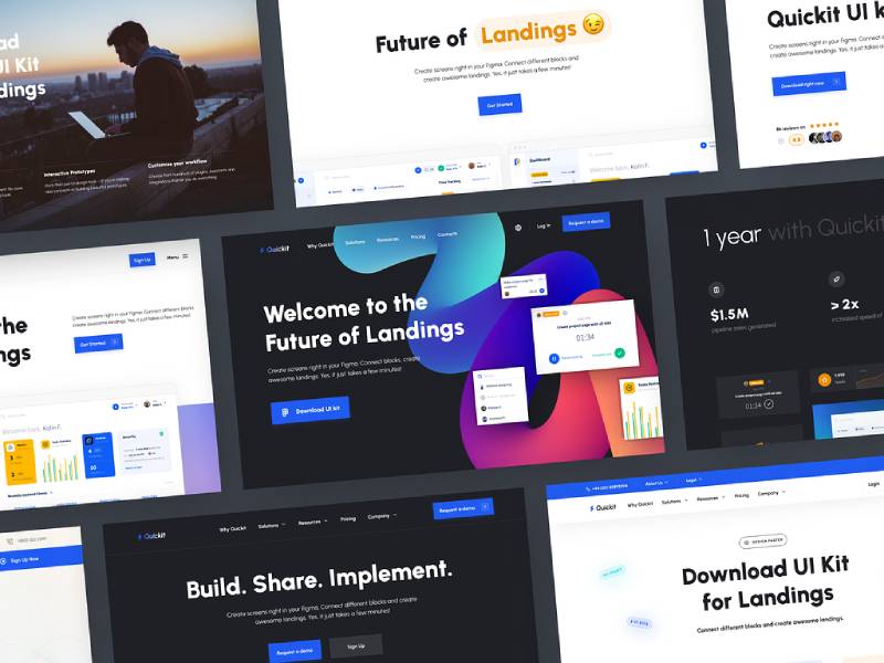
Landing Page Builders
These are your DIY kits in the digital world. You don’t need to be a coding ninja or a design guru.
Just drag, drop, and boom – you’ve got yourself a landing page. Platforms like Wix, Squarespace, or Unbounce are the unsung heroes here. Easy-peasy.
Custom Development
This is for when you want that tailored suit fit. You’ve got a vision, and you want it pixel perfect.
It’s pricier and takes more time, but man, it’s worth it when you see your dream come to life. Dive deep into HTML, CSS, or maybe hire a pro if coding isn’t your jam.
Essential Elements to Include
Lead Capture Forms
It’s like asking for someone’s number, but less creepy. A lead capture form is where visitors drop their details. Maybe they want updates, or they’re interested in a freebie. Whatever it is, these forms are golden.
CTA Buttons
That’s “Call-To-Action” for the uninitiated. These are your digital shout-outs, urging visitors to take action. “Sign Up”, “Buy Now”, “Learn More” – these buttons guide your visitor. They’re like the big, glowing EXIT signs, but way cooler.
Testimonials and Reviews
Okay, you know when you’re buying something online, and you stalk the reviews? That’s the power of testimonials.
They’re little stamps of trust. Someone’s used your product, they loved it, and they’re telling the world. Flaunt these badges of honor.
Common Mistakes and How to Avoid Them
Overloading with Information
You want to charm your audience, not drown them in info.
The Fix? Less is more. Have a buddy review your page. If they start yawning or scrolling too fast, you know you’ve gone overboard.
Ignoring Mobile Responsiveness
Picture this: you find out about this rad new startup. You whip out your phone, type in the link, and… ugh! You can’t read a thing. The images overlap, and the text size gives you a headache. Don’t let that be your page.
The Solution? Always, and I mean always, test your landing pages on multiple devices. Better yet, use platforms that auto-adjust to different screens. It’s 2023, folks. Mobile-friendliness isn’t a luxury; it’s a must.
Not Testing and Iterating
Alright, this one’s a biggie. Launching your landing page and just letting it be is like cooking a dish and never tasting it. You gotta check, tweak, and check again.
How to Nail It? Use analytics. See where visitors linger and where they bounce. A/B test if you’re feeling fancy. Change up CTAs, play around with images, and always be on the lookout for what works best. Your landing page is a living, breathing entity. Treat it that way.
FAQ about startup landing pages
What’s the real purpose of a landing page for a startup?
Whether that’s signing up for a newsletter, downloading an eBook, or buying your snazzy new product. It’s all about converting those casual web wanderers into something more.
How important is the design of the landing page?
If it looks shoddy or thrown together last minute, folks will bounce.
But if it’s sleek, intuitive, and downright pretty? You’ve got their attention. Aesthetics matter, but remember, it’s also about the user experience. If they can’t navigate easily, all the pretty pictures in the world won’t save you.
What should the main CTA (call to action) look like?
Alright, picture this: you’ve got a big, shiny red button. It’s begging to be pushed. That’s your CTA. It needs to stand out, but not be obnoxious.
The text? Concise and compelling. Tell folks exactly what you want them to do and why. “Sign Up Now” or “Grab Your Deal”. And don’t bury it somewhere no one can see – front and center, my friend.
How much information is too much on a landing page?
Give them enough info to understand your offering, answer any burning questions, but leave them curious for more.
If they’re scrolling for days or clicking away because they’re bored, you’ve missed the mark. Look at what others are doing and copy the principles.
Is it necessary to A/B test the landing page?
You betcha! Imagine you’ve got two shirts. One’s blue, the other’s red. Which one gets you more compliments? A/B testing is kinda like that. It helps you figure out which version of your page performs better.
Maybe it’s a headline change or a different image. Small tweaks can lead to big results. It’s like the scientific method for marketing.
Should I include testimonials on the landing page?
Testimonials are like your buddies vouching for you at a party. They give you street cred. Letting potential customers see that real people have benefited from your product or service? That’s pure gold.
Just make sure they’re genuine – nobody likes a bragger who’s all talk.
How do I drive traffic to the landing page?
Ah, the million-dollar question! There are heaps of ways. SEO to rank on search engines, paid advertising (like Google Ads or Facebook ads), social media promotion, email marketing campaigns… the list goes on.
Just pick what suits your budget and audience best. And remember, it’s not just about quantity, but quality of the traffic.
Do videos improve the conversion rate of a landing page?
Videos can be like a secret weapon. They grab attention, explain your product or service quickly, and can be super engaging.
How often should I update my landing page?
It’s not like milk – it won’t go bad in a week. But you should definitely revisit and refresh it from time to time. If there’s new info, updated testimonials, or even seasonal promotions, keep things fresh.
Plus, consistently optimizing based on feedback and performance data is key.
How do I know if my landing page is successful?
Metrics, my friend! Dive into those analytics. Look at conversion rates, time spent on the page, bounce rates, and other juicy data points. If people are taking the desired action, like signing up or purchasing, give yourself a pat on the back.
Conclusion
So, let’s have a quick throwback, shall we? We’ve walked through the busy streets of startup landing pages together and boy, what a journey! Remember that time we spoke about how vital these babies are for startups?
Just like the right shoes can totally make the outfit, a killer landing page can be the game-changer for a brand new startup, especially in industries like travel agency websites. These aren’t just static pages, they’re the first impression.
These aren’t just static pages, they’re the first impression. They’re the digital handshake, the welcoming smile, the “hey, come check us out” beckon. They build interest, they validate ideas, they test waters. And, they’re the launching pads that propel startups into the big leagues. For real, in this wild startup world, these landing pages are the unsung heroes.
Now, before we part ways, let’s get real for a sec. This web designing thing? It’s not a “set and forget” kinda deal. Nope. It’s more like keeping a plant. You gotta water it, give it sunlight, talk to it sometimes (or is that just me?), and trim off any dead leaves.
Your startup landing pages? Designing one isn’t the end. It’s just the beginning. There’s a whole exciting world of testing, tweaking, and twisting to explore. And every tweak, every change, is a step towards perfection.
Don’t be afraid to play around, to think out of the box, to ditch the rulebook once in a while. Keep those creative juices flowing, keep learning, and keep iterating. Because the sky’s not the limit, it’s just the view.
About the Author

Bogdan Sandu
Bogdan is a designer and editor at DesignYourWay. He's reading design books the same way a hamster eats carrots, and talks all the time about trends, best practices and design principles.