If I have to name one email design trend that everyone loves, right from email developers to subscribers, it is the dark mode. This trend has taken over all major social media platforms, productivity apps, messaging apps, and there’s no reason for you to miss on dark mode compatible emails. It is aesthetically rich, easy on the eyes, gives your emails a crisp look, and helps with deliverability. The big brands have already started surfing the dark UI tide, but many businesses are still lagging. Today, I will explain how email designers can build dapper email templates using dark mode compatible email design methods.
I am dividing this blog into two parts for better understanding:
Aesthetic Portion Of A Dark Mode Compatible Email Template Design
The aesthetics part of the email design process revolves around the UI elements like the color scheme, the spacing between adjacent content blocks, branding, and ease of consuming the information. In this section, I will share the tips and hacks that will help you give the best possible aesthetic look to your dark theme HTML email templates:
Don’t Go For Pure Black
It is normal for email designers to fall for the true black (#000000) to dent your message’s readability. If you use pure black in email design, the contrast with the (white) fonts will make your message hard to read, contrary to the purpose of switching to the dark mode. You can go for a dark grey (#121212) as the base color for the theme. It contrasts well with the white font and makes your emails look appealing.
Blend Your Brand’s Colors With The Dark Theme
It is common to face troubles in situations where your brand colors do not look good with the dark theme. I find that most email developers go with the hack that they use for the regular fonts to solve this problem: Add a white stroke.

This will make it easier for the reader to differentiate your brand elements and recognize them quickly:
Go Minimalist
This is a very important part of designing dark mode friendly email templates. The basic idea is to declutter and provide a soothing experience to the reader, and thus going minimalist is necessary. If you add too many content blocks, it will only degrade the visual appeal, so avoid doing that.
Have Proper Contrast
It is necessary to set the contrast between various elements in your email design. The coloring schemes are interpreted with the help of their surroundings, so avoid using low contrast coloring.
Desaturate Your Color Palette
Prefer using the colors in the 200 to 50 range and desaturate all the primary colors as dark-on dark elements will make your design appear faded and distasteful.
Technical Portion Of Dark Mode Friendly Email Design
I will cover the technicalities for the dark UI-based email template design. These tips will help your messages render flawlessly across all ESPs, but I will also cover Outlook tips here as its rendering engine continues to challenge an email developer.
Drop Compatibility Hint For Mailbox Provider
You should give a hint to the email client regarding your message’s compatibility with dark mode. Inserting “prefers-color-scheme: dark” inside “@media query” enables the recipient’s ISP to render your message when the user has turned on the dark theme on their device. Outlook will cause duplication errors in rendering, so you will need to use “data-ogsc” inside the CSS styling.
Leverage HTML And CSS As Dividers
This is one of the smart hacks where you can use the <hr> and <td> elements coupled with height and width values to create divisions between various design elements. This helps the readers differentiate between various elements and keeps your email’s accessibility intact.
Be Careful With Email Typefaces
If you use light colors for the fonts, your text will appear as if it were bolded. You can use lighter font weights to reduce this effect. Thus, you should avoid using “#FFFFFF” (pure white) as a standard color for typefaces. Also, add a light stroke around your fonts, as shown in the section above, to enhance readability.
Optimize Your Images Before Embedding Them Into Dark Mode Compatible Designs
Firstly, you should use a transparent PNG format. Also, you need to reduce the brightness of the image to appear eccentric when the reader opens your email. You will need to place the DIV tag image and add the “mso-hide style” tag for ensuring compatibility with older Outlook versions.
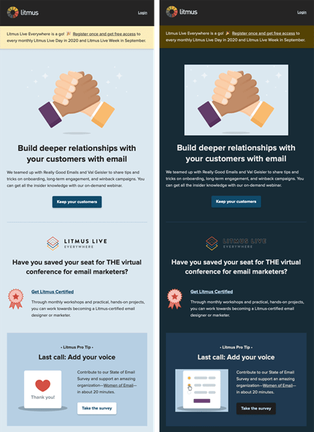
Don’t Go For Direct Color Inversion
Don’t fall for the direct inversion short cuts, not even for smaller elements. It becomes unpredictable how your reader’s ESP rendering engine processes it. You may end up with faulty-looking messages if you go choose to do so. Here’s a very famous example of what can go wrong coming from a leading email testing Litmus:
Partial Color Inversion:
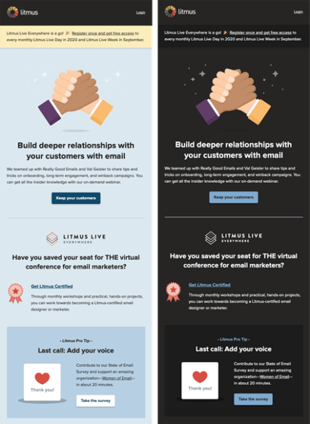
Full-Color Inversion:

Thus, you should optimize every element properly.
Properly Optimized Email Rendering In Dark Mode:
Wrap Up
Dark mode compatible email design isn’t hyper-complicated, but it does require practice. Keep these tips in mind, and you will be able to master them easily. You should approach the design and technicalities separately in the beginning. I hope you find this blog helpful.
Author Bio: Kevin George is Head of Marketing at Email Uplers, one of the fastest growing custom email design and coding companies, and specializes in crafting professional email templates, PSD to HTML email conversion and free HTML email templates. He loves gadgets, bikes, jazz and eats and breathes email marketing. He enjoys sharing his insights and thoughts on email marketing best practices on his blog.
About the Author

Peter Makeshoff
Peter Makeshoff is the founder and main author of Designer Daily.