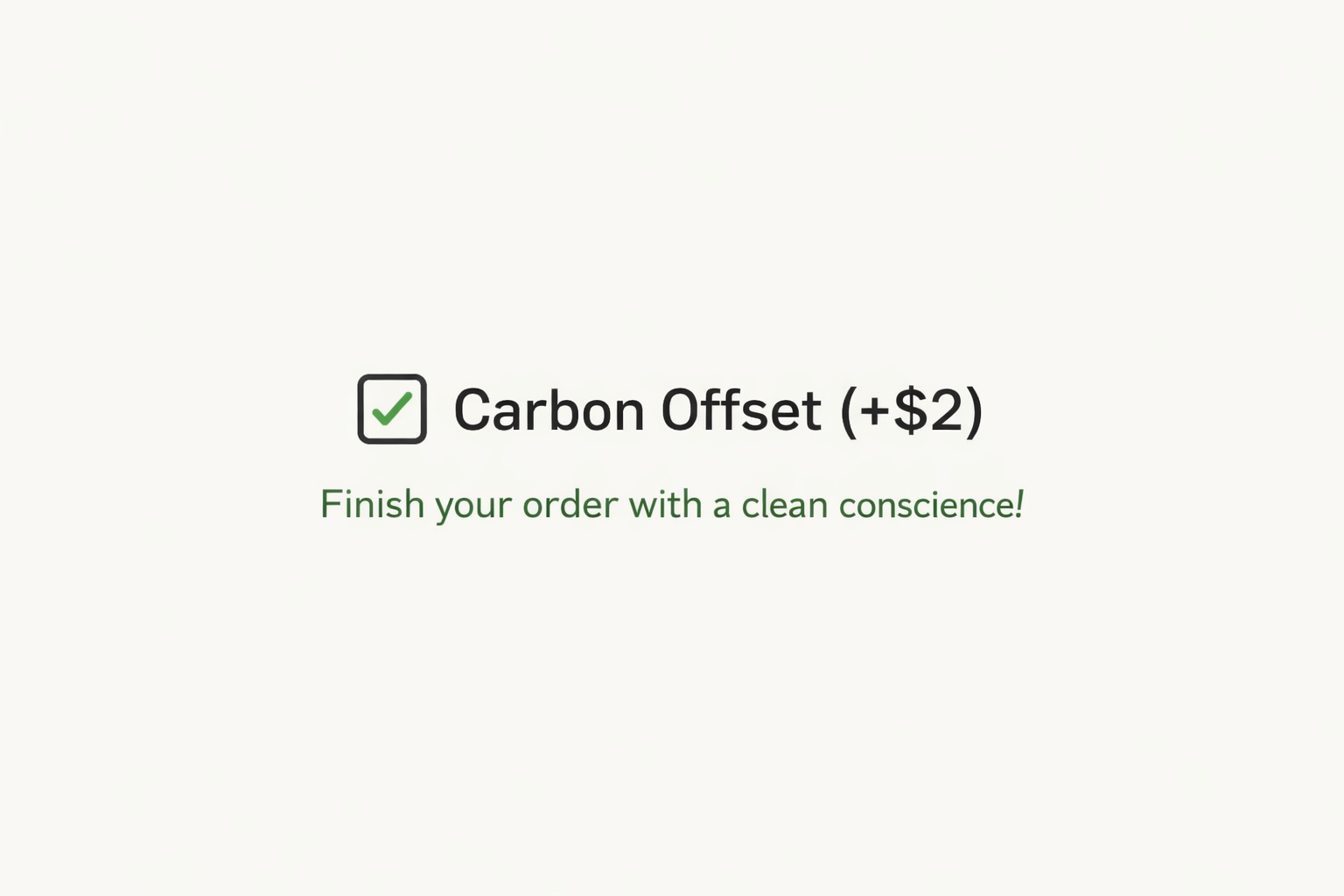
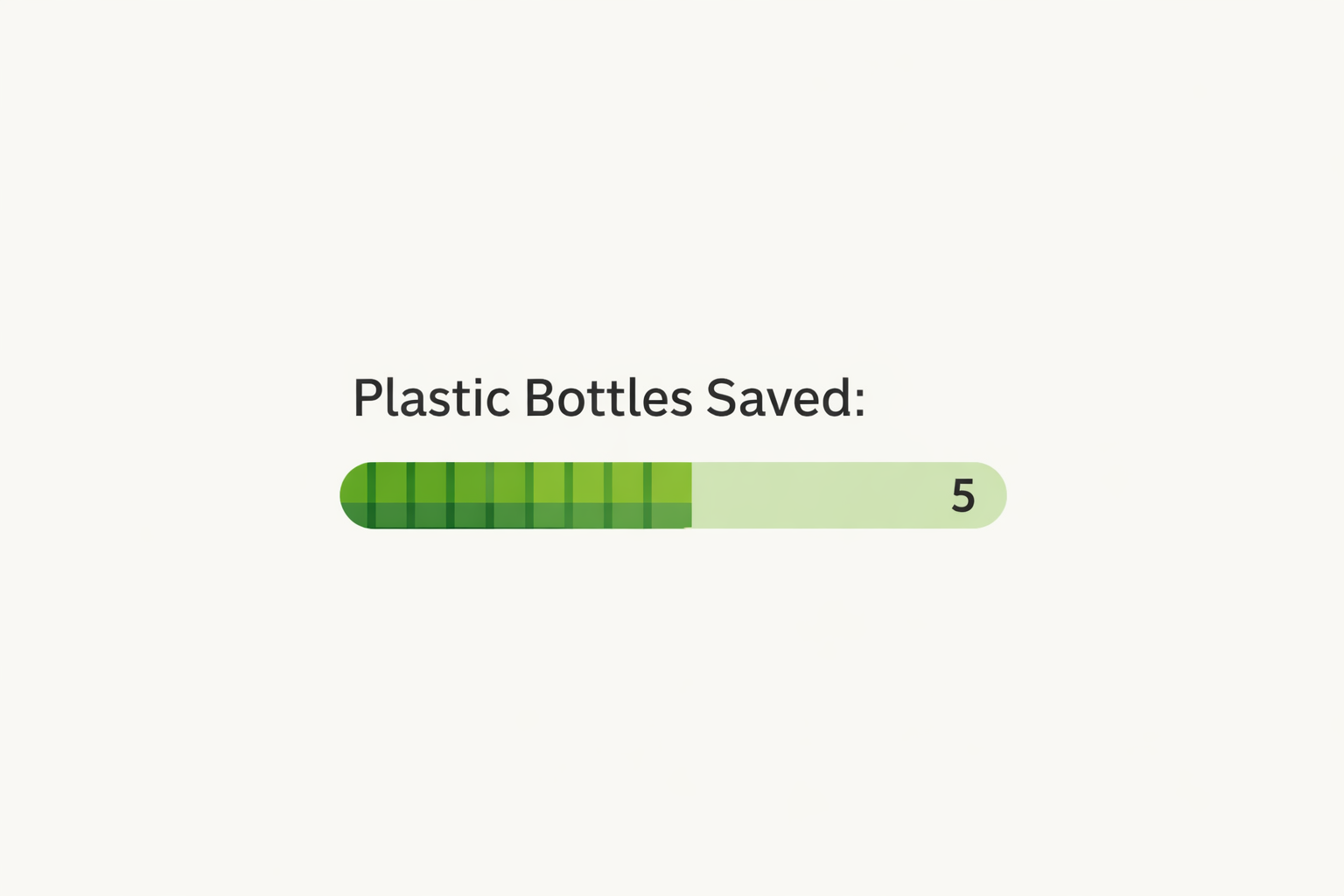
At checkout, a pre-checked box adds $2 for “carbon-neutral delivery.” A progress bar shows your “plastic savings” for refusing a bag. Your banking app awards “green leaves” for reading an article about conservation. These interfaces feel virtuous, but increasingly, they function as digital indulgences, transactional gestures that obscure systemic inaction and shift the burden of planetary repair onto individual consumers. This is the rise of sustainability dark patterns: UX that leverages our ecological anxiety not to drive change, but to manufacture consent for business-as-usual.
The Anatomy of a Sustainability Dark Pattern
These patterns exploit the gap between intention and impact, often through careful interface design.
1. The “Carbon Offset” Checkbox: The Guilt Launderer
- The Pattern: A small, optional fee at checkout to “offset” the emissions of a purchase. Often pre-selected or presented as the path to “finish your order with a clean conscience.”
- Why It’s a Dark Pattern:
- Misdirection: It frames the climate impact of consumption as a simple, cheap accounting error to be corrected with pennies, rather than a fundamental problem with the product’s life cycle or the company’s supply chain.
- Absolution, Not Reduction: It allows the company to market “carbon-neutral” products without changing their own high-emission operations. The user buys absolution; the company buys a marketing claim.
- Opaque Impact: The interface provides no transparency about which offset project is funded, its verification, or its actual, additional climate benefit (many offsets are proven ineffective).
2. The “Eco” Mode Toggle: The Efficiency Mirage
- The Pattern: A button or switch in an app or device that promises “reduced environmental impact” (e.g., “Eco Mode” for a delivery app, “Data Saver” for streaming).
- Why It’s a Dark Pattern:
- Burden Shifting: The most sustainable default for a delivery app would be consolidated, slower shipping. “Eco Mode” often makes the less profitable, truly sustainable behavior an opt-in choice, placing the cognitive and moral labor on the user while preserving the default of wasteful immediacy.
- Marginal Gains: The savings are usually trivial compared to the core impact of the service. Focusing on the user’s “Eco Mode” diverts attention from the company’s massive warehouse energy use or vehicle fleet emissions.
3. The “Green” Progress Bar: The Gamified Distraction
- The Pattern: A dashboard metric showing “plastic bottles saved” or “CO2 avoided” based on user micro-choices (e.g., refusing a receipt, skipping a bag).
- Why It’s a Dark Pattern:
- Trivialization: It gamifies systemic crises, turning planetary breakdown into a personal point system. The progress bar fills, creating a sense of accomplishment, while the company’s overall plastic production or emissions continue to rise.
- Moral Licensing: The positive feedback can induce a “moral license,” where the small digital reward psychologically permits less sustainable behavior later. “I saved five bags, so I can take one now.”
4. The “Sustainable” Tier: The Premium Virtue
- The Pattern: A “Green” or “Planet” subscription tier that costs 20% more, with vague promises of “supporting environmental projects.”
- Why It’s a Dark Pattern:
- Monetizing Ethics: It creates a two-tier system where ecological responsibility becomes a luxury add-on. Sustainability is framed not as a baseline imperative, but as a premium feature for those who can afford it.
- Lack of Accountability: The interface rarely shows what specific, measurable difference the upcharge funds, or how it’s audited. It’s often a branding surcharge.
The Designer’s Culpability & The Path to Integrity
These patterns succeed because they offer a seductive, low-friction solution to a high-anxiety problem. The designer’s role is often to make the complex feel simple. But in sustainability, oversimplification is deception.
Principles for Ethically Sustainable UX
1. Design for Systemic Transparency, Not Transactional Absolution.
- Instead of: A carbon offset checkbox.
- Design: An “Impact Breakdown” accordion at checkout. Show the estimated emissions from manufacturing, shipping, and use. Then show the company’s own reduction commitments for the next year (e.g., “We are reducing our shipping fleet emissions by 30% by 2025”). If you include offsets, make them one option under a larger header: “While we work to reduce our footprint, you can also support verified removal projects.”
2. Make the Most Sustainable Choice the Default and Frictionless Path.
- Instead of: An opt-in “Eco Mode” for slower shipping.
- Design: Make consolidated, slower shipping the default standard. Offer “Expedited” shipping as a clear, paid upgrade with its environmental cost stated: “Expedited shipping generates approximately 2x the emissions. Learn more.” This aligns business incentives with ecological outcomes.
3. Connect Micro-Actions to Macro-Context.
- Instead of: A “bags saved” counter.
- Design: A dashboard that contextualizes individual action within the system. “You’ve saved 5 bags this month. Our goal is to reduce virgin plastic in our packaging by 50% by next year. Here’s our progress.” This frames the user as part of a collective effort demanding corporate accountability, not a solo hero.
4. Prioritize “Footprint Reduction” over “Green Premium” Pricing.
- Instead of: A “Sustainable” premium tier.
- Design: Build sustainability into the core product offering. If there is an extra cost for truly better materials, explain it with radical transparency: “This shirt costs $8 more because it uses 100% traceable, organic cotton from farms practicing regenerative agriculture. Here’s the farmer’s story.” The value proposition is quality and traceability, not just virtue.
The Ultimate Test: Does Your Design Reduce or Redecorate?
Before shipping a “sustainable” feature, ask:
- Does this design change the user’s behavior toward a lower-impact outcome, or just their feeling about a high-impact one?
- Does it highlight the company’s own systemic responsibilities, or only the consumer’s transactional choices?
- Is the ecological claim specific, verifiable, and meaningful, or vague, unproven, and marginal?
True sustainable design is uncomfortable. It often means designing less consumption, slower convenience, and more transparency about uncomfortable truths. It moves away from dark patterns that greenwash and toward bright patterns that illuminate—making complex systems understandable, aligning user choices with planetary limits, and holding the most powerful actors, including our own companies, accountable.
Our role as designers is not to make the unsustainable feel sustainable. It is to help design a world where sustainability isn’t a feature, but the foundation. That begins with interfaces that tell the truth, challenge the status quo, and empower real action, not just assuage guilt.
About the Author

Peter Makeshoff
Peter Makeshoff is the founder and main author of Designer Daily.