A brightly colored website can be very hard on the eyes. Bright colors can be fun and eye-catching, but they are also exhausting to look at, especially in low light conditions.
Web designers have begun to turn away from brighter colored websites, adopting dark website designs instead. Dark website design has generally been found more attractive and stylish.
The use of darker colors is often more elegant. Many web designers have found that clients have begun requesting dark-colored website designs.
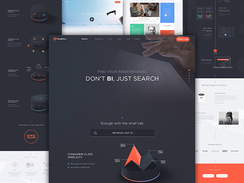
https://dribbble.com/shots/1917495-Thoughtspot-Website
Darker website design is not ideal for every situation, so take that into account when assessing what colors to use for your site design. It’s also easy to fall into increasingly common design dead ends when designing a dark website. If you’re not careful, the darker colors can lead to a serious loss of usability on the website.
Still, a dark website design can work very well if you just keep in mind your design fundamentals, as well as these dark website design best practices.
Dark Websites Should Still Make Use of Whitespace
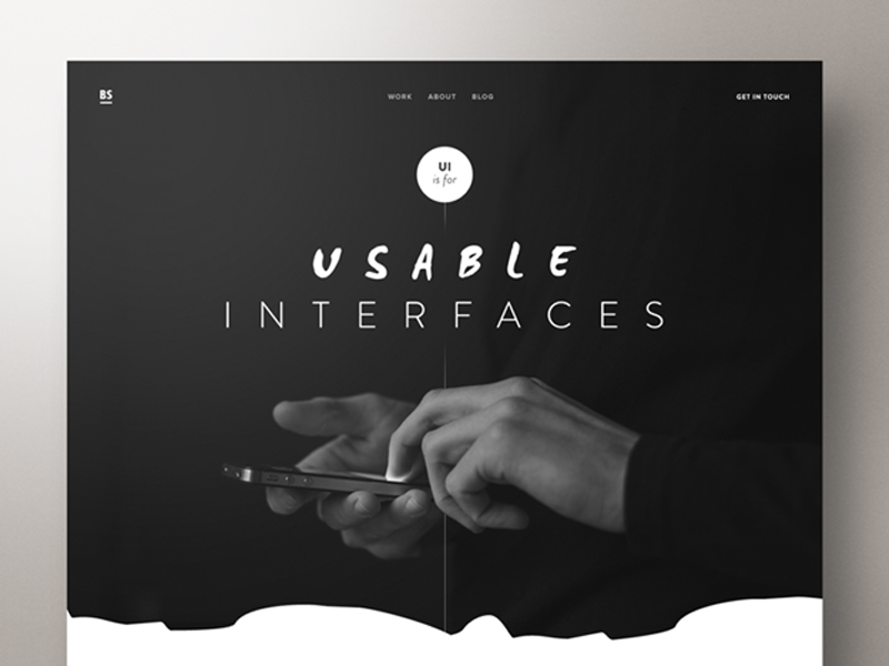
https://dribbble.com/shots/2034557-UI-Designer-Portfolio-Website
Or is it ‘blackspace’ in this context? In any case, you should be using negative space even if your site design has a dark background. It’s no less effective at increasing the overall usability and readability website than it is for websites that use lighter colors.
In fact, good use of negative space can help keep darker colored websites from seeming heavy and oppressive. Darker colored backgrounds easily seem cluttered even with fairly few items. Giving everything on the page space to breathe.
Use negative space to frame your site’s pages to give the page more of a sense of space, for instance. This will give every element on the page its own space, making it easier to understand.
Make Sure the Text is Readable

https://dribbble.com/shots/3791707-Mutt-Motorcycles-Day-11
One of the greatest challenges of designing a dark website is making the text readable. The text is an incredibly vital part of any website since your site is trying to communicate info, ideas, or messages to viewers.
You should think about how exactly you are going to make all of your text visible before you decide on a dark website design.
Dark website text needs to avoid eyestrain, an all too common problem for dark websites. Eyestrain will drive away site visitors and turn your dark website design into a hindrance rather than a help.

https://www.apple.com/mac-pro/
First things first. Make sure the text is in a color that is visible on the dark background. Yellow is often hard to see, but white or off-white can work very well. Don’t layer dark colors on dark colors.
Another couple things that will help the text readability on a dark background is making the paragraph spacing larger and larger text sizes. Text that is too close together on a dark background runs together even more so than text on a lighter background. Utilize kerning and leading to help as well to help with these issues, as well.
Choosing Fonts
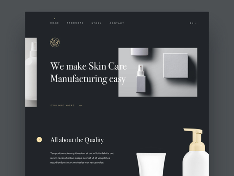
https://dribbble.com/shots/3749512-Skin-Care-Manufacturing-Homepage
Readability on any website is heavily affected by the font. Sans Serif fonts are generally more legible on screens, as they look good at any resolution.
However, since you might want a degree of elegance on your dark website design, you might opt for a Serif font instead. Serif fonts are often more old-fashioned and elegant.
Consider having headers, navigation bar text, and other larger prominent uses of text in a Serif font, while the body text is in a clear Sans Serif font.
There are plenty of places to choose a font from, starting with articles containing curated fonts to font galleries and font shops.
Keep the Color Scheme Minimal
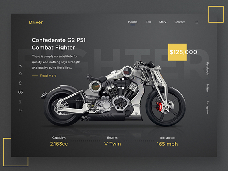
https://dribbble.com/shots/3901713-Driver
Color palettes for dark website designs should follow the same rules as those for brighter colored websites. Stick with two or at most three colors.
You don’t want to confuse viewers or cause a sense of visual clutter. Since dark colors tend to be heavier, you also want to avoid making the color scheme seem too oppressive.
Certain bright colors, like yellow, seem harsh on dark backgrounds. More colors only complicate the use of a dark background, so keep it simple. Play to the elegance imbued by a dark color scheme.
Choosing to include a single bold color can really help. Just use it discretely throughout the site design.
Your site will still have the overall dark color scheme, but the bolder color will add a touch of life and liveliness while the design remains unified.
Glowing lights and effects look very nice on a darker background. The glow should preferably pull from your color scheme. Using a glow effect can be a great way to draw attention to your site’s call to action.
Showcasing
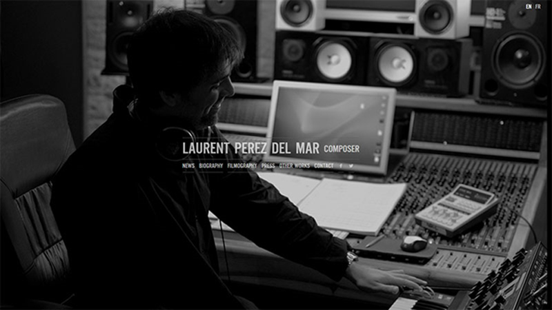
http://www.laurentperezdelmar.com/
Dark website backgrounds are great for showcasing videos and images.
They can be a great choice for photography or art websites, as the colors of the images really pop against the darker background. If showing off visuals is your website’s goal, select a dark color scheme and design it so that the images are front and center.
Think About Atmosphere
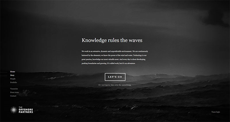
https://theoffshorepartners.com/
A dark website can have a lot of different atmospheric feelings depending on how it is used. You can make a dark website design seem industrial or elegant, grungy or professional.
A lot will depend on the font and textures you use. When considering using a dark website design, think about what kind of feel you want the completed website to have.
Think About Style Switching
A lot of text-heavy websites and even apps now have an option to switch the color palate between light and dark (often labeled as ‘night mode’). People have different preferences of which one they prefer to read, and it can vary depending on mood or lighting.
Offering an option for users to switch between light and dark color palettes may be more work for you as a designer, but it is a feature that users will really appreciate. Just make sure that both versions are functional and all text is readable.
Conclusion
Dark website design can be a great choice for your website if you think it through carefully.
Remember to focus on the user experience first. Keep in mind the website design fundamentals and you may have sleek and elegant new site.
About the Author

Bogdan Sandu
Bogdan is a designer and editor at DesignYourWay. He's reading design books the same way a hamster eats carrots, and talks all the time about trends, best practices and design principles.