The internet is useful for many things, but the thing that we use it most often for, probably, is looking for reviews of things that we want to try. Honestly, why wouldn’t we? The freedom with which information can be shared and found with on the internet encourages us to look for it. With the competition for attention being as high as it is, in terms of reviews, it is not surprising that a large number of them have started making design choices that enhance the engagement of the people. This includes any kind of reaction that results in people being more trusting of the reviewer, as well as engaging with the reviewer in ways that the average text is unable to do. While there are many design choices that come with creating a review, there are some key ones that multiply the desired effect to a high degree. We are going to be exploring these specific key aspects through several examples of reviews on different websites.
LearnBonds
LearnBonds is a website that dedicates a significant portion of their resources in identifying financial opportunities and understanding the financial companies that are currently driving change within the industry. As a result, they create a huge number of reviews of different companies and products on a week by week basis. In this process, they have elevated the art of creating a review with an official air about it to a new level.
One of the simplest and most obvious examples of this is the Bitcoin trader review page from LearnBonds. The design is relatively simple, but it is one that manages to quickly convey the information that it was created to convey. One of the key features you will see is the fact that the star ranking system is available for viewing at the very top of the review. This design choice allows the review to provide the users with the information they came here to find out almost immediately. While the information might not be detailed, it is simple, general and conveys the attitude of the website about the product quickly. But the design of the website goes a step further. In order to provide enable the user to find more detailed information faster, the website creates a box. This box attracts the attention of the reader immediately, because of the way it stands out. This is where all of the information on the subject of the review is contained in a quick and easy to get through manner. Moreover, the box contains a quick indication of whether the review trusts the product or not by inserting either a green or red shield and the top left of the box. This shield is almost on the same level as the star rating. The green shield means approval and security, the red means the opposite. The combination of the number of stars and the colour of the shield provide the most important information for a user: whether the service is good and whether the service is secure.
Such a quick and succinct way of conveying information is the result of thoughtful, but simple design. It is enabling users to understand whether the service or good they are trying to purchase is reliable, trustworthy and good enough to be paid for within seconds of arriving on the website. Efficiency and usefulness are always the top priorities for designers, so this can be considered a highly successful design.
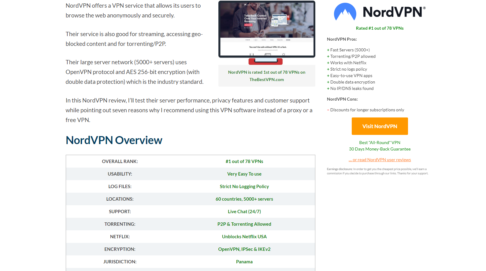
thebestVPN
The very first thing that thebestVPN website does well in their review is to help the user find the information they need and further establish a detailed understanding of it. The quick summary list on some of their reviews, specifically in the case of their NordVPN review, provides all of the key information required by the users to be known and allows them to be aware of the key qualities of the company.
What is even more interesting is that there is a sidebar to the entire website, that remains sticky at all times, without getting in the way of the user’s experience. If the product is good (or if it is bad), the sidebar will let you know. This is done by the sidebar containing either the link to the service or not containing the link. Although, in the case of this website, the sidebar that doesn’t move does not get in the way. The thing with the stick tags and bars is that they easily get very annoying, which proves to be a detriment to the overall trustworthiness of the website. In the case of thebestVPN.com though, the stick tag does not get in the way. Not only does it not get in the way, but the way it follows the person reading the article, on the right side of the page, allows them to quickly understand whether they want to get a hold of the product at all. If the product is good, the sidebar reflects it, making it a quick and easy source of information.
All of this is the result of smart design – by placing the stick bar in the area towards where the eye moves naturally when reading, the designer ensures that the reader will engage with it. But placing the bar in a way that does not jump out and does not bother the reader when reading through the article also ensures that the website remains trustworthy and is not thought of as an ad. Good design choices!
Mashable
Mashable is a popular site, full of all kinds of progressive people looking to connect and speak their mind. But what is really interesting is that beyond simply being an online magazine of sorts, they also provide reviews of different services that people of a certain age might find interesting. In doing so for a while, they have managed to stumble onto something more or less interesting when it concerns designing engaging and trustworthy reviews. Most of their design philosophy seems to be rather simplistic and unbothered with tricks to engage the public. But one thing that they do very successfully, and that results in the public being very engaged, is the way they use media. Specifically, the way they place their gifs and pictures. Their OKCupid review is one interesting example of this practice. While using media is not something that is new to the industry, the way Mashable goes about placing these allows for maximum engagement from the audience, simply by breaking their engagement from the content that they are reading. The style of the writing in Mashable is one that is self-aware and often comical. By letting Gifs and images dominate certain parts othe page, the website allows people to further enjoy the comedy of each page. They maximize the fun and thus keep the reader even more engaged with the article. In doing so, the writers and designers bring some humour to their articles and also introduce interesting concepts to the minds of the people. This way they are able to earn trust and earn more engagement, which is in the end, what most of these reviews are created for.
The page also takes out quotes from the overall article and inserts them as quick summaries in certain parts of the page. These little quotes are either very fun or very descriptive and are really useful in doing several things. The first is the overall look of the article – providing structure with these quotes allows for breaks in the text and for the size of the article to be less intimidating. The snippets themselves are interesting and noticeable, while also being quotes from the article, which means that some of them result in the interest of the users rising and drawing them back into the article. Finally, these quotes, being placed strategically by designers, draw the attention of the users towards the end of the text, resulting in them in staying on the page longer and scrolling down. This means they get more engaged and that they might end up actually reading the articles.
About the Author

Peter Makeshoff
Peter Makeshoff is the founder and main author of Designer Daily.