Sometimes, when focusing on designing things, we forget the obvious and let horrible mistake slip through. In this post, you can find examples of what happens when you forget to proofread and go to print carelessly.
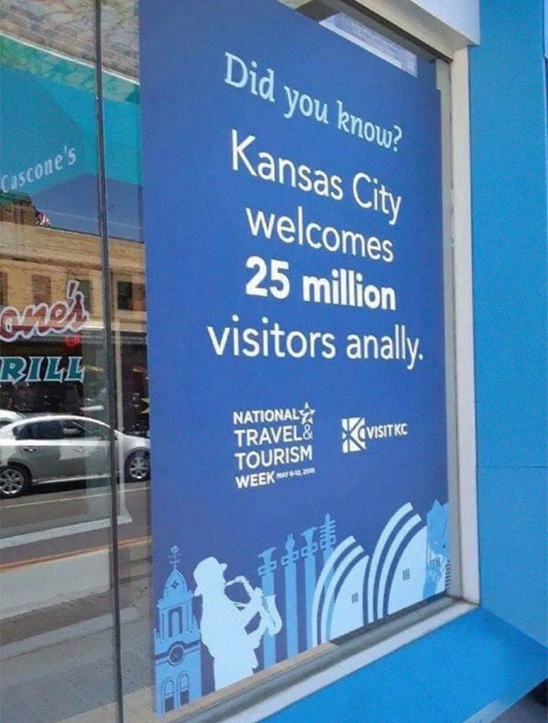
Welcome to Kansas City
What was meant to be a welcoming statement becomes a warning for most.
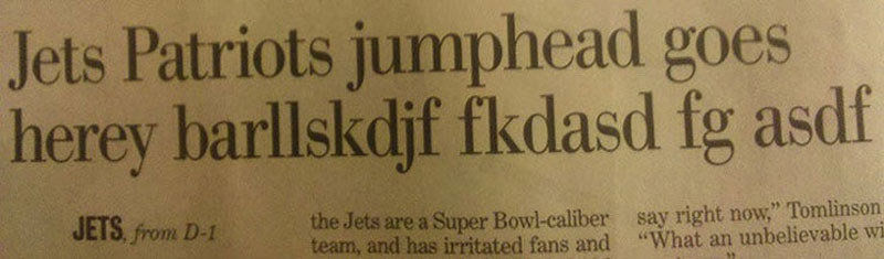
Not Lorem Ipsum
But not much better, looks like somebody slammed the keyboard.
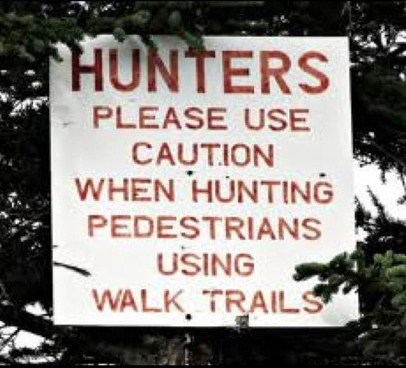
Pedestrian hunters
The lack of punctuation and spacing turns this message in a different one.
Orignal
Making typos may be a way to be original, but it will not make you look more professional.

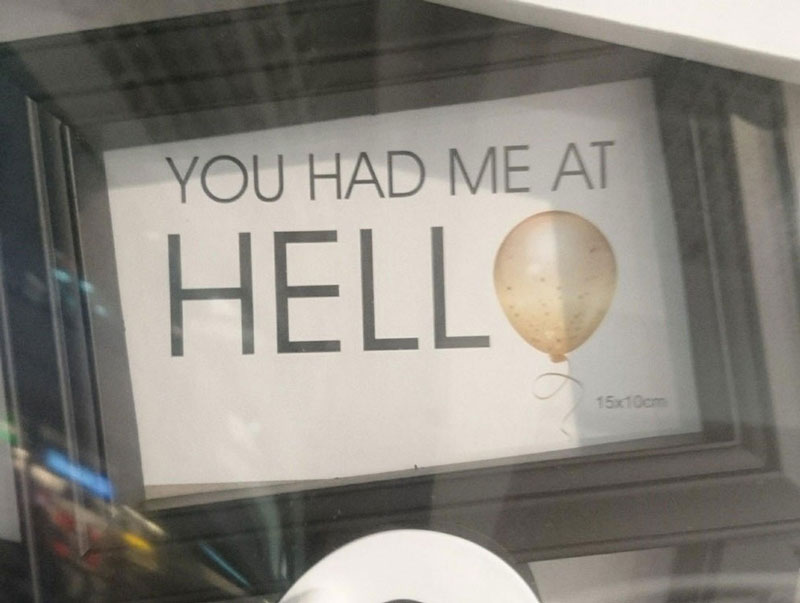
Hell
Sometimes replacing a letter with a picture can be a good idea, sometimes not.
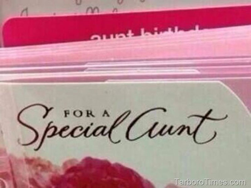
For a special aunt
Some fonts are more readable than others.
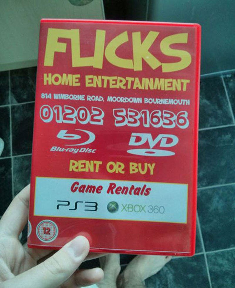
Flicks
Some mistakes are not typos, but bad kerning can change the meaning of words as well.
Shitake
Bad kerning again, with too much space this time.

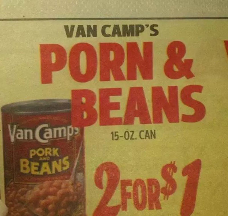
Porn & Beans
This looks like something autocorrect would do, but I doubt the designer was working with his phone.
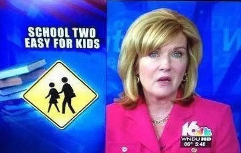
School too easy for graphic designers
In this graphic designer’s defense, working for TV as a designer must be quite stressful as you need to always be producing new work quickly.
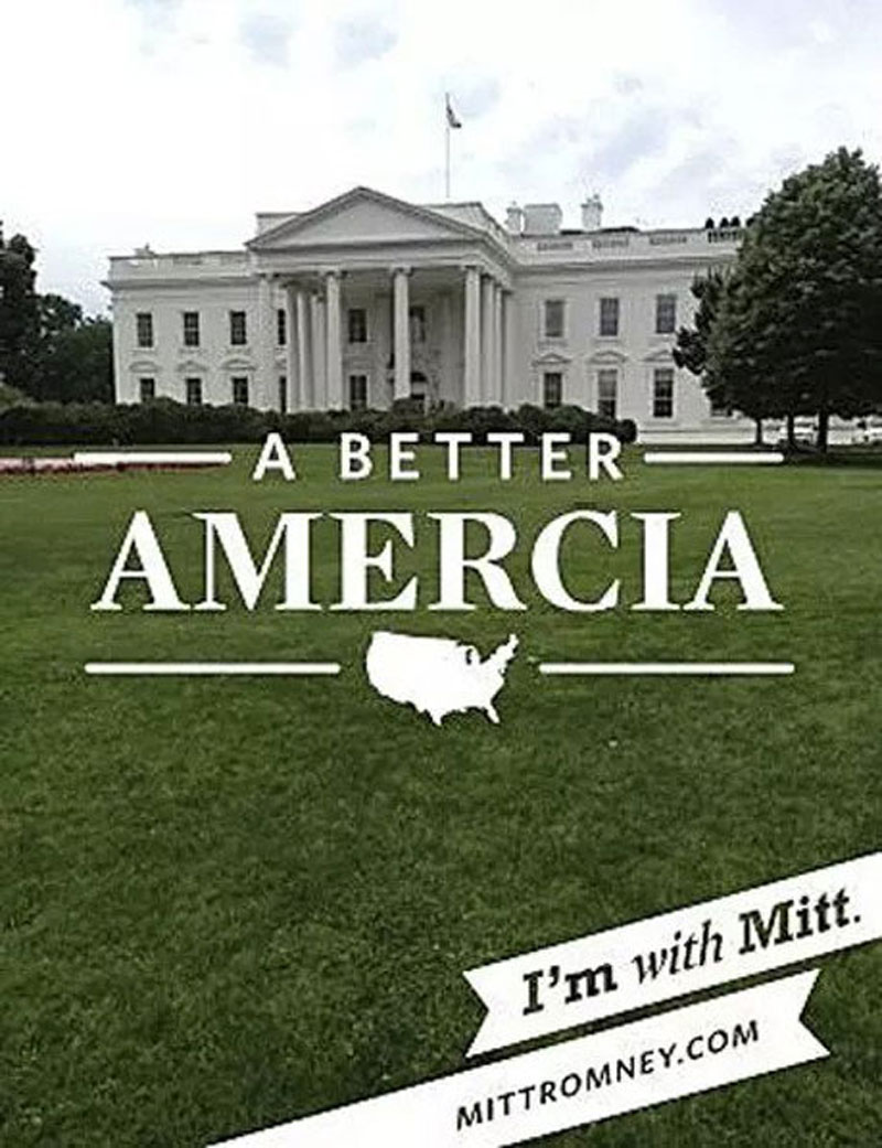
A Better America
This campaign slogan for Mitt Romney had a typo in the word America, which is a shame.
About the Author

Peter Makeshoff
Peter Makeshoff is the founder and main author of Designer Daily.