Mobile navigation is one of the essential aspects of mobile application design. In a time when many of us use mobile phone applications to carry out online tasks, the ability to use an application quickly and efficiently makes all the difference. A mobile application should work intuitively in a way that provides you with what you need when you need it.
However, designing an effective mobile navigation system for a mobile application can be complex. Hardware and software are continually changing and evolving. Phones come in different strengths and sizes.
And unlike a desktop or laptop, mobile screens are small, and therefore each area or aspect of a screen becomes increasingly more important. For this reason, navigation systems should be minimal.
When a user opens up an application, they need to be able to understand where to go, and how to get there. If they cannot do this, you will lose them.
This means that designing an effective navigation system for a mobile application is crucial.
Get to know your audience
Without understanding who will be using your design, it can often be difficult to gain insight into how to begin designing.
Audience research assists with making better choices when working towards a design. It will also assist with gaining consensus on how these designs should be implemented.
If you are unsure where to start, get some UI design inspiration by looking at the competition.
Without an effective navigation system, the website or application will suffer. However, creating an interface which will be effective across different interfaces or screen sizes may not always be easy.
You, as a designer, have to balance business goals with technical constraints, stakeholder strategy, content needs and user behavior.
The Principles of Mobile Navigation
Mobile is different
Although desktop computers are seen to be more powerful than a small screened computer like a mobile phone, smartphones are more powerful than desktops in that they work quickly, are highly personal, and are carried with us.
A smartphone has sensors which can detect location, movement, acceleration, orientation, proximity, traffic conditions and much more.
A mobile phone is very different to a desktop computer. So, when designing for a mobile phone, take the following points into consideration:
- Go Zen: edit your features carefully, only including those which will assist the app to work intuitively, and with efficiency.
- Be unique: With so many applications to choose from, add a special interface, which will motivate a user to pick yours.
- Be effective: Mobile phones are very personal. We use and interact with them constantly. Apps that are fun, efficient, reliable and delightful to use bring pleasure. People will become attached to the experience.
Mobile devices have their own contexts
It’s important for designers to understand when and why we use mobile phones. This enables an enjoyable application experience.
Mobile phones are often used to carry out micro-tasks such as banking, checking a location, searching for recipes or booking tickets. Understanding when people use phones adds to creating a valuable experience. Most people use phones when they are bored, busy and lost.
Bored
Waiting at an airport, traveling by train or passing time often provide opportunities for phone use. People may often play games or search for information. A mobile app can provide a fun or playful experience which a person might become immersed in. In this context, applications can be geared towards longer time sessions.
Busy
Carrying out tasks while in a rush or during a quick break means they need to be efficient and often might be carried out with only one hand in a busy environment. Bold design is important.
Lost
People in unfamiliar surroundings or who are searching for somewhere new in a familiar surrounding might be considered to use a phone while lost. Create an application which wouldn’t use too much battery power, and which can be extended to offline support.
Guidelines for creating a Mobile Application
If the interaction between the user and the app is not instant, then the app will not have an audience. If a user uses the app, there needs to be an instant response, even while the app may process this input.
Style: An app which is both attractive and intuitive will be extremely valuable. Place a lot of attention into the finer details of how the app is styled to give it a gorgeous interface.
Thumbs: Ensure your user will be able to use thumbs to get your app to work. Even in a two-handed grip, your user will likely use thumbs to get the app to work.
Scrolling: Try to avoid a scrolling screen, which can be frustrating and unreliable when in a hurry.
Targets: Thumbs present large areas when working on a small screen. Consider what this means for the various features or targets of your app.
What size would you need numbers or letters to be? Where do you space your features? Planning carefully helps. It wouldn’t be helpful to place a return and send button close together on an SMS application, for example.
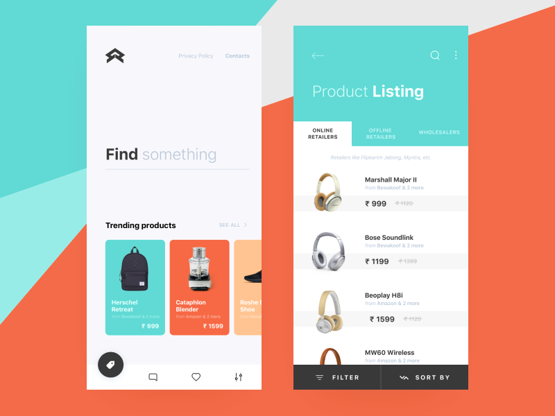
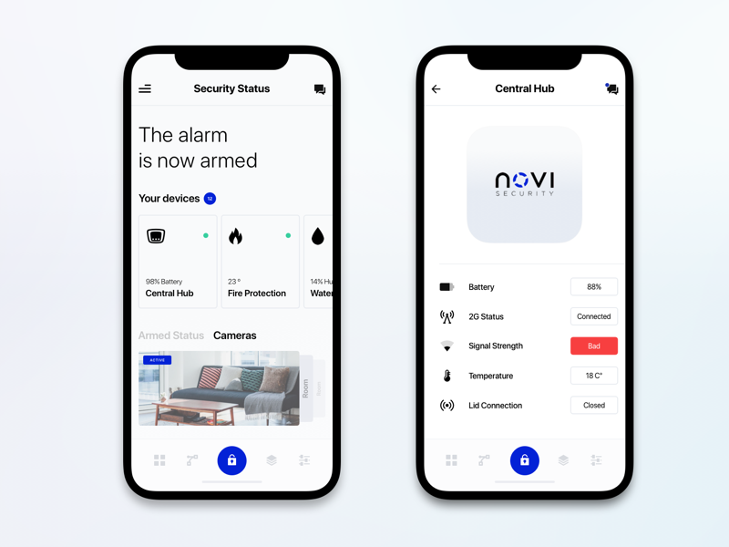
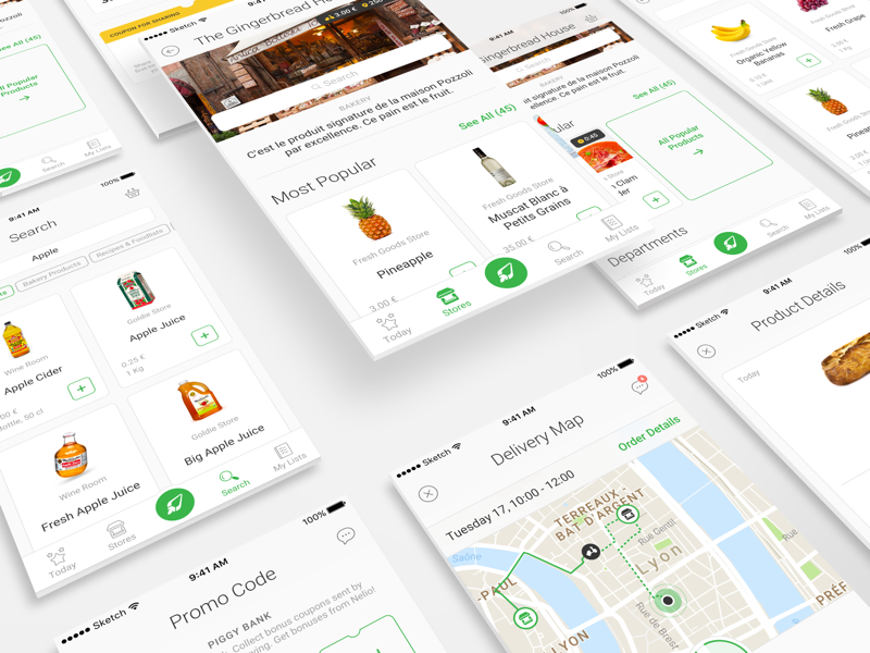
Navigation models
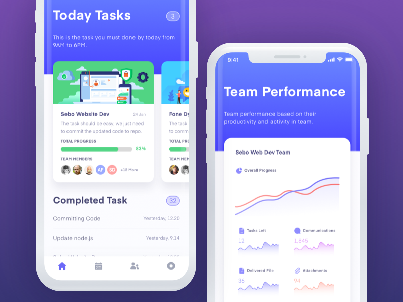
There are many navigation models for mobile apps. Choose one which will be most effective for your application.
None: Most helpful for isolated screen utility apps.
Tab Bar: Three to six content areas.
Drill Down: Content placed in a hierarchy.
Design interactions to be tappable
With a mobile interface, the user won’t be clicking on options or instructions. Instead, the user taps a screen.
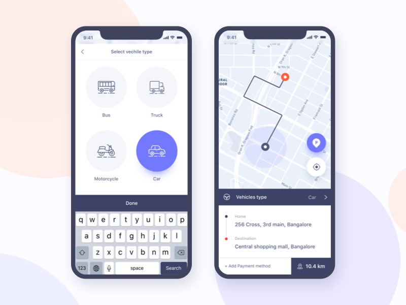
Therefore, improving the quality of this interaction will improve the user experience. Ensure that your app doesn’t respond to accidental tapping or touch, as this will frustrate the user.
Create buttons which are large enough, and spaced widely enough to create a usable interface, but not too far apart that they become unreachable.
User-friendly keyboards
Assist your user with typing keyboards which are easy to use, and which is most useful for the information being submitted.
If your application requires a lot of typing, ensure that it can be used in landscape position to enable a larger keyboard.
Gestures
If your app enables the use of gestures, such as a screen swipe to turn a page, you might have to decide how to reveal their availability to the user.
Two-handed gestures are often difficult for a user, and not an essential part of your app. Most apps use controls which can be used with a single finger.
The benefits of designing for mobile
Apart from not being left behind as people use smaller screens to carry out everyday tasks, there are other benefits to embracing a mobile-first approach:
- Mobile users needs are met.
- This allows designers to focus on content, structure and navigation details.
- Web pages become easier to navigate, which improves the overall experience. This assists visitors with wanting to visit a site.
- A mobile first approach produces fresh concepts and clean designs.
Conclusion
In order to create an effective design for a mobile application, a different perspective is needed. Mobile applications need to be simple, responsive and intuitive. This is important when designing for clients.
Designing for the small screen can be challenging. Not all design concepts can be implemented on smaller screens. Different sizes or technical capabilities of phones means that designs are often complicated.
There is no single solution to designing for mobile apps. Instead, focusing on what your audience needs, and providing effective and well thought out designs to enable pleasurable user experiences is crucial.
By conducting research and exploring how a mobile app interacts with users, a designer can provide a quality product which offers value and efficiency.
About the Author

Bogdan Sandu
Bogdan is a designer and editor at DesignYourWay. He's reading design books the same way a hamster eats carrots, and talks all the time about trends, best practices and design principles.