
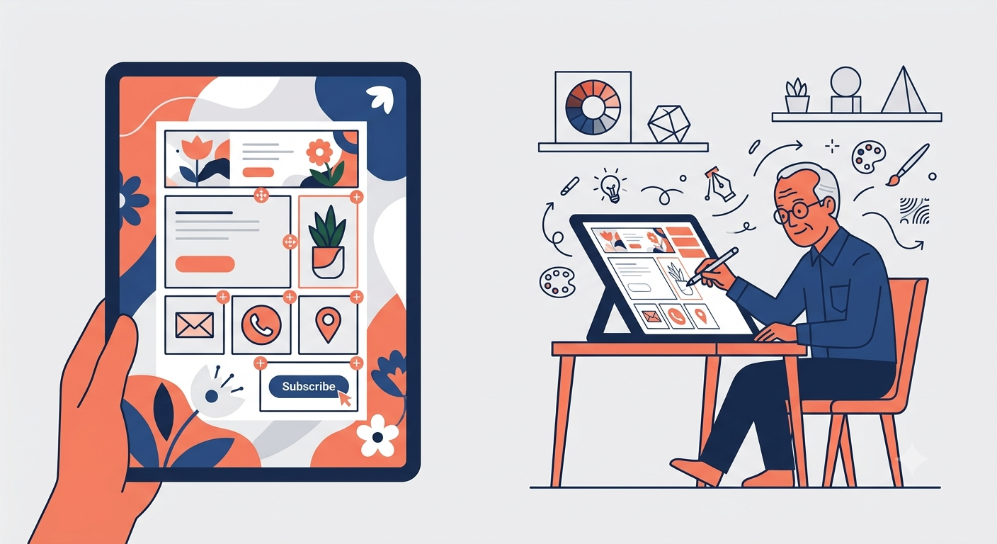
Email has quietly outlasted every other digital channel. Not because it is flashy. Because it is personal. The inbox remains the one place where a brand’s message sits alongside messages from friends, family, and colleagues. That proximity changes the stakes. A well-designed email does not interrupt. It belongs.
Here is how to design emails that feel like they were made for the recipient, not just sent to them.
The Shift: Email as Experience, Not Broadcast
For years, email design meant a logo at the top, a hero image, some copy, and a button. The format was fixed. The experience was static. That model is fading, because recipients have learned to ignore it.
The brands winning the inbox in 2026 are treating email as a canvas for experience. They are using design to reduce friction, signal personality, and invite interaction .
Interactive Email: When the Canvas Invites Participation
True interactivity is design that allows recipients to engage directly with the email’s content, without clicking out to a website. It can take many forms :
- Polls and surveys. A customer feedback form embedded in the email removes the barrier of opening a browser tab. Response rates can increase dramatically .
- Image carousels. Subscribers can swipe through product images or property listings without leaving the email. One campaign saw a 10–20% boost in engagement .
- Accordion sections. Expandable content keeps emails clean while still offering detailed information. Ideal for FAQs or product details .
- Gamified elements. Scratch cards, quizzes, and spin-to-win wheels build anticipation and encourage repeat opens .
The barrier to entry has lowered. Marketers no longer need to code from scratch; reusable interactive modules are becoming standard .
Typographic Design: When Words Are the Visual
A striking visual does not have to be a photograph. Some of the most memorable emails use nothing but text and color. Typographic design strips away everything but the message, forcing the design to be honest .
- Go big. Large type is an intentional design move. It communicates confidence and clarity .
- Use contrast. A bold font color against a contrasting background is a reliable technique for grabbing attention .
- Keep it narrow. A single-column layout (around 500px) improves readability on mobile and creates a distinct, almost letter-like feel .
- Minimize padding. Tighter spacing between text blocks creates a more cohesive, condensed message .
Minimalism: The Power of Restraint
The minimalist approach removes extra elements, allowing the text to stand out and the message to come through clearly . This is especially popular for automated onboarding emails in B2B SaaS, where the priority is clarity over spectacle .
Its power is in its familiarity. A clean, text-forward email can feel personal and natural, similar to a message sent through Gmail. It removes the noise and gets straight to the point .
Considerations for the Modern Inbox
Dark mode is a primary design pillar. Over 80% of mobile users enable dark mode. Designing for it from the start ensures contrast and readability across all settings .
Mobile-first is non-negotiable. Mobile devices now contribute to over 67% of internet traffic. Emails must be tested on phones before being sent .
Accessibility is standard. Proper heading hierarchy, high contrast ratios, and descriptive alt text are no longer optional. They are expectations .
The Bottom Line
Email remains the most effective marketing channel because it is the most personal. Treating the inbox as a canvas for genuine experience—whether through interactive polls, bold typography, or minimalist clarity—is the next evolution.
The goal is not just to be seen. It is to be remembered.
About the Author

Peter Makeshoff
Peter Makeshoff is the founder and main author of Designer Daily.