A stunning ad doesn’t matter if no one stops scrolling. In 2026, the Facebook algorithm has fundamentally changed: creative doesn’t just attract attention, it is the targeting. Meta’s Andromeda algorithm now reads your visuals, audio, and captions to determine who should see your ad. Feed it the wrong signals, and your costs skyrocket. Feed it the right ones, and your ROI follows.
Here’s how to design Facebook ads that convert across every placement.
The Algorithm Has Changed: Creative = Targeting
Historically, you picked an audience first, then designed an ad for them. In 2026, that model is dead. Meta’s AI now analyzes your creative assets directly, interpreting visual cues, sounds, and text to decide who gets served the ad.
If you’re selling hiking boots, your ad needs to show a trail, mud, or a boot in action. The AI reads those signals. If your ad is a generic product shot on white, the algorithm has no idea who to show it to, and your CPMs will rise.
The rule: design for the algorithm’s vision, not just human eyes.
1. Feed Ads: The High-Intent Workhorse
Facebook and Instagram Feeds remain the most stable, high-volume placements. They excel at both branding and direct conversion because they allow for deeper storytelling and clear calls-to-action.
What works in 2026:
Authentic, “Ugly” Creatives. Polished, studio-shot ads are getting filtered out. Ads that look like organic content (lo-fi video, user-generated footage, founder selfies) are bypassing mental ad-blockers. One demand gen pro noted that “ugly ads” that appear platform-native often see dramatically higher CTRs because they don’t trigger the viewer’s internal “this is an ad” alarm.
Carousels are back. Instead of one image, use 3-10 cards to tell a story or showcase multiple products. Meta’s current trends show carousels performing very well, particularly for e-commerce.
Text-heavy statics. Don’t sleep on static images. They still drive 60-70% of conversions on Meta. A bold, text-only graphic that states a clear problem/solution can outperform a video if the hook is strong enough.
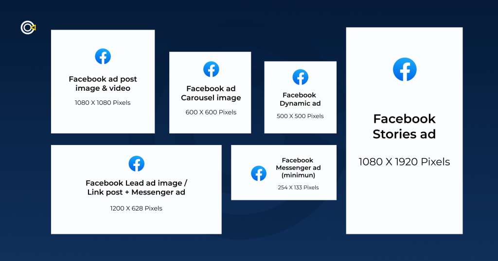
Specs: 1:1 (1080×1080) or 4:5 (1080×1350). Keep critical text away from the bottom 15% (where the action buttons sit).
2. Reels & Short-Form Video: The Discovery Engine
Short-form video is no longer just for “brand awareness.” With YouTube Shorts hitting billions of views and Instagram prioritizing Reels, this format is now a full-funnel performance driver.
What works in 2026:
The “Hook” is visual. You have 1-3 seconds to stop the scroll. Do not start with a logo fade-in. Start with a visual question, a surprising result, or a person talking directly to the camera.
Platform-native pacing. Don’t export a horizontal TV ad and crop it. Shoot vertically, use captions (sound off is default for many), and embrace fast cuts. The content should blend into the feed, not interrupt it.
Founder-led content. People trust people, not brands. Videos featuring a founder or an employee explaining a product’s “why” are generating up to 25% more leads than faceless corporate animations.
Specs: 9:16 (1080×1920). Duration: 15-60 seconds is the sweet spot. Text must be in the “safe zone” (center 80% of the frame) to avoid being covered by the like/comment buttons or profile icons.
3. Stories & Reels: The Full-Screen Immersion
Stories (and Reels placements) offer a full-screen, distraction-free environment. Because users tap through them quickly, you have about 5 seconds to convey your value proposition before they swipe away.
What works in 2026:
Vertical-First Design. Never run a horizontal letterboxed video here. It breaks the immersion. Use the full 9:16 canvas.
Dynamic Elements. Use stickers, polls, or countdown timers. In Stories, interactivity stops the swipe. A poll about a pain point engages the user immediately.
Sound & Silence. Since many users browse in public, design your Story to be understood with captions, but use trending audio to boost reach when sound is on.
Testing: Finding Your Winner (Without Wasting Budget)
Even the best hypothesis needs validation. With creative driving 56% of campaign outcomes, a systematic testing approach is non-negotiable.
1. Use Advantage+ Creative (AAC).
Don’t just upload one image. Meta’s AI can now generate multiple text variations, adjust brightness, and even animate static images. Turn on Advantage+ Creative to let the algorithm serve the best combination to the right user. Studies show this can increase sales by 1.2x to 7.4x.
2. Dynamic Creative (DCO).
Upload 3-5 headlines, 3 images/videos, and 2 descriptions. Meta will mix and match them in real-time to find the winning combo. This is more efficient than running 10 separate manual ads.
3. The “Big Swing” Test.
Don’t test red vs. blue buttons. Test Video vs. Static or Problem-focused vs. Benefit-focused. Make the differences obvious so the data is conclusive.
Key Takeaways
- Creative is the new targeting. Diversify your assets (images, short video, carousels) to give the AI enough data to find your customers.
- Authenticity beats production value. User-generated content and founder-led videos build trust faster than polished commercials.
- Optimize by placement. An ad that works in the Feed will fail in Stories if it’s not 9:16. Use the platform tools to customize aspect ratios per placement.
- Let AI do the heavy lifting. Use Dynamic Creative and Advantage+ to automate testing, but always keep human oversight on the final brand message.
In 2026, the brands that win are not the ones with the biggest budgets, they are the ones with the smartest creative systems. Design for the algorithm, test relentlessly, and let authentic visuals lead the way.
About the Author

Peter Makeshoff
Peter Makeshoff is the founder and main author of Designer Daily.