If you’ve ever felt that sinking feeling of spending hours aligning a button in a new mockup, only to find three other versions of it floating around in different files, you’re not alone. This chaos—inconsistent components, clashing colors, and disjointed user experiences—is the “drab” that plagues growing product teams.
The antidote? A design system.
Think of a design system not as a fancy UI kit, but as a single source of truth. It’s a collection of reusable components, guided by clear standards, that can be assembled to build any number of applications. It’s the playbook that turns your team’s drab, inconsistent workflow into a fab, streamlined machine.
Ready to build your own? Let’s break it down.
Phase 1: The Foundation – Laying the Groundwork
You can’t build a house without a foundation. Before you even think about components, you need to define your core principles.
1. Audit Your Existing Product
Start by taking inventory. Screenshot every button, form, modal, and color in your current product. You’ll likely find a “zoo” of similar-but-slightly-different elements. This audit is your most powerful tool for building a business case—it visually demonstrates the problem and the need for a system.
2. Define Your Design Tokens
These are the atomic particles of your system—the named entities that store visual attributes. They include:
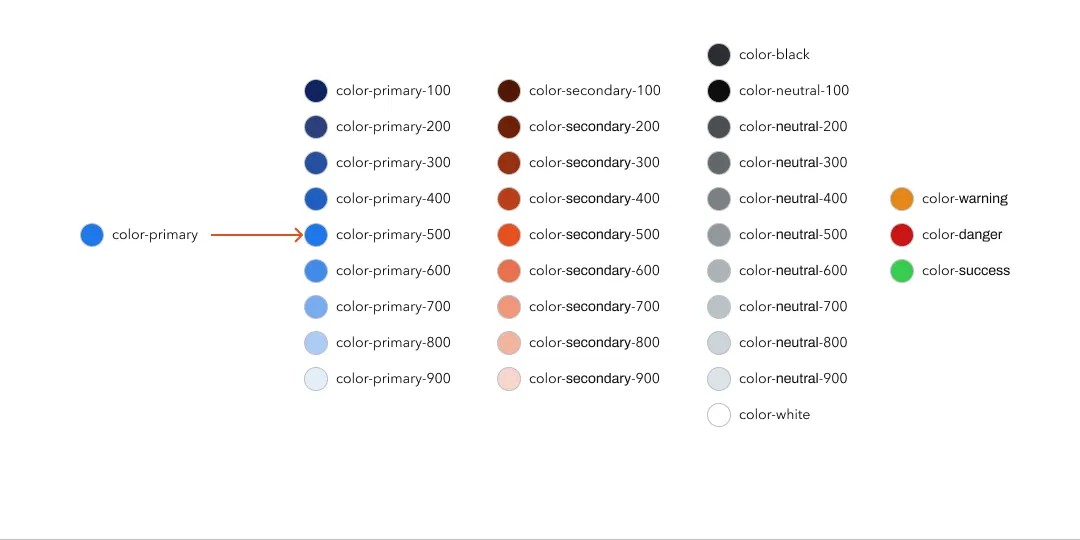
- Color: Define a primary, secondary, and neutral palette. Assign clear names (e.g.,
--color-primary-500,--color-error-600) instead of vague ones (e.g., “that blue,” “dark grey”). - Typography: Establish a type scale for headings, body, and labels. Document the font families, weights, sizes, and line heights.
- Spacing & Sizing: Use a baseline grid (like 8px) to define a consistent spacing scale (e.g., 8, 16, 24, 32px). This brings rhythm and alignment to all your layouts.
- Border Radius, Shadows, etc.: Standardize the visual styles that give your UI its character.
3. Create Your Core Components
Now, use your design tokens to build the fundamental building blocks. Start small and focus on the most reused elements:
- Buttons (Primary, Secondary, Ghost)
- Text Inputs & Form Fields
- Icons
- Avatars
For each component, document its different states: default, hover, focused, disabled, and error.
Phase 2: Construction – Building and Documenting
With your foundation set, it’s time to build and document the system so others can use it.
1. Assemble the Core Library
In your design tool (like Figma), create a dedicated library file for your foundations and components. Publish this library so your product team can start using the official components in their mockups.
2. Build in Code (In Parallel)
A design system that only lives in Figma is a style guide. A true system is connected to code. Your engineering team should build a component library in Storybook or a similar tool, using the exact same design tokens and component specs. This creates a sacred, two-way relationship between design and development.
3. Document, Document, Document
This is the most crucial step for adoption. For every component, document:
- What it is: A visual and description.
- When to use it: Clear usage guidelines.
- When not to use it: Equally important!
- The different variants: All the states and styles.
- The code snippet: For developers to copy and paste.
Tools like Zeroheight or Supernova are fantastic for creating this living, documented website for your system.
Phase 3: Adoption – Making it Stick
A design system no one uses is just a wasted effort. Adoption is a cultural challenge, not just a technical one.
1. Start with a Pilot Project
Don’t try to boil the ocean. Choose a new, small-to-medium feature or a small team to pilot the system. Use this project to iron out kinks, gather feedback, and create a success story you can share.
2. Sell the Benefits
Constantly communicate the “what’s in it for me?” for both designers and developers:
- For Designers: Less tedious work, faster prototyping, more consistency.
- For Developers: Less time rebuilding the same components, fewer bugs, cleaner code.
- For the Business: Faster time-to-market, a more cohesive brand experience.
3. Appoint Guardians
A design system is a product, and it needs a dedicated team or a group of “guardians” to maintain it. They are responsible for reviewing new component requests, updating documentation, and ensuring quality.
Phase 4: Evolution – It’s a Living Thing
Your product will evolve, and so must your design system. It’s not a one-time project; it’s a living, breathing ecosystem.
- Establish a Contribution Model: How can designers and developers suggest a new component or a change to an existing one? Make the process clear and accessible.
- Schedule Regular Reviews: Hold monthly check-ins to review usage, discuss upcoming needs, and plan the roadmap.
- Embrace Feedback: Your system’s users are your best source of insight. Listen to them actively.
From Drab to Fab is a Journey
Building a design system from scratch is a significant investment. But the payoff is immense: you trade chaos for clarity, and friction for flow. You stop designing and building the same button over and over and start focusing on solving bigger, more interesting user problems.
That’s the real magic—the shift from repetitive drab to creative fab.
About the Author

Peter Makeshoff
Peter Makeshoff is the founder and main author of Designer Daily.