There are two types of trends in web design. The first type is trends that stem from research. UX trends do not disappear, they evolve. Ultimately, there are some things that work best, and they are there to stay.
Then there are UI trends. Most of the times, they’re a great way to show your website is changing. Some trends, however, tend to be so prevalent they become trite.
It’s these trends that you’d be better off not using in 2019.
1. Bright Colors
How do you attract attention to something on your website? You make it bright red! This was the motto of some web designers for quite some time.
Even though the trend to use bright colors is not as egregious as this simple strategy, it’s not without its faults either. It’s been overused, and frankly, bright colors do not work for most websites.
Take a look at this website. It does a great job with imagery on the top of the page – great photography and smooth pastel tones. Then it descends into this nightmare of a background.
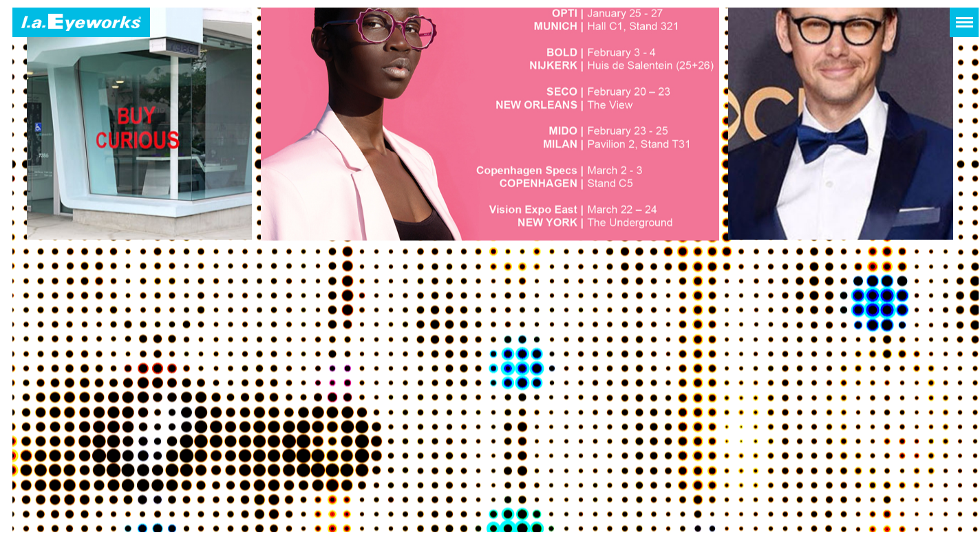
Source
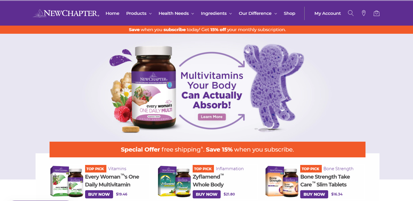
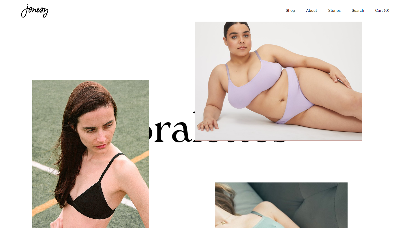
If you have to use color, make it smoother. Take a look at this screenshot. The biggest part of a page is taken up by a picture, but it isn’t bright and doesn’t make your eyes bleed.
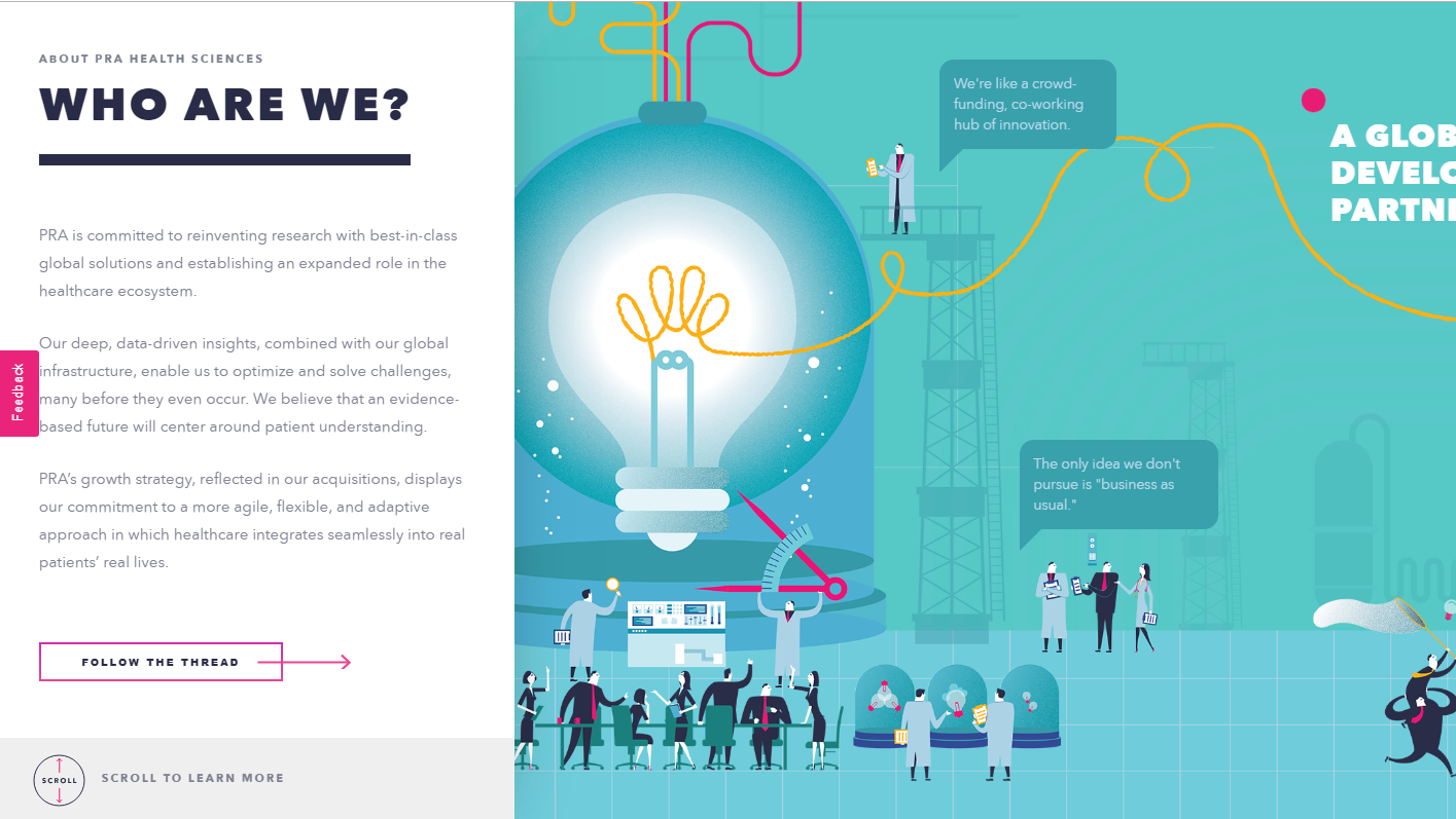
Source
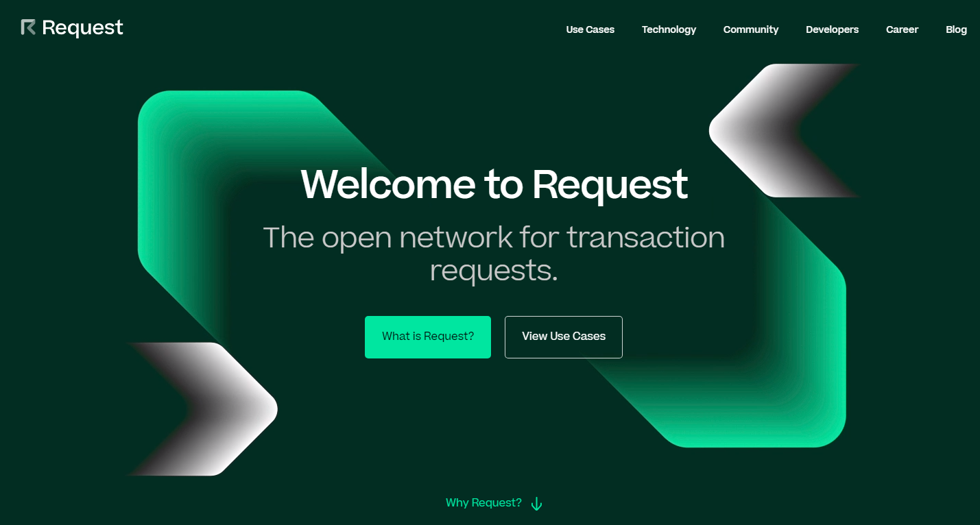
You can also go for complete minimalism, and forget about colors whatsoever as this website does.
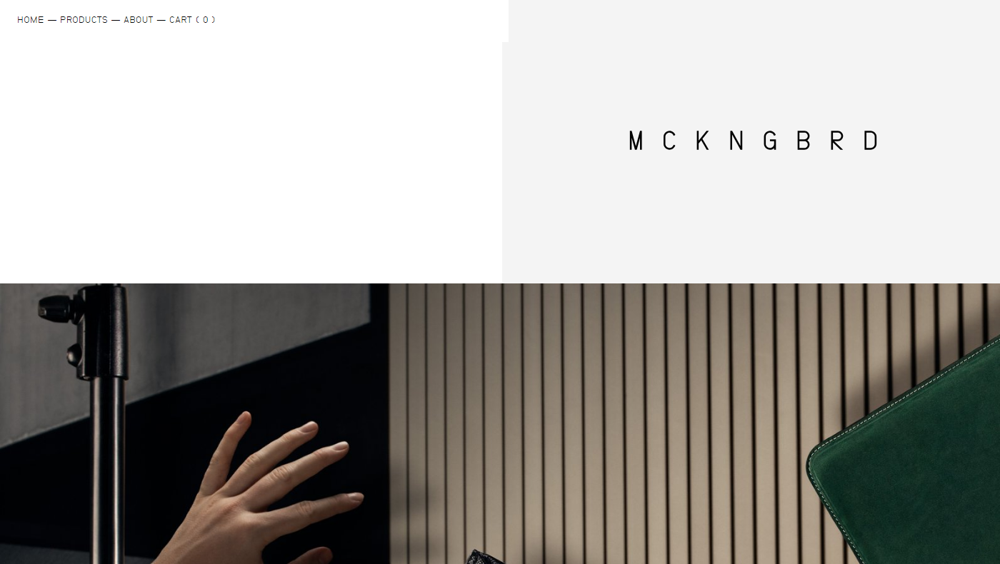
Source
2. Mixed Typography
If you’ve read something on typography trends, you know that people love to mix fonts. Sometimes it looks good, sometimes it’s over the top.
When you take on too many fonts, the odds of you making something that looks good are rather low. Add to it too many different and mismatching fonts and you’re headed for a disaster.
Sometimes, creative use of fonts works. Take a look at this website, for instance.
Source
In most cases, it just doesn’t cut it. If you stick to a more traditional approach, you have higher chances of success. At least, you don’t have as many opportunities to fail. Make your typography look something along these lines, and you’re on the safe side.
Source
3. Badge Logos
If you’ve tried to design your own logo, you know what badge logos are. They’re supposed to look hip and vintage. They’re the Gucci of logo design – everyone wants one but few can afford them.
The thing is, most stock websites offer some kind of badge logo. Most of these logos look pretty cool, and they may be a great fit for a website that sells beard lotions with wood flavor.
But what is a logo for, anyway? It should make your company stand out from the crowd. A badge logo will only make you look like every other company that visited this page to get a cheap logo.
Approach creating your logo like getting your APA style paper written for you. If the thing you’re paying for predicts your success, make sure to find a professional and pay them well.
4. The Burst
The burst is another ugly trend that comes from the stock websites and must go. It’s a classic way to attract attention to something important, and it shows you’re a lazy designer.
The problem with this design trend is that it’s overused. It’s overused to the point where it’s become trite. The bursting badge that says “New” or “Sale” is boring now.

Try to present your sale in a new and fun way. Make the news about a sale an experience of its own. This is what your popup that informs people about discounts can look like.
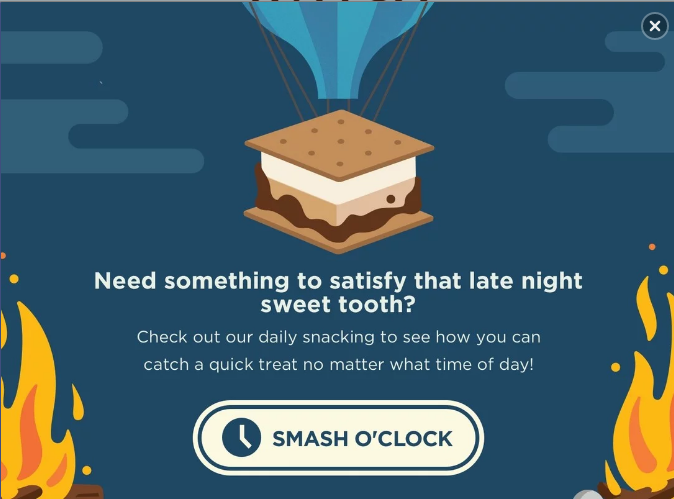
It catches attention due to being well-designed and well-written, and not due to being bright and having the word “Sale” in all caps.
If you need to use badges for products, make them minimalistic. These badges attract attention by means of contrast, even though they don’t look like a small explosion that the burst is .
5. Asymmetrical Design
What? Do you want my website to look boring?
No. The thing is, there’s a fear that if you conform to the standards of UX design this will make your website look dull.
That’s not what makes it this way. It’s a combination of things, really. If your website does follow the standards of layout that many conform to and then doesn’t communicate to the users, you end up looking like this.
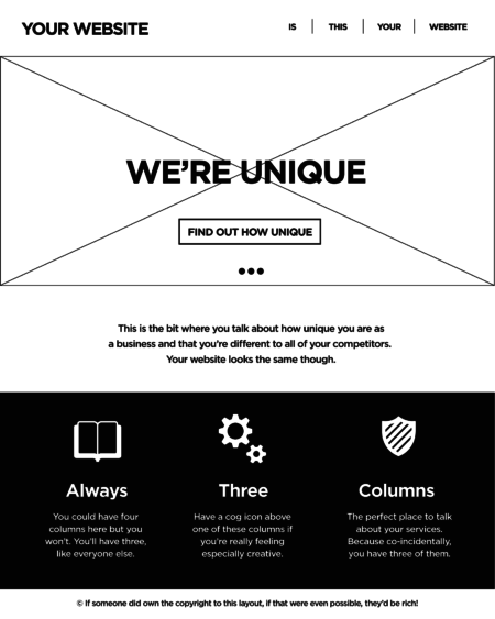
It sure looks ugly, but breaking the tree columns rule won’t make your website interesting. It’s inconsistent and confusing for the customers. It will only work if you have a couple of products on display as well since scrolling through four screens of these is hard.
Source
You can add a bit of asymmetry to spice things up though. Here’s one way to do that.
The simplest way of making things a bit asymmetric but maintaining the overall graphics hierarchy is placing an object or a picture a bit off center.
Source
In the end, you’ll most likely have to stick with the three columns. But they can look pretty fresh as well if you know how to make them work.
Source
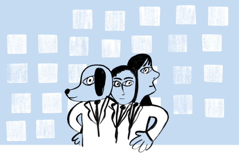
6. Flat Design
Minimalism is trendy. It’s great, too. Flat design is not the minimalism you need, however.
It’s been around for a while. It had its peak of popularity, and now it’s time for it to go. The problem with flat is that it’s overused (just like the burst and badge logos). Every stock photo website offers it. This picture must have been posted on too many websites.

Source
Your illustrations don’t have to be this boring. Take a look at how MailChimp treats illustrations in their blog articles. It’s just a random picture, but it’s fun and attention-grabbing.
Source
You can even get this kind of abstract illustrations for little to no money on the web. Here’s how you can present a sent message to your users.
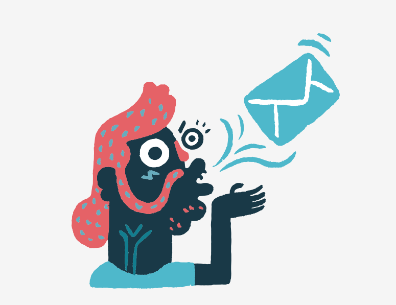
Source
7. Following Trends
The ultimate lesson you should draw from this list is that following UI trends is not a great idea in general. You can use most of them and make your website look great but only if you adopt a trend, not follow it.
Take a trend and give it your own spin. This will make you both up to date and unique.
About the Author

Peter Makeshoff
Peter Makeshoff is the founder and main author of Designer Daily.