![]()
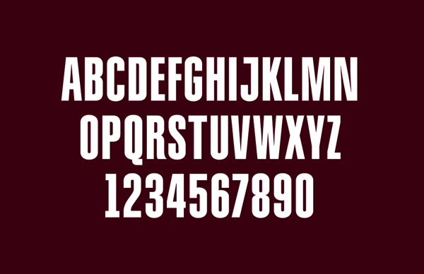
The Hershey company changed its logo a bit. The internal design team did the work, and overall I think they did a pretty good job. The typography in the logo was simplified, a font was even created with that new type.
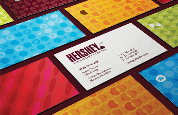
But the icon of a Hershey Kiss just looks like a turd that sits next to the company name.
Honestly I don’t know how they could let this one slide, it even looks like it’s a hot turd with some smoke going up. How could noone tell the designer: “Hey Jimmy, great job! But why did you put a little shit on our logo?”.
![]()
![]()
About the Author

Peter Makeshoff
Peter Makeshoff is the founder and main author of Designer Daily.