I love talking about homepage design. It’s the heart and soul of any website. A homepage isn’t just any old page.
No, it’s the virtual welcome mat, the first impression, the digital ‘hello’. It carries an important responsibility – creating a spark of connection between your audience and your brand.
Let’s be honest here. Homepage design is an art form. It’s where creativity meets functionality, where visuals meet user experience. It’s the process of creating that first, critical page that your users land on when they visit your site.
The Importance of Effective Homepage Design
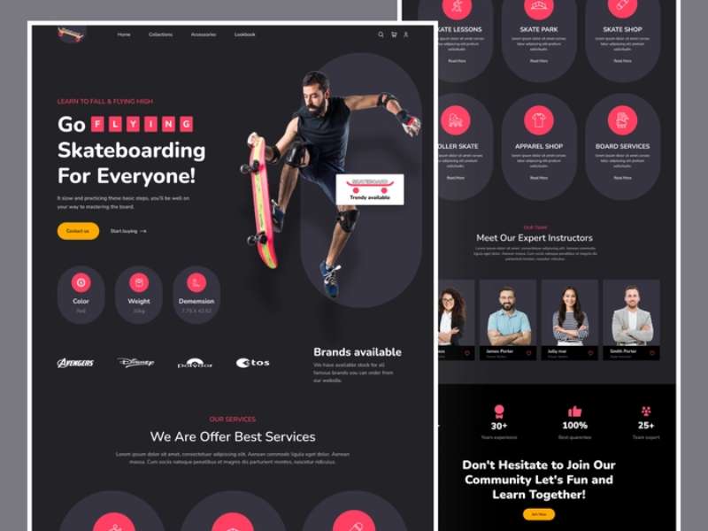
Image source: https://dribbble.com/shots/20295684-Skateboard-Landing-Page-Exploration
A well-designed homepage?
It’s more than just pretty aesthetics. It’s the make-or-break of user engagement. It guides your users, tells your brand’s story, and most importantly, turns visitors into customers.
The Evolution of Homepage Design
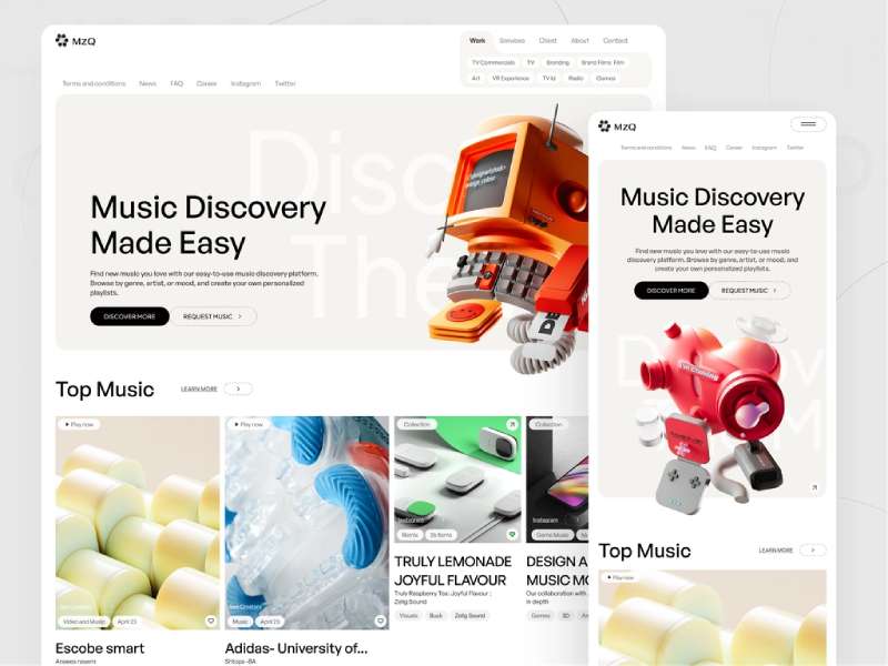
Image source: https://dribbble.com/shots/21592688-Sound-Design-Agency-Website
Ah, the journey of homepage design, it’s been quite a ride.
The Early Internet Years: Homepage Design in the 90s
Remember the 90s? I bet the internet doesn’t! But let’s take a stroll down memory lane. Back then, homepages were wild west of blinking GIFs, rainbow gradient backgrounds, and comic sans.
They were a mess, but an honest, enthusiastic attempt at this new thing called the ‘web’.
The Mid-2000s: Emergence of Modern Web Design Principles
Fast-forward to the mid-2000s, things started getting a little more sophisticated. We waved goodbye to the visual chaos and welcomed simplicity.
White space, intuitive navigation, consistency. These became our best friends. The homepages? They started focusing more on user experience.
Current Trends in Homepage Design
Now, let’s come back to the present day. Today’s homepages? They are more than just an intro to a website. They’re interactive, personalized, mobile-optimized.
They’re not just about being beautiful. They’re about being functional, being user-friendly.
Understanding User Behavior
Designing a homepage is not just about what we think looks good. It’s about what our users think, feel, and do.
User Expectations from a Homepage
Here’s the deal. Users land on your homepage, they want answers. They want to know who you are, what you do, and why they should care. They want to find what they’re looking for without having to hunt for it. And they want all this fast.
How Users Interact with a Homepage
When users visit your homepage, they’re not reading every word or admiring every picture. They’re scanning, clicking, scrolling. They’re bouncing around, following their curiosity. It’s a fast-paced dance, and our design needs to keep up with their rhythm.
The Impact of First Impressions
But here’s the kicker. Users make judgments about your website in milliseconds. A bad first impression, and they might just bounce off, never to return. A good first impression, and they’re more likely to stick around, explore, engage.
Core Components of an Effective Homepage
Let’s break it down. There are a few key parts that every homepage should have.
Navigation Menu
The navigation menu is like the map of your website.
It guides your users, shows them where to go. It’s about making their journey easy and enjoyable.
Hero Area
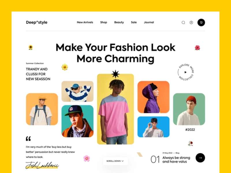
Image source: https://dribbble.com/shots/18404881-Fashion-Website
Then comes the hero area. It’s the star of the show, the first thing your users see. It’s your chance to grab their attention, spark their interest.
Content Area
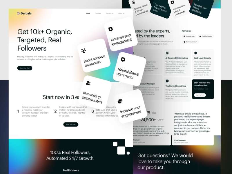
Image source: https://dribbble.com/shots/19780141-Derbala-Follower-Booster-Service-Website-Design
After that, we have the content area. This is where you can showcase your products, share your stories, flaunt your achievements. It’s where you provide value, solve problems, answer questions.
Footer
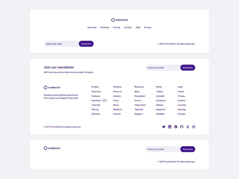
Image source: https://dribbble.com/shots/19771073-Footers-Untitled-UI
And finally, the footer. It’s like the credits roll at the end of a movie. It’s where you can tuck away useful links, contact info, social icons. It might be at the bottom, but don’t underestimate its power.
That’s it folks, the building blocks of an effective homepage. But remember, how we arrange and design these blocks is where the magic happens. And that magic? It’s what makes your homepage truly awesome.
Principles of Good Homepage Design
Image source: https://dribbble.com/shots/17900055-Home-Page-Startup-Agency-Website
When we talk about homepages, there’s an unwritten rulebook that we designers swear by. A sacred trifecta, if you will.
Clarity is King
First up, clarity. This is about making things simple for your users. Clear messaging, intuitive navigation, concise content – all these elements play a role.
But remember, clarity doesn’t mean boring. It means being user-friendly.
Consistency Matters
Next, consistency. Your homepage should be a mirror image of your brand’s personality. Colors, fonts, images, voice – everything should be singing the same tune.
Mobile-First Approach
Lastly, the mobile-first approach. It’s 2023, people. More users are browsing on their phones than on their computers. Your homepage should look and work just as good on a tiny screen as it does on a big one.
Key Features of an Engaging Homepage
Want to make your homepage really stand out? Here are some things you should consider.
Effective CTAs (Call to Actions)
Image source: https://dribbble.com/shots/6329102–Pick-a-path-CTAs-A-B-Test
CTAs, or Call to Actions. They’re like signposts on your user’s journey, guiding them towards the actions you want them to take. “Buy Now”, “Learn More”, “Sign Up” – these are all examples of CTAs.
But remember, a good CTA isn’t just about the words. It’s also about the placement, the color, the size.
Integrating Social Proof
Now, let’s talk about social proof. Testimonials, reviews, case studies – these are all powerful tools.
They show your users that other people have trusted you, and they should too.
Incorporating SEO Keywords
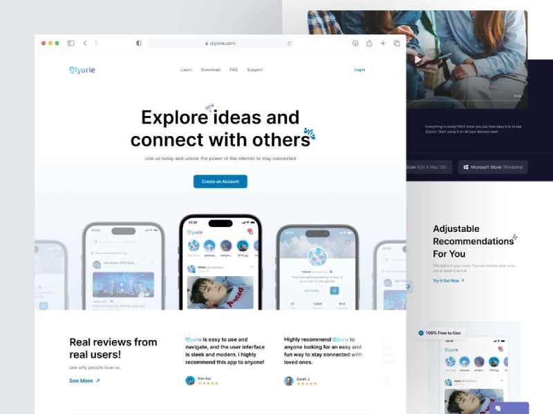
Image source: https://dribbble.com/shots/21218664-Qiyorie-Social-Media-Landing-Page
SEO. You might think it’s all about those hidden codes and tags. But guess what? Your homepage content also plays a big role. Integrating SEO keywords can help your site rank higher in search engines, making it easier for users to find you.
Incorporating Sliders
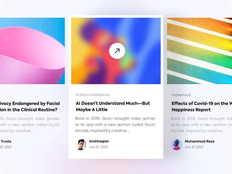
Image source: https://dribbble.com/shots/18542215-Blog-Slider-Dark-and-Light-Version
One trend that’s been gaining traction? Homepage sliders. These can add a dynamic touch to your homepage, allowing you to showcase multiple elements in a compact space.
They can be used to highlight your products, share customer testimonials, or display key messages.
Adding a Blog Feed
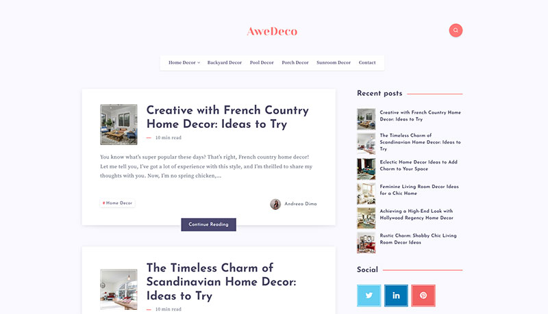
A blog feed on your homepage? Why not!
It’s a great way to share updates, provide value, and keep your content fresh.
And the best part? It can also help improve your SEO.
Utilizing Images and Visuals
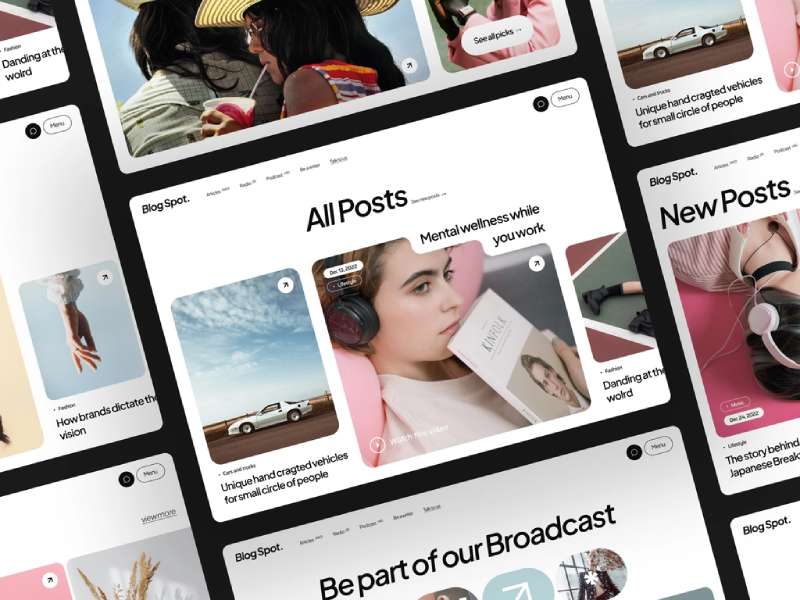
Image source: https://dribbble.com/shots/20197333-Blog-Spot-Landing-Page-UI
Finally, don’t forget about visuals. Images, videos, infographics – they all can help make your homepage more engaging. But remember, quality over quantity. Your visuals should be high-quality, relevant, and aligned with your brand.
Common Mistakes in Homepage Design
Okay, it’s time to talk about the stuff we need to avoid.
Trust me, I’ve seen some homepages that made my designer heart cringe.
Information Overload
First off, information overload. More is not always better, folks. You don’t need to throw everything at your users at once. Give them room to breathe, let them explore at their own pace.
Lack of Clear Navigation
Next up, poor navigation. If your users can’t find what they’re looking for, they’re going to leave. Period. Make their journey easy, intuitive.
Poor Mobile Experience
And finally, don’t neglect the mobile experience. It’s not just about shrinking your desktop design. It’s about considering the touch interface, the smaller screen, the slower load times.
Tools and Resources for Homepage Design
Now, onto the fun stuff. We designers have a secret weapon – our toolkit. It’s filled with awesome stuff that helps us create those stunning homepages.
Web Design Software
There’s a plethora of web design software out there. Some of my favorites? Sketch for its clean interface, Figma for its prototyping features, and Figma for its collaboration capabilities.
Image Editing Tools
Then come the image editing tools. Photoshop, Illustrator, Canva – each has its strengths and can help you create stunning visuals.
A/B Testing Tools
And let’s not forget about A/B testing tools. These can be a game-changer, helping you figure out what works best for your users.
Sources of Inspiration
In addition to the design and testing tools, I always keep a list of websites that inspire me. You know, for those days when the creative juices aren’t flowing.
If you look at recently created websites with amazing design, that can spark ideas and get those creative wheels turning again. Check it out and keep your own list of inspirations handy!
Conclusion: Pulling it All Together for an Awesome Homepage Design
Alright, we’ve reached the end of our journey.
Recap of Best Practices
Let’s do a quick recap. An awesome homepage? It’s clear, consistent, mobile-friendly. It has compelling CTAs, social proof, SEO keywords.
It avoids information overload, unclear navigation, poor mobile experience. And it uses a variety of tools to bring everything together.
Final Thoughts on Creating Your Awesome Homepage Design
In the end, an awesome homepage isn’t just about design. It’s about the users. It’s about making their journey enjoyable, memorable. So keep experimenting, keep learning, keep growing. And most importantly, keep creating.
About the Author

Bogdan Sandu
Bogdan is a designer and editor at DesignYourWay. He's reading design books the same way a hamster eats carrots, and talks all the time about trends, best practices and design principles.