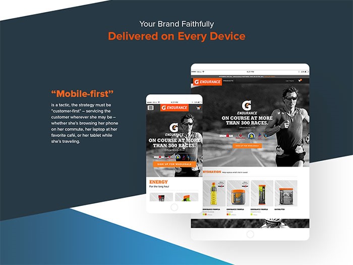
Mobile is something that is not always designed for the first time around; however, it’s something that should always be considered depending on the specific type of website that’s being constructed, as well as the overall demographics and how the website itself is used in general.
With a mobile-first approach, you are really seeing more of the content than the graphics or the design itself, meaning that the content that you create to help improve the user experience itself is extremely important.
This is the most basic mobile-first definition. This kind of content not only includes text, but also images, audio, and video. Designers always work hard to dedicate their time to create a better user experience by ensuring that every bit of content is arranged in a manner that is convenient, especially when it comes to viewing this content on various kinds of mobile devices.
Why you should use a mobile-first strategy
All of the different needs of mobile users are always met, including all of the various specifications of mobile platforms. Besides that, designers are able to focus on various technicalities, as well as details involving navigation, structure, and content.
Let’s not forget that websites are much easier to navigate, which leads to better user experience. In addition, a fresher concept and design can materialize as the result of a mobile-first approach.
There are other additional benefits to approaching a mobile website before a more traditional website. For starters, a mobile user’s requirements are able to be met on a level that is more basic thanks in large part to the platform’s landscape and performance constraints.
The device used by a mobile user is smaller in terms of both real estate and overall connection speed and/or specific data plan. This, essentially, makes us become much more focused and direct with the content that is created, which, in turn, produces a great user experience that can carry over to a desktop website.
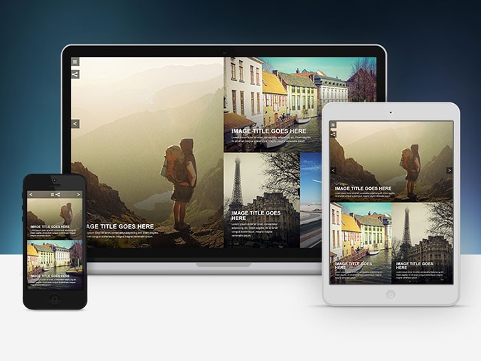
Delivering a better experience in various viewports
There are many challenges in terms of mobile development that must be met before a website can be created that works well for various types of mobile devices in terms of context rather than just the smaller screen size.
Thanks to the different constraints of mobile context, we are essentially forced to focus on exactly what particular content is essential, as well as determining exactly how to present that content in the quickest possible way.

When we concentrate on first building mobile experiences that are both optimized and fast-loading, this will eventually lead to a form of “trickle-down” effect for other platforms such as desktops and tablets.
Different adaptive experiences are able to be kept manageable and accessible thanks in large part to the latest advancements in web technologies, especially in HTML, with the release of HTML5, and CSS with the latest version, CSS3. For example, if responsive tables were a bit science fiction a while ago, now they are the norm. I know at least one WordPress table plugin that does this by default. Most likely, there are several others.
The best approach with this is not to reinvent the wheel, but to use one of the many CSS libraries out there and get on with the next task that you have for the site.
Unicode symbols

One useful way to help reduce the overall need for any type of background images is to use special HTML characters for the simplest shapes. This is also a great way to save HTTP requests as well.
When it comes to stars that are generally used to rate something or other simple icons, you could use something as simple as a question mark to create both solid and empty stars. Even better is the fact that since it’s HTML and not an image, the end result will be a lot crisper visually on screens that are of a higher resolution.
Overall style
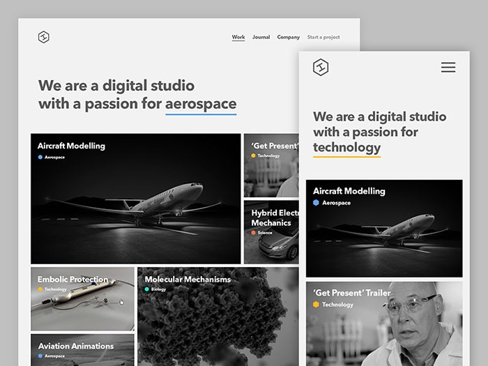
Whenever we craft anything involving CSS, it’s important that we do anything to keep all elements as fluid and lightweight as possible. It’s no secret that mobile devices have many different screen sizes.
It’s also no secret that the devices that come later on down the road won’t have a lot of the same features as the ones of today do. The content itself is therefore used to help determine how the layout should actually adjust to the device that contains it.
When you start with a style that is more baseline and shared, you will be able to introduce more advanced layout rules whenever the screen size itself actually permits you to do so. This is something that will help to keep the code smaller, more maintainable, and a lot simpler.
JS libraries
JavaScript enhancements can then be added to add a sense of functionality to the overall navigation of the website. Doing so will also add functionality to aspects such as auxiliary content and image galleries. The best interactive websites out there are taking advantage to the maximum of JS libraries.
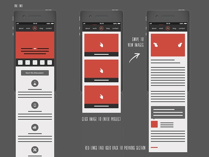
Mobile navigation
This is something that can be especially tricky when it comes to experiences that are adaptive. Aspects such as top navigation are very common for desktop websites; however, this is something that can also clutter up the screen itself, as well as push down the amount of primary content on screens that are smaller in size.
A hamburger menu could be useful, but be careful to make some tests before using one form of another of this type of navigation.
Responsive images
Mobile optimized images should always be loaded in by default before loading in any larger images whenever they are needed. Different techniques exist for responsive images on both the server-side and the client-side of the spectrum. Whenever images are optimized, overall performance can also be optimized even further.
Make sure you deliver a good user experience
Search engines such as Google have worked hard to identify many different components involving user experience mistakes. These mistakes are common and are ones that you should work hard not to make. This is because of the fact that Google uses these to judge your pages on how mobile-friendly they actually are. For example, if you have an event website and people can’t book events easily, you will lose positions in SERP.
Here are the most common mistakes to avoid:
- Avoid using lots of plugins
- Avoid using font sizes that are not legible. Also aim for good fonts.
- Size all of your tap targets as appropriately as possible
- Forgetting to configure the viewport
- Forgetting to size content to viewport
What you won’t like
Perhaps the biggest downside of mobile web design is that it’s not fun, nor is it easy, as you are hit with a lot of constraints from the first step.
These can range from a smaller-sized screen to fewer amounts of resources, which can create many headaches on your part. Additionally, beginning with mobile design and working your way up from there can make it especially difficult to really dive into a design concept, but it’s doable.
When you adopt a mobile-first approach, you are essentially helping out your user base a lot. After all, the main point of establishing a presence on the internet is to reach all of your users and have a pleasant interaction with them.
Ending thoughts
Adopting a mobile-first strategy can be extremely difficult at first; however, there are many benefits to this concept. All that is required from you is to step up and take the leap. So what’s holding you back from doing so?
About the Author

Bogdan Sandu
Bogdan is a designer and editor at DesignYourWay. He's reading design books the same way a hamster eats carrots, and talks all the time about trends, best practices and design principles.