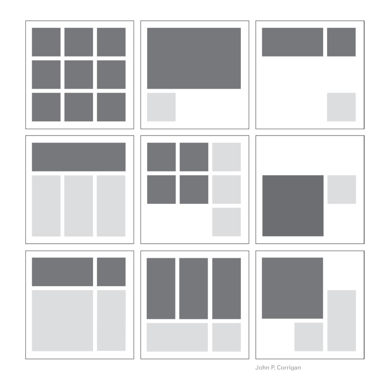
Any designer — and pretty much any Internet user, as well — has probably noticed that grid-based design has grown hugely popular in the last three years. But is this only a fad, or is it a sustainable design strategy that could survive over the long haul?
The Appeal of Grid-Based Design
No matter who you are, where you’re from, or what life experiences you’ve had, you surely have encountered grids. The world is full of them.
From graph paper in high-school math classes to the stripes in a supermarket parking lot, grids may be seen everywhere. They serve as guides for the placement of various elements.
Grids are orderly, clean, and functional. But they can also be visually pleasing, and even beautiful. Put that together: When strategically deployed, grids can be both functional and beautiful.
This is perhaps nowhere more evident than in web design. “Designers solve problems,” developer Steven Bradley notes.
“Web designers are faced with finding solutions to visual and organizational problems and one approach to solving these problems is the grid. It’s not the only approach you might take, but it’s one with several important benefits.”
According to Bradley, the greatest benefits of grid-based design are clarity/order, efficiency, economy, and consistency/harmony. A grid provides a relatable, functional solution in an entropic, chaotic world where disorder regularly threatens to overwhelm us.
From a practical standpoint, grids make it easier for web designers to scale up designs and make changes over time. “The same way grids help an individual design more efficiently and add content to a page, they help other designers understand the structure of a design and do the same,” Bradley writes.
“Your grid becomes a blueprint for the design that others can quickly follow.”
How to Use Grid-Based Design
The mutually beneficial nature of grid-based design is probably why it’s become so popular in the online marketplace today. But when so many designers select the style, it’s not easy to recognize when it’s been used especially well (as opposed to serving as a lazy fallback option).
To clarify the matter, here are three essential guidelines backed by real-world illustrations.
1. Use Grids to Categorize Products
Grid design is perhaps most effective when it’s used on ecommerce websites to organize products systematically in a visually pleasing manner. The Battery Operated Candles website is a perfect example of this.
This site sells hundreds of products, and the navigation/menu would be far too complex if everything were to be listed in a hierarchy. The grid on the homepage provides a simple visual layout that directs readers to the products they seek.
The same principle can be applied in the case of blogs and news sites. Instead of the grid being used to organize an array of products, each tile may represent a blog post or news category for easy click-through.
2. Leverage Color Strategically
Though most grid designs follow a pretty standard formula, there are plenty of opportunities to try to think outside the box for a more creative result. Check out this example, which uses a grid to fill the entire screen.
One of the keys to successful grid-based design is to use color to the best advantage. A strategically arranged color palette can amplify the coherence of the grid so it’s easier on the eyes.
But as the previous example shows, you don’t have to depend on a typical color scheme. Sometimes an alternative palette that features bright splashes of color can work just as well, if not better.
3. Take Negative Space Seriously
Grid-based design concerns the negative space just as much as it focuses on the tiles in the apparent foreground. In order for your design to resonate with visitors most effectively, you should give serious thought to how the negative space complements the rest of the picture.
This page from Optimo Hats is a fine example. Notice how the negative space here — the gray and white — encourages the hats to pop off the page. This facet of the design is primarily what makes the page so effective.
Using Grids Strategically
Grids can be a potent design tool … but they aren’t your only option. Watch for opportunities to use grid-based layouts, but don’t limit all your work to that rigid standard.
Sometimes, you’ll find it’s best to break out of your established mold and do something novel. Learning when to use grids and when to switch to something else may prove to be one of your biggest challenges.
About the Author

Peter Makeshoff
Peter Makeshoff is the founder and main author of Designer Daily.