Ever stumbled onto a website and instantly understood how to navigate it? That, right there, is intuitive web design.
An intuitive website feels like it’s reading your mind. It’s designed so you, the user, can use it without having to overthink or fumble around looking for instructions. You know where everything is and how to get there.
And why does this matter? Because we’ve all had that experience of landing on a webpage and then leaving in frustration because we couldn’t find what we were looking for. Intuitive web design is about making sure that never happens to your users.
Historical Background: From Complexity to Intuitiveness
Let’s take a trip down memory lane. Websites didn’t start out intuitive. In fact, early web design was like the wild west – untamed, unrestricted, and pretty chaotic. There was this rush to put as much as possible on a page. But as the web grew, we started realizing that more doesn’t always mean better.
That’s when user-centered design started getting the recognition it deserved. It’s all about the users, their needs, their experiences. The aim shifted from making websites pretty to making websites usable.
And now we’re in the age of intuitive design. The world is at our fingertips and users are more impatient than ever. The challenge now is to anticipate their needs and deliver instant satisfaction.
The Psychology of Intuitive Web Design
Digging deeper, there’s a whole world of psychology that influences how we design intuitive websites. It’s about understanding how users think, what they expect, and using that to guide the design.
Take scanning vs. reading, for instance. When we’re online, we don’t read – we scan. We’re looking for specific information or clues that can guide us to what we want. If we have to read every single word, that’s just too much work.
And that’s where familiarity comes into play. Our brains are wired to recognize familiar patterns and respond to them. So, by sticking to what users already know, we can make it easier for them to navigate our websites.
Core Principles of Intuitive Web Design
Alright, let’s get down to the nitty-gritty. What are the key principles that make a website intuitive?
First up, simplicity. Yes, it’s tempting to use all the latest bells and whistles, but the simplest solution is often the best. It’s easier for users to understand and less likely to break.
Consistency is another biggie. If every page on your site looks different, users will be confused. By keeping things consistent, you’re helping users know where they are and what they can do.
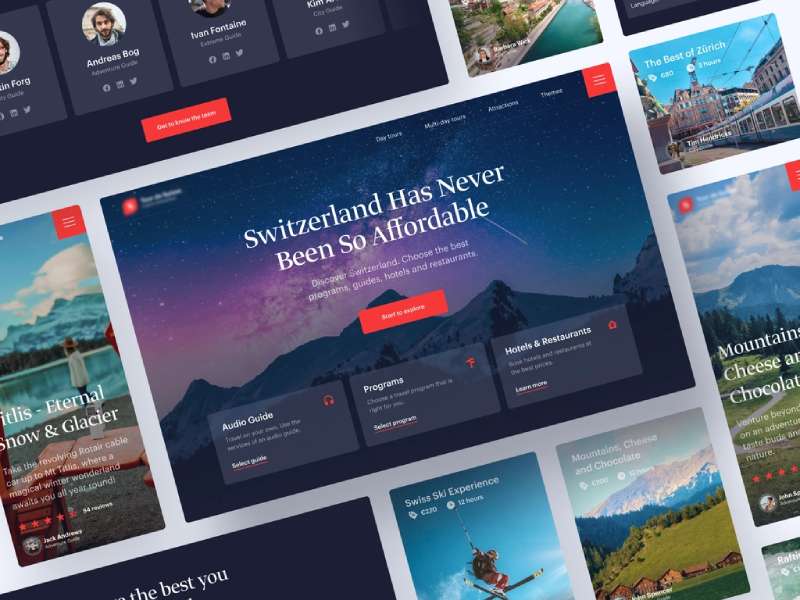
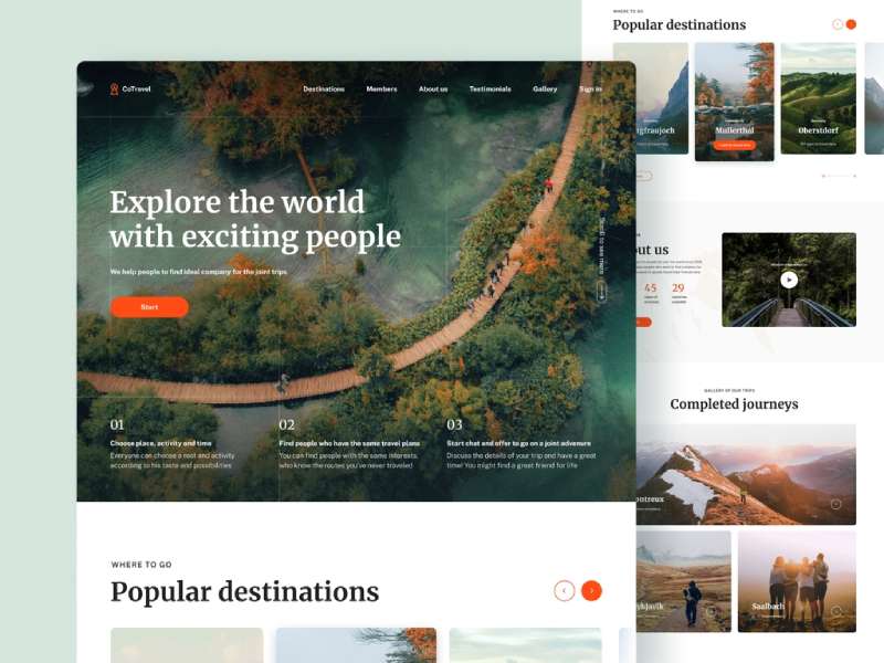
And then there’s navigation. A good navigation system is like a map that guides users. It should be easy to find, easy to understand, and point users in the right direction.
Lastly, the key information should be visible. You don’t want your users to have to hunt for what they’re looking for. Make it easy for them, and they’ll thank you for it.
User Interface Components for Intuitive Web Design
Back to our chat about crafting the perfect, intuitive website, let’s talk about UI – the user interface. It’s like the bones of our website, the structure, and guess what? It matters. Big time.
Layout and grid systems first. Picture your website as a jigsaw puzzle, with the layout being the pieces. The grid system helps us put these pieces together in a way that looks good and makes sense to the user.
Next up, Typography and Readability. Ever tried reading tiny, cramped text on a screen? Yeah, not fun. The fonts we use, their sizes, line heights, colors, all affect how easily users can read and understand our content.
And let’s not forget about colors. Color isn’t just about making a site look pretty. Different colors can evoke different emotions and reactions. We use them to guide attention, show importance, and even influence how users feel about our site.
Lastly, those interactive elements. You know, buttons, links, forms, the bits that users click or interact with. They’re like signposts, telling users: “Hey, click here to do this thing!”
Speaking of interactive elements, sliders can be a great addition. Not only do they look good, but they’re also fantastic for showcasing multiple pieces of content in a limited space. If you’re interested in exploring this further, check out this awesome guide on website sliders. It’s super helpful!
User Experience Considerations
Remember when we talked about user-centered design? That’s where UX, or user experience, comes in. It’s all about making sure the user’s journey through our site is smooth and enjoyable.
A huge part of that is responsiveness. We’re living in the age of smartphones and tablets. People are browsing websites while chilling on the couch, riding the bus, even walking their dog. Our sites need to work well on all these devices.
But it’s not just about mobile. Load time and performance play a huge role in UX too. If your site takes ages to load, or keeps freezing up, people are going to leave. Simple as that.
Now, let’s talk accessibility. This isn’t just about making your website usable for all, it’s about ensuring that everyone, regardless of their abilities, can enjoy a quality experience. Don’t just take my word for it, take a look at these brilliant examples of accessible websites. They’ve absolutely nailed it!
Practical Tips for Creating Intuitive Websites
Okay, time to roll up our sleeves and get down to business. Here’s some handy tips to make your website intuitive.
Keep the user journey in mind. It’s like we’re telling a story with our website. What do we want the users to do? Where do we want them to go? We need to guide them along this path.
Make actions and results predictable. If a user clicks on a button, they should have a pretty good idea what’s going to happen. Surprises are fun at parties, not so much on websites.
Ever noticed how certain icons and symbols are used everywhere on the web? That’s because they’re familiar to users. Use well-known icons and symbols to make navigation a breeze.
And finally, let’s talk about error prevention and guidance. Nobody’s perfect. Users will make mistakes. Our job is to make sure these mistakes don’t lead to frustration or confusion.
While we’re on the subject of error prevention and guidance, let’s not forget about our good ol’ friend – the 404-error page. When a user lands on this, it’s often because something’s gone wrong. But that doesn’t mean the experience has to be negative.
Believe it or not, a well-crafted 404 page can turn an error into an opportunity. Want to know how? Check out this insightful guide on creating a custom WordPress 404 error page. You’ll thank me later!
Common Mistakes in Intuitive Web Design
Even with the best intentions, it’s easy to trip up when designing an intuitive website. Let’s shed some light on a few common pitfalls, so you can sidestep them.
First, over-designing. It’s like cooking – sometimes, less is more. Loading a website with a bunch of flashy elements can distract users from what they’re really there for.
Next, ignoring user feedback. Your users are the ones navigating your site. If they tell you something isn’t working, listen. Their feedback is golden.
Last up, forgetting about content strategy. Yes, design is key, but content is the reason users are on your site. Make sure it’s easy to find, understand, and engage with.
Tools and Resources for Designing Intuitive Websites
Now, we can’t talk about web design without giving a shout-out to the incredible tools out there that make our jobs easier.
Wireframing and prototyping tools help us visualize our design before we dive into coding. It’s like sketching out a blueprint for a building.
For testing, there are awesome user testing platforms. They allow us to watch real users interact with our design. Remember what we said about user feedback being golden?
And finally, web analytics tools. These tools give us insights into how users behave on our site. Where they click, how long they stay, where they leave – all useful stuff for refining our design.
Conclusion: Building a Future with Intuitive Websites
Well, we’ve come a long way, haven’t we? From understanding what intuitive web design is, to exploring its principles, discussing tools, and avoiding common mistakes. Hope this journey has been as enlightening for you as it was for me!
Remember, intuition in web design isn’t static. It’s always evolving with technology and user expectations. What works today might need a tweak tomorrow. So, let’s keep learning, exploring, and pushing the boundaries of intuitive web design.
The aim? To craft websites that not only look good, but feel good to use. Websites that help users achieve their goals without breaking a sweat. That, my friend, is the beauty and power of intuitive web design. And you’re now well on your way to mastering it.
About the Author

Peter Makeshoff
Peter Makeshoff is the founder and main author of Designer Daily.