The most essential page on your website is the price page. A potential consumer visits your website to learn more about your goods and what you have to offer. As a SaaS firm, your product and service are both one-of-a-kind, and your price page should reflect that. A well-designed SaaS price page not only looks good but also leads to increased conversions.
Selling virtual tools necessitates a flawless web presence. When your marketing qualified leads (MQLs) arrive at your SaaS price pages, ready to buy, it’s critical to maintain an exceptional experience.
Key Benefit of a Well-Designed SaaS Pricing Page
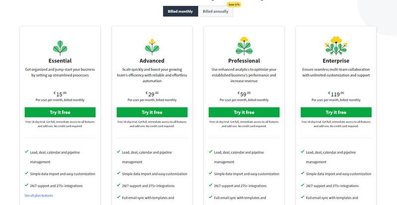
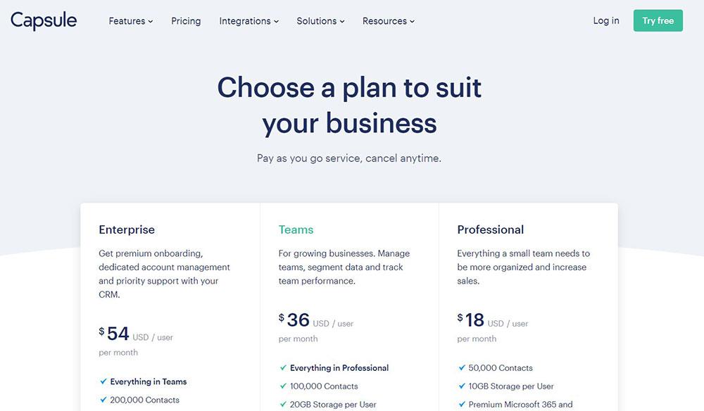
When your SaaS price page is fully optimized, you’ll know it’s precisely suited for your customer profile. Just look at the example presented above, in one of the most popular contact management software out there.
The website will show the actual value of your software as a service firm and should keep your clients paying to and utilizing your service monthly for years to come.
It’s tempting to base your pricing approach on the strategies of successful firms. However, merely duplicating what your rivals are doing is detrimental to your product and customers. Instead of conveying what sets you unique, you are conforming to other alternatives. Before you consider how to design your price page, you should create a plan that aligns with the value of your company and the demands of your consumers.
Furthermore, the design of your price page should always work in tandem with your pricing strategy. Because there is a connection and a dynamic market between price, value, and volume. Because the design is what helps you acquire and drive the attention of the consumers, it is essentially a means for you to implement the plan.
Don’t panic if your SaaS pricing plan gets you scratching your head. Here are some things to think about while building the finest SaaS price pages for your company.
Keep It Simple
The pricing page should not be very complicated. If a lead lands on your price page, chances are they already grasp the core concept of your tool and aren’t looking to be educated or entertained. All this page needs to do is give price information (ideally on a white or single-color backdrop that is simple to see) and persuade visitors to go to the next step: conversion.
Don’t miss your last chance to sell the outcome
If your prospective customer has reached the price page, they are on the verge of deciding to join up or go on. Don’t squander your H1; instead, emphasize the value proposition and remind them of the consequence of utilizing your product.
One Plan for Each Persona You’re Targeting
The pricing table is where all of your user and market research work will pay off. The Buyer Persona is a group image of the individual who selects your organization to solve their problem. By identifying the appropriate amount of buyer personas, you will be able to rapidly give each client information that is relevant particularly to them. It also streamlines the decision-making process for your potential consumer.
Quantified buyer personas are critical since each of your price plans must be tailored to each of these personas in terms of packing and the amount you charge. Proper alignment implies that your whole marketing and acquisition funnel comes into place, and you end up selling the right product, at the right price, to the right individual.
Showcase benefits & features
If you desire conversions, your price page should demonstrate the value of your services. Benefits and features should be highlighted so that visitors to the website are tempted to spend money on more costly packages.
Group the Price and Benefits
Make it apparent to your audience that for X dollars, they will obtain X benefits. Give your consumers a reason to purchase your goods. When you show them a price tag, remind them of why it’s a fantastic deal. Then, with a call to action, seal the deal.
Make those digits easy to see
Once you’ve shown the price, ensure it’s at the top of the visual hierarchy. After all, this is what people have come to see. Small numbers appear apologetic and suspicious, and they slow down your consumers’ ability to access the information they need first.
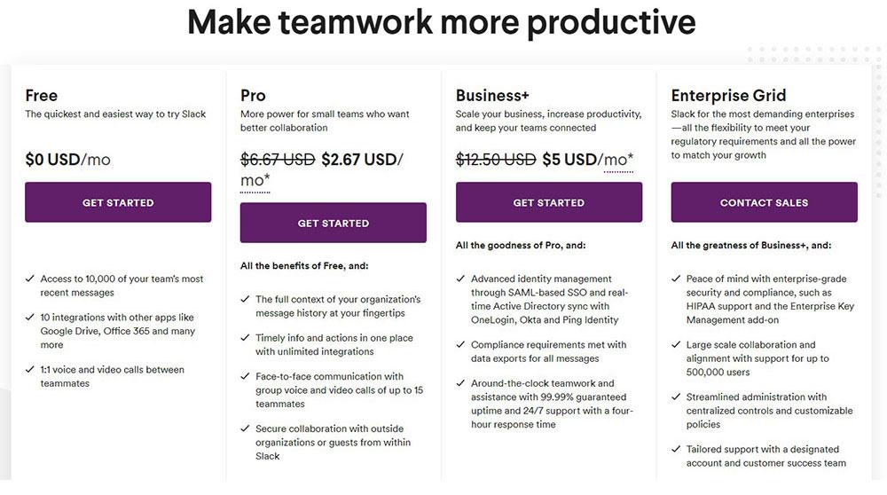
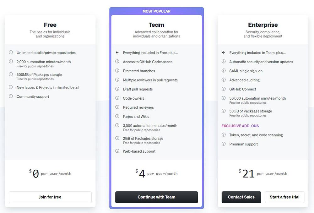
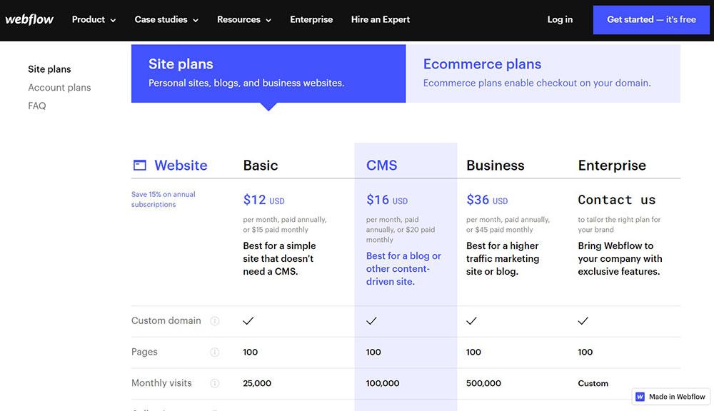
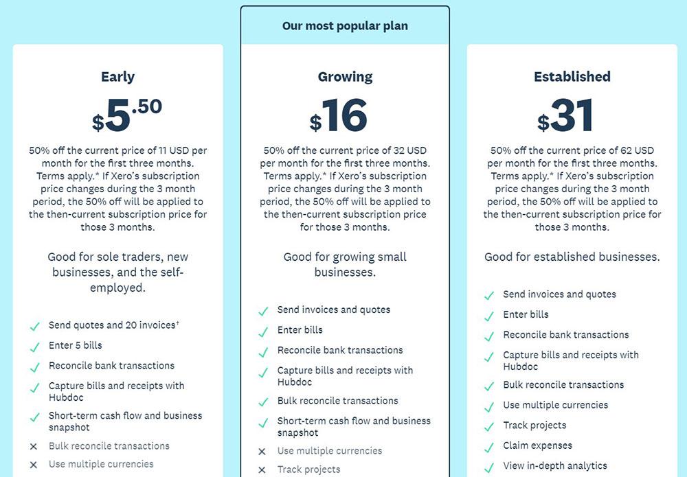
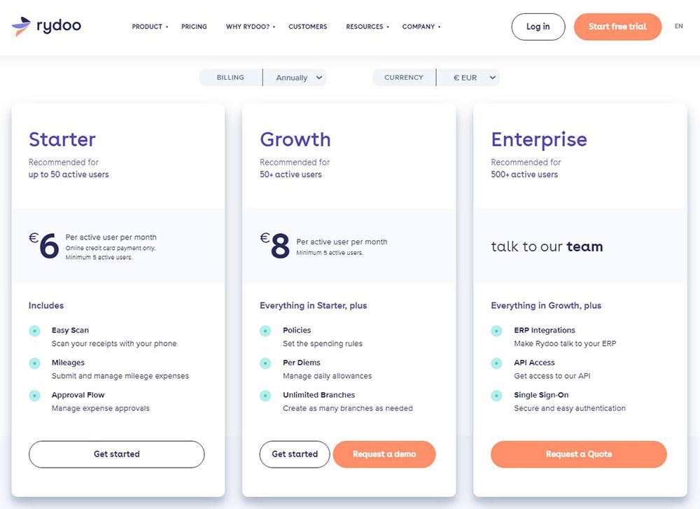
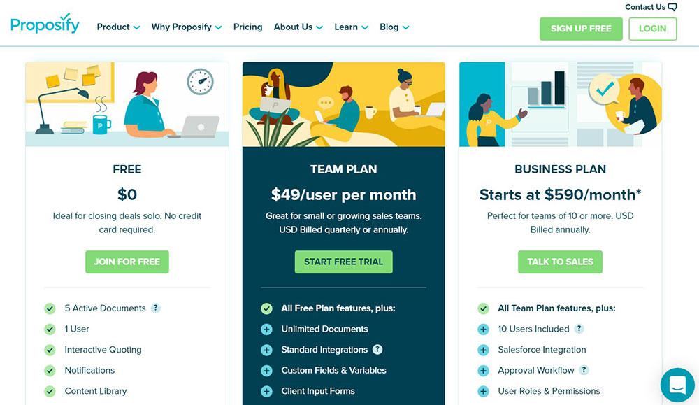
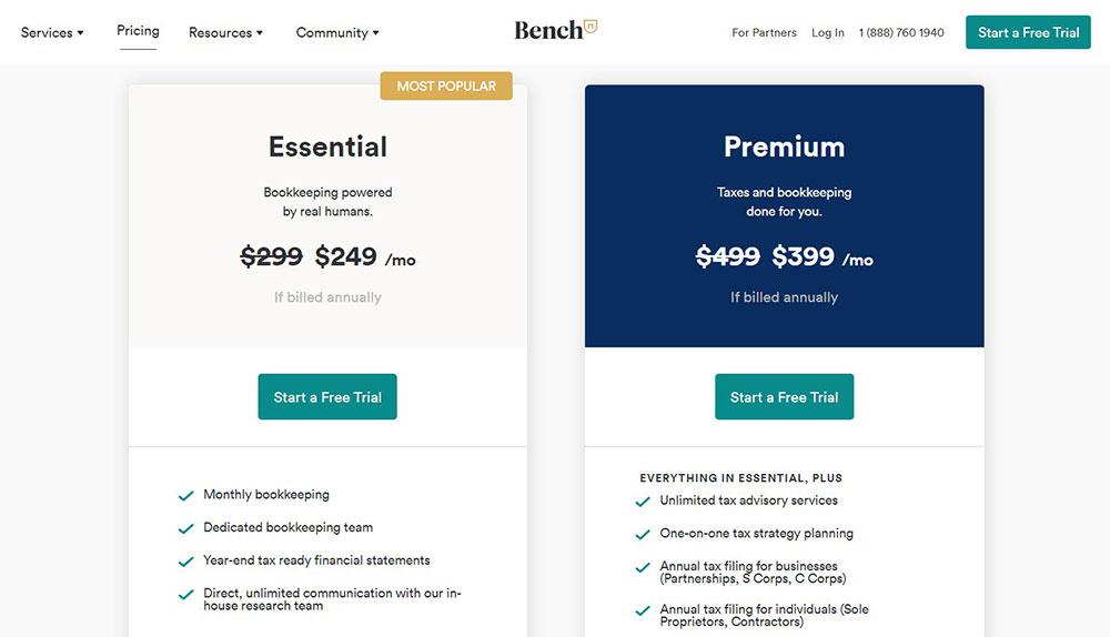
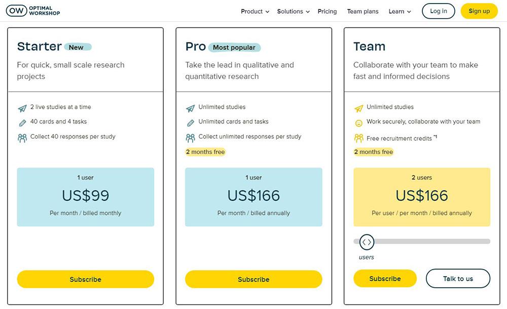
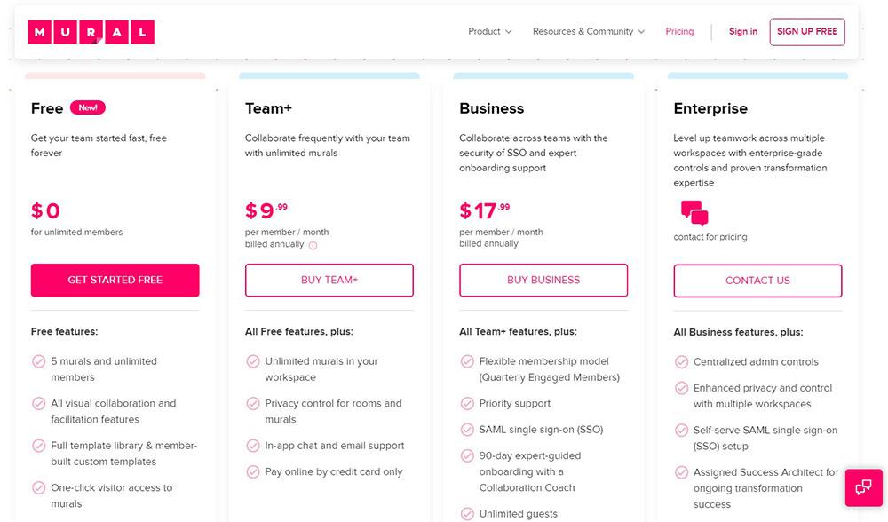
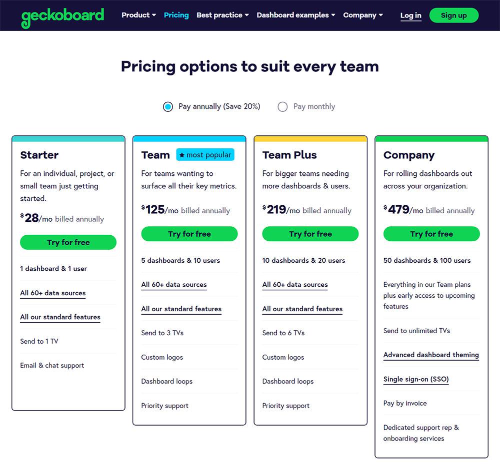
Three is the optimal amount of pricing tiers
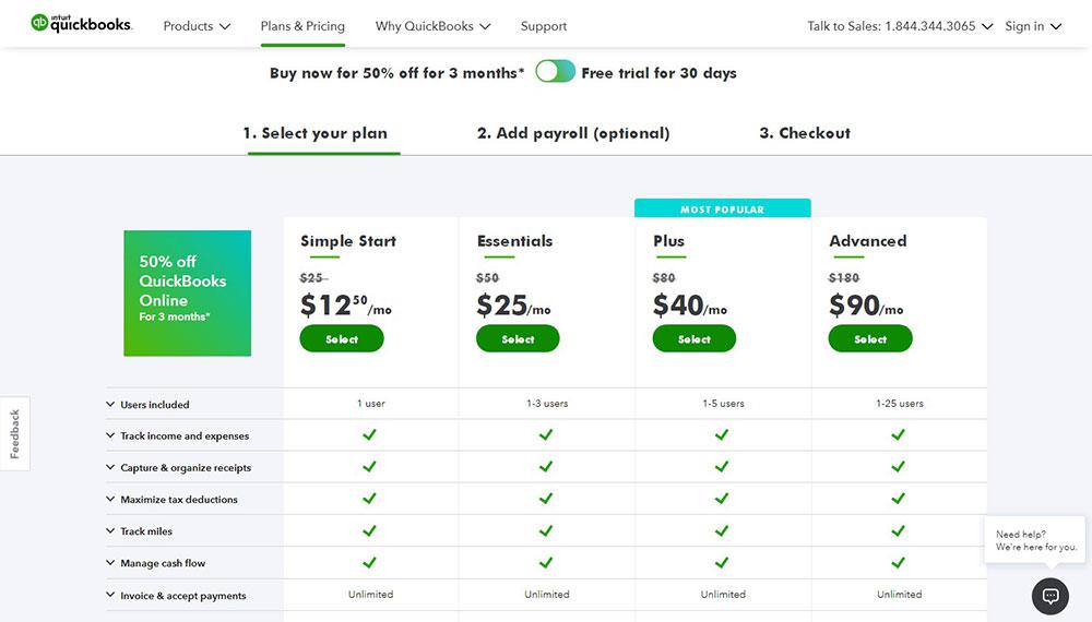
If your price page just provides one plan, the main duty of individuals who visit your website will be to determine whether or not to subscribe to your service, but if you have two or more pricing tiers, potential consumers will consider which plan is best to choose.
However, more than four options might overwhelm the prospect with too much information, whereas your job is to make each offer straightforward and quick to review. As a result, the ideal approach is to establish three strategies for distinct buyer profiles.
Give your customers resources
Once your consumers arrive at your price page, they have reached the end of your sales funnel. While your price page design should be as simple as possible, clients will still want resources to assist them to cross the finish line.
The last thing you want is for your consumers to be perplexed, hesitant, or hurried into deciding due to insufficient information.
Anchor your prices
Numerous people have discovered that anchoring product pricing is a successful technique. Anchoring is the process of setting visitor expectations by displaying different pricing. A $15,000 vehicle, for example, may appear costly until it is compared to a $50,000 one.
This isn’t simply a theory; it’s been verified by psychology. Researchers at the University of Missouri discovered that when consumers were handed real estate brochures with falsely inflated prices, they were more inclined to overestimate the worth of their properties.
Convert your currencies
Customers are more likely to purchase a product when it is priced in their local currency. However, the currency isn’t the only thing that has to be adjusted: you also need to modify the pricing based on how the currency’s value changes for clients in different regions.
Add Good-Looking Visuals
Pricing pages should never be overcrowded. However, certain graphics that hit the appropriate notes while still appearing beautiful and appealing might be beneficial. For starters, utilize eye-catching colors for price data. Emphasize the plan that provides the most value—this strategy can help the viewer decide which plan to purchase. Each plan should include a picture.
For example, with your free plan, start with a simple image and gradually add more features as you go to the more expensive ones. The pictures should show how their business will benefit from more expensive plans. You may even employ animation to bring attention to your “best value” plan.
Offer a discount upfront
And you’ve lowered your rates and raised them significantly; now show me the amount as you entice me with a discount. Although monthly and annual alternatives are quite frequent, why not try 18 months? You may also consider providing a modest discount on the “popular” plan.
Use Consistent Branding
Your price page should utilize the same colors and logos as the rest of your website. Customers will be less confused as a result, and your price page will appear less rushed.
Instead, make your price page big and stand out by using strong hues that complement your brand’s color strategy.
While you don’t want your SaaS to appear to be all about money, you do want users to understand that you’ve spent a significant amount of time contemplating your price strategy and building a pricing page that works.
Start with the most expensive plan
According to the study, consumers read the first two plans on the left side more carefully, and the visitor is more likely to pick the most costly offer if it is presented on the left.
Use a Slider to Showcase Dynamic Pricing Options
Pricing might be difficult, but it doesn’t have to feel that way. Experiment with different components and be creative. Create an interface to assist the user in achieving their objectives.
Autopilot, a visual marketing, and automation solution have a dynamic visual price slider that allows you to investigate expenses dependent on the number of contacts.
Make the action obvious and urgent
After your consumers have decided to buy your product or service, they will search for a clear, conspicuous method to proceed.
Check to see if your call to action is indeed actionable. Don’t use the standard “Submit” button. Rather, ensure that the text on your “Buy now” button properly explains what will happen following the click.
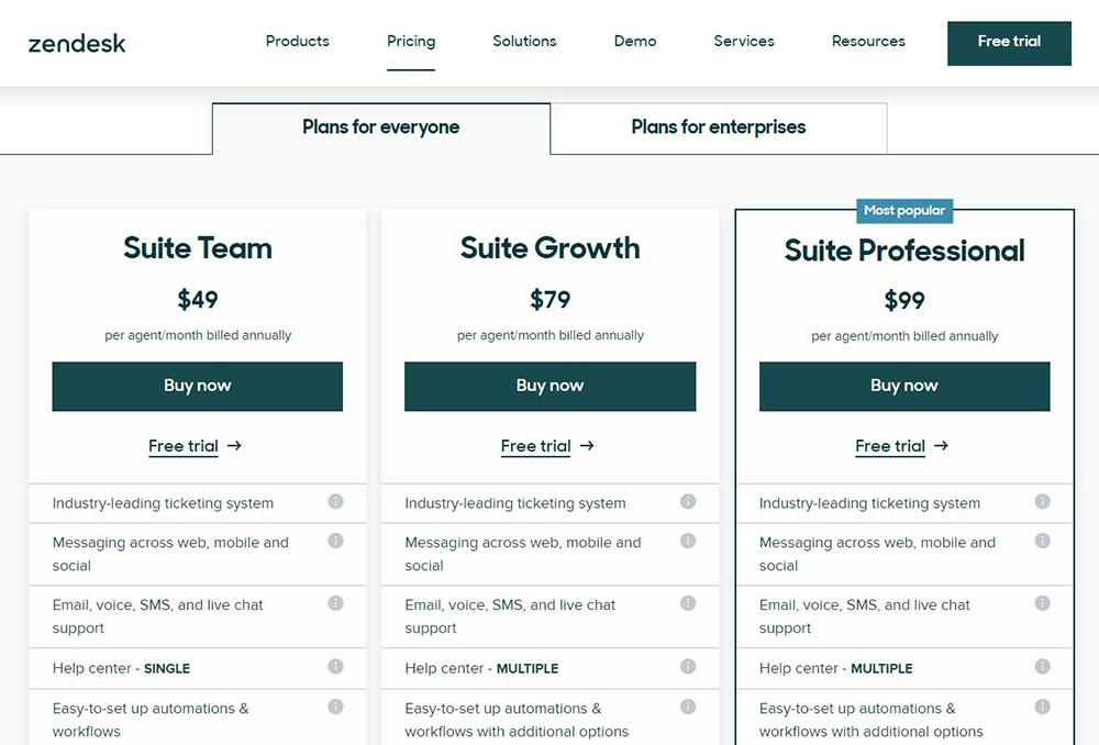
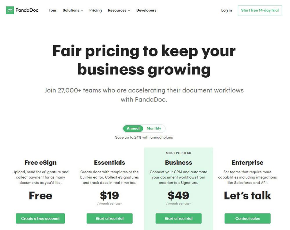
Highlight your recommendation
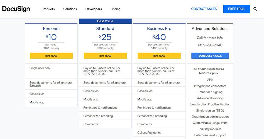
If a user is undecided about which plan to select, displaying the “most popular” or “recommended” plan alleviates the buyer’s uncertainty.
Always select the plan that you know will provide the most value to the majority of your consumers when determining which one to promote. The “Professional” plan is distinguished by the “Most popular” badge as well as the vivid blue hue.
Include Social Proof
Social proof is a massive issue for clients. In 2013, for example, 79 percent of online shoppers polled trusted online reviews as much as personal recommendations. In addition, up to 85 percent of consumers check reviews for local businesses. Some social evidence on your page, on the other hand, might correctly nudge them.
Avoid stock photo faces and generic evaluations in favor of genuine individuals, maybe through social media postings or video testimonials.
And if you’re a B2B company, use other companies’ logos and display them with a logo slider.
A large number of your marketing activities, such as sending promotional emails, generating instructional material, and implementing a paid advertising strategy, will direct visitors to your price page. There is nothing better than more leads and sales if you work in marketing for a SaaS firm.
Whenever designing a SaaS price strategy and associated pricing page, you have a lot to think about. Pricing is a methodical procedure. Treat it like such, especially when developing in a fast-paced industry like SaaS. You’ll unavoidably keep chipping away at your pricing potential to keep your bottom line expanding and successful.
About the Author

Bogdan Sandu
Bogdan is a designer and editor at DesignYourWay. He's reading design books the same way a hamster eats carrots, and talks all the time about trends, best practices and design principles.