
To create the perfect sticker, you have to think about the design and print in equal measure. After all, an incredible design can become a costly waste if the print is low-quality.
As well as all the design elements mentioned in this article, you should know exactly what your stickers will be used for before starting. Once you have a clear vision, a professional designer, and a copywriter, can bring your ideas together to create a sticker that’s visually appealing and persuasive.
Designing the perfect sticker
Sticker design is as much science as it is art. There are four key elements to the design stage: Shape, size, typography, and colour. The way you use creativity within these parameters is what determines how well your sticker or label is perceived. Don’t be afraid to break some rules to make your sticker stand out. Don’t be afraid to break some rules to make your sticker book stand out.
Shape
The shape of your sticker depends on the purpose of your sticker. Is it for marketing, or is it going to be a product label? If it’s just for giving away to customers, size isn’t as important as it would be for a product label.
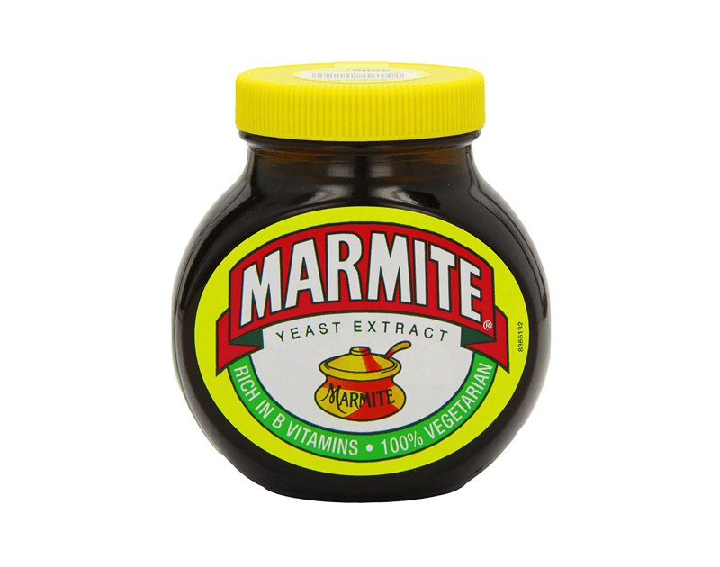
There are many creative shapes and sizes for stickers and printed labels. The latter requires precise measurements to ensure it’s right for the product package. You might want your product label to complement the shape of the packaging, like the label on Marmite…
Size
A good sticker printing company will get your stickers printed in almost any size. From product labels to stickers that cover vehicles and entire walls. Much like the shape, the size depends on what the sticker will be used for. If you have multiple uses for your sticker, or plan to use it in the future, make sure the design is saved as a vector file so it can be scaled up and down without the loss of image quality.
Typography
You might think typography is just sticking a font on that you like and calling it a day. But there are vital details that affect how people read your words that shouldn’t be overlooked.
The three most important factors are that the text is:
- Readable,
- Visible,
- Clearly arranged.
This is achieved through carefully selecting the following…
Font
The first stage of nailing your typography is using a font that’s clear and easy on the eye. But you also have to consider what represents your brand. For example, Jack Daniels uses a font called Black No. 7. The lettering is old style, which represents the brand, but is also readable.
Font weight
The weight of the font refers to how bold the text is. Most labels and stickers use bold typeface to highlight the most important text. This makes the text more visible from a distance.
Arrangement
The arrangement of letters refers to:
- Text direction
- Line and letter spacing
The direction of your text refers to horizontal, vertical and diagonal positioning. Many stickers may feature text on a curve, or around a circle, with the most important text central to the design.
Line and letter spacing have a significant effect on readability and should be tweaked with the same importance as font type.
Colours
Along with typography, colours are arguably the most important aspect of sticker design. There’s a psychology to the use of colours that is rarely disputed among consumer behaviour analysts. The magic is bringing the colours together with the typography to deliver the message you want to consumers.
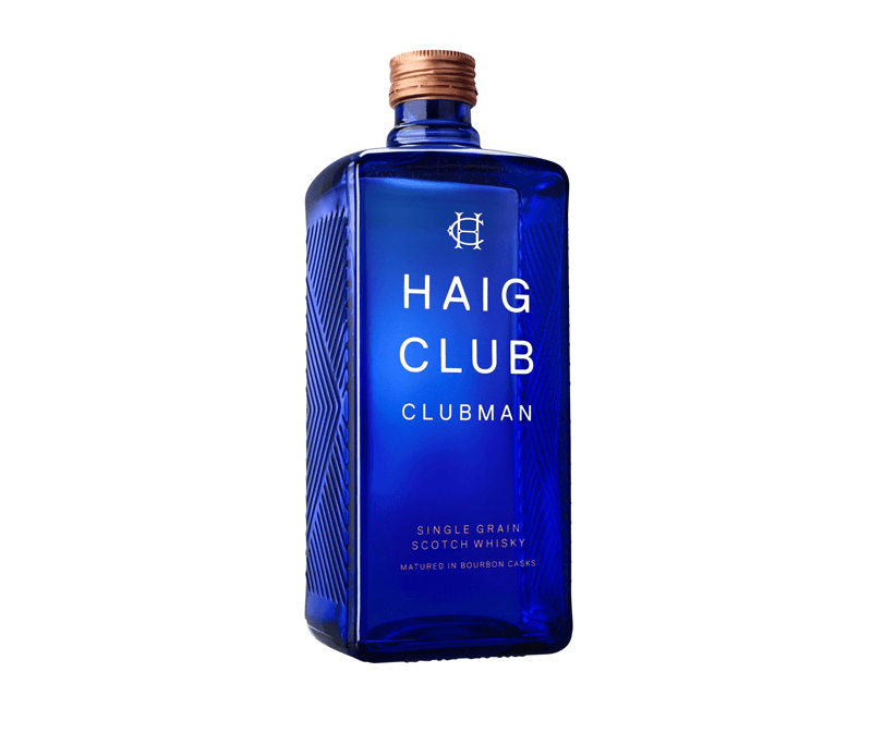
Let’s say your product is juice. It’s well known that reds and yellows are appealing on food and drink items. In the case of juice products, many brands use transparent elements to show off the juice inside, using the colour to appeal to consumers. Transparency and minimalism are a big theme on alcohol bottles, too…
Other known colour combinations are:
- Blue and white = clean
- Green = natural, organic
- Brighter hue = more positive
Bearing the psychology of colours in mind, you should pick your colour palette based on what makes sense for your product or brand.
Printing the perfect sticker
Once your design is finalised, you’ll be keen to get it printed. But this stage is just as important as any other. You want a high-quality sticker that looks how you imagined it would. You also need to find the best printer for graphic design that will meet your demands be it a printer that is durable, produces high-quality prints at high speed or has a low running cost.
DPI
DPI stands for Dots Per Inch. It’s the resolution of the image in print. 300 DPI is the recommended minimum for a high-quality printed image. However, there are many companies who print up to 1440 DPI for an incredibly crisp image quality. For stickers you want people to see from a distance, the higher the DPI the better.
Format
If you want full control over the design, get the vector. This allows you to edit the individual elements of the design, and it means you can scale the image to any size without losing visual quality. Ask your designer to provide the vector file.
When it comes to getting your sticker printed, it should be sent over in a lossless format. These are widely accepted formats for printing:
- EPS(vector)
- TIFF
- PNG
Material
The material your sticker is printed on plays a part on the message you convey to viewers. Premium product labels and stickers may be printed on materials that feel premium.
Matte
Matte is a non-reflective sticker with a smooth appearance. It’s a good choice for premium designs.
Clear
The use of transparency is common on many stickers and labels.
Gloss
Glossy stickers may be the most popular choice. They shine in the light which can be eye-catching.
Metallic
Stickers are also available in polished or brushed metal for another sleek and premium-feel material.
Bleed/trim
The bleed and trim are the two outer-areas of your sticker design. This excess area is there to ensure your design doesn’t get cut off, and there’s no white space leftover. The bleed and trim area will be removed from the printed design, leaving the “safe area” in the middle in-tact. The design however, should go up to the trim to ensure the whole sticker is covered by your design. This is something to discuss with your sticker design company or read more about on their website to ensure everything is set up correctly.
Conclusion
Making a sticker that’s ‘perfect’ takes time. If you rush blindly into the process and get ahead of yourself, it’s easy to make a mistake. But it doesn’t have to be that way. Do enough research and the process is a simple and rewarding one.
About the Author

Peter Makeshoff
Peter Makeshoff is the founder and main author of Designer Daily.