Even if you are not involved in design activities, from time to time there is a need to edit the photo. You can ask someone you know, as clipping path service, but anyway I would like to tell you about some tips on editing pics.
5 examples where it is easier to turn to the program than to go for help
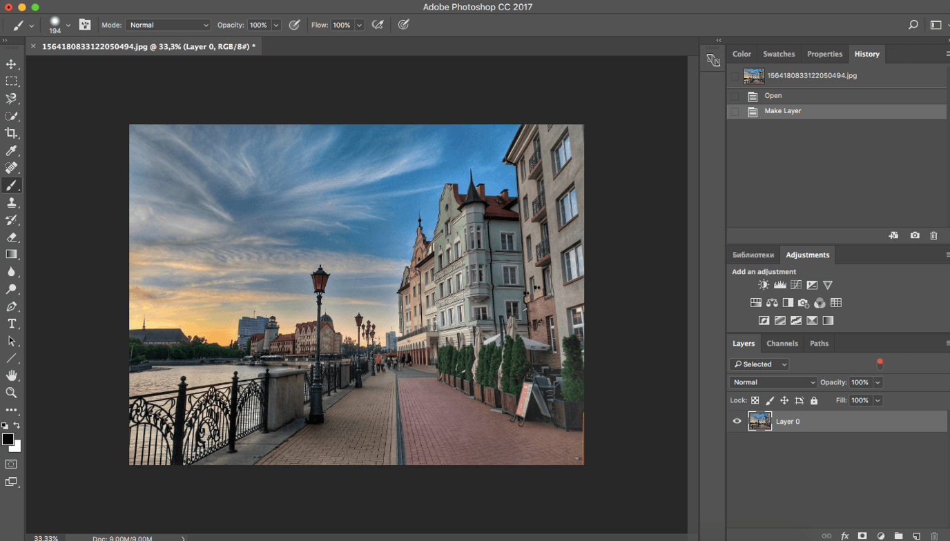
Let’s say you have pictures of your trip. The photos are not bad, but still raw: somewhere the horizon is filled up, somewhere you need to tighten the contrast or you want to generalize the color so that you can put it on Instagram or make a beautiful album.
First, you need to open the file in Photoshop and unlock the photo layer by clicking on the “lock” next to the image on the “Layers” panel.
1. The Horizon, Cropping, Perspective
By the combination of keys “Ctrl / Cmd + t” we open the tool of transformation and, keeping the key Shift (for the preservation of proportions), we pull by a corner of a grid of a photo, cropping it to the necessary size. Then release the mouse and the Shift key (in this order) and when the cursor changes to a semicircular arrow, click and rotate the photo to the desired level. As soon as we achieve the required result, press Enter.
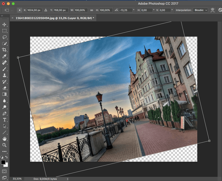
To change perspective or to align a collapsed building, hold down the Ctrl key in the same transformation mode. Hold down the key and pull the corner of the transforming grid until the horizontal or vertical alignment is achieved. Remember to hold down the Shift in order to fix the direction of travel accurately, if necessary.
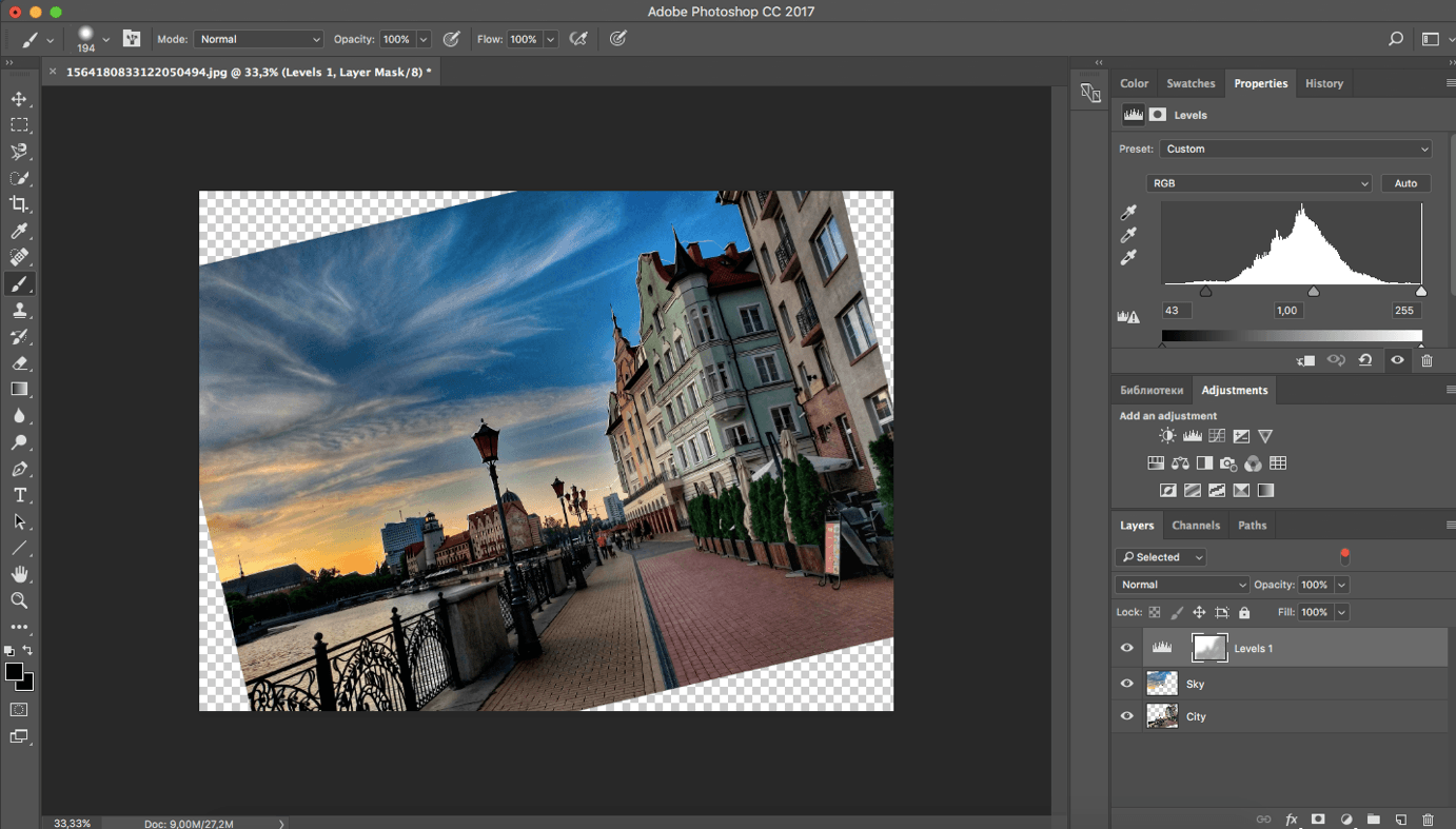
2. Contrast
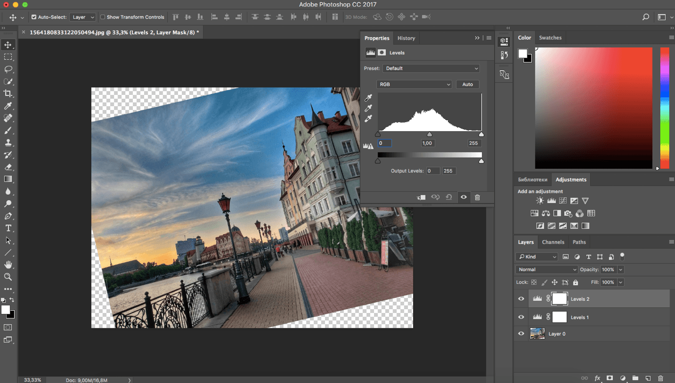
To increase contrast in the Layers window, select Levels. In the new Properties window move the sliders left and right. The far left is responsible for the dark areas of the image, the average for half-tones, and the far-right for the lights. By making the light more active, we also influence the mid-tones. Therefore, in order to avoid overlapping, the middle slider can be moved to the right by darkening the halftones.
P.S. here and in the following correction tools we use the non-destructive method of influence, i.e. we do not change the image, but superimpose correction layers on it, which settings can be changed at any time without affecting the original image.
Obviously, the sky and the building are contrasting in tone, and the architecture becomes too dark when the sky is darkened. To fix this, you need to change the contrast of each object separately. For this purpose, in the same way, we create a second corrective layer Levels (levels) called it “Sky”, it will affect only the sky.
We turn off the second “eye” and set the desired contrast of the sky, without paying attention to the architecture.
In our case, we need to make the sky much darker, so the slider on the left (responsible for the dark areas) shift to the right. We do the same with the middle slider.
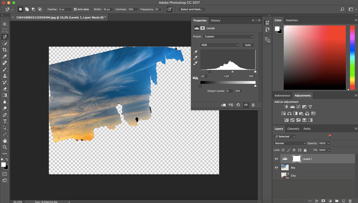
To separate the zones of influence, click on the white window in the correction layer “Sky”. This is a mask: when it is selected, we are in the mask mode. Its task is to remove the effect of the adjustment layer from certain places. To do this, we’ll paint the areas we don’t need with a black brush. In our example, the architecture. The brush is the B key.
By drawing in masks, we can influence the contrast of individual areas.
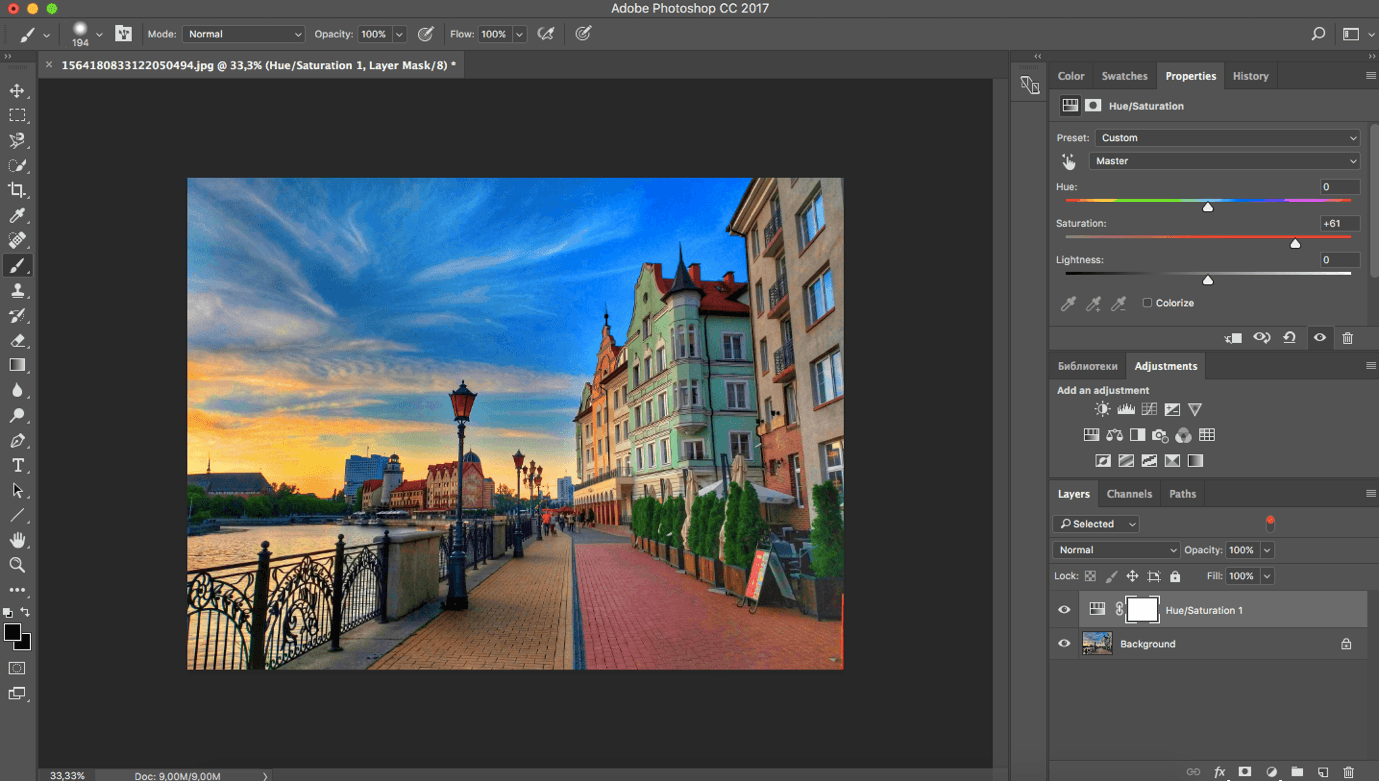
3. Brightness and Saturation
The easiest way to add or remove saturation is to adjust Hue/Saturation. In the Layers window, select the Hue/Saturation function and use the sliders to influence the color. The first slider is responsible for color distribution in the picture. By moving it, you can simultaneously charge all the colors in the image across the entire color spectrum – from red to blue. So you can experiment with the color, make the overall tone of the image darker or colder.
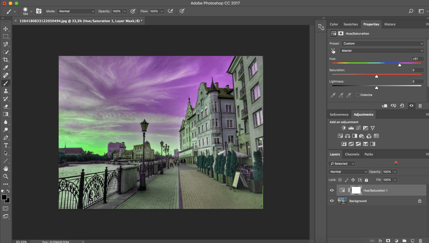
The second slider changes saturation. Moving it, you can discolor the image or make it brighter. The third one affects the general tone, the slider to the left becomes darker, to the right – evenly lighter.
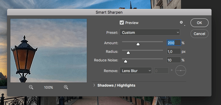
4. Clarity
If the image looks cloudy, you can add clarity. To do this, select the desired image layer and in the upper menu bar in the Filter section find Smart sharpen. The first two sliders allow you to set the force of the filter on the whole image.
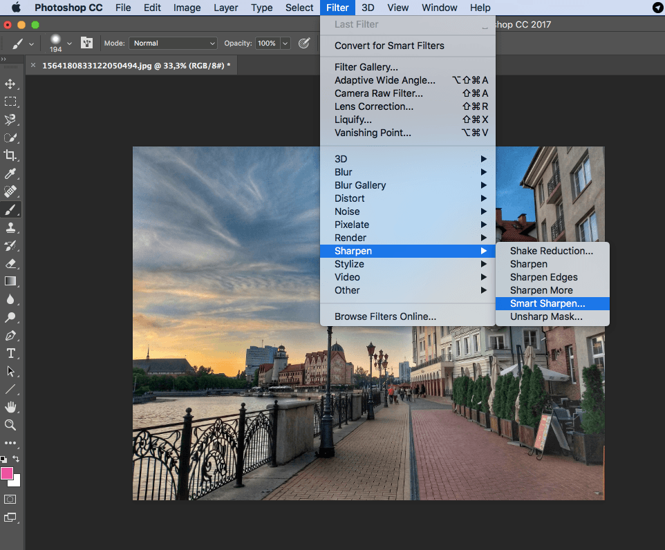
Below are advanced Shadow/Highlights settings to reduce the impact of the filter on light and dark areas of the image. This method is destructive because it changes the image itself and you cannot undo any adjustments.
5. Coloring
The popularity of one or another color scheme in the graphics depends on the popular techniques of cinematography. The more a picture looks like a movie, the more atmospheric and attractive it looks. In Photoshop there is a large number of various filters, presets, which can be downloaded from the network. There are so-called LUT – Color Lookup, they are used to process the video and static images that professional photo editors use too. LUT is a set of correction layers with specified settings. Initially, there can be any number of correction layers, some of which affect the light, others – the colors, for example, painting blue in a green hue, and warm red change to cold. Using LUT for similar photos, we can set a specific atmospheric vector through color and tone.
The installation of such additions usually does not cause problems and has a similar scenario. In the directory where Photoshop is installed, you need to find a folder with the native presets of the program and copy there the downloaded LUTs. After starting Photoshop the list of presets will increase.
However, do not abuse the number of additional presets, as it significantly reduces the speed of downloading the program.
So, we decided to use one LUT for all photos.
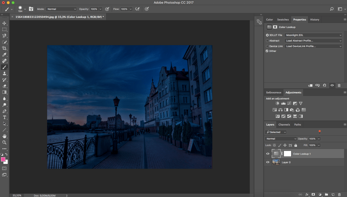
After application, a correction layer appears, and the photo located on the lower layer changes. If necessary, we can reduce the impact of the adjustment layer by reducing the FILL value.
Thus, by correcting each photo, we get a geometrically smooth, beautiful in color and composition image. Now the photos have turned into a full-fledged series, united by color. The processing of photos in Photoshop is over.
About the Author

Peter Makeshoff
Peter Makeshoff is the founder and main author of Designer Daily.