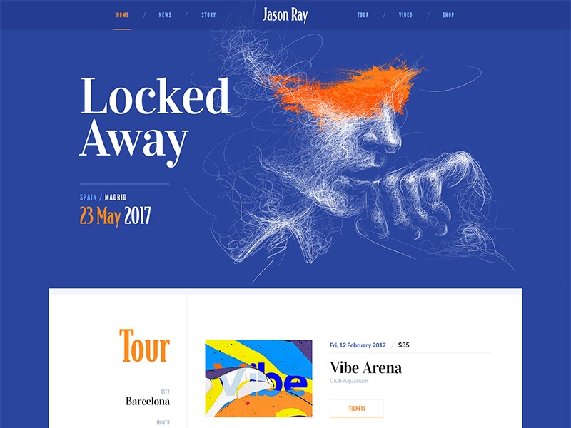
When you are working on a website, you’re aware that great typography helps to create a message, keeps viewers engaged and adds to your design.
There are so many fonts available, that you might wonder how you create the perfect choice for your site. Here are some tips to help you:
Go back to the basics
Working with website design means looking at the foundations of a font.
Explore the divide: almost every font choice is based on the decision of serif or sans serif.
Use space: kerning means working on the space between letters, tracking means pulling blocks of text together by eliminating excessive space, and leading refers to the amount of space between text lines.
Legibility: ensure that your text is easy to read. Play with font size to ensure that your viewers will be able to read easily without impacting how sentences run across a page.
Remove hyphens and justification: this helps to keep your work looking organized and eliminates unnecessary spaces.
Limit choice: try to use only two or three fonts on a screen. This keeps your page from becoming chaotic or overwhelming.
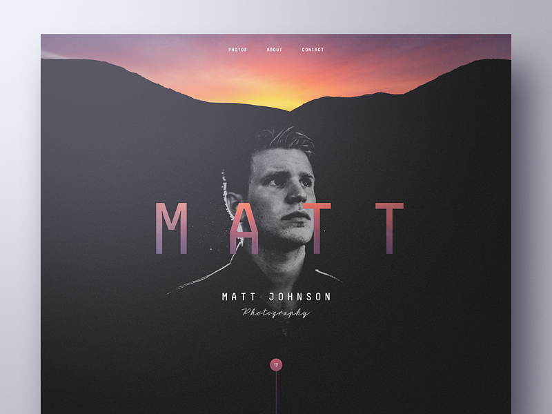
Remember to contrast: when you want to make a message pop out onto your screen, remember to use contrast.
Contrast is created by combining light and dark colors, but can also be used by contrasting color intensities such as vivid and muted colors.
Use browser friendly fonts
When you are shifting between browsers, make sure your texts are compatible. Text should also be compatible with different devices, such as mobile phones and laptop computers.
To do this, you could explore browser friendly fonts from Google Fonts, and ensure that you can read or use them on a smartphone or tablet.
How to create atmosphere or emotion using text
Words or sentences carry a message, but your viewer will take a first glance at your site and absorb meaning from your design, text, background, and color.
Your audience will not be able to relate to your site or text if the following four elements are not present:
- Type
- Color
- Texture
- Image
Adding these to your typography will enable you to create atmosphere, and to pass on a message to your viewers.
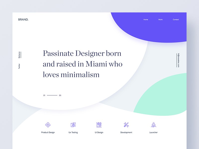
Working with color
When working with color, limit your choices. Many designers use a primary color, secondary color and accent color.
By using too many colours in your design, your website will be chaotic. If you’d like to create points of emphasis, use contrast instead of additional colour.
Be creative with your graphics
Surely, you want your site to be different than other websites in your niche. You can design a great header, footer or simply create a creative background.
That would be easy for a graphic designer, but if you’re a web designer that usually tackles simple graphics and code, it might be quite the challenge.
My advice is to start reading a few typography tutorials for Photoshop or Illustrator. Then, the sky is the limit when it comes to designing beautiful typography designs.
Working with content
When working with content, add hierarchy by working with paragraphs, headings, and subheadings.
While books are divided into chapters, sections, and paragraphs, websites use individual pages. The navigation bar represents a table of contents.
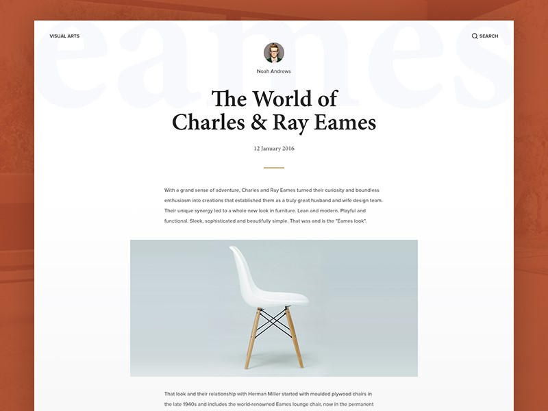
Websites have a clear distinction between titles, main paragraphs, and subsections of content. Subparagraphs often come with subheadings, so that users can take in information quickly.
Web users often want to be able to take in information quickly and get the general idea of a page. Page design is about making the reading process as quick and efficient as possible.
It is for the designer to lay out content according to importance. This means getting to know the content of your client’s pages so that you can organize it effectively.
Create mockups
If you’re working with small amounts of content, arrange the text according to headings, subheadings, and short paragraphs or bullet points.
However, if you are working with a great deal of text design a mock-up first. This will help you to work with chunks of text in a way which is both attractive and easy to read.
This way you can experiment with different combinations or page settings. Once you are happy with the mockups, you can incorporate other elements of your design.
Align your text
Alignment means placing text so that it can be read from left to right.
Aligning text from left to right prevents creating a chaotic feel to the website and makes it look professional. Only center large headlines on a website.
Preview the website
Once you have inserted your text into your page, take a look at how it fits within the page.
Look for text errors such as excess spacing, or sentences which fall out of balance. Examine the white space above and below your text. Without changing the content, make sure that the text gives an attractive and legible appearance to the page.
Create hierarchy
In the current society, website users are exposed to so much information on a daily basis that, were this not arranged effectively, it would feel chaotic.
As a designer, it is your role to structure this information so that it is easily digestible, arranged into a hierarchy of importance, and attractive to look at.
This relies on typography. From a design perspective, creating hierarchy is absolutely crucial in order to ensure users engage with a site.
Acknowledge the tone and message
When selecting a font, consider the tone and message of your content or site. Pick a typeface which matches the project you are working on.
A typeface for a thrash metal band would be different to that of a vintage furniture and clothing shop. Corporate projects would be different to casual ones.
Ask whether your typeface should be formal or casual, sleek or elegant, large or small, bold or light, and how it will pair with the colors you will be using on the site. How will the mood of the letters match with the words being read? A focus on zen design, for example, would clash with a very elaborate font.
Ending thoughts
Website designers use text to tell a story using words, but to provoke emotion and atmosphere through design.
When the writer and designer are able to work together to produce quality content which can be effectively and legibly displayed, this creates an attractive and easily absorbable end result.
About the Author

Bogdan Sandu
Bogdan is a designer and editor at DesignYourWay. He's reading design books the same way a hamster eats carrots, and talks all the time about trends, best practices and design principles.