A modern web design is essential because it helps set first impressions.
Visitors judge the credibility of your website within mere seconds.
If it looks outdated or unappealing, they’re likely to bounce off right away.
Understanding the Basics
Modern web design is more than just creating a good-looking website.
It’s about integrating user experience, speed, mobile design, simplicity, and aesthetics to make a modern website that resonates with your audience.
User experience (UX) plays a pivotal role in modern web design.
It’s all about creating websites that are easy to navigate, understand, and use.
A website with good UX design keeps users hooked, increases engagement, and boosts conversions.
Key Elements of Modern Web Design
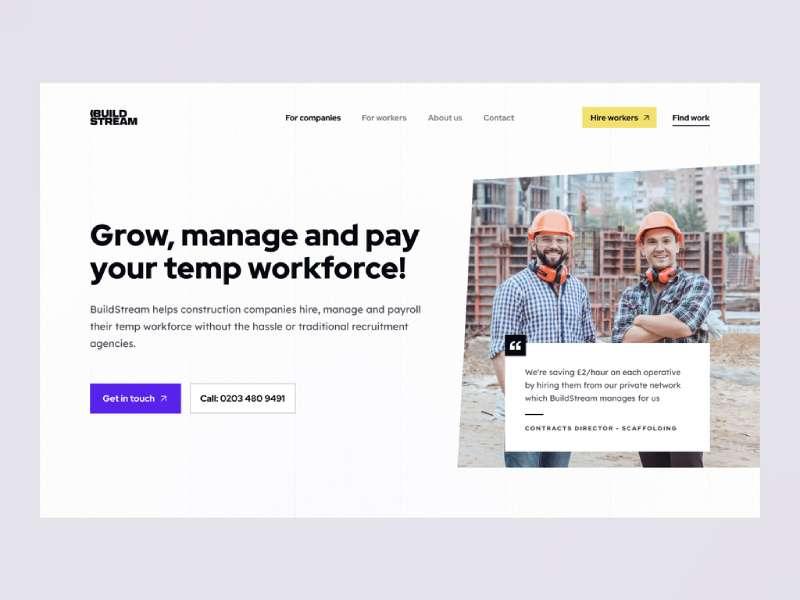
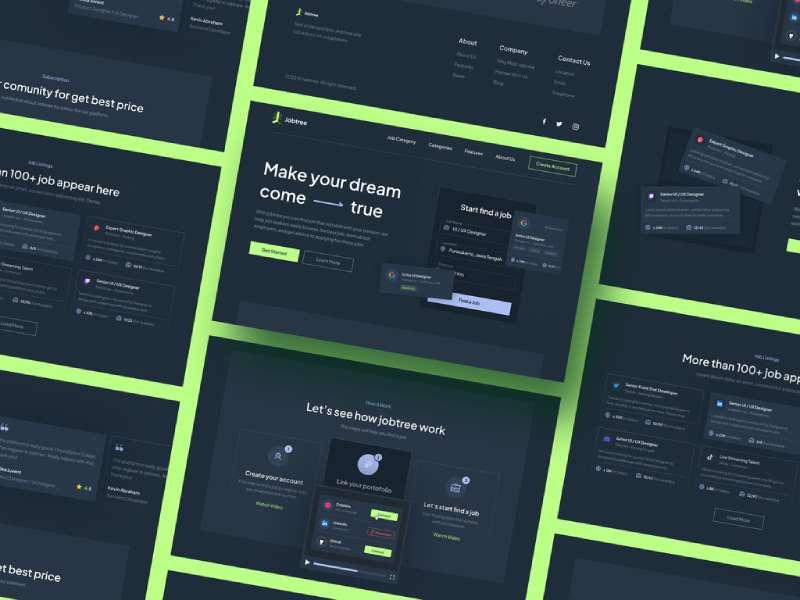
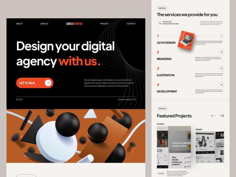
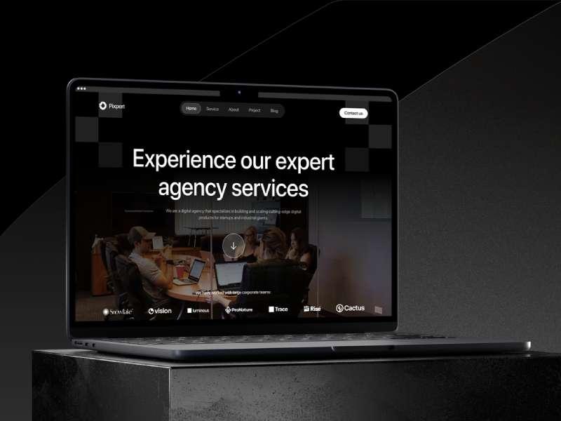
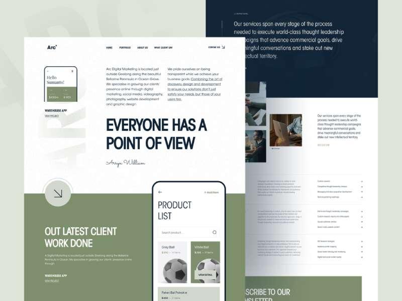
Unique Typography, engaging and responsive hero images, background videos… these are some of the elements that make a modern website pop.
But it’s not just about having these elements. It’s about how you use them to convey your brand’s story and create an engaging, user-friendly experience.
For instance, check out these examples of well-designed coaching websites that effectively use these elements. Let’s delve deeper into some of these key elements.
Unique Typography
Making a splash with typography is one of the secret ingredients when you’re figuring out how to make a modern website.
Importance of Typography in Branding
Ever thought about how you instantly recognize a brand just by looking at its font? That’s the power of typography. It’s your brand’s silent ambassador, shouting out loud about your brand’s character without uttering a word.
Choosing the Right Font
Picking the right font isn’t as simple as throwing a dart and seeing where it lands. The fonts have personalities. Sans serif says, “Hey, I’m friendly and approachable.” Serif says, “Trust me, I’m reliable and professional.” Script fonts? They’re like your fun-loving, energetic friend who always brings the party. So, choose your font carefully. It needs to echo your brand’s personality.
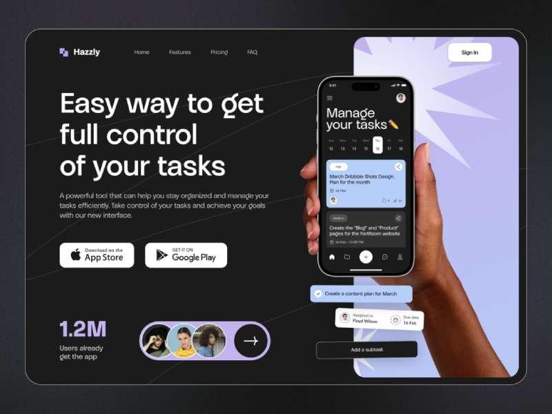
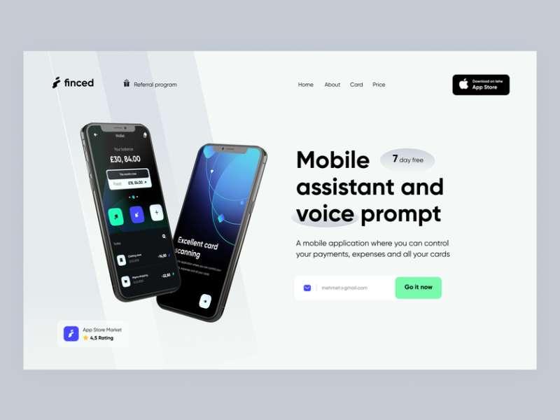
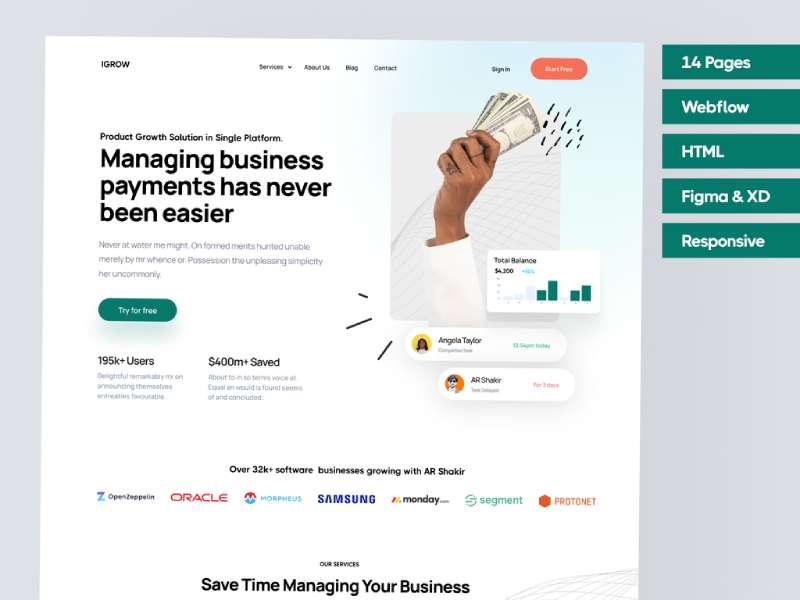
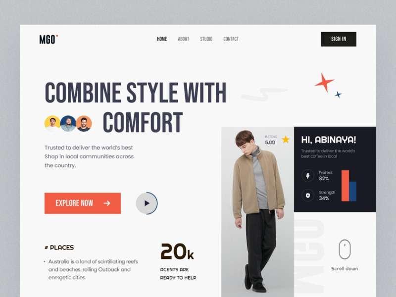
Engaging and Responsive Hero Images
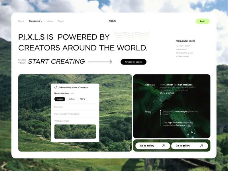
Role of Hero Images in Web Design
Picture this. You land on a website, and the first thing that grabs your attention is a striking image with a powerful message. That’s the hero image at work. It’s not just an image. It’s your website’s welcoming committee, greeting visitors, and guiding them into your site.
Best Practices for Using Hero Images
Remember, your hero image needs to be engaging, but it also has to play nice with devices of all sizes. Make sure it’s responsive, and it scales and repositions itself based on the device being used.
Background Videos
Ever thought about using videos in the background of your website? Let’s see how they can jazz things up.
Benefits of Using Background Videos
Background videos are like silent storytellers. They create an immersive, interactive experience without disrupting the user flow. Plus, they are super engaging. If a picture speaks a thousand words, imagine how much a video can convey.
Tips for Implementing Background Videos
However, remember to keep the videos short, silent, and relevant to your content. You wouldn’t want to distract your audience, would you?
Semi-Flat Design
“Semi-Flat Design” may sound like a term from a high-brow art critic, but it’s really not that complicated.
Understanding Semi-Flat Design
Imagine a 2D image, but with a dash of depth and realism. That’s semi-flat design. It’s about using subtle shadows, gradients, and layers to create an illusion of depth in your designs.
Advantages of Semi-Flat Design
Semi-flat design strikes the perfect balance between flat design and skeuomorphism. It’s clean, minimalist, and yet it has depth. This is why it’s a popular choice when trying to figure out how to make a modern website.
Hamburger Menus
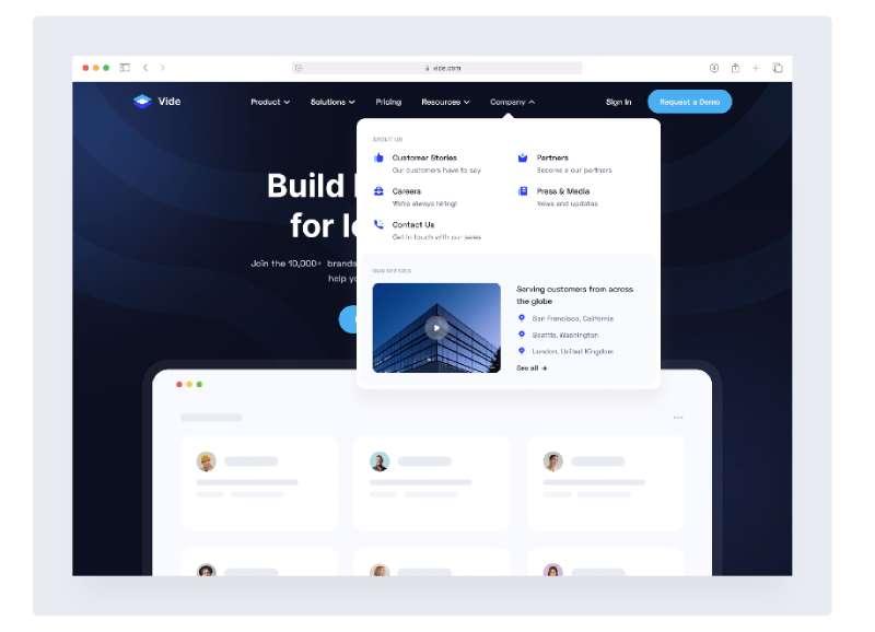
The “Hamburger Menu” has nothing to do with burgers, but it’s an equally delicious addition to modern web design.
What are Hamburger Menus?
The three parallel lines you often see in the corner of a website? That’s the Hamburger Menu. It’s like a secret door to the treasure trove of your website’s other pages.
When to Use Hamburger Menus
They’re great for mobile interfaces where space is at a premium, but use them with caution on desktop interfaces. Remember, out of sight, out of mind. If it’s not immediately visible, your users might not discover it.
The world of web design is vast and evolving. But hey, don’t feel overwhelmed. One step at a time, right? Let’s continue to explore more key elements of modern web design in the following sections.
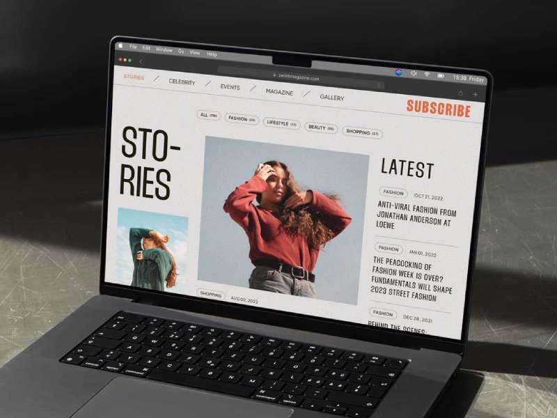
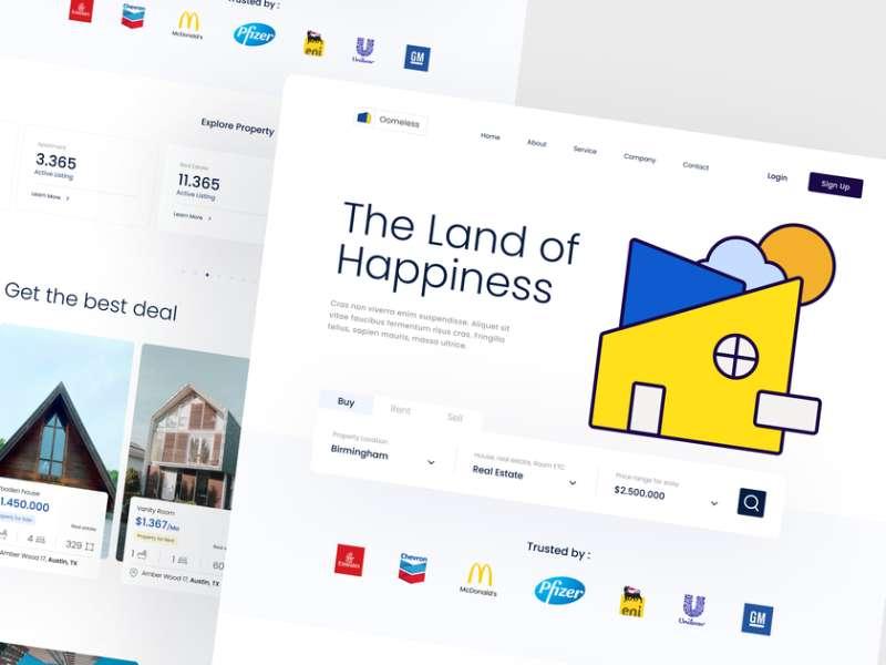
High-Quality Product Images
Next on the journey of how to make a modern website, let’s dive into the realm of product images.
Importance of High-Quality Images
We are visual creatures. When we see a product, our brains start picturing us using it. It’s all about stirring emotions. A well-shot, high-resolution image does that effortlessly. It’s like saying, “See how awesome this product is? You know you want it.”
Tips for Using Product Images
But remember, while quality matters, size doesn’t – not in the way you think. Make sure your images are optimized so they load fast. You wouldn’t want your audience to doze off waiting for the images to load, would you?
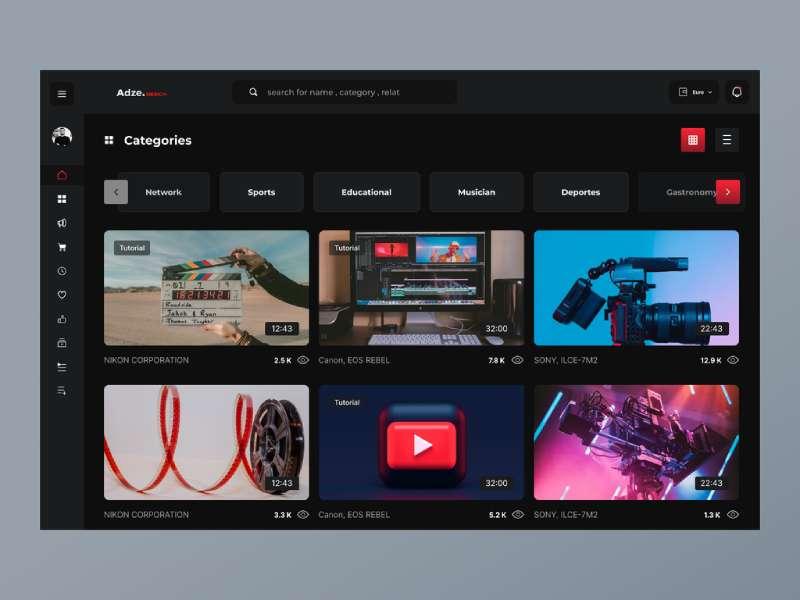
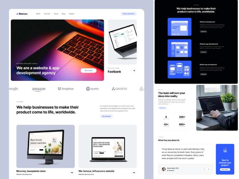
Card Design
Let’s step into the world of card design next.
Understanding Card Design
Cards are like little containers of information. Each card holds a chunk of content. It’s like saying, “Here’s a bite-sized piece of information. Enjoy!” Think of them as trailers to the main movie that resides on another page.
Benefits of Card Design
Card designs are neat, flexible, and work like a charm on devices of all sizes. They are an awesome way to create a clean, organized layout.
Feature Videos
Ever considered using feature videos in your web design?
Role of Feature Videos in Web Design
Feature videos are your brand storytellers. They show your brand in action, narrating a story, and engaging the viewers. They are your virtual salesperson, showcasing your brand’s features and benefits.
Best Practices for Using Feature Videos
While feature videos can be super engaging, make sure they are well-made, concise, and have a clear message. And yes, make them optional. Autoplay? That’s a big no-no.
Mobile-Friendly Layouts
In the age of smartphones, this is non-negotiable.
Importance of Mobile-Friendly Design
Everyone’s got a smartphone these days, right? So, if your website throws a tantrum when accessed from a mobile, you’re basically turning away a huge chunk of your audience.
Tips for Creating Mobile-Friendly Layouts
To make your website mobile-friendly, prioritize simplicity, ensure easy navigation, and keep the touch targets large and accessible. Oh, and test. Then test again. Rinse and repeat.
To understand better how these concepts translate into a working website, you can take a look at this coffee shop website templates, which beautifully encapsulates modern web design principles.
Interactive Charts in Modern Web Design
In today’s data-driven age, interactive charts have emerged as a significant element in modern web design. They not only provide a dynamic way to represent complex data but also engage users, making them spend more time on your site.
A well-designed interactive chart can simplify intricate data sets, making them easily understandable at a glance. Plus, the interactive nature means users can hover, click, and drill down for more detailed information, enriching the user experience.
When integrating these charts, ensure they are mobile-responsive and align with your website’s aesthetics for a seamless user experience.
White Space
White space is like the oxygen of your web design.
Understanding the Role of White Space
White space is not about waste of space. It’s breathing room for your content. It’s what allows your design elements to stand out and catch the viewer’s attention.
Best Practices for Using White Space
Use white space strategically. It should guide the viewer’s eyes, improve readability, and highlight the key elements on your page.
Speed Optimization
Last but not least, let’s talk about speed.
Importance of Speed in Web Design
In the digital world, speed is king. A slow-loading website is a fast way to lose visitors. A fast website, on the other hand, keeps users happy and also gets a thumbs up from search engines.
Tips for Optimizing Website Speed
To boost your website speed, optimize your images, minify your code, use browser caching, and consider a Content Delivery Network (CDN). It might sound like a lot, but hey, speed matters!
Phew! We’ve covered a lot today. The world of web design is an exciting one. We’re not done yet though. Stick around as we dive into more advanced concepts in the following sections.
Advanced Concepts in Modern Web Design
Full Width & Full Screen Design
Full width and full screen designs are like the “Imax” of web design. When you’re figuring out how to make a modern website, they are a neat trick to have up your sleeve.
Full width design means using the entire screen width to your advantage, while full screen design scales and fills the entire screen, creating an immersive experience.
Why do we love them? They’re attention grabbers. They let your content sing, loud and proud, without any distractions.
Mixing Up Layouts
Variety is the spice of life, and web design is no exception.
Sure, grid layouts are cool, organized, and easy to follow. But who said we have to stick to the grid all the time? Break the grid, shift elements, overlap them, play with asymmetry. It can lead to some pretty exciting, unpredictable results.
Just remember, with great power comes great responsibility. Be adventurous, but don’t go overboard. User experience should always be the North Star guiding your design decisions.
Animation & Transitions
Animation and transitions are like the secret sauce in your web design burger.
Animations can range from tiny micro-interactions (like a button changing color when you hover over it) to complex animations telling a story. Transitions, on the other hand, are the effects used when changing from one page/state to another.
The key with both? Subtlety. You want to create a smooth, seamless user experience that feels natural and intuitive.
Depth in Design
Flat design has its charm, but adding depth to your design? Now that takes things to a whole new level.
Think shadows, gradients, layering elements, playing with opacity. These techniques create a sense of depth and make your design more visually engaging.
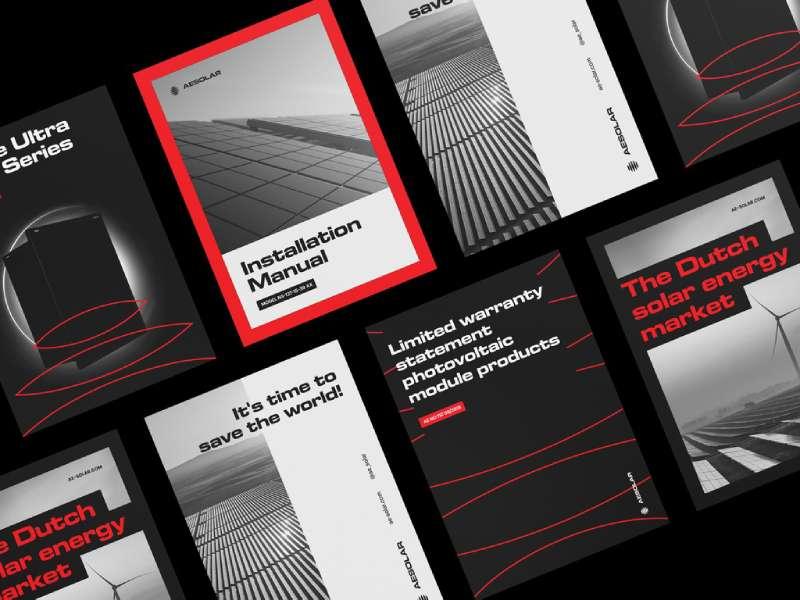
Custom Graphics & Iconography
When it comes to standing out in the crowded world of the web, custom graphics and iconography are your best friends.
Custom graphics and icons add personality, reinforce your brand identity, and make your design unique. Plus, they can simplify complex information and make it more digestible.
SVG Graphics & Icons
Say goodbye to pixelation. SVG, or Scalable Vector Graphics, are like the superheroes of web graphics.
No matter how much you zoom in or out, SVG graphics and icons retain their quality. So, they look crisp and clean on any screen size.
Typography Considerations
Typography isn’t just about choosing a nice font. There’s a lot more to it.
Think font pairing, line spacing, hierarchy, contrast, readability on different devices… the list goes on. All these factors play a crucial role in how your content is perceived and understood.
Conclusion
Web design is a blend of art and science, creativity and logic, form and function. It’s about creating an experience that’s engaging, intuitive, and enjoyable. So, as you venture into your web design journey
About the Author

Peter Makeshoff
Peter Makeshoff is the founder and main author of Designer Daily.