Even for brick-and-mortar shops that don’t offer e-commerce, having an online presence is essential these days. A strong website is vital for the success of any small business, whether you are a freelance photographer, manage a hardware store, or run another form of small business.
Having a good, complete website is essential for almost every new business. However, for individuals who have never had their website before, getting started might be scary.
A competent website designer’s focus should be on creating a website that can drive more meaningful and relevant traffic to your organization, produce more leads, and reduce obstacles that visitors across the spectrum may have when navigating around the website for varied reasons and purposes.
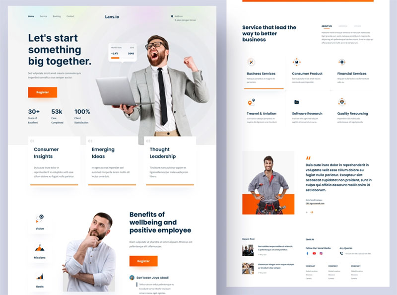
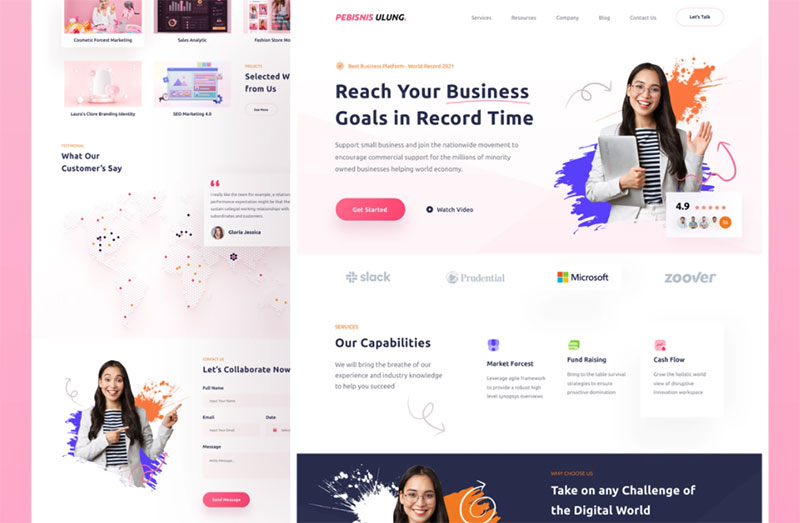
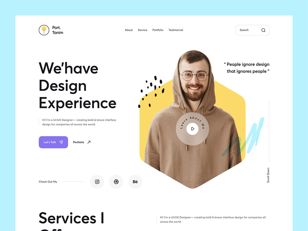
With so much competition online, simply having a website isn’t enough. While creativity is crucial, there are certain basic design and user experience standards that can help you expand your website. Keep the following recommendations in mind while developing or redesigning your website.
Quick Site load time
Visitors become irritated when a website takes too long to load. Ascertain that your small company website design is supported by enough server infrastructure and bandwidth.
A graphically intensive design may slow down your loading speed and turn off potential clients. Choosing reputable hosting can also help to enhance site load time.
Use a straightforward layout
No one loves clutter, and web visitors are no exception. It is better to keep things clean, basic, and orderly. The easier it is for visitors to locate what they need, the better. If you want things to be easier for you, you can get a corporate website template and start from there.
Have a Clear Goal
Each minor company website is unique because each one serves a distinct function. If you want your first company website to be a shopping gateway, you must design it with that purpose in mind.
You must design it with that purpose in mind if you want it to deliver information and persuade potential clients to call you. A website that lacks a defined objective will waste your time and money while delivering little if any, profit.
Provide all the relevant information
Individuals that search the web are searching for solutions. If your site lacks facts, the user will go on to the next one in the results pages.
Give users robust search capabilities
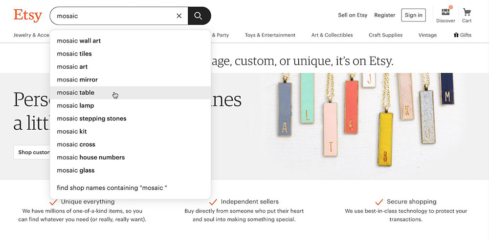
It’s also vital to consider how users will search your site and how results will be displayed. Concerning how results are structured, the search experience should reflect your navigation experience. Incorporating features such as auto-complete would make searching easier for users as well.
Clutter-Free
The design of corporate websites should be simple yet appealing. A lot of information or an intricate design might be overwhelming to the viewer. A clean design also conveys a sense of professionalism. Allow your website to breathe so that your visitors enjoy a good viewing experience.
Make your site mobile responsive
For a website to be effective, it must be mobile responsive. Every day, American people spend more than five hours on their mobile phones, and more than one-third conduct all of their internet purchasing through mobile devices. Needless to say, the mobile website for your company must provide a great customer experience.
Tell customers what you can do for them
It might also be beneficial to read your material as if you were a potential visitor. According to Bracket, a major mistake she finds among novice website owners is a focus on what they do rather than what advantage they bring to consumers or clients.
Place your contact information above the fold
If your company relies on customers being able to contact you or your sales staff, make sure that information is easily accessible. Your contact information should be prominent, preferably at the top of the site, so that visitors do not have to look for a phone number or address if they wish to contact the company.
Make it Easy to Navigate
Whenever users come to your site, they should be able to quickly access your main items and services. It ought to be right in front of them. If people have to spend an extraordinary amount of time wandering through a virtual maze of online pages simply to locate what they’re looking for, it will be a unpleasant experience for them.
Develop a Page Hierarchy
Nearly all company websites have a few separate pages. You might go with a very simple arrangement that has a home page, about page, and contact page.
Alternatively, you may desire separate sites for each of your services, with a main services page that provides a high-level summary. That is something you should decide on, or at the very least think about, before developing or paying someone to build your website.
Use clear calls to action
How exactly do you want site visitors to perform? Purchase goods? Would you want to receive an email newsletter? Donate to a good cause? Consider your calls to action. Create them in such a manner that they stand out to a visitor browsing your website. If you’re utilizing buttons in your design, keep the text simple and to the point.
Incorporate attractive, easy-to-read fonts
To make your website text clear and interesting, choose an appealing type that is aesthetically balanced and unique. Brandon Grotesque, Museo Sans, Railway, and Playfair Display are the top four trending typefaces.
Design & Color
The colors you use to design a website are the first step in making it aesthetically appealing. It’s the first thing that strikes your sight as you try to avoid a bus. It’s what causes you to halt when scrolling through your Facebook page.
Colour draws attention and adds an extra layer of communication. Even before the conscious mind has begun to consider, the subconscious has already determined whether or not something is fascinating. It is solely based on colors.
Inbound Leads
Focusing on inbound leads and capturing as many as possible is one of the most critical duties of any small company website.
People usually want to make preliminary research and comparisons before purchasing a product, and they may not be ready to buy right away. This time should be spent collecting their e-mail addresses so that you can keep them updated and determine when they are ready to buy. However, you should avoid being overly persistent, since this may irritate a potential consumer.
Engage users with video and rich images
Videos and graphics are more appealing than text alone—in fact, landing pages containing videos may increase conversions by up to 80%. To provide a high-quality user experience on both desktop and mobile platforms, employ scalable images (SVG).
Make it easy to find
You’ll need a domain name that either fits the name of your organization or defines it in some manner. You can even have many domains pointing to the same website.
This includes implementing technical SEO best practices, keyword research, content marketing, and paid advertising campaigns to bring visitors to your website.
Use conversational English
Nobody wants to read content that sounds like a term paper, regardless of what your high school English instructor believed. Yawn. Write the copy as though you were speaking directly to the visitor. As though you were having a one-on-one talk.
Confirm your visitor’s actions
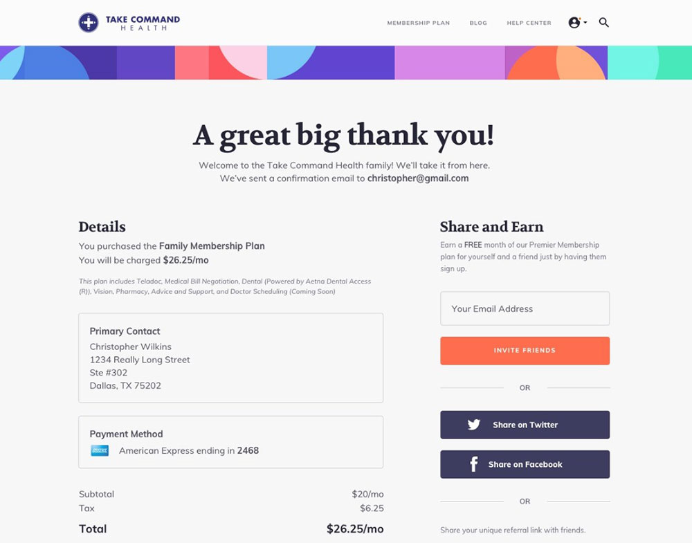
If your visitors buy a product from you, sign up for a subscription, or share your content, it’s a good idea to offer them a confirmation page that demonstrates their activity was successful. It also doesn’t hurt to thank them from that screen.
Branding should be professional
Minimize humor on your small company website and instead concentrate on giving it a professional appearance that is consistent with your brand. Use colors that stand out in your brand’s logo. if necessary, to give your website a professional appearance.
Choose one or two typefaces and utilize them consistently throughout the website. The designs and pictures you employ should also be consistent with and enhance the website.
Make sure your website copy is customer-oriented
Future clients visit your website in search of information that will be valuable to them. Sometimes people come to your blog for instructional staff, and other times they are looking for information about the items and services you provide.
In any case, you should deliver pertinent information that will interest your prospects, provide them with something of value, and help them to trust your expertise.
Leave out the hype
Users aren’t interested in spinning. They demand candor and openness. They want information so they may make an informed decision. Place all of your cards face down on the table and let guests form their conclusions. Include facts and pertinent specifics that might assist support your statements wherever possible.
Keep your website up to date
If people realize that your content is out of date, your site will lose all trust. Update your website regularly, adding new content and removing outdated material.
You should not simply include material. You should also get rid of everything that is no longer useful. If useful information is buried, your visitor may never locate it.
Draw Inspiration
If you’re not clear how you wish your first company website to look or how you want your material to read, search around for several websites that you truly enjoy. Of course, do not imitate them. However, exploring for outside ideas might help you figure out what you want from your new website.
Conclusion
The process is far from done after your first company website is online. You’ve taken an excellent first step. However, a company’s website is never truly complete. As your company develops and evolves, you may add or remove items. Visitors to your website are likely to be impatient in today’s information-saturated society. If they can’t locate what they’re looking for immediately, they’ll move on. Your website must provide genuine value to be effective. Put your visitors’ needs and desires first while creating content, and watch your conversion rate skyrocket!
About the Author

Bogdan Sandu
Bogdan is a designer and editor at DesignYourWay. He's reading design books the same way a hamster eats carrots, and talks all the time about trends, best practices and design principles.