Every shape carries psychological weight. The circle does not just look round. It feels safe, complete, and continuous. The square does not just look boxy. It feels stable, trustworthy, and grounded. Before a viewer reads your client’s name or understands their industry, they have already reacted to the shapes in your logo. That reaction happens in milliseconds. It is emotional, not rational. And it is your responsibility as a designer.
This is not pseudoscience. Decades of research in visual perception and consumer psychology have identified consistent patterns in how humans respond to geometric forms. Here is what your shape choices actually communicate.
Circles and Ovals: Community, Unity, and Movement
Circles have no beginning and no end. They suggest eternity, wholeness, and protection. The shape is soft, avoiding the harshness of corners or points.
Brands use circles to communicate community (the Olympic rings), relationship (rings in wedding logos), or global reach (the World Wildlife Fund’s panda enclosed in a circular frame). The rounded shape feels inclusive and welcoming. Tech companies use circles to suggest connectivity and seamless integration. Health and wellness brands use them to convey holistic care, body, mind, and spirit as a complete system.
Use circles when your client wants to feel approachable, unified, or endlessly evolving. Avoid circles when the brand needs to feel aggressive, edgy, or exclusive.
Squares and Rectangles: Stability, Trust, and Professionalism
Squares are the most reliable shapes in the designer’s toolkit. They feel balanced, grounded, and honest. The right angles suggest order, logic, and adherence to rules.
Banks use squares. Insurance companies use squares. Any brand that needs to communicate trustworthiness and stability reaches for rectilinear forms. Microsoft’s four-pane window is a square. Adobe’s red square is an icon of creative reliability.
The trade-off is warmth. Squares are professional but rarely passionate. They are dependable but not dynamic.
Use squares when your client needs to be seen as established, secure, and trustworthy. Avoid squares when the brand needs to feel cutting-edge or emotionally warm.
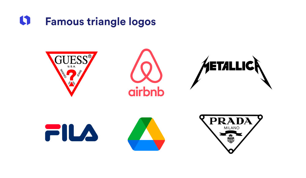
Triangles and Diamonds: Energy, Direction, and Ambition
Triangles point. That pointing suggests movement, direction, and purpose. An upward-pointing triangle feels aspirational, growth, progress, achievement. A downward-pointing triangle can feel stable (like a pyramid) or, depending on context, slightly aggressive.
Triangles are dynamic. They feel less settled than squares, less soft than circles. They suggest a brand in motion, pursuing a goal.
Use triangles when the brand is competitive, ambitious, or in the business of transformation. Avoid triangles when the brand needs to feel calm, nurturing, or traditional.
Horizontal Lines: Calm, Stability, and Rest
Long, horizontal shapes suggest rest, weight, and stability. They are the visual equivalent of a horizon: calm, settled, unchanging.
Brands use horizontal forms to communicate reliability and a steady hand. Insurance company logos, bank marks, and any brand promising security often leans into horizontal orientation.
Use horizontal shapes when the brand’s core promise is “we will be here tomorrow, the same as we are today.” Avoid them when the brand needs to feel urgent or dynamic.
Vertical Lines: Strength, Elegance, and Aspiration
Vertical lines reach upward. They suggest masculinity, hierarchy, and power. Tall, narrow shapes feel aspirational, reaching toward something better, higher, more refined.
Luxury brands use verticality. Skyscraper silhouettes, tall letterforms, and elongated marks all signal prestige and sophistication. The upward movement implies progress and excellence.
Use vertical lines when the brand occupies a premium position and wants to be seen as elite. Avoid them when approachability or warmth is the primary goal.
Spirals and Organic Forms: Creativity, Growth, and Natural Flow
Spirals are circles in motion. They suggest evolution, creativity, and natural cycles. Organic, free-flowing shapes feel human-made, approachable, and artistic.
Creative agencies use spirals and organic shapes to signal that they do not think in straight lines. Wellness brands use naturalistic forms to suggest holistic, non-industrial approaches. Children’s brands use soft, irregular shapes to feel non-threatening and playful.
Use organic shapes when differentiation and human touch matter more than corporate authority. Avoid them when the client needs to project absolute reliability or technical precision.
Combining Shapes: The Emotional Palette
Most logos combine multiple shapes. A circular mark on a square badge. A triangular element within a rectangular frame. The emotional message becomes a conversation between forms.
A circle inside a square suggests community within structure, a bank that cares about its customers, a tech company that values connection. A triangle inside a circle suggests dynamic energy contained within a harmonious whole, an ambitious brand that still feels approachable.
The interplay is where nuance lives. The base shape establishes the dominant emotional tone. Secondary shapes add complexity. This is how logos avoid feeling like simplistic stereotypes.
The Limits of Shape Psychology
Shape psychology is a starting point, not a formula. A circle does not guarantee that viewers will trust your client. A square does not guarantee stability. The full context, color, typography, cultural associations, and the viewer’s prior experience with the brand, overwhelms any single shape signal.
A square logo for a skateboard brand reads very differently than a square logo for an accounting firm. Shape meanings are always modulated by context. Use the psychology as a guide, but test your assumptions with real audiences.
The Bottom Line
Your shape choices are not neutral. They telegraph emotional messages before a single word of brand copy is read. Circles invite. Squares reassure. Triangles energize. Spirals inspire. Understanding this vocabulary lets you design with intention rather than intuition. The viewer will react either way. The question is whether you chose the reaction they have.
About the Author

Peter Makeshoff
Peter Makeshoff is the founder and main author of Designer Daily.