If you’d ask me what’s the most famous British font, I’d probably tell you it’s Gill Sans, at least for graphic designers. For other people, it would certainly be Times New Roman, given its widespread use in Word documents. There is however another typeface that we have all seen at least once: Johnston. Ok, you may not know it by name, but you have all seen it, it’s the font used for the London underground.
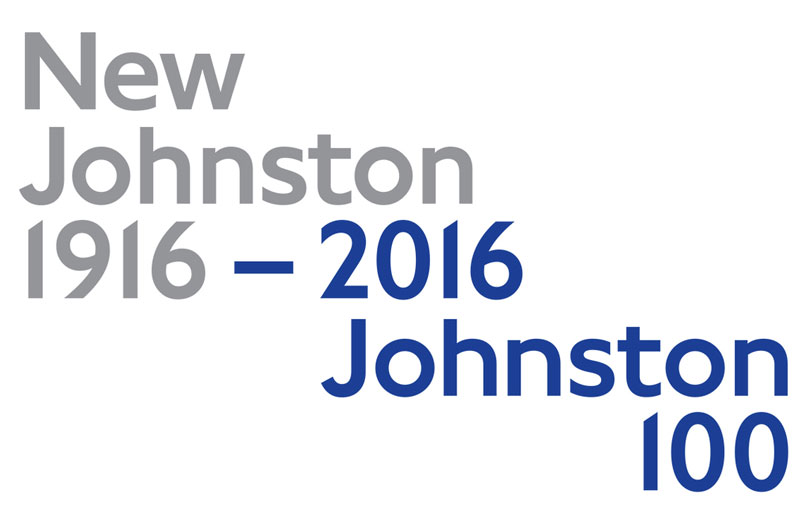
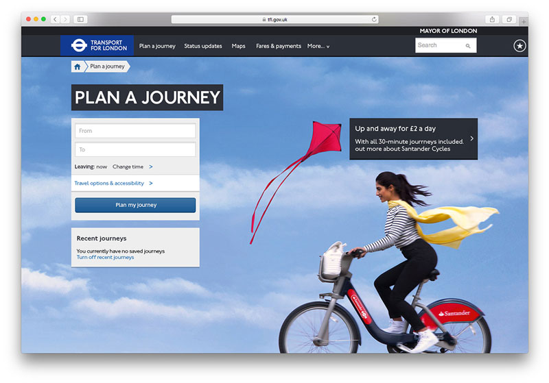
The sans-serif was designed 100 years ago by Edward Johnston, a British craftman and calligrapher. It became iconic through along with the pop culture that was widely exported by England in the second part of the twentieth century. To celebrate the anniversary of the typeface, Transport for London commissionned Monotype to redesign the typeface, which they did perfectly as you can see in this video.
The lead designers on this project, Jon Hunter, Malou Verlomme, and Nadine Chahine, took upon the task with the idea of improving the things that had to change without changing the font’s unique characteristics. They worked with a lot of archive drawings, which is probably the best way to respect the original design principles of the typeface.
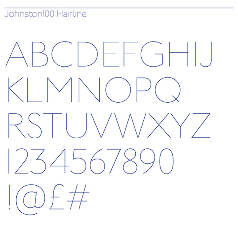
The biggest change brought to the new typeface is without a doubt the addition of two new weights, hairline and thin, which gives more options in terms of branding for Transport of London. These will be particularly useful for new media platforms such as tablets and phones.
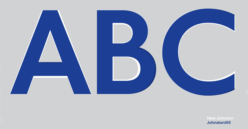
Some of the changes can be seen in this comparison picture.
About the Author

Peter Makeshoff
Peter Makeshoff is the founder and main author of Designer Daily.