
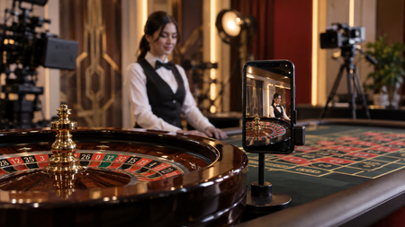
Roulette requires a lot more space than any other casino game, even in its physical form at land-based casinos. There is a roulette wheel, a big table with a large betting area, and then there needs to be a croupier. Now, try to imagine how that might fit into a digital version of the game that has to display on small-screened mobile devices. It’s not that simple at all.
Roulette is now available in both digital and live formats at online casinos. Anyone searching online roulette NJ will find that it’s also sat alongside a whole host of other live dealer games, including blackjack and baccarat.
The challenge is no longer simply putting a roulette table on a website. It is working out how much of that table can fit on a phone without making the controls difficult to use.
A Roulette Table Is a Lot to Fit on a Phone
There’s a lot more that needs to be fit into a screen for roulette when compared with simpler card games. There’s a roulette wheel for starters, while a large betting overlay is needed on the screen as well. While it’s simple for all of that to fit into a large desktop screen, it’s a whole other matter for mobile devices.
Simply shrinking the layout wouldn’t fix the issue either. Buttons that are easy to click with an accurate mouse are not the same when they’re smaller and require big fingers to touch.
This is where responsive web design can help, as it automatically configures displays to fit devices. Modern responsive websites are designed with the very purpose of being able to convert regular desktop screens into working mobile versions.
The Betting Grid Needs More Thought
That roulette betting grid is probably the biggest design challenge. The size of desktop monitors allows plenty of space for the various inside and outside bets to stay on screen. Fitting all the above onto smaller screens is not as straightforward.
One solution that’s been used is to keep the main betting layout visible, but to make the controls simpler. Another has been to allow users to switch between certain sections of the betting grid, rather than having the whole thing visible. Probably the easiest solution, however, is to only display the interface when bets need to be placed. It can disappear as the round plays out.
Live Roulette Adds Another Layer
Digital roulette is one thing. Live roulette has another problem because the mobile interface has to accommodate video as well as the betting controls. There’s also a live croupier who has to be on screen as well.
The game is streamed live from a casino floor or from within a custom-made studio. Cameras send the action back to players’ phones in real-time. The wheel, table, and dealer all need to be on screen, and the betting overlay needs to fit too.
The phone needs to fit all of that in while also ensuring the controls are big enough for users to use adequately. A desktop monitor can accommodate these elements easily due to having so much space, while a phone generally can’t.
Portrait or Landscape?
Screen orientation is another consideration, as there are two that players can use. Portrait mode provides the smallest amount of space for a game, while landscape gives developers much more room to play with. Turning the phone sideways puts it into landscape, which provides more room. The only issue with that is that players may prefer to play games holding the phone upright rather than on its side.
That is why some mobile roulette games allow both portrait and landscape modes. They’re just designed to display differently. Some features might be removed for portrait, but the wheel and croupier are usually accommodated. This may sound like a small detail, but orientation can make a considerable difference to a game based around a wide betting grid.
Typically, in portrait mode, just the wheel and croupier are prioritised. Conversely, landscape versions may also include the betting layout depending on the roulette game being played.
The Final Takeaway
Bringing online roulette to mobile devices has long been a challenge for developers, especially as simply shrinking the screen is never going to work. They have to consider how they can fit everything in, ranging from the betting grids, croupiers, roulette wheel, and any controls players need to use.
Still, this has been done successfully to date thanks to responsive website technology. The display alters automatically depending on the device used and the size of the screen. The design allows for certain elements to be hidden away while a game is being played.
About the Author

Peter Makeshoff
Peter Makeshoff is the founder and main author of Designer Daily.