
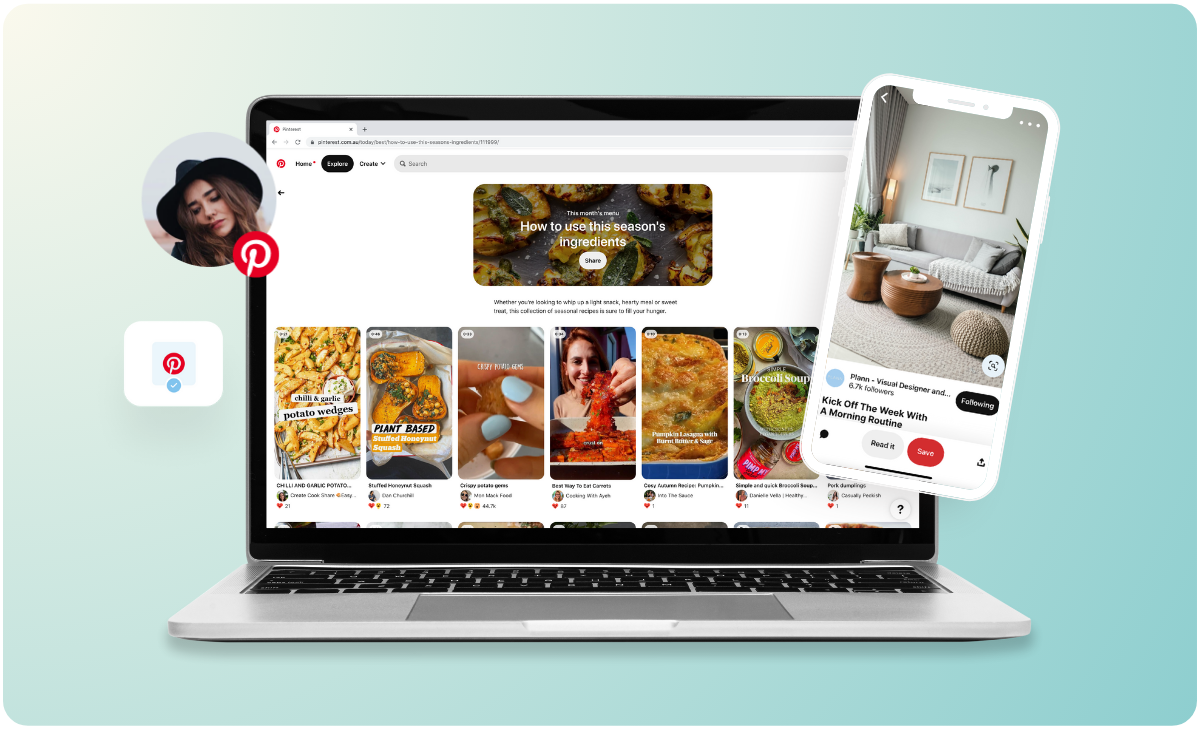
Pinterest is not social media. It is a visual search engine. People arrive with intent, planning a wedding, remodeling a kitchen, starting a business, not to kill time. This changes everything about how you design for the platform. Likes are meaningless. Saves and shares are the only metrics that matter. If your pin gets saved, Pinterest shows it to more people. If it gets ignored, the algorithm buries it.
Here is how to design pins that stop the scroll and earn a place in someone’s board.
The Vertical Advantage
Pinterest recommends an aspect ratio of 2:3 (800 x 1200 pixels) or 1:2.1 (1000 x 2100 pixels). Vertical pins occupy more screen real estate, making them harder to scroll past. They also perform better because users expect a tall, readable format.
Do not crop a horizontal Instagram graphic and call it a pin. Start with the vertical canvas. Design for it from the first sketch.
Readable at a Glance
Most Pinterest browsing happens on phones. Users scan quickly, pinning promising images to review later. Your pin must communicate its value in under two seconds.
Text must be large. On an 800 x 1200 pixel canvas, headline text should be at least 60 pixels. Subheadings at 40 pixels. Body text at 24 pixels. If a user cannot read your pin without zooming, they will scroll past.
High contrast is non-negotiable. Dark text on a light background or light text on a dark background. Avoid medium tones that blur together. Test your pin in grayscale. If the text disappears, the contrast is too low.
Limit the message to one idea. A single, clear headline outperforms three competing messages. “10 Kitchen Storage Ideas” is specific. “Kitchen Tips and Hacks” is vague. Specific pins get saved because users know exactly what they are saving.
The Text Overlay Decision
Should you add text to your pin or rely on the image alone? The answer depends on the content.
Text overlays work for: How-to guides, listicles, recipes, tutorials, and any content where the value is in the information. The text tells the user what they will learn. The image sells the result.
Textless pins work for: Product photography, art, fashion, home decor, and any content where the emotional response comes from the image itself. If the pin is aspirational, let the image speak.
When in doubt, test both. Create two versions of the same pin, one with text, one without, and see which generates more saves. Pinterest’s analytics will tell you.
Color as a Category Signal
Pinterest users organize their boards by color as much as by topic. A user planning a wedding might have separate boards for “blush pink inspiration,” “sage green details,” and “neutral reception decor.” Your pin’s dominant color determines which boards it gets saved to.
Use color strategically. A recipe pin in warm oranges and browns will land in fall entertaining boards. A home office pin in soft blues and whites will land in calm workspace boards. The color is not just aesthetic. It is metadata.
Avoid desaturated, muddy palettes. Pins that lack a clear dominant color get ignored because users cannot categorize them. Give your pin a color story that is intentional and vivid.
Branding Without Shouting
Your pin needs to be recognizable as yours, but the branding should never distract from the content.
Place your logo or URL in the bottom left or bottom right corner. Users expect branding there, and it will not interrupt the visual flow. Keep it small. Keep it consistent.
Use the same typography across all pins. A consistent typeface palette signals professionalism and builds recognition. The user may not notice consciously, but they will start scrolling for “that brand with the clean sans-serif overlays.”
Do not watermark the entire image. A translucent watermark across the center makes the pin unusable for saving. Users will skip it even if they like the content.
The Save-Driven Copy
The pin description matters as much as the image. Pinterest’s algorithm reads the description to understand what the pin is about.
Lead with keywords. “Modern farmhouse kitchen ideas with open shelving and brass hardware.” Not “Check out our new kitchen post.”
Include a clear value statement. “Save this pin for your next renovation” or “Tag a friend who needs these tips.” Direct calls to action work because users are in planning mode. They want to save for later. Remind them.
Keep descriptions under 200 characters. Longer descriptions get truncated on mobile. The first sentence must contain the most important keywords and the value proposition.
The Carousel Opportunity
Pinterest now supports carousel pins, multiple images in a single post. These are ideal for step-by-step tutorials, before-and-after transformations, and any content that benefits from sequencing.
Use carousels for: A recipe with ingredient shot, prep shot, cooking shot, and final plate. A DIY tutorial with materials, steps one through four, and finished result. A room reveal with empty corner, furniture arrival, styling process, final room.
Carousels generate more saves because users get multiple pieces of value from one pin. Each image reinforces the decision to save.
What Pinterest Rewards
The algorithm favors pins that get saved quickly after publishing. A pin that earns 20 saves in the first hour will be shown to far more users than a pin that earns 200 saves over a month.
To drive early saves: Publish pins when your audience is most active (typically evenings and weekends for lifestyle content). Share the pin to your other channels immediately, email newsletter, Instagram Stories, Facebook groups. Ask engaged followers to save the pin as a favor. The early momentum signals to Pinterest that the content is valuable.
To sustain saves: Design pins that remain useful over time. A seasonal pin (e.g., “Halloween Decor on a Budget”) will get saves for two months and then die. A timeless pin (e.g., “How to Fold a Fitted Sheet”) will get saves for years. Balance timely ideas with evergreen content.
The Bottom Line
Pinterest design is not about artistic expression. It is about utility, clarity, and saveability. Design for vertical, readable, high-contrast visuals. Use text overlays when the value is informational. Use color intentionally. Brand consistently but quietly. Write descriptions that tell the algorithm and the user what the pin delivers.
And remember: every save is a vote for your pin. The algorithm counts those votes. Design to earn them.
About the Author

Peter Makeshoff
Peter Makeshoff is the founder and main author of Designer Daily.