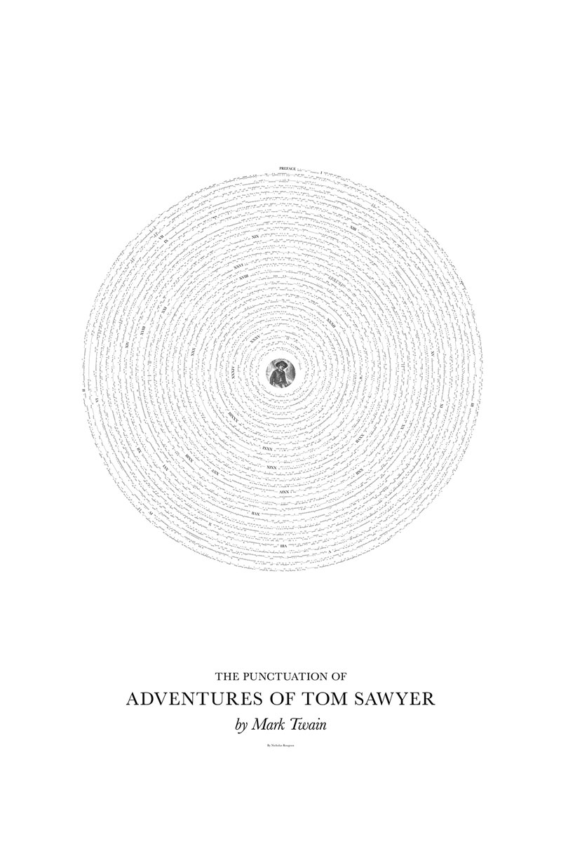
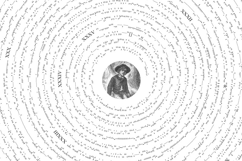
What creates rythm in texts in general, and books in particular? Punctuation, of course! The little commas, periods, semi-columns, and their other friends, are often forgotten when it comes to typography and design.
Nicholas Rougeux, a Chicago-based graphic designer and data geek, did more than remember about punctuation, he put it at the center of his series of designs by featuring the entire punctuation of classic novels in his posters.
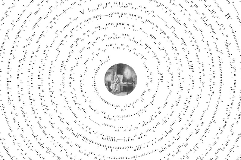
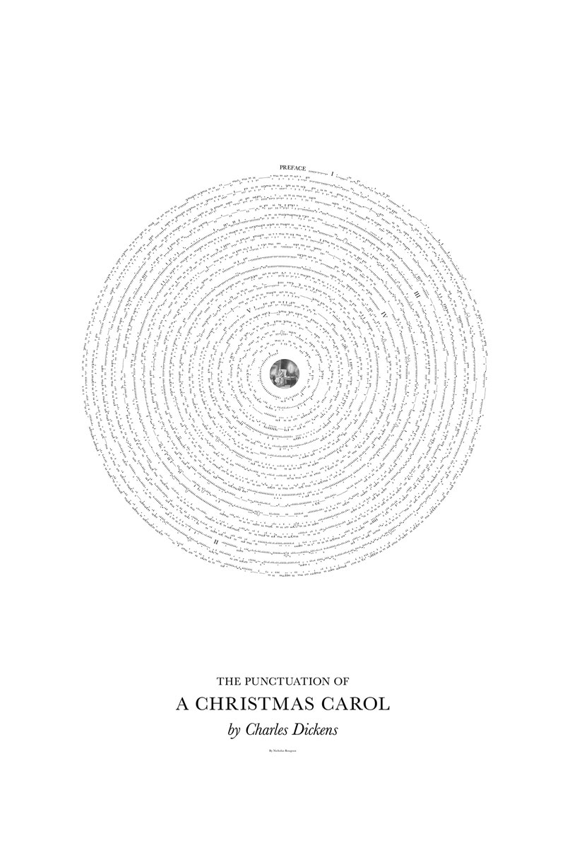
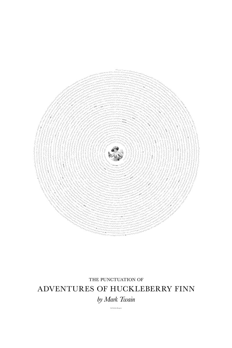
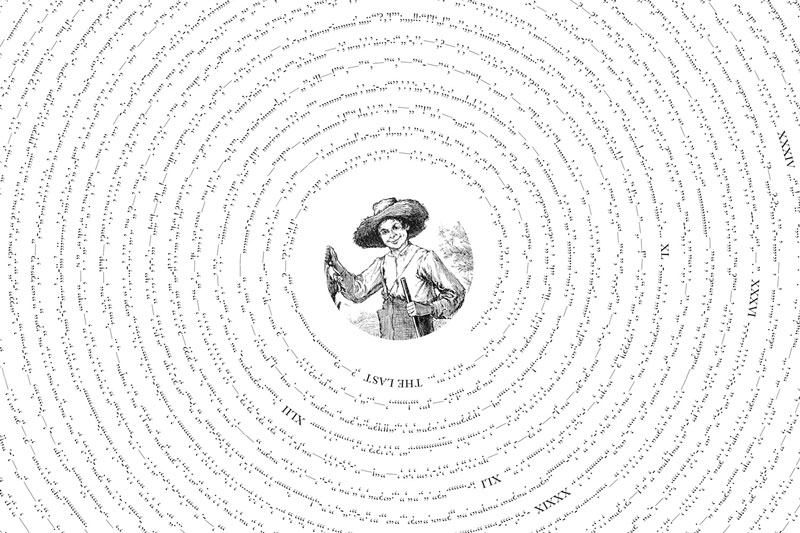
Each poster in “Between the lines“, his series of posters, is built the same way. A vintage illustration is placed in a circle at the center of the poster, and the punctuation is layed out around in order. He pulled out the texts from classic novels he retrieved from the Gutenberg project, so they are all in the public domain and he knew he could use it all.
About the Author

Peter Makeshoff
Peter Makeshoff is the founder and main author of Designer Daily.