As we go about our lives, there are a number of different things which motivate us to make the choices we do. We are often unconscious of these various elements. A colour can make us feel vibrant. A new scent can remind us of a childhood spent in a meadow. These various factors influence what we will do or how we will rate our experiences.
As web designers, then, we know that psychology plays a massive role in user experience. It can determine the conversion rates of a site, and whether our users have a positive experience or not. Understanding basic elements of psychology can help us to create sites which appeal to our users.
It isn’t enough to design a website nowadays, you also have to play the role of a UX researcher a bit, or work with one to create a good experience for the site’s users.
These following tips are here to assist!
Understand how the brain works
In order to work both creatively and effectively as a web designer, it helps to understand how the brain functions. This doesn’t mean you need to be a neurologist. Instead, some basic tips will help us to interpret a webpage from a viewer’s perspective.
The field of neurodesign was introduced in 2012, and this shows us the impacts our designs will have on user experience. That’s right, aesthetics really does make a massive impact.
Interestingly enough, one of the most important aspects of web design in order. Our brains battle with chaos. When we look at a situation or space, our brains automatically create categories or ‘schemata’ in order to make sense of what we see. This helps us to come up with solutions to problems or to grasp the meanings that are presented to us. These ‘heuristics’ or broad rules help the word feel predictable. We are able to make sense of what is happening around us. This creates the feeling of comfort or safety.
One example of how our brain makes sense of scattered information involves pattern formation. Our brains recognize patterns, and will even create imagery out of scattered information. Early astrologers, for example, produced patterns from scattered stars. We often fill in information when we see gaps in sentences or even letters that are missing or misplaced in words. We see the whole as greater than the sum of the parts.
You may be wondering how this relates to web design? Here are a few helpful tips:
Make use of hierarchy: When your users are able to grasp a pattern or order to what is presented to them, it helps them to make sense of the information presented. This helps your users to understand what your site is about and where to access what they are looking for.
Create categories: Your users like to see information collected into groups. This could be groups of products, services or even people. Categories help to simplify what is on offer. An E-commerce site which offers up ladies clothing and then divides it into tops, then t-shirts, jackets and shirts, will make it easier for clients to find what they are looking for. Information is no longer presented in scattered mass. Instead, it has been given a sense of order.
Use recognition: If you’ve ever been trying to explain a concept to a friend and couldn’t find the term you’re looking for, you know how frustrating retrieval failure can be. This is something to avoid on your website. Instead, ensure your viewers are familiar with your interface and are able to navigate it effectively. By using recognition you are able to do much of the work for your viewers.
You may be wondering how recognition works in online design?
Think of the way that Google draws on a browser’s history in order to auto-fill information a user could be searching for.
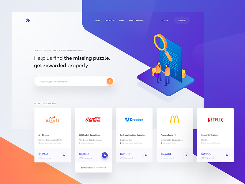
E-Commerce sites such as Amazon will often show shoppers what they have recently browsed. They might also show shoppers purchases that have been combined by past shoppers in order to make product recommendations.
By presenting and organizing information in this way, website experiences often become more friendly for viewers.
Here are some further methods you can use to organize your webpage in a viewer-friendly manner:
Grab your user’s attention
By organizing your website into sections which grab your user’s attention, you stop your user’s mind from wandering across the site. This helps to give your information structure as well as keep your viewer’s attention focused on specific aspects of your site.
Use colour and contrast
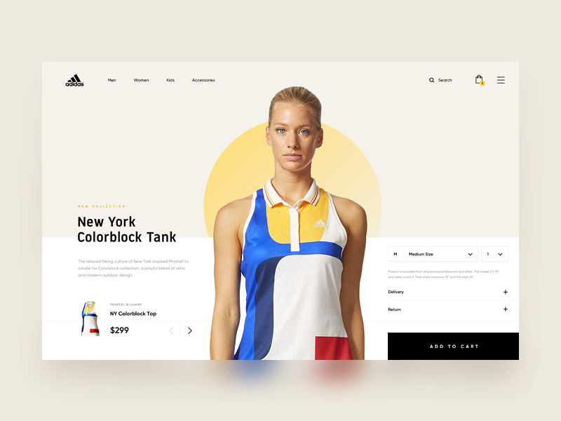
Your viewer will receive an emotional message from colour. By using colour carefully, you will, therefore, be communicating with your viewer. The contrast will help you to draw attention to aspects of your site, enabling them to stand out. A call to action button, for example, should be clearly visible so that your viewer knows how to proceed. This will increase the conversion rate on your site.
The messages communicated by colour
When it comes to using colour, each choice will have a psychological impact on your viewers. This will determine how they will respond to your site. Colour can be very complex, and some colours may represent different emotions. Red, for example, may represent both passion and danger. Context, therefore, plays an important role when it comes to colour usage.
Here are some broad rules when it comes to colour usage:
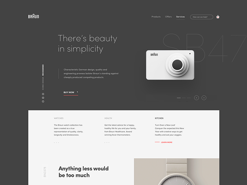
Black is often associated with luxury, value or professionalism. Colours mixed with black often give a professional or corporate feel.
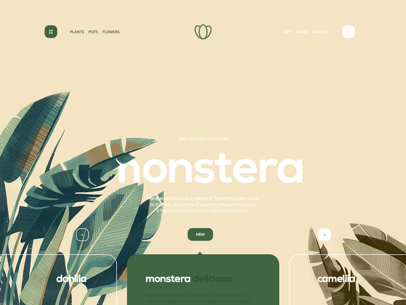
Green is often associated with environmental awareness as well as with humanitarian organizations such as NGO’s.
Blue provokes feelings of calmness or serenity. This colour is often used to show trust.
Yellow is linked to warmth but can also be used to indicate a warning.
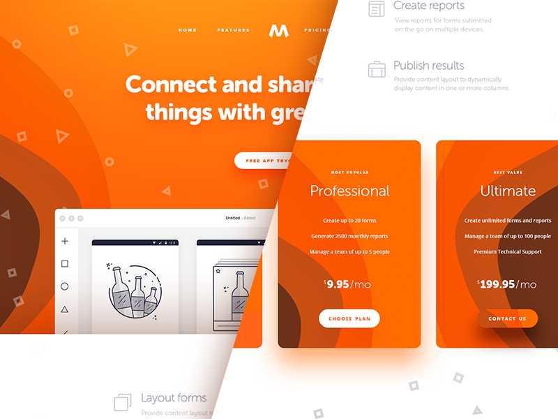
Orange shows warmth and vibrancy but is also used to represent impulse.
All of the above colours can be used to communicate a message to a viewer. However, it is not only the colour in the foreground that sends a message but the use of white or background space as well.
Effective use of white space
When white space is used effectively, this creates a clean, clear effect, reducing cognitive load. White space keeps your site looking clean and fresh. If you use colour to attract attention to your site, your white space will create a breathing space for your viewer.
Create a consistent site
In order to work towards maximum viewer comfort (and therefore conversion rates), it is important to keep your site as predictable as possible. This will keep your viewer feeling at ease. Ensure that each page of your site uses the same typography, colours and page headers.
Keep your navigation system consistent across your different web pages. Icons such as search buttons or shopping baskets should be in the same position on each page. This way your site will seem predictable (and therefore easy to navigate) for your viewers. By doing this, you will increase your conversion rates.
Create emotional resonance by using imagery
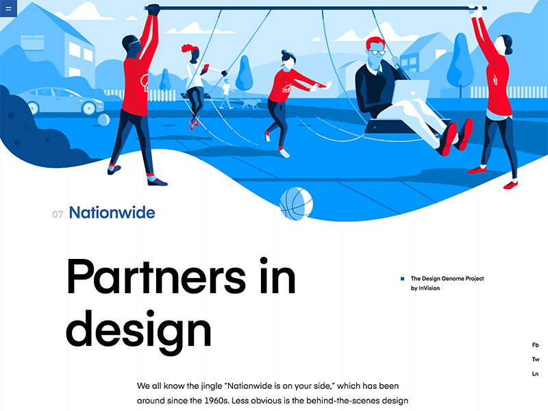
A picture says a thousand words! If you would like your viewers to resonate with your site, use imagery to build a connection.
Effective (and relevant) use of imagery creates emotional resonance within your viewers. This is particularly helpful on a landing page in order to assist your viewers to identify with your brand. A great image will boost your conversion rates.
Use the F page layout
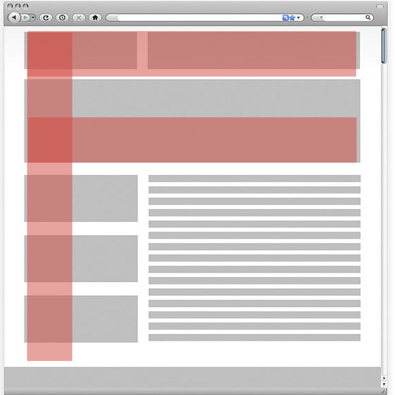
Research into web design has shown that the most common way to read a webpage is by using the F pattern. Eye tracking studies show that this is true. Viewers will look at the top of a webpage or in the header. They will then look at the left side of the screen. However, viewers will only glance at the right side of the page every now and then.
By designing web pages which fit in with the viewer’s gaze patterns, you will be able to produce an effective site. Concentrate your important messages or key information on the left side of the page for maximum impact.
When viewers are ready to leave a site, research reveals that they often look to the right. By placing an effective image or enticing information on the right-hand side of your site, you may be able to distract your viewer, keeping him on the site for longer.
Think through your use of typography
Typography sends out a message to your user. It is not only the typeface you select but how it is laid out that will make your user feel comfortable. A comfortable, easy to read font which is well laid out will ensure easy reading.
Keep your font selection simple and easy to read in order to keep your viewer engaged. When a font is hard to read, your information will seem more complex to your viewer. Content which is simple to read and easy to digest will keep your user engaged.
Fonts can often tell the viewer if they are in the right space. A font choice which is suitable for your brand or company will create a sense of trustworthiness in a viewer. A modern, clean-lined font will often suit a technology company, where a typeface style font might suit a writer.
The layout will make a big difference as well. When your site is clean-lined and easy to read, your viewer will be more likely to engage with your content.
Keep your calls to action clear
Your call to action buttons guide your viewer, assisting him with what he should do next. They are therefore a very important element to any webpage. It is important that they stand out against the background of your site. You can use contrast to ensure that your calls to action attract a great deal of attention. In web page design, the call to action should generate the most attention on your page.
If you are unsure if your call to action button is vivid enough, stare at your computer screen with your eyes unfocused. If you can still see your call to action button, your design is effective.
When it comes to vivid contrasts or attractive colours, our brains are wired to take notice. By drawing attention to the Call to Action button and compelling the brain to focus on it, you will guide your viewer towards responding. This will increase your conversion rate.
Attract your viewers with new information
Viewers enjoy novelty and as a result, are attracted to new information. When setting up your site, ensure that you create a section where new products can be seen or explored. Even if your site has minor updates, ensure that these stand out to your viewers.
Let your viewers know that you have the latest products available. By placing this information on your landing page, you will encourage your viewers to delve further into your site. Try to whet your viewers’ appetite and leave them wanting to find out more.
If you have regular readers, making subtle changes to your site will hold your viewers’ attention. You could add some new imagery, load some quotes, or change your font sizing to create a sense of variety.
Conclusion
There are no single solutions to designing a great website. However, by understanding what will appeal to your viewers and attract their attention, you will be able to ensure an effective website design. This will help you to work towards dynamic creations which result in high viewer conversion rates.

