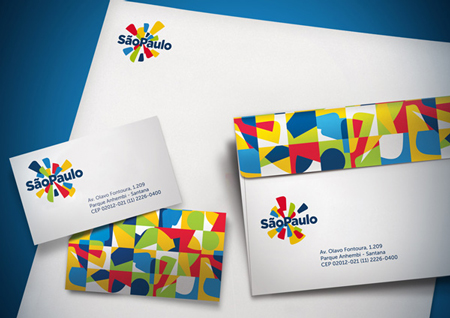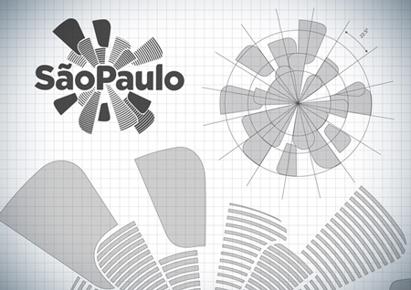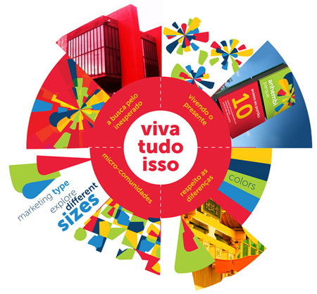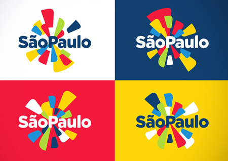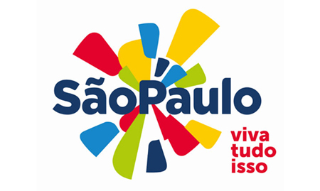
A very colorful new identity for the Sao Paulo’s Turismo agency. The only problem for me is maybe the readability of the capital P in the logo, but overall I like the various applications of the logo. Via Brand New.


A very colorful new identity for the Sao Paulo’s Turismo agency. The only problem for me is maybe the readability of the capital P in the logo, but overall I like the various applications of the logo. Via Brand New.
