In today’s tech-savvy world, users effortlessly transition between devices and platforms as part of their daily lives. This has given rise to a growing need for outstanding cross- and multi-platform solutions. Designers can no longer concentrate solely on a specific operating system; instead, they strive to craft clear and captivating experiences that transcend the boundaries of certain platforms. As our interconnected world keeps on developing, the mastery of cross-platform app design is no longer optional but essential for achieving success.
Unlocking simplicity: embracing cross-platform design
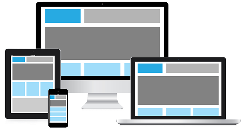
Simplicity is a prized virtue, and the IT sector is no exception. It makes it easier for specialists working on software products to carry out tasks more efficiently and expands the reach of their solutions. Cross-platform mobile app design is a good way to secure this important feature in digital platforms.
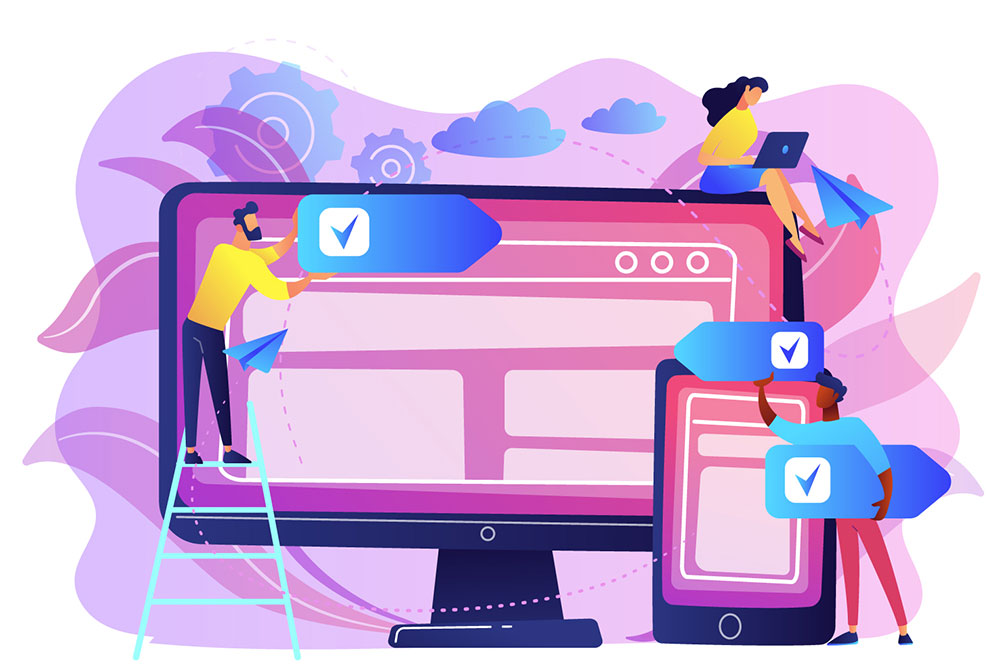
The primary objective of cross-platform app design is to create uniform interfaces and seamless experiences across diverse platforms. This entails ensuring the smooth performance of an application on various operating systems. By leveraging shared codebases, vital assets, and standardized elements, specialists strive to establish a consistent and intuitive experience that remains familiar and cohesive to users, irrespective of the specific device or platform they employ.
It comes with numerous advantages:
Consistency
With cross-platform design, people get similar UX and UI, regardless of what hardware capacities they have or what software product they use. Everything is clear and familiar, and it’s very easy to handle such apps.
Perfect teamwork
Cross-platform app design fosters collaboration between programmers and designers. Professionals work closely together, leveraging shared assets and achieving a unified vision. Teams that share a single codebase and understand the app’s principles will have improved communication.
Impeccable experience
This approach allows for uniformity and consistency, irrespective of the usage scenario. People switch between devices without experiencing a jarring transition.
Rapid prototyping and QA activities
Going cross-platform implies rapid prototyping and testing. Professionals rapidly revise and test their concepts, collecting important opinions and making the required changes.
Scalability
With cross-platform design, systems show enhanced scalability. All platforms can be quickly updated with the latest features and changes, ensuring a consistent experience for all users and reducing fragmentation.
Cross-platform and multi-platform design: meaningful distinctions
There are important distinctions between cross-platform and multi-platform design systems. The concepts sound pretty similar, and lay users may not know the differences. But specialists working on software projects must be fully aware of them to achieve significant outcomes.
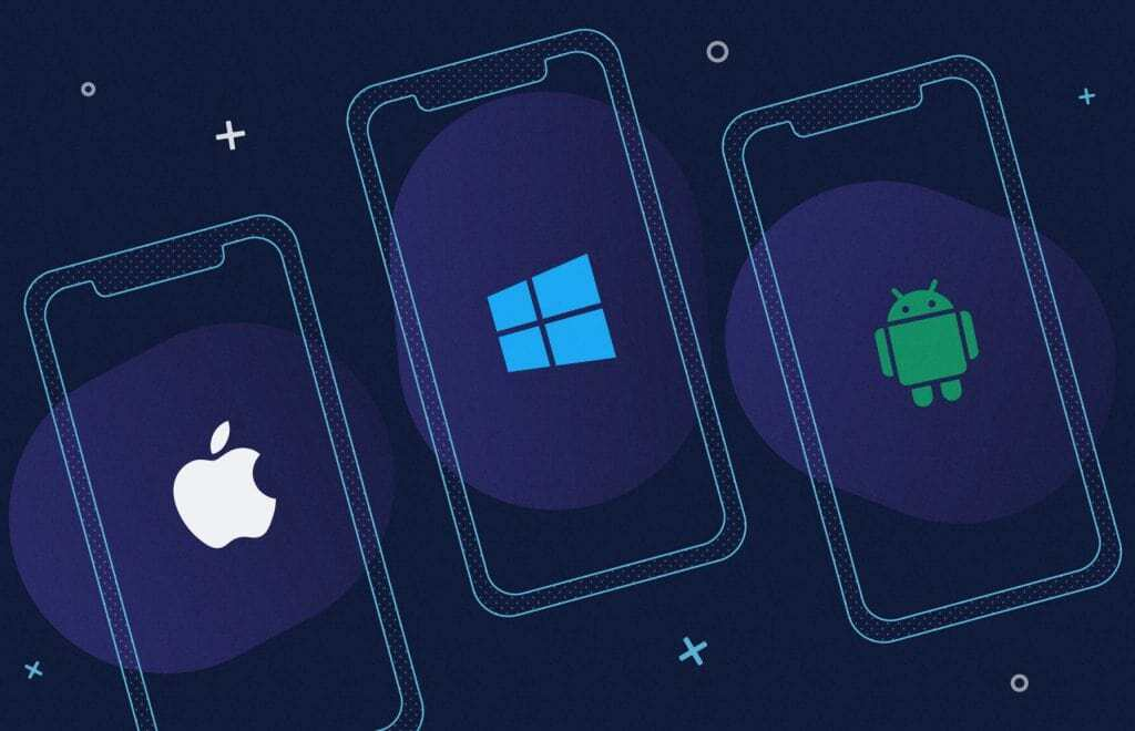
The main objective of cross-platform development is to build a digital solution that runs on a variety of platforms, like Android and iOS, with the same codebase. This is reflected in the design as well:
Uniformity
Ensuring a consistent experience is of utmost importance. Designers play a crucial role in achieving this by ensuring that visual elements, interactions, and navigation are in line with the specific requirements of this or that platform.
Platform constraints
Features and capabilities tend to be consistent between cross-platform frameworks. Designers have to be conscious of their limitations and boundaries to make sure the user experience is seamless on different devices.
Professionals involved in multi-platform design systems create separate software products for each platform, addressing the needs of each OS they are working with. They should thoroughly examine Android and iOS capacities to achieve optimal results.
This approach influences design in the following ways:
Platform-specific customization
Multi-platform design implies that professionals work with the requirements of each platform in mind. The key goal here is to preserve platform-specific guidelines and ensure comfort, appealing app appearance, and ease of use.
Design language adaptation
Each platform has its own visual identity, so the language and branding must respond to it. Designers can employ specific elements and still maintain their brand’s overall coherence. They should keep in mind even minor details to secure the best possible result.
Enhanced user experience
By examining each platform individually and adapting it to align with specific behaviors and user preferences, designers have the opportunity to enhance the overall experience. This approach enables greater customization and improvement of the app’s functionality.
So, cross-platform design aims for outer consistency, while multi-platform design prioritizes familiarity. Designers face the challenge of finding a harmonious equilibrium between upholding a unified brand identity and accommodating users’ platform-specific expectations.
Key principles to follow
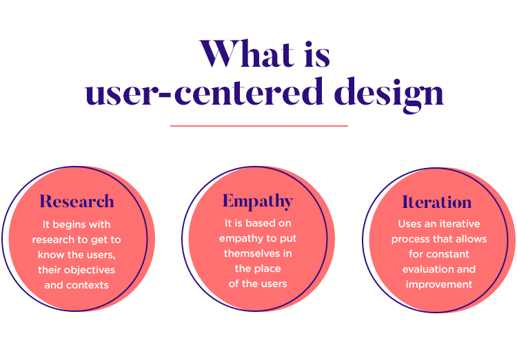
Crafting a user-centric experience
If you embark on a cross-platform UI design journey, you should delve deep into the psyche of your target audience. To truly captivate their attention and cater to their needs, try to obtain a comprehensive understanding of their preferences, behaviors, and pain points. By acquiring valuable insights through meticulous user research, surveys, interviews, and rigorous testing, you will be equipped with the knowledge to make sound decisions and craft an app that resonates with your users.
Begin by delving into the identities of people who will work with your software product. Who are they? What is their motivation? If you examine their goals and dreams thoroughly, you will be able to offer a cross-platform UI design that fully responds to their wishes and needs.
The devices and platforms people use for work or daily activities are numerous. And you must perfectly know who you want to address. Do you want to build an app for Android or iOS audiences? Maybe your potential clients will use your product through web browsers? Perhaps they need progressive web apps? If you understand their preferences, you will easily optimize your UI for various use scenarios, ensuring a comfortable and intuitive experience.
However, the user-centric approach doesn’t stop at demographics and specific OSs. It requires direct engagement with people who use your product, listening attentively to their opinions on its performance and considering their ideas. By gathering real-life stories, you can detect problems, uncover hidden opportunities, and refine your UI to deliver an extremely efficient solution. The best product is always the one that speaks to as many users as possible.
What’s more, by putting emphasis on the preferences of your users, you are profiting as well. The app will enjoy market demand and bring you revenue.
Strengthening trust with consistency
Establishing consistency across platforms is paramount in cultivating user confidence and strengthening brand recognition. This strategy helps organizations strengthen their identity and effectively enhance brand visibility among their clientele.
This requires following strict brand guidelines. These instructions give designers a clear path to take and secure comfort for end users. Professionals elaborate on a unified visual language by using similar font sizes, colors, and structures. All this results in a unified flow and increased comfort of use.
Such an approach not only increases the outer appeal of a digital product but contributes to better involvement. People appreciate the sensation of familiarity when they use different products. Their confidence becomes a major benefit for your business.
Additionally, implementing this principle into life makes it easier for users to switch between products or buy new devices. They can carry out their tasks without having to relearn or adjust to absolutely unfamiliar models.
With ongoing tech advancements and frequent updates, specialists should frequently return to and revise the guidelines to embrace meaningful modifications. Digital products will thus be aesthetically pleasing and fully in line with what people demand.
The importance of continuity
Continuity boosts cohesion. If components are thoughtfully arranged and consistent everywhere, this means an easier journey for users, regardless of what device they are working with at a particular moment.
Its significance becomes apparent as people switch platforms. A sensation of harmony is increasing their satisfaction. Imagine a scenario where people visit a company’s website on their smartphone and later switch to a PC session. Continuity is of pivotal importance in maintaining familiarity and diminishing friction. It gives users a chance to perform any tasks efficiently and uninterrupted, retrieve information, and complete their desired actions without any hindrance.
To implement this strategy into practice, specialists pay meticulous attention to the arrangement and alignment of vital elements. By following the same patterns and structures, users can move between platforms without a hitch, feeling comfortable in an environment they know well and that works flawlessly.
Continuity not only makes users happy but also strengthens the company’s identity and integrity. Everything is well-thought-out, and each detail has a meaning. So, using a product becomes a breeze. As a result, there grow deeper connections between people and businesses.
Furthermore, continuity demonstrates a company’s commitment to its audience and attention to detail. This way, businesses showcase their dedication to creating a unified experience and speak to various user groups simultaneously. Such commitment resonates with people as they appreciate being thought of.
Adapting to user context
For IT professionals designing software solutions, it’s essential to be aware of the context and adapt to it. Knowing that people use each device differently allows designers to create specific experiences that fit different contexts. No matter if someone is reading emails on their cell phone while commuting or looking at the same information on a computer, the context-driven approach allows for flexibility and adaptability across devices.
Imagine a person traveling on a bus or train. They would sooner rely on their mobile phone to view and respond to emails, profiting from the convenience and portability of this device. In such a scenario, the same person may not find this task convenient using a computer. Designers can improve the UX by recognizing and using potential scenarios, and also by considering the unique abilities and restrictions of every device.
Interfaces and interactions must be crafted in a flexible way, helping people to carry out their tasks without much difficulty. Optimizing page layouts for various screen sizes could be a part of this. Thus, specialists make sure mobile users have the essential features they need while they’re on the go or offer desktop users greater multitasking abilities with more space on their screens.
Phone and tablet differences are also important when building mobile solutions. Screen sizes may vary significantly, which implies various scenarios of use and various context.
By considering meaningful discrepancies, professionals secure experiences that feel familiar and personalized. They can predict users’ needs and give appropriate features and information based on the platform and context of use. This improved adaptability makes users happier and propels engagement and productivity.

Employing the potential of complementarity
When implementing cross-platform design in software systems, specialists put a special emphasis on complementarity. No matter PC or mobile, the key aim is to use the unique strengths and limitations of each platform to secure a harmonious user experience.
A desktop design typically goes with enhanced screen space, allowing for elaborate functionality, many more details, and intricate elements. However, when translating this to a mobile device, professionals must condense these elaborate features into a compact form. The difficult part is to keep the core of the desktop design and adjust it to the limitations of a smaller screen.
The collapsed design on a phone or tablet must encapsulate essential elements and features present in the desktop version. By carefully selecting and prioritizing them, specialists make sure that the mobile experience remains true to the company’s image and offers a simple transition for users. Such a complementary approach helps people to use core features and information on their mobile devices without feeling overwhelmed or constrained by the smaller screen size.
Conversely, expanding elements from a phone to a desktop version presents another facet of complementarity. Designers can improve the UX and UI by using the additional space. This expansion helps them include more extensive content, richer interactions, and impeccable visuals. Utilizing a more extensive area can help designers construct a more interactive and fascinating experience that is in line with the usability and comfort of a mobile design.
To thrive in their endeavors, experts must conscientiously deliberate on the fundamental essence and intent of diverse components as they traverse across platforms. This necessitates a deep comprehension of user requirements, behaviors, and interactions. By discerning the intrinsic value of each element, they can make sound choices regarding how to tailor and amplify them, culminating in a coherent and seamless user experience.

Wrapping up
Mastering cross-platform app design is a must if you want to make a successful product. By delving into the depths of user requirements, leveraging appropriate tools, and adhering to the basic rules, designers unlock limitless possibilities for building visually appealing and intuitive apps.
About the Author
Valentin Kuzmenko
Chief Commercial Officer/ VP of Sales | Andersen works in close cooperation with customers to define, craft, and improve high-performing software solutions across numerous industries.