It’s the default. The safe choice. The first color in every software’s palette. But pure black (#000000) is often the worst color you can choose for your designs. The world’s most sophisticated interfaces, from Apple’s iOS to luxury brands, rarely use true black. They use near-blacks, off-blacks, and deep grays that create more visual appeal, better hierarchy, and improved accessibility.
Here’s why you should stop reaching for pure black and what to use instead.
The Physics Problem: Pure Black Doesn’t Exist in Nature
Look around you right now. Find the darkest shadow in your field of vision. Is it truly black? Probably not. Even the deepest shadows contain reflected light, subtle color casts, and variations in tone.
Our brains are calibrated to the natural world. When we encounter pure, absolute black, it reads as artificial, even alien. This is why designs that rely heavily on #000000 often feel harsh, digital, and uninviting. They lack the subtlety and depth of the physical world.
The Accessibility Advantage: Reducing Eye Strain
Pure black on pure white creates the highest possible contrast ratio (21:1). While this exceeds accessibility minimums, it’s actually too much contrast for extended reading. The extreme luminance difference causes eye strain as your pupils constantly adjust between bright text and dark background.
The solution: Use dark gray (like #1E1E1E) for backgrounds instead of pure black. This reduces glare while maintaining excellent readability. Similarly, using off-black (#121212 or #0A0A0A) for text on white backgrounds reduces the harsh “vibration” that can make reading uncomfortable.
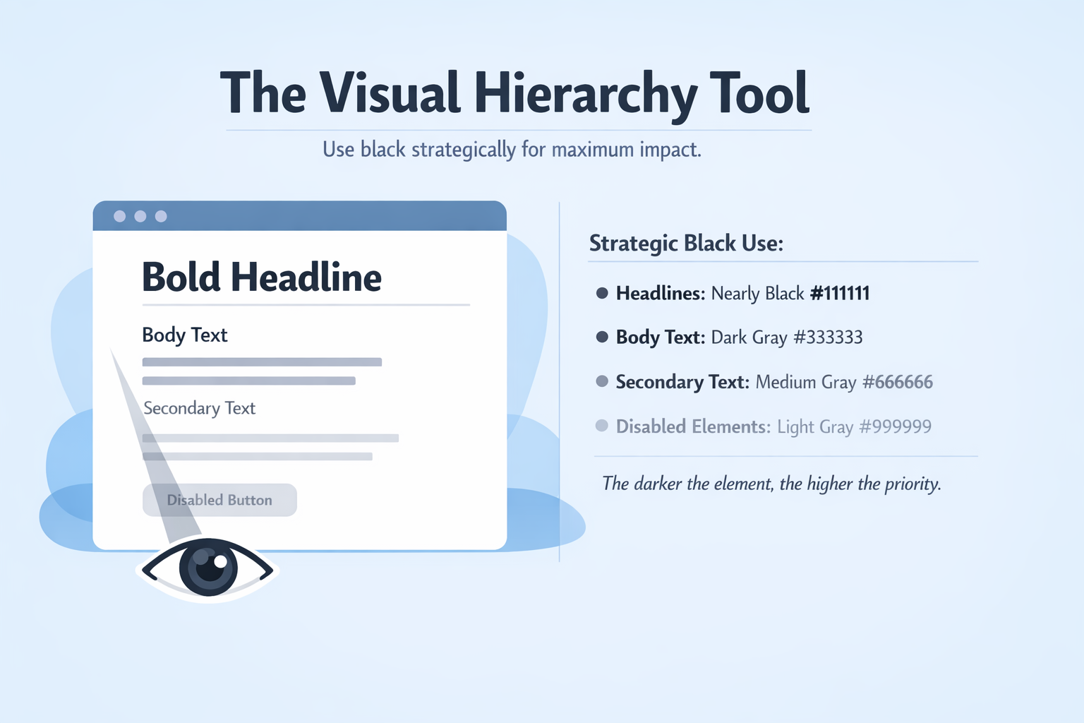
The Visual Hierarchy Tool
When everything is pure black, nothing stands out. True black should be reserved for your most important elements, the moments where you need maximum impact.
Strategic black use:
- Headlines can be nearly black (#111111)
- Body text can be dark gray (#333333)
- Secondary text can be medium gray (#666666)
- Disabled or tertiary elements can be lighter gray (#999999)
This creates a natural hierarchy without relying on size or weight alone. The eye instinctively knows what’s most important based on darkness.
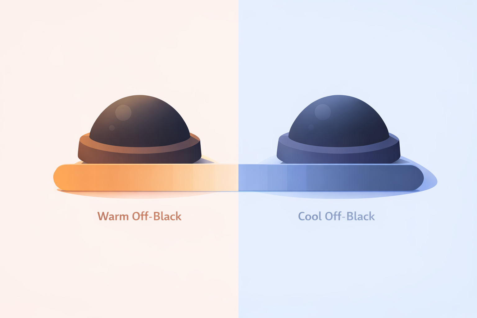
The Color Temperature Secret
Here’s where off-blacks get really interesting: you can tint them with color temperature to create mood and cohesion.
Warm off-blacks (adding a touch of brown or deep red) feel more approachable, organic, and comfortable. They’re perfect for editorial design, lifestyle brands, or any project needing human warmth.
Cool off-blacks (adding blue or purple) feel more technical, precise, and sophisticated. They’re ideal for tech products, luxury brands, and minimalist aesthetics.
A study of luxury brand color palettes shows that even “neutral” brands use carefully calibrated off-blacks with subtle undertones that align with their overall identity.
Practical Formulas for Better Blacks
For light mode interfaces (dark text on light background):
- Text: #111111 or #1A1A1A (not #000000)
- Secondary text: #333333 or #4A4A4A
- Borders: #DDDDDD or #E5E5E5
For dark mode interfaces (light text on dark background):
- Background: #121212 or #1E1E1E (not #000000)
- Surface cards: #2A2A2A or #333333
- Secondary text: #B0B0B0 or #CCCCCC
For colored off-blacks:
- Warm black: #1A1414 (black with deep brown undertone)
- Cool black: #14141A (black with deep blue undertone)
- Rich black (print-inspired): #0A0A0F (adds depth for digital)
Real-World Examples
Apple’s Dark Mode: The background isn’t black, it’s a carefully calibrated dark gray (#1C1C1E for many surfaces). This reduces eye strain while maintaining the premium feel.
Stripe’s Documentation: Their text isn’t pure black, it’s a soft dark gray (#2D3748) that’s significantly more readable than pure black would be.
Medium’s Reading Experience: Body text is #292929, not black. The slight softening makes long-form reading comfortable for hours.
The Technical Note: Accessibility First
When moving away from pure black, maintain sufficient contrast. WCAG 2.1 requires:
- 4.5:1 for normal text
- 3:1 for large text and UI components
A off-black like #1A1A1A on white (#FFFFFF) still provides about 15:1 contrast, well above minimums while being more visually comfortable than 21:1.
The Bottom Line
Pure black is a tool, not a default. Use it sparingly, for the moments when you need absolute maximum impact. For everything else, reach for the rich, subtle world of off-blacks and dark grays. Your users’ eyes will thank you, and your designs will gain a sophistication that pure black can never achieve.
About the Author

Peter Makeshoff
Peter Makeshoff is the founder and main author of Designer Daily.